Subscribe now and get the latest podcast releases delivered straight to your inbox.
How to Create a Powerful Landing Page in 1 Hour: A Step-by-Step Guide

Aug 20, 2019
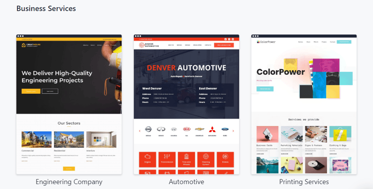
Don’t have a landing page and looking for ways to create one? Are your current pages not showing the results you expected?
Building a professional, well-structured landing page can be challenging for those lacking skills in coding or web design — but it doesn’t have to be.
It’s no longer necessary to spend time learning to code, searching for a design expert, or developing a site from scratch.
There are many ready-made or DIY options that can help create a landing page without requiring tech expertise.
If you need a landing page or you want to optimize a current one, we’ll show you how to use a website builder to create a page in just one hour.
Before we dive in, let’s review what landing pages are most commonly used for. Overall, a landing page is good to have when you need to communicate a specific, unique selling proposition (USP), but more specifically, marketers use them for:
- Lead generation: You can collect leads for your mailing list using lead magnets and contact forms.
- Segmentation: Many companies use landing pages for specific partnership campaigns, or for discounts for a specific audience segment. This allows unique landing pages to be linked and indexed.
10 steps to creating a powerful landing page in 1 hour
A website builder is typically the most effective way to build a landing page in terms of time, cost, and overall efficiency.
The following step-by-step guide will help small businesses and marketing experts use a website builder to create a landing page in just 1 hour (plus the 10 minutes to read this guide, of course.)
Let’s get started!
1. Determine the goal of your landing page — 5 mins
Setting the goal of your landing page is a fundamental step, as it will determine the requirements for the design and functionality of your website. The most common goals of your landing page include:
- Boosting brand awareness. So-called viral landing pages that users share on their social media are organically driving tons of traffic.
- Providing basic information about your business. In this case, your landing page will act as an online business card, providing “About us” information along with contact details. This is a perfect option for businesses that don’t sell anything online but are eager to share what they do with online communities.
- Generating leads. The main objective would be to gather your visitors’ information through contact forms that visitors fill out to request your services.
- Expanding your email list. You could collect contacts with a landing page that is a “lead magnet.” For example, free materials that are available for download after a visitor completes a form. Lead magnets include infographics, ebooks, white papers, guides, and webinars.
Once you know what you’re working towards, you can start to walk through the steps of HOW to achieve it.
2. Decide on the right landing page builder — 7 mins
There is a variety of website builder/landing page builder software available to help you create these essential pieces with ease. (Examples: Weblium, Leadpages, Squarespace, or Instapage.)
A great landing page software should combine functionality, ease of use, and fair pricing.
With that in mind, when choosing a landing page builder, look for:
User-friendliness. The landing page builder should have an intuitive visual website editor, well-designed templates for different business industries to choose from, simple integration with third-party analytics and marketing tools, and human support to help if you’re stuck at any point.
Also, the pages must be adaptive to all platforms (desktops, laptops, mobile phones, and tablets).
Security. The website builder should have reliable hosting, and provide SSL-certificates and backups of your website (e.g. Google Cloud or Amazon Web Services) to ensure the data collected on your landing pages is safe.
Customization capabilities. Sometimes standard pre-made blocks and templates are not enough to realize all your wishes. In this case, you will need the capability to create custom website sections or embed your HTML code.
Another important thing to remember is pricing plans.
Don’t be fooled by deceptively low cost, as this often mean that there’s limited bandwidth storage or a lack of important security features. In such cases, you might need to pay extra if you need anything beyond the standard package.
3. Choose the design of your landing page — 10 mins
Choosing the design of your landing page is one of the crucial steps.
65% of people are visual learners, and the design of your page has a great influence on how they — and all visitors — will react.
2.6 seconds is enough time for visitors to make a first impression of your page. So, it should be well-structured and match the objective of your campaign.
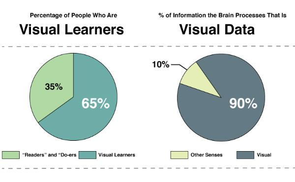
Source: Content Marketing Institute
With most site builders, it’s all down to choosing the right template.
When browsing through templates, pay attention to the quality of design, relevance to your business niche, and variety of landing page sections (i.e. information about the company, calls-to-action (CTA), forms, and testimonials).
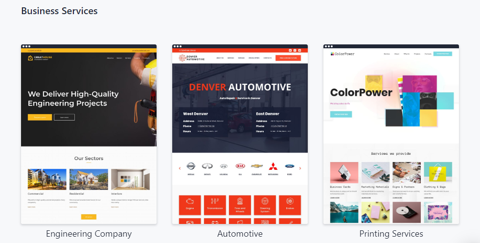
More specifically, look for:
- Consistent style. Make sure that the landing page template has matching colors and no more than two or three fonts. Otherwise, it will look messy.
- Attractive forms and buttons. Check if the most important elements of the web page grab visitors’ attention.
- Logical layout. The information about your business should be displayed logically, especially the main message, information about us, and the call-to-action buttons or forms.
Remember that an old-fashioned design could be a real turnoff. To prevent that, keep in mind the most recent design trends:
- Minimalist design improves functionality and optimizes the speed of your website (Example: Apple)
- Geometric shapes are attention-grabbing and let you express the proper message (Example: SimilarWeb)
- Unique images bring value and identity to your brand (Example: 99designs)
- Video content and animation effects make landing pages more appealing to users and help explain how the service works (Example: Weblium)
- Live chats improve clients’ satisfaction while allowing you to respond to their queries in real-time (Example: Intercom)
- Contrast CTA buttons grab attention and make visitors more likely to click (Example: Ahrefs)
4. Choose the right URL — 3 mins
If you want to target your audience and accelerate your search engine placement, remember that the URL or domain name for your landing page is almost as important as the name for a newborn baby.
It can work in favor of the visibility and credibility of your brand, making you stand out and look professional, and most importantly — having a huge impact on your search engine ranking.
Here are some effective tips that will help you to choose the right, SEO-friendly URL.
1. Carefully pick the domain zone, especially if this landing page isn't launched for a short-term promo. The most famous and most common is .com, but if you want to do business within one country or your region, it is better to look at the local domains, like .us, .ca (for the US or Canada) or ny.us (for instance, for a local business in New York).
If you already have a domain name for your branded website, you could make the landing page its subdirectory (example.com/name) or subdomain (name.example.com), but it could also be a standalone registered domain.
Google treats a website or a landing page with a custom domain name as a new player with serious intentions on its online presence. If you do opt for this…
2. Double-check before buying. Carefully explore the companies with similar domain names.
3. Keep it short. We recommend having 6 to 10 characters in your domain name and avoiding hyphens between words.
4. The name should be easy to remember and have positive associations. Ask your friends or a focus group for help. 5-6 answers will be enough to understand whether you are on the right track.
5. Create a strong title for your landing page — 3 mins
Your title has to mirror your objectives and give visitors a clear understanding of what you are offering.
To create a really strong title, use these techniques (you can either focus on one or try to combine a few):
- Keep it unique. Why should people convert on your page/offer over another? Come up with something catchy, appealing, and memorable so that people can’t
- Use “Fear of Missing Out” (FOMO.) Make your offer sound like the one that a visitor cannot miss, stressing significance and limited time.
- Ask a question. Play with your audience’s pain points, making them open up about the problems they face (and you can help solve).
- Guarantee results. Give them a reason to believe that your offering will give them what they expect. A money-back guarantee works great, as it is an immediate trust-builder.
- Reveal a secret. People enjoy mysteries. If you promise to unveil one, they may be more likely to scroll down the page.
- Be clear about what you do. If the main goal of your landing page is to introduce your business, tell precisely what you do in the hero screen. Avoid vague phrases that could apply to any business, like “a team of highly motivated professionals.”
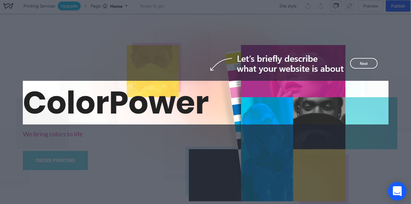
6. Add your unique content — 4 mins
With the help of content, you differentiate, convey useful information to users, and motivate visitors to take a certain action. As for SEO, Google ranks websites with unique content higher, which is vital for proper landing page optimization.
Apart from uniqueness, the text should be easy to read, grammatically correct, and broken down into logical paragraphs.
As soon as you prepare the content, it will be really easy to add it to the landing page.
Here is a list of questions to check whether your text will work as intended and convert your visitors into sales:
- Does your main headline convey the value of your offer?
- Is it clear what your visitors will get if they click a certain button or complete a form?
- Have you highlighted the benefits of your offer? (For example: save 20%, get a free consultation, or a money-back guarantee)
- Are there any trust factors like testimonials, certificates, photos, or case studies?
- Is it easy to find ways to contact you?
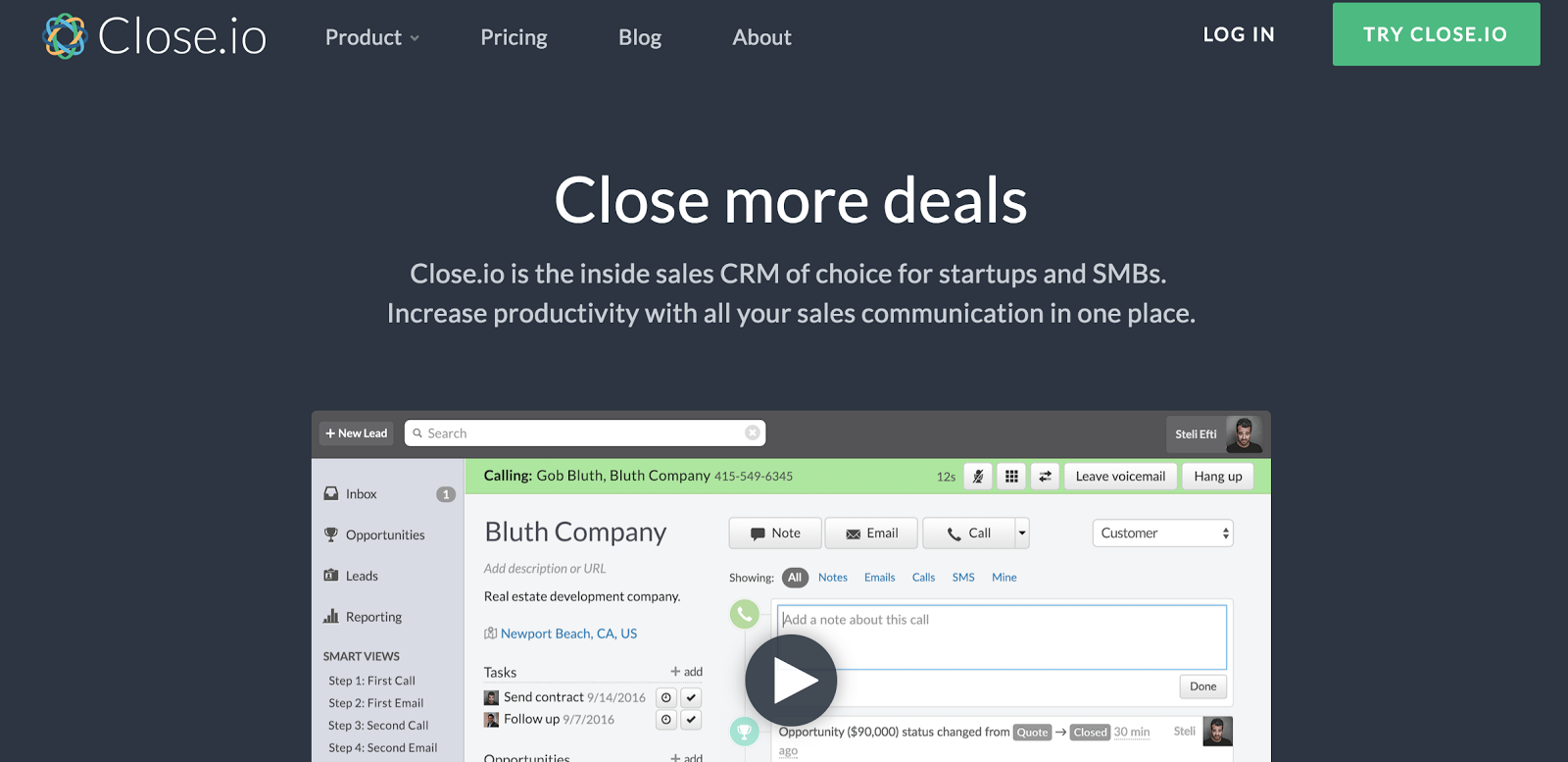
7. Add engaging media — 8 mins
Strategic visual content can make your landing page more attractive and help express the main promise of the offer.
In fact, statistics show that visitors on average spend 88% more time on a website with video.
This is a great technique to keep users on the page and engaged with your message. Furthermore, a good video can describe your offer better than a thousand words.
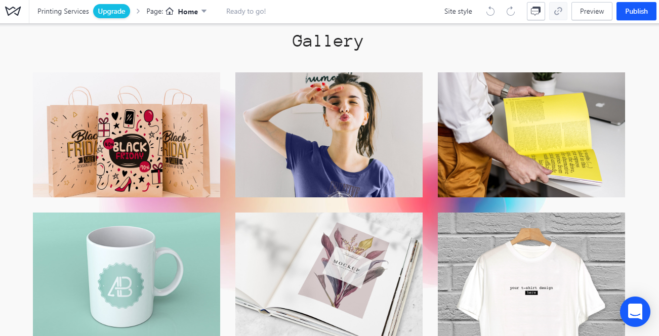
As for the images, a study conducted by Bright Local showed that 23% of consumers are more likely to contact local businesses that have an image attached to their listings.
According to an eye-tracking study from Nielsen Norman Groups, stock images are mainly ignored by people, while good quality and photos that show your product or team in action are more attractive to online users.
8. Add a lead generation form — 4 mins
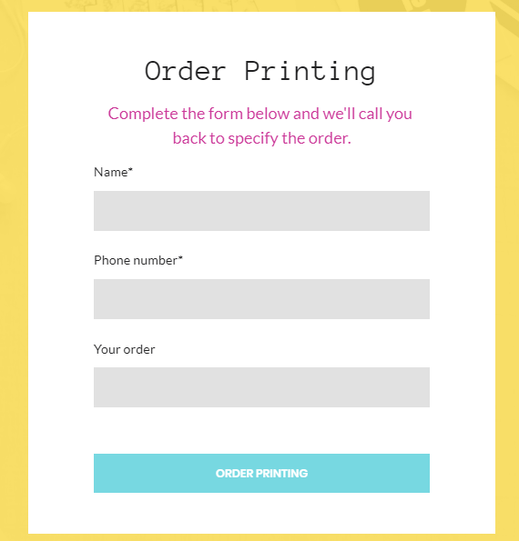
The lead generation form allows you to collect users’ data for further communication. When applying any forms to your landing page, make sure:
- You don’t request too much information (the number of fields should equal the value that the user will get upon form submission)
- Your form is properly designed and has enough white space
- Your form has help text to assist the user in understanding what information is requested
- You added a CTA to your landing page that describes the benefits of the offer
- The form is mobile-friendly
9. Make sure links and forms work properly — 2 mins
These two are key in lead generation, which is the whole purpose of creating a landing page. CTAs on your landing page should drive visitors to take your intended goal. Think of how to make them effective.
The best-performing CTAs usually contain an active verb (e.g. “try for free,” “order now,” "request a quote").
Keep CTAs consistent in their purpose without providing unnecessary links that could distract the user.
Upon clicking on a CTA, a user will be redirected to a form submission to request certain information or services.
Be sure to test your CTAs before launching the landing page to make sure that all the responses are saved in the right place and that users receive the right information upon submission.
10. Complete your meta description and SEO title — 5 mins
Don’t underestimate the power of SEO. Add the meta title and description for your landing page to highlight the product or service you’re offering and allow it to show up nicely in search engine results.

Before creating a title tag for your landing page, make sure you’ve conducted proper keyword research on the topic and identified the top keyword you’d like to rank for.
Then, try to embed it naturally into the title. Ideally, the title length shouldn’t exceed 50-60 characters so that Google can display it fully.
An optimal idea is to use the following structure:
Primary Keyword - Secondary Keyword | Brand Name
A meta description is a short text summary of what the web page is about (up to 160 characters). The description doesn’t have an impact on SEO but may influence the user’s willingness to click on the link. Make sure you use compelling copy that highlights your benefits and clearly explains what you do.
11. Apply analytics tracking — 4 mins
Add analytics tools like Google Analytics and Heap to track the effectiveness of your landing page. Other options include LuckyOrange or Hotjar (for heatmap and click map generation) and KissMetrics (for more sophisticated analytics).
Analytics tools are vital for a landing page as they allow you to track the most important metrics:
- How many new/returning visitors do you have
- What percentage of them complete a form and convert
- What acquisition channels work best at attracting visitors to your landing page
- What regions do most of your visitors come from
This information will help you optimize the landing page and your marketing strategy to tailor offers to the best-converting audience.
Where to build — and how much does it cost?
As mentioned above, there are multiple ways to create a landing page, such as building it from scratch in HTML, with content management systems or even creating a Facebook ad landing page. However, if you don’t have plenty of time and want to create your landing page quickly and easily, website builders will be your best option.
Website builders have an intuitive interface so you won’t need to spend your time learning to code when creating your landing pages.
Modern builders are perfectly suited for landing page and simple website creation as they ensure the most crucial factors:
- Easy-to-use even for non-pros
- Fast to set up
- Easy to customize
Website Builders are affordable in pricing, from $10.50 (for Weblium) to $18 per month (for Squarespace) for hosting and other perks.
To sum up
Making a powerful landing page in one hour is possible.
At Weblium, we enable users to quickly and easily create powerful websites and landing pages without needing any coding skills. Click the link below to see how an AI-powered website builder can help get your landing pages created efficiently.

Order Your Copy of Marcus Sheridan's New Book — Endless Customers!
