Topics:
Web DesignSubscribe now and get the latest podcast releases delivered straight to your inbox.
How to Create Consistent UX on Your Website Using Color Theory

Feb 16, 2016

Color is not only an incredibly powerful part of one's website, it plays a crucial role in defining the user's experience.
Using color gives you the ability to evoke particular emotions, attract attention, and deliver visual cues that direct your users on how they should interact with your website.
They also help deliver a psychological message about your brand & product, so it has the ability to be recognized within your industry.
Depending on how you use color, it can make or break your brand; choosing the wrong scheme could confuse your audience or give them the wrong idea about your company.
To make matters more complicated, choosing a couple of nice looking colors you personally like, may not properly represent your product or resonate with your target audience.
To help direct you in your quest to picking an ideal color palette, let’s look at what colors convey certain emotions, how to use them to brand your site, and best usage practices to channel specific visual messages.
Identify and Understand Your Target Audience
Typically, the colors and patterns you use are meant to evoke appropriate emotions from your user while giving your site it's own personality.
As you incorporate color into the UX of your site, the goal becomes trying to get users to perform a certain action, read specific content, or engage with your site in a particular way.
In order to get your colors and ux to accomplish these goals, you need to identify your target audience/buyer persona. This is especially important since the colors you use can be perceived differently based on their age, culture, social status, values, etc.
Before your pick your color palette, there are four crucial points that need to be recognized:
- Identify the product & industry the UX is being designed for
- Define the primary demographic for the product/industry
- Understand how colors are perceived by that demographic
- Identify how the colors can be used within the UX of your site
You will want to make sure you pick colors that emotionally expresses the type of personality you want your company to have, that will be most attractive to your demographic.
You may even start to notice that certain industries tend to use specific colors (blue for tech giants(Dell, HP), Green for nutritional/food companies (Whole Foods, Tropicana), etc). The industries mentioned best identify with these colors because they help evoke their ideal emotions from their consumers.

While you might like how Twitter uses the color blue, that doesn’t necessarily mean it’s going to work well for your user base. Choosing the colors best suited for your users is the first step to creating a personality specific to your industry and brand.
Doing the research on your demographics and industry color patterns will help create a more consistent brand for your company while also creating a sense of authority and trust.
Designing Palettes
Take a trip down memory lane and head back to your elementary school art class. I’m sure at least once, your teacher taught you about the color wheel.
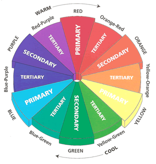
On it, you have your primary colors (red/magenta, yellow, and blue/cyan) which can be combined to create your secondary colors (orange, green, and purple). Adding white can help tint a color while black will create shades.
You might also remember that the colors across from one another are complementary colors. The contrast generated from these colors can help attract attention to specific areas of your site. Work Ninja utilized this on their homepage to draw attention to the “Get Started” button as well as any important elements on their graphics.

If you're taking this route on your site, make sure you don’t have too many complementary colors, or you’ll start driving attention to areas of your site that don’t deserve it.
Also, colors immediately next to one another are analogous. They tend to be a ‘safer’ choice due to the similarity of the colors, which evoke calmer feelings and have low contrast. Lloyds Bank incorporated this theme across their site creating an overall unity to their banding.

Be wary of using colors that are too close to one another that lack contrast, as this may create readability issues for your user.
Even with all these guidelines, choosing a color palette can still be a bit difficult to settle with. One tool I enjoy using when trying to pick out colors is Adobe Color, it allows you to explore a variety of color schemes, more than are touched on in this article.
Utilizing Adobe Color is a fantastic way to visualize the different categories of color theory and generate inspiration for branding your site. Play around with the tool and see what kinds of combinations are recommended for your color preference.
Enhancing the User’s Experience
After you identify a palette that's suitable for your brand, it’s time to begin understanding how it can be applied to your website.
On the surface, you need to focus on making sure you stay within the colors you’ve chosen to keep the sites look consistent. But beyond that, you need to make sure the colors you choose support users tasks and keep your users satisfied.
Let’s look into some of the examples where you can use colors to deliver the proper visual cues and messages to your users.
Identify Related & Specific Web Pages
You can use specific color schemes to identify web pages that are meant to be grouped together or stand out from the rest. This helps users learn how the information of the site is organized, so they can begin categorizing what certain page styles and colors represent.
Differentiating certain pages also allows users to pinpoint areas of your site that may hold its own unique purpose. For example, if you have a stand alone landing page for a special webinar you are running, that page's layout may differ from the rest of your site to alert your users it's not like the standard landing pages they’re used to seeing on your site.
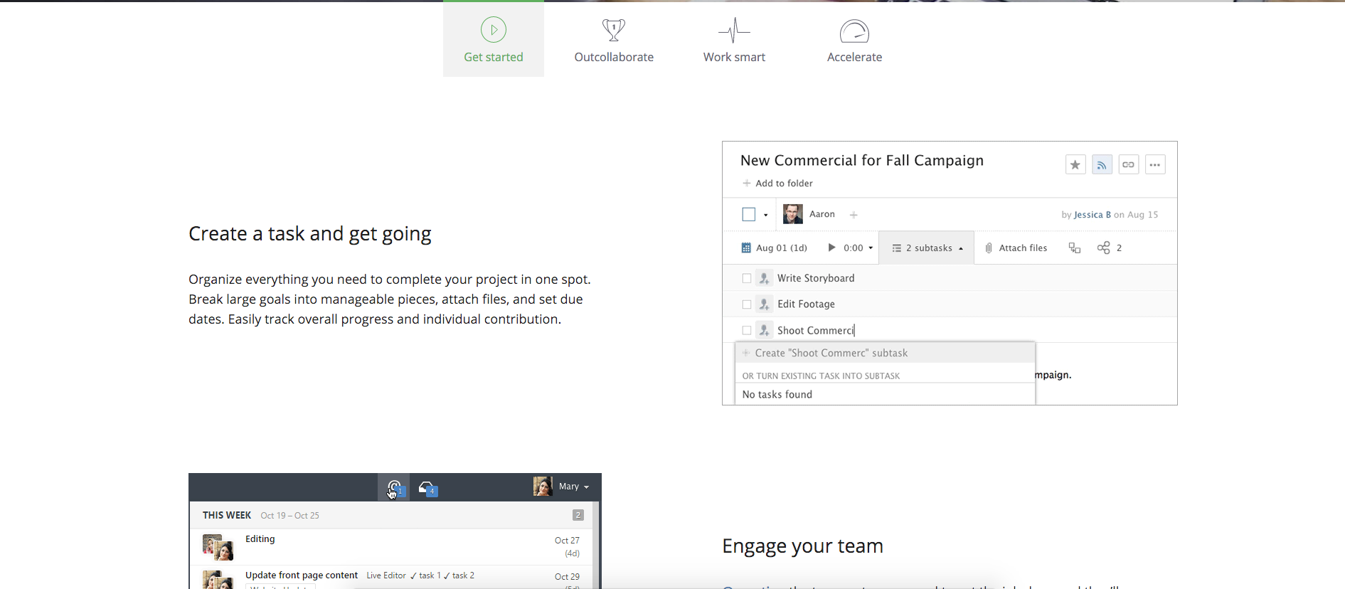
Wrike uses this technique to help create unity for their product pages. They all have a very similar template and follow the same style by utilizing large images with light black text alternating sides. They even have tabs on each page to signify which product page you are on.
Relate Visual Elements or Controls
You need to have a distinct style to the certain visual elements and controls so yours will be able to relate the purposes of them without users having to guess.
For example, you are going to want your BOFU button to have a distinct color from the rest of your buttons to highlight it as the most important call-to-action. Tabs emphasizing categories on your blog should be easily recognizable for users to identify what topics you discuss.
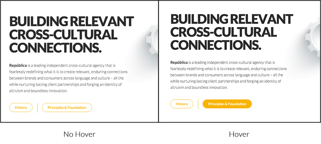
You can also use analogous, or different shades of colors to define certain states of your links/buttons. This technique can also be used to add depth to your elements, making them looked pushed in when clicked or hovered.
Republica uses this technique on their buttons to draw attention to what is currently active based upon what your are hovering over.
Highlight Important Task-Related Information
Using high-contrasting colors is a great way to attract your users to elements that may require their attention or certain action.
For example, if you have a form that needs to be filled out, using red to identify if there's an error in it is a great way to draw eyes to them. Google uses this technique when filling out a form to sign up for a Gmail account.
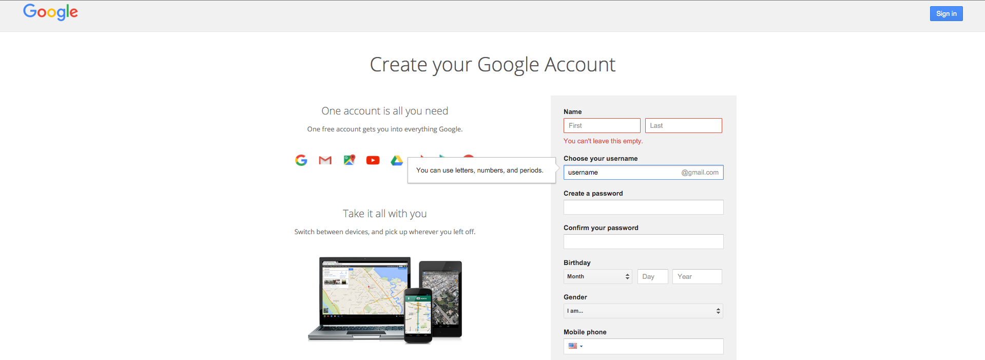
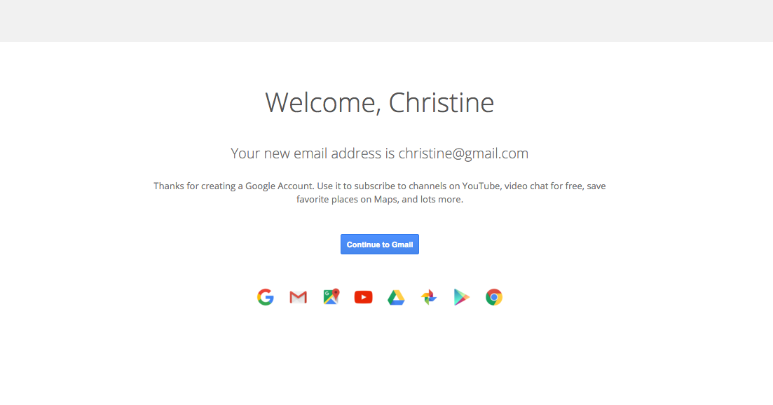
You can also apply that concept when certain tasks have been completed. Using cooler or more subtle colors gives users the cue that they have finished the task. Gmail uses their minimal style and a blue button to help signify when you’ve successfully signed up for an account.
Represent Hierarchical Information
Color is especially important in establishing information hierarchy across your pages. If done properly, users should be able to skim through pages and understand what they are about.
To achieve this, you don’t necessarily need the brightest pink you can find to draw their eyes to a specific action. Using a tame palette accompanied by bolder or lighter colors will do the trick.
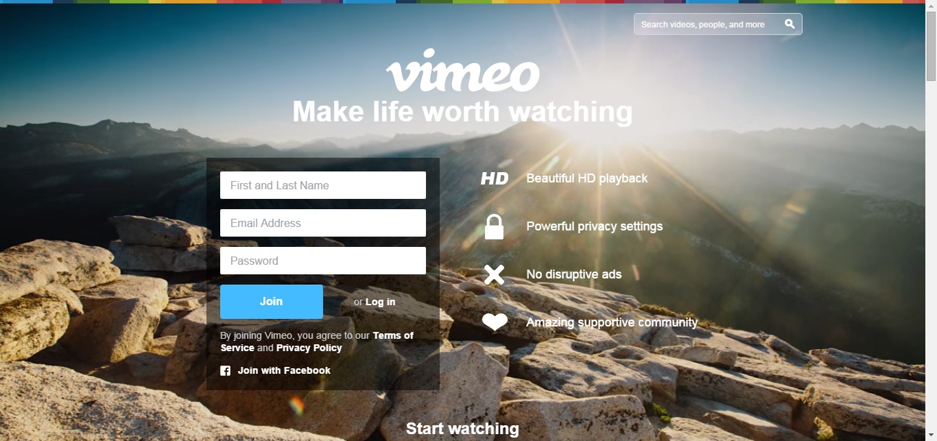
Vimeo uses this technique on their homepage by placing a black box around the white form which adds contrast against the background. After the user sees the logo and value prop, the form is the next item the user's eyes are drawn. That’s important since it’s the next step they want users to perform.
Free: Assessment