Subscribe now and get the latest podcast releases delivered straight to your inbox.
How to Increase User Engagement with Potential Leads on Your Website

May 27, 2015

Think of a website as your storefront.
Tens of hundreds of people pass by it each day, and maybe even decided to visit, but if they aren’t staying long enough to purchase anything, then the amount of people in your store just doesn't matter.
You need to get these people to engage.
This digital revolution has made it a necessity to impress and entertain users while we have them, especially since you ty
pically only have 15 seconds to do so. (Time Magazine)
While it’s tempting to believe that the high traffic numbers speak for themselves, that data alone just doesn't cut it anymore. You need to figure out what areas on your website peak your users’ interest.
To start getting a solid understanding, here are several ways to increase your potential leads’ engagement on your website through dynamic content and eye catching design and interactions.
Tell A Story
Storytelling allows you the chance to introduce your company, the brand, and describe what makes you stand out from the rest of the internet noise.
While five paragraphs of content or a simple bulleted list with pictures would get the point across, basic layouts like this are just too dry for your users. You need to present your brand in a more dynamic and personable way utilizing clean design and lean content.
Depending on how you tell your story, you can influence how users perceive your company.
To create the most impactful influence, it's important to appear transparent in your content and imagery.
Your content should clearly explain what your company does, your product(s), and it's value to the customer. Images supporting this should show your company in a positive light and your product looking its best (or in use if applicable).
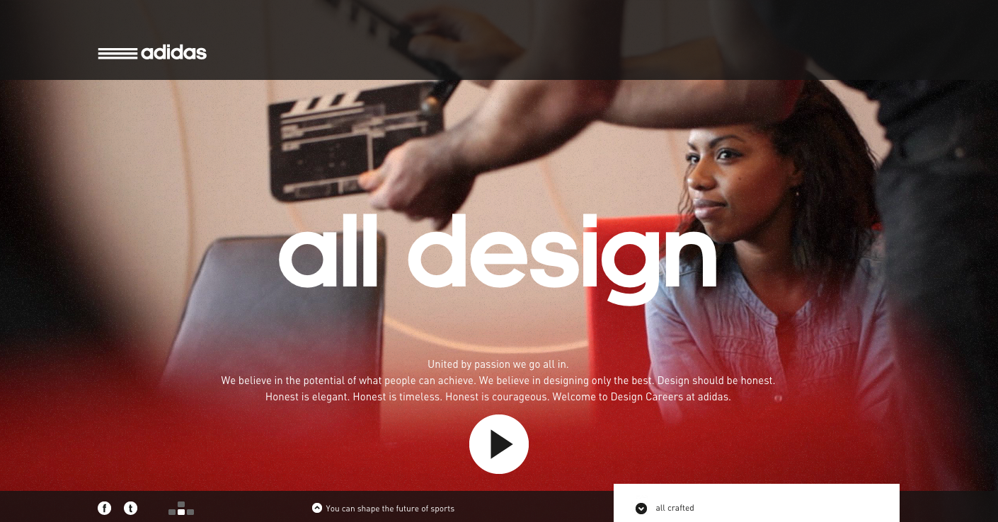
Who to look at: Adidas does an excellent job displaying its product, history, and the relationships it has created with its customers. They even provide a video at the top that gives the emotions they want their brand and fashion style to evoke. This allows users to develop their first impression of the brand before even reading much into the content.

Friendly Forms
One of the core methods your website secures engagement is through allowing users to download certain resources your website offers.
While your users may desire your offer, you’re not going to get them to convert on it if they must fill out a long, bland, and messy form.
To minimize pain for the customer, create conversion paths to the form that flows efficiently. The form itself should have short labels with only the most necessary fields that are aligned fairly tightly, especially if it’s on the longer side.
Consider using eye catching colors to help make certain sections stand out as well as adding interactive elements, such as pop up error messages if users forget to fill out a specific field.
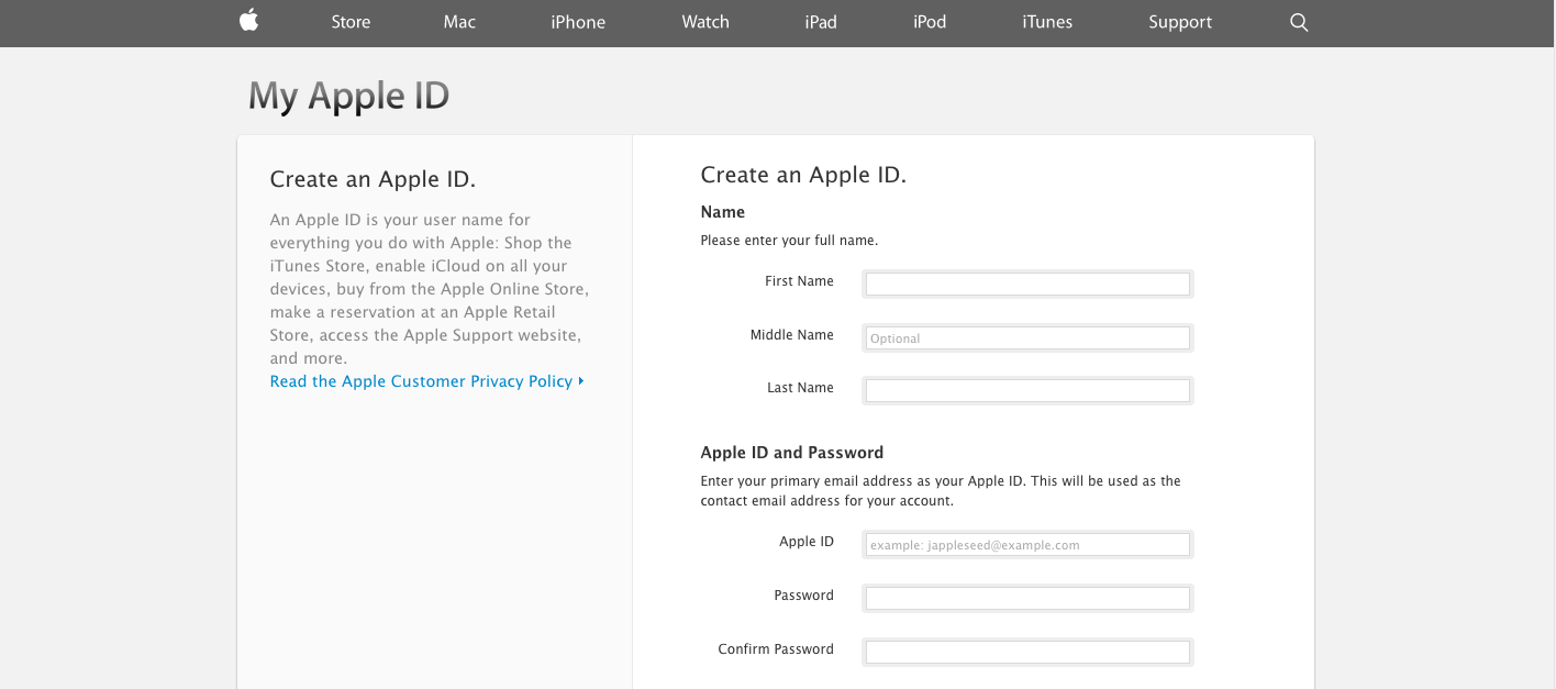
Who to look at: Apple is no stranger to doing things beautifully simple and it's no different for their forms. While creating an Apple ID requires users to fill out a long form, Apple keeps the fields small and separates everything into neat sections. If you do something incorrectly, an error is displayed immediately, rather than having to submit the form first.

Interact with Users During Post-Download
Interaction with users doesn't end after they choose to download a few of your offers or a free trial of your product, you need to continue to keep the engagement going by sparking a conversation with them.
Emailing users thanking them for their time spent downloading and interacting with your content increases the opportunity that they will likely return and engage in a more consultative way.
If your user downloaded a product instead, it’s important to create a dialogue to understand if the product met their expectations, and if not, where there is room for improvement. This reveals your company's desire to listen to feedback and increases your chances of them purchasing your product over a competitor's.
While this activity may appear more tedious it will inevitably give you valuable insights into the reasons people chose to sample your products and offers over others, allowing you a chance to improve it for future customers.
Who to look at: Rather than using email, Hotjar engages with users using an in-software chat feature which allows users to receive quick responses from representatives standing by. The chat also has the image of who you are talking to, adding a clear human connection to the conversation. The chat itself is also visually stimulating and emanates a more personable feel compared to traditional email.

Display Product/Offer Recommendations
Chances are you don't have just one product or offer on your website. You probably have a variety of them and would be thrilled if your users could convert on or purchase more than one.
So why not show them where these other products and offers are? Especially ones they may be more inclined to search for next.
To help facilitate this, try adding recommendations to items that most pertain to what they are currently viewing.
If you are a ecommerce website and your user is buying white blouses, try recommending them to other white blouses they may prefer as well as other matching accessories. If you have a beginners guide to SEO ebook users can downloaded, try recommending a more advanced SEO ebook on the thank you page.
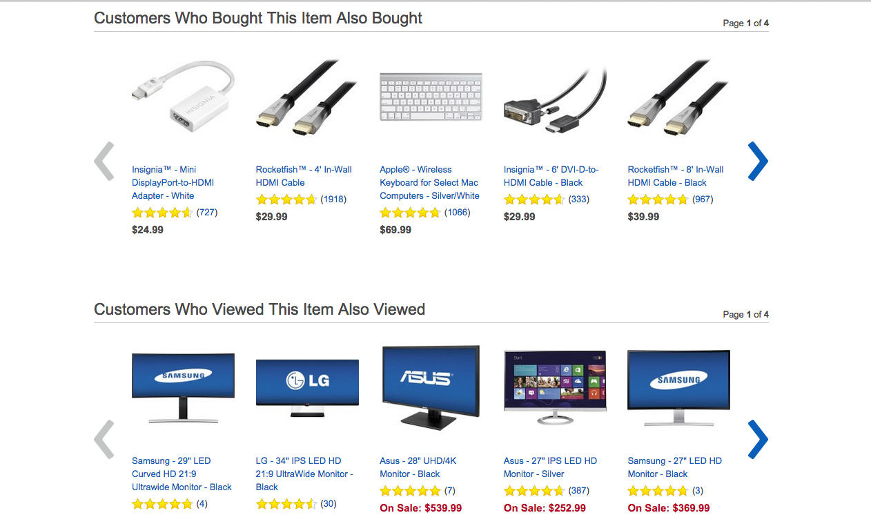
Who to look at: Best Buy has two areas below its individual product pages specifying items users also bought and viewed. This helps secure user engagement by helping them narrow down exactly what product works best for them as well as what products may also be necessary before they make their final purchase.

Free: Assessment