Subscribe now and get the latest podcast releases delivered straight to your inbox.
How to Make the Most of Your 404 Page

Sep 14, 2013

 Mistakes happen. It's a fact of life. However, they seem 10 times worse when they happen on a companies website.
I can say for certainty that its probably happened to you once or twice.
Companies do everything in their power to keep a viewer from coming face-to-face with a 404 page. Sometimes it's not enough. No matter what we do, it is inevitable.
The least we can do is ensure that our viewers remain on our site. A significant percentage of those who land on your error page will be more inclined to click the back button.
Your mission should be to keep them on your site. A 404 page should be used to alert visitors that the content is no longer there and offer a way for that visitor to re-engage with your website.
In the event that your visitors find themselves in the company of a 404 page, there are four things you can do to help them stay engaged on your site.
4 Ways to Make the Most of a 404 Page
Find All Your 404 Pages
It's almost like a scary movie, to know that a 404 page could be lurking around the corner and not knowing when it's going to strike.
Thankfully, that is no longer the case. Finding all of your 404 pages is key. Not only to ensure that you can redirect your viewers to another page, but to uncover the reason behind all of the broken links.
Look no further than Google Webmaster Tools. Not only will this tool be able to tell you which pages have broken links, but also the source that causing your links to break.
You'll want to fix the problem as quickly as possible. One solution to resolving the 404 errors is by setting up redirects.
Ensure Your 404 Page Matches Your Web Design
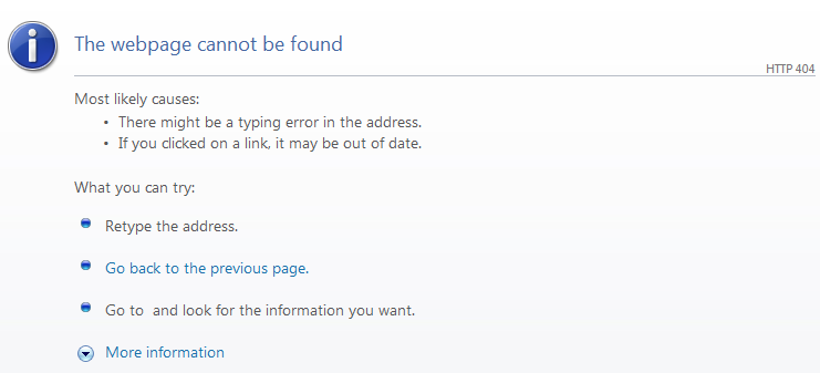
There is nothing worse than seeing a generic 404 page that doesn't provide you with any direction or relevant content.
The goal of your marketing department should be to provide your website visitors with a page that mirrors the design of the site.
You don't want your page to look like this:

You want a 404 error page that will do the following:
- Written in an apologetic tone
- Say what went wrong without admonishing the visitor
- Allow the visitor to go to other sections of your site
- Include a link to your support team. You might not even know that the page isn't showing up.
A great example is from Mint.

They used key elements of their site and their personality to keep their viewers entertained. I think a lot of people could relate to finding various household items under their couch cushions.
The impact of your 404 page is dependent of the elements your company includes on the page.
Elements to Include in 404 Page
There are several reasons why your visitors received a 404 error. It could simply be due to a page being removed or the page was moved to a new URL. But that doesn't mean, you shouldn't provide them with the necessary tools to keep them moving around your site.
There are two key elements every company should include within their 404 page, a search box and a navigation bar.
"Only 23% of visitors that encounter a 404 page make a second attempt to find the missing page." That leaves the chances of them staying on your website extremely slim. You need something that will increase your chances of keeping those visitors on your site. And a search box is just the thing.
Give them a second chance. Just because they didn't find the page they were looking for initially, doesn't mean that they won't try again.
They will quickly hit the back button if there's not navigation or some sort of direction. It's a natural instinct for visitors to hit the back button if something takes too long to load or isn't what they were looking for. Give them a second attempt, if not they will end up on Google or another search engine entering their search query, looking for a company that has the information they're looking for.
Remember to Have Fun
Be creative! A 404 page doesn't just have to be text explaining what happened to the viewer. Infuse your personality into the page. Don't be afraid to make them laugh. Just because it's a 404 page doesn't mean that it has to be boring.
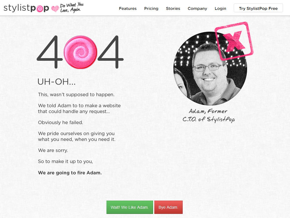
In the event that a visitor lands on a 404 page, make it a good experience. Have you considered showcasing members of your team on the 404 page? If not, take a look at what StylistPop did.

Ask your visitors if you should fire the person in charge of ensuring that errors don't happen. You don't want your visitors to become angry by landing on the page. Your page should interact with the viewer. Evoke an emotion that makes them forget that they're on a 404 page.


Order Your Copy of Marcus Sheridan's New Book — Endless Customers!