Subscribe now and get the latest podcast releases delivered straight to your inbox.
I used to think persuasion was a dirty word. For me, and there’s really no viable explanation for it, it was synonymous with deceit.
I don’t know, just something about the word seemed very “Vader coercing Luke of interstellar domination" to me.
But then I started working for an awesome company where I believed in the solution we offered. It’s crazy what that can do for changing one’s philosophy.
I wanted our audience to believe, too. But I know enough to understand that people view any advertisement with a healthy dose of skepticism. It’s a natural defense mechanism.
Therefore we need to persuade. And landing pages are prime real estate.
Want to write persuasive landing page content?
Provide actionable benefits
Instead of promoting the main features of your solution, promote the value of it.
Benefits are real. They’re grounded. When done right, they convey a world devoid of challenges. (At least the ones your audience experiences.) What’s better than that?
Features are geeky and abstract. And really, who cares as long as whatever you’re offering solves a problem?
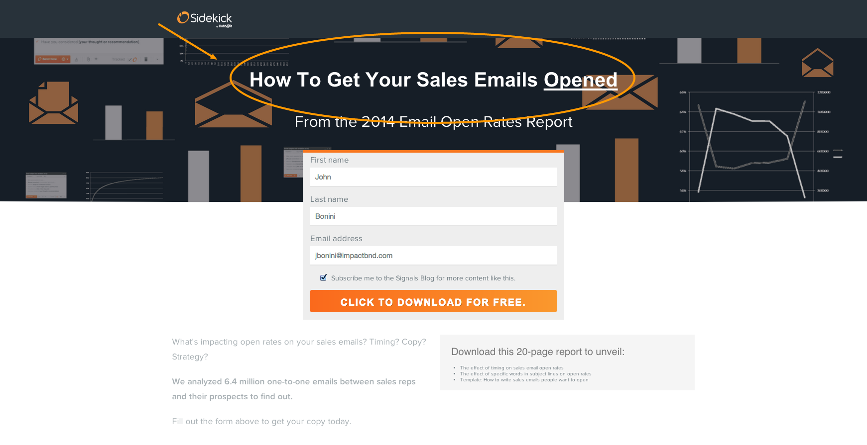
Check out this example from Sidekick by HubSpot, an email tracking software that also provides insights, scheduling, and just about anything else you could think of.
The benefit here is clear. I know exactly what I’m getting from this report. More importantly, the message clearly aligns with a common pain point of anyone who finds themselves on this website in the first place.
Who doesn’t want to learn more about sending better emails?
Convey empathy
“The most basic of all human needs is the need to understand and be understood.” Ralph G. Nichols, author of "Are You Listening?”
It goes without saying that before you can convey empathy, you first need a deep understanding of the challenges and interests of the people you serve.
Empathy is about radical connection. It’s about people saying, “man, this company gets me.”
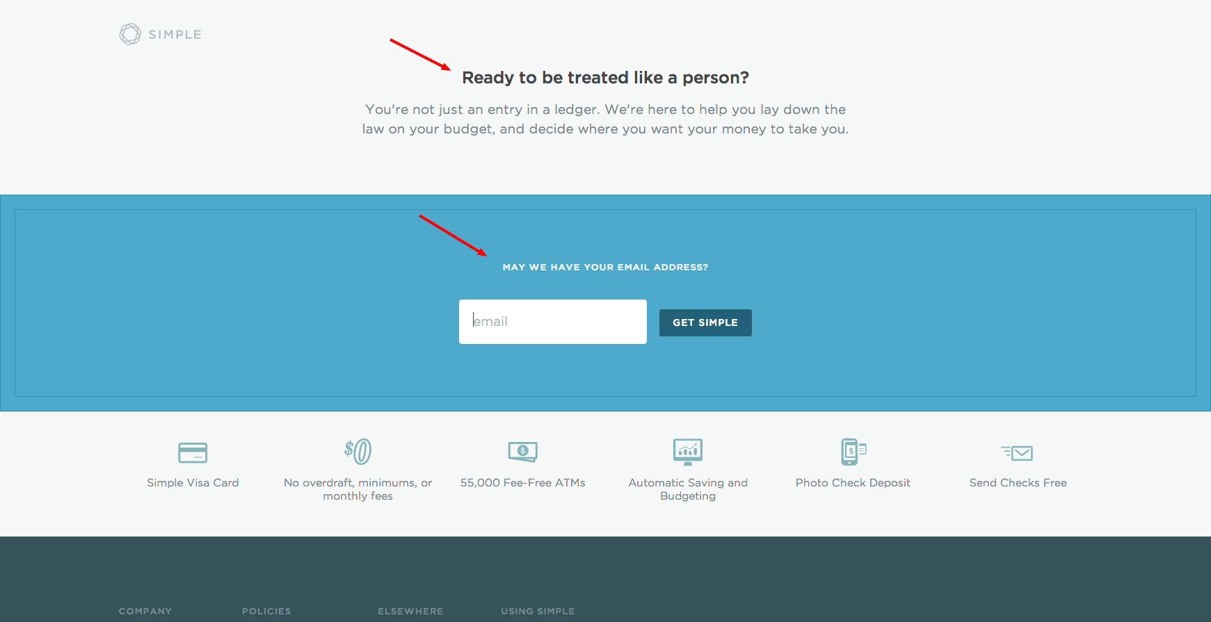
Take Simple, an online banking platform focused on the modern web and mobile experience, for example.
You hear people complain about their banking experience all the time. Transfer fees. Minimums (the worst!) Overdrafts. Monthly fees. Automated customer service.
Simple’s solution is a great alternative, but if they weren’t so great at conveying empathy for the experiences we all have, would their message be as effective?
Bonus points: Check out how politely they ask you for your email address.
Be brief
Brevity is powerful.
It’s focused.
It’s quick (duh.)
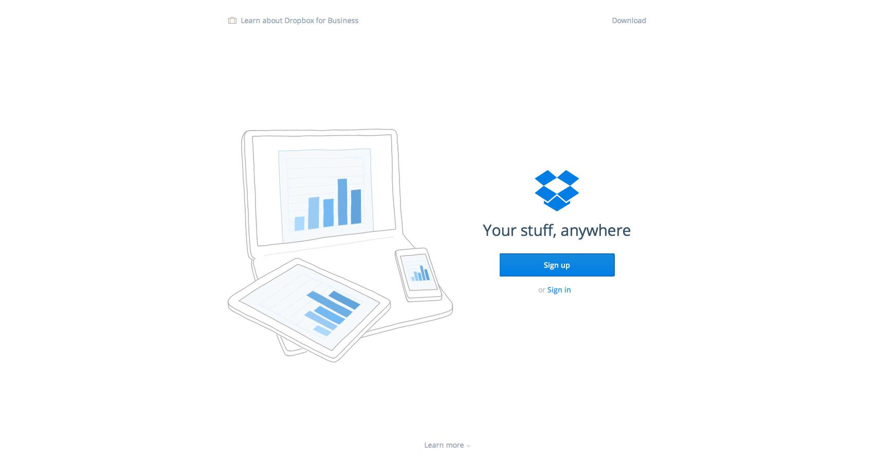
Like Dropbox.
All my stuff, everywhere?
Sounds great.
That was quick.
Provide social proof
Social proof appeals to people’s sense of “safety in numbers.”
People feel safer doing something only if others have done so first. Volume is a factor here, too, as if there’s an overwhelming number of people who have done it, people’s “fear of missing out” inclination kicks in.
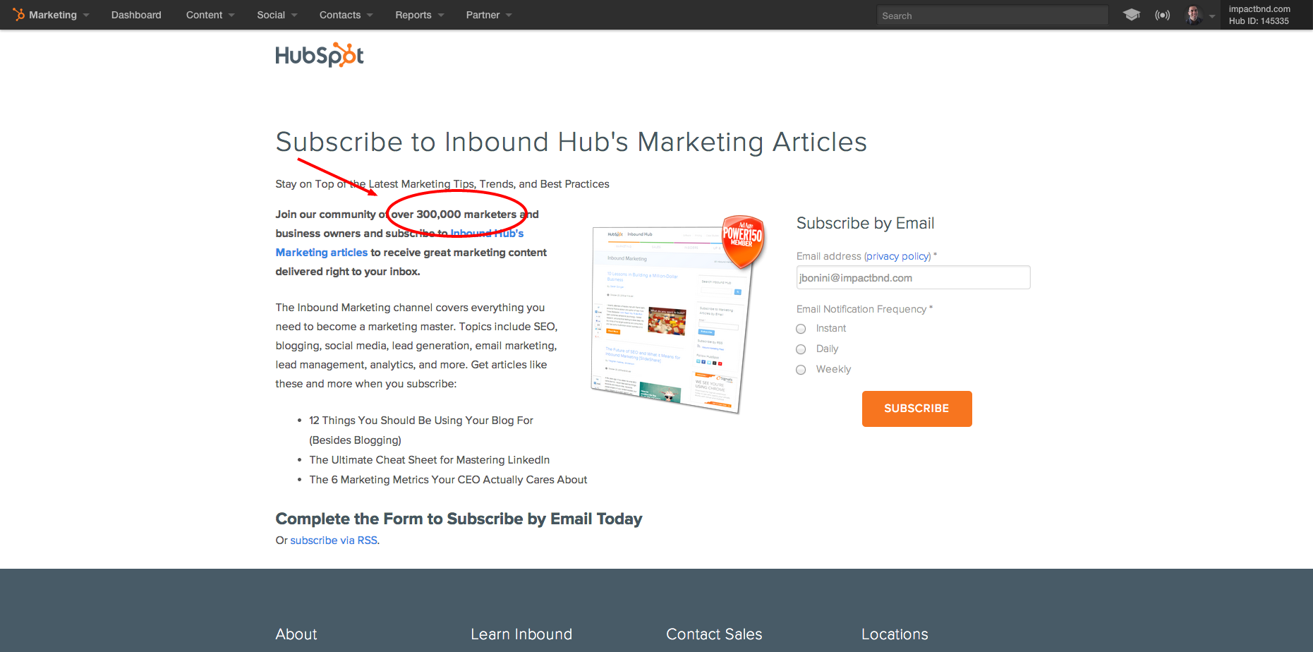
But social proof isn’t just about attaching the number of shares a page has gotten. Check out how HubSpot effectively uses social proof to promote blog subscriptions.
Wow.
Over 300,000 marketers have subscribed to this blog? If I haven’t subscribed already, this statistic alone is more persuasive than any other content on the page for getting me to do so.
I’m a marketer, so clearly I’d be missing out. (Note: I’m already a subscriber. Highly recommend you subscribe as well.)
Introduce scarcity
Famed psychologist and New York Times bestselling author Dr. Robert Cialdini lists scarcity as one of the six psychological triggers that win sales and influence people.
It’s one of the oldest tools in a marketer’s tool belt. Every infomercial in history leans heavily on the “call now” or “limited time only” tactic for increasing sales.
As a result, you have to be careful here, as you can go from persuasive to shady really quickly.
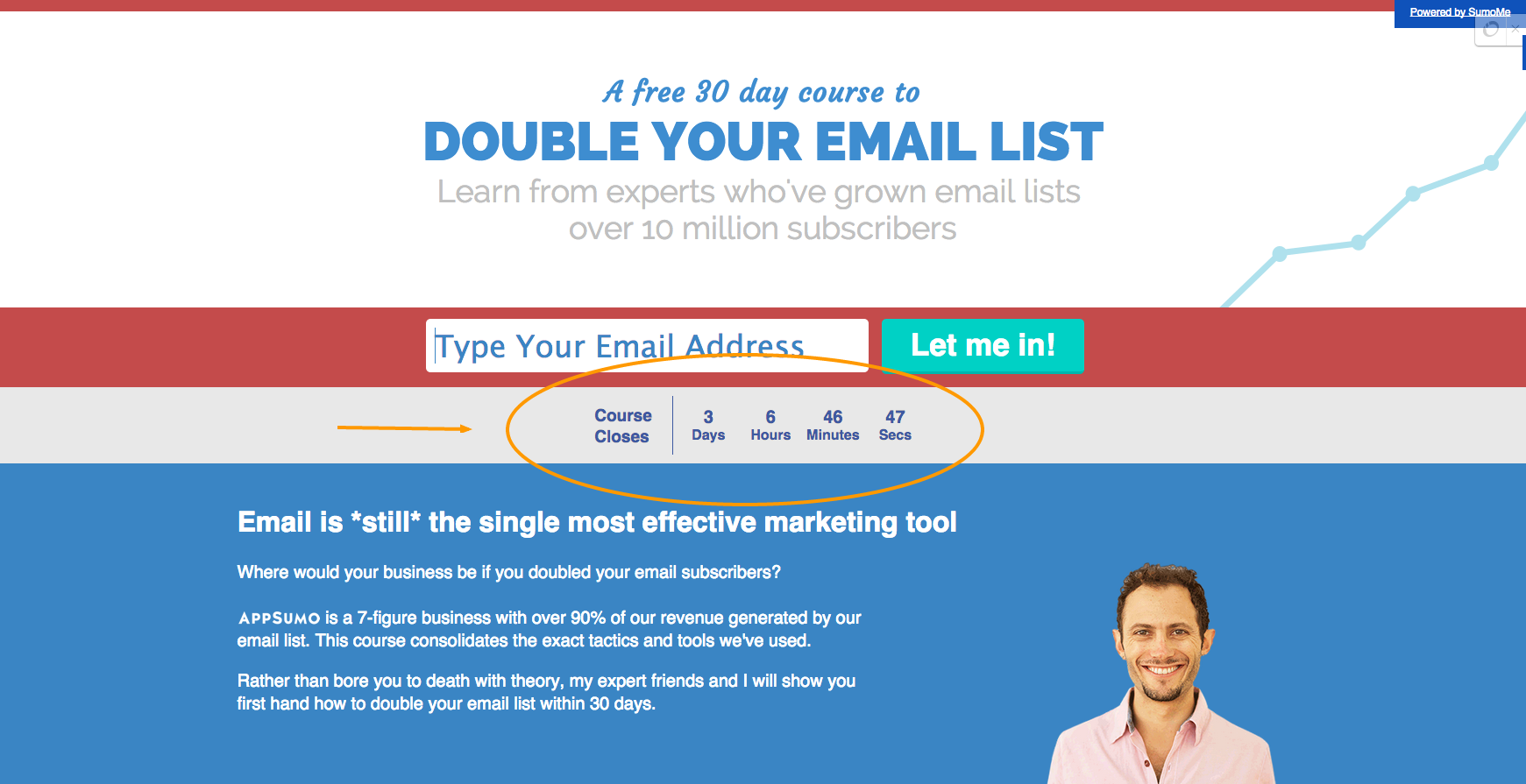
Noah Kagan, founder of OkDork and Facebook employee number 30, utilizes scarcity with the right balance that gets people (myself included) to sign up for whatever he is promoting. (His email list numbers over 700,000.)
Notice how he still provides value? This is unimportant, as relying solely on scarcity can come across as shady. But coupled with a free 30-day course focused on teaching me the secrets for doubling my email subscribers?
I’m in.
Create a knowledge gap
One of the most proven ways of drawing an audience in is by introducing a knowledge gap, one that piques their curiosity, and then shows them how to fill it.
Chip and Dan Heath, bestselling authors of Made to Stick, describe this phenomenon as follows:
“We can engage people’s curiosity over a long period of time by systematically 'opening gaps' in their knowledge – and then filling those gaps.”
More simply, it’s natural that we all want to learn about things we perceive to not know now.
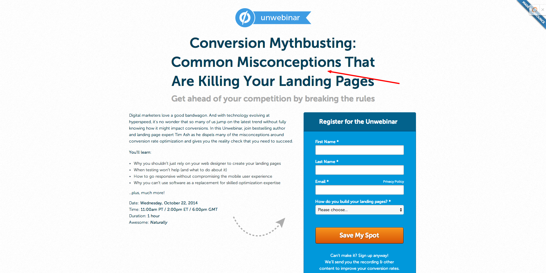
Here’s how Unbounce, the landing page builder for marketers, employs this tactic.
Common misconceptions that are killing my landing pages?
What?! If they’re common, there’s a pretty good chance I could be committing them too, right?
Well, now I need to know.
Promote exclusivity
The top level of Maslow’s Hierarchy of Needs is “self actualization,” or how we view and feel about ourselves.
We all want to feel important. More importantly, we need others to affirm this for us.
Wheaties claims its cereal is the "breakfast of champions," or how L’Oréal says, “because you’re worth it, “ – this affirms how certain people view themselves, either as champions or beautiful. Now they’re more likely to buy the product, as “this is what people like me buy.”
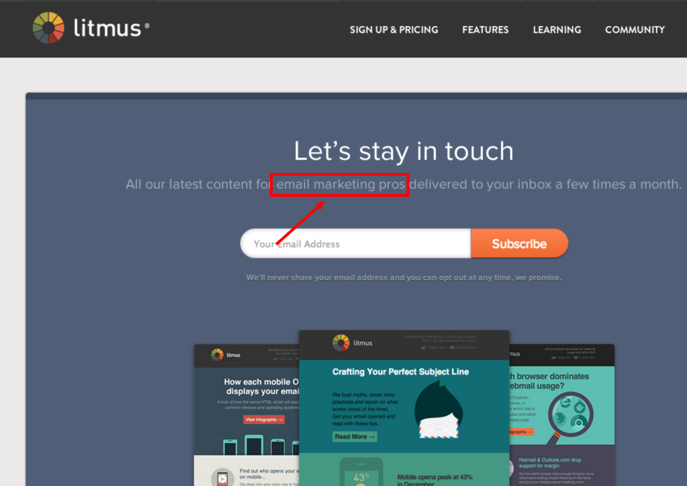
Here’s how Litmus applies this in a B2B setting.
I like to think of myself as an email marketing pro, therefore I subscribed to this newsletter long ago.
I mean, isn’t that what people like me do?
Align button text with benefit
It’s easy to neglect the button text on a landing page, but rest assured, this is important copy.
The button is either the first or last step required for someone converting on a page. Either way, these are both critical points on the conversion path.
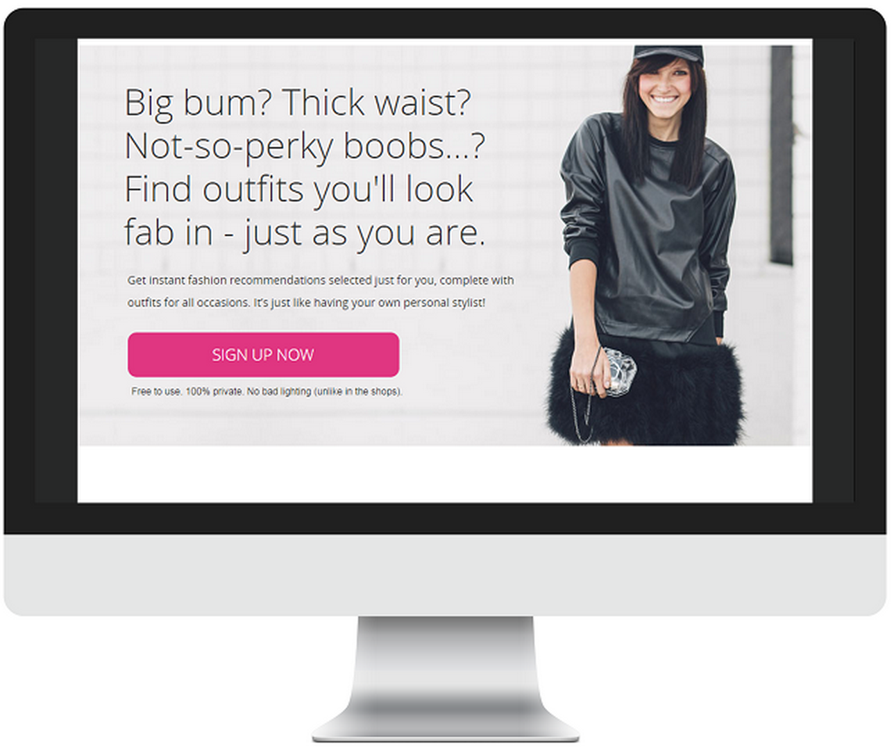
Take this example from Dressipi.com, originally detailed on Copyhackers.
By making the simple switch away from the unoriginal “Sign Up Now” button text…
To the more enticing “Show Me Outfits I’ll Love,” Dressipi.com saw an increase of 123.9% in clicks.
Aligning your button text with the actionable benefits of your offer can greatly increase the chances of a click-through.
With persuasiveness comes great responsibility
When you’re marketing a product you believe in, persuasion is not a dirty word at all; it’s a responsibility.
I believe in the solution I’m marketing very much. It’s a responsibility for me not only to find the people who need it most, but also to successfully articulate how we can help.
Are you like me? Are you marketing a product or service so helpful that you believe in it with every fiber of your being?
Great. You’ve got some work to do, then. Now take a look at our list of 44 great examples of landing pages for inspiration.




Order Your Copy of Marcus Sheridan's New Book — Endless Customers!


