Subscribe now and get the latest podcast releases delivered straight to your inbox.
 “By making itself evident, typography can illuminate the construction and identity of a page, screen, place, or product.” ― Ellen Lupton, Thinking with Type
When trying to communicate our ideas and purpose to our viewers, we sometimes get so wrapped up in our website's layout and content that we fail to recognize the way our words are presented is what actually helps users to absorb everything.
Typography is what creates the voice for your copy, sets the tone for the users experience, and helps identify the brand on your website.
When typography isn’t taken into full consideration, you may end up confusing your users which could prevent them from making a decision and ultimately cost you conversions.
To gain a better understanding of the true impact typography can have, here are some explanations on how it should be used and how you can begin implementing it on your own website.
The Purpose of Typography
Each website has its own typographical approach, but regardless of how it looks, its purpose remains the same - to style the information in a way that communicates the feel, style, and language your company is trying to evoke.
Typography is defined as “the way in which the type is laid out on a page to best achieve the desired visual effect and to best convey the meaning of the reading matter.” The layout, size, color, spacing, and placement all have their own individual effects in controlling the copy so it directs how the user should approach and understand what they are reading.
In an effort to give an appropriate voice and style to your website, you also need to keep the typography-styled so that it effectively helps facilitate readability and doesn't disrupt the user’s flow down the page.
Making Typography Readable, Understandable, and Legible
It may be hard to believe, but the type of font face you choose can dramatically affect your website's voice, flow, and conversions. But, as long as the word ‘the’ looks like ‘the’, why should it matter?
The reality is that you not only need to think about the style of the type, but also how the people who visit your site will interpret the type. Do they need the type slightly larger than normal? Should paragraphs be displayed in a specific manner? Are they more attracted to a certain color and thus, will using that color on some of your type influence a specific decision?
Certain research has even shown how the layout of typography can affect the users readability of it such as how smaller font sizes and low-contrast are the number one complaint for web users and that the best readability for web type is at a line-height of 1.5.
While readability is important, you also need to make sure it’s legible too, which means you can't just go putting some random content larger just because you think it’s important, or drastically spacing things out so it takes the reader that much longer to digest the content.
Combining legible and readable content will ultimately help solidify the copy on your website so people will not only be reading content they understand but also be able to continue through it without the type disrupting or confusing them.
How to Choose Your Type
With so many beautiful font styles out there, it can be hard to decide what’s best for your website. While the easiest solution may just be to pick something standard and basic, you shouldn't feel like you are boxed into choosing something super safe just because you don’t know what other options may work.
1. Use fonts that are legible at a variety of sizes and weights.
Most of the time, websites are filled with fonts ranging in size and style depending on what their purpose is (buttons, navigation, body text, etc). So when picking your fonts, make sure you take into consideration how it will look on your website’s interface. Take a look at Invisionapp’s home page for example:

Invisionapp uses two different font styles on their website - Open Sans for headers, subheaders, and body copy, and Brandon Grotesque for their navigation and buttons. Open Sans has the ability to look visually appealing and legible regardless of its size and color while Brandon Grotesque manages to hold its own for the navigation and buttons specifically due to its case type.
2. Pick a font that represents the appropriate personality you want.
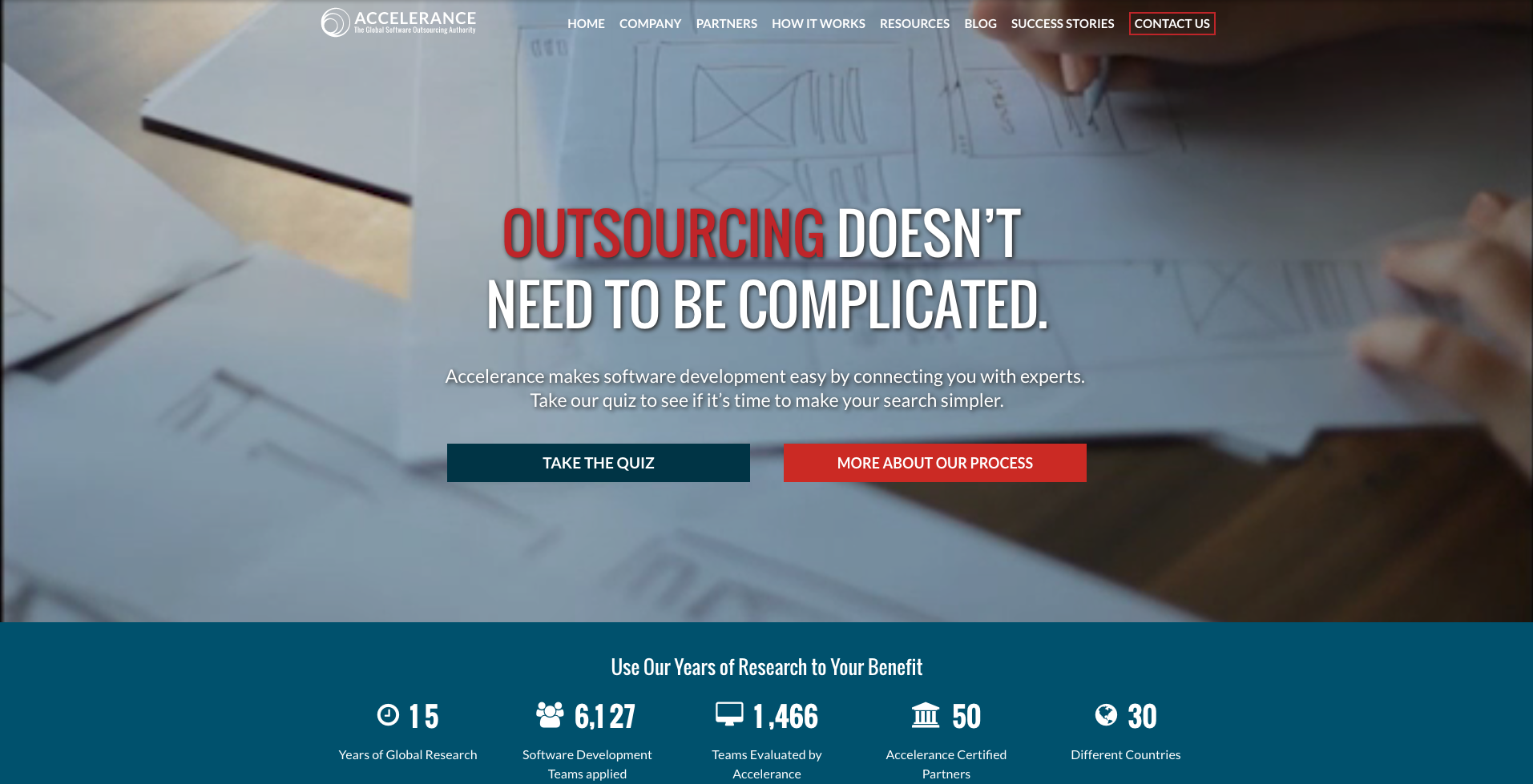
This one can be the trickiest to decide upon, especially because you may not be able to describe the “personality” you want your type to evoke. To help make this tip a little clearer, take a look below at Accelerance’s homepage, an IMPACT client.

The first thing you see is the value proposition, or H1, and more specifically the word in red which immediately draws you into reading it. The capitalization makes the message all the more powerful and helps identify the direct and relatable personality this page plans to continue with. For them, this bold font helps grab their users attention and communicates an energy that works for the content they display.
3. Use fonts with distinguishable letters.
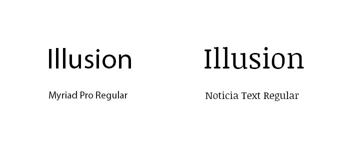
Many fonts are plagued with similar letter styles, specifically with “i”s and “L”s (as seen in the image below), and poor letter spacing, such as when an “r” and “n” look like an “m”. These fonts can confuse users when trying to distinguish a word and will add unnecessary friction when reading. So when choosing your type, be sure to check your type out in different contexts to make sure it won’t cause an issue for your users.

Conclusion
If you still feel a little worried about what fonts might work best for you, check out Typographys article on font pairing to get a more in-depth look at how the style of font can affect the energy and personality of what it’s being used for.
Another neat website I suggest is Font Pair, which lists a variety of font combinations that are guaranteed to look good together, but it's up to you to make sure that what you choose is both acceptable to your voice while supporting the type of experience you want your users to have when visiting your website.
Download The Complete Website Redesign Guide
Fill out the form below for tips on how to design a website that generates results

Free: Assessment

