HubSpot COS Tip: Custom Read More Buttons in Your Blog Subscription Emails
By Bobby Kane
Dec 30, 2013

 Sometimes a plain Read More » in your subscription emails just isn't enough. Whether you're a designer or a marketer – a little more effort will go a long way toward improving your open and click rates.
If you want your buttons to look cooler, stand out, or POP (I loathe this one), then you're in luck.
Believe it or not, you've always had the ability to create custom buttons. While it's not the most accessible of functions, simply brushing up on a tiny bit of code will have you creating a custom button in no time. If the word "code" elicits panic attacks among you marketers, worry not, as I have some done up for you.
Where to Start
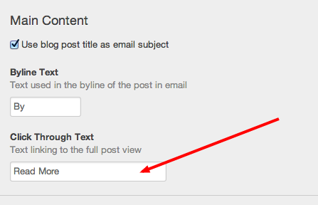
Go to Content > Email get to you're emails and look for your blog subscription email. Edit that email and go to the "Click Through Text" area.

Now that you have that, it's time to edit that "Read More."
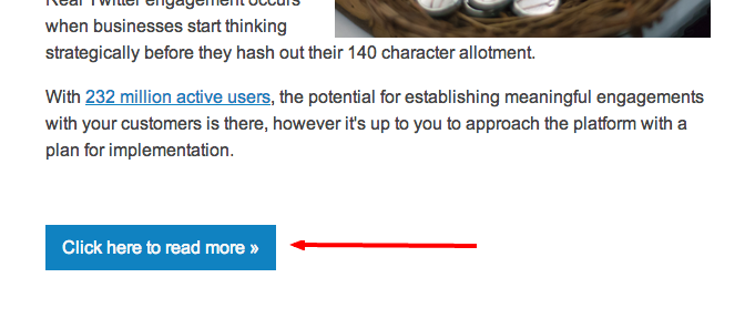
To get it to look more like this: Click here to read more »
<span style="size: 16px!important; font-size: 16px!important; display: inline-block!important; clear: both!important; margin: 15px 0 30px 0!important; color: #f7f7f7; border: none!important; text-decoration: none!important; background: #1082c1!important; padding: 10px 15px!important;">Click here to read more »</span>All of the green above has the ability to be changed. If you don't want blue, change "background: #1082c1" to "background: {yourcolor}".
*Ask your designer/developer if you're unsure of any other changes.
Now if you kept exactly what I had above, go test your email and you'll see this:

So now you know what I mean when I said it wasn't too accessible on where to update the look of it. There's always a way around customizing ANY CMS, including HubSpot's COS.

