Subscribe now and get the latest podcast releases delivered straight to your inbox.
When was the last time you stopped to really reflect?
It might seem like a silly question, but when you work in an industry as fast-paced and constantly changing as marketing, it can be easy to forget to slow down and take the time to look back at the work you’ve done.
I know I’m guilty of this. I was already writing articles on what the biggest design trends of 2018 would be back in the beginning of November, but when we spend too much time looking forward and not enough time reflecting on the past, we miss out on a lot of valuable learning lessons.
Reflection helps us connect what we’ve learned from previous experiences and apply it to our future work in order to get better results.
It's also a major morale booster.
Everyone has those rough days where you struggle with things like imposter syndrome. Reflection gives perspective on how you’ve grown and progressed as both personally and professionally..
With this in mind, I decided to take a look back at some of the impressive things our design and development team accomplished this year.
Some of those accomplishments include:
- Creating beautiful work for over 80 different clients, some even international.
- Our developers releasing the second version of our original web framework, allowing us to cut way down on development time.
- Christine, our talented IMPACT designer working with Ramona and the rest of the marketing team to redesign and launch our new website.
- Jessie-Lee and Marcella joining forces with our content strategist, Liz Murphy to continue Creator’s Block, a podcast geared towards creatives living the agency life.
Seeing these amazing accomplishments, I was inspired to take this exercise one step further.
I challenged a few members of our creative team to reflect on the past year of design, share some of their favorite projects, and their greatest takeaways.
Here’s what they had to say and the lessons for all of us:
![impact-design-ashleigh.png]() Ashleigh Respicio, Designer:
Ashleigh Respicio, Designer:
EarthTreks
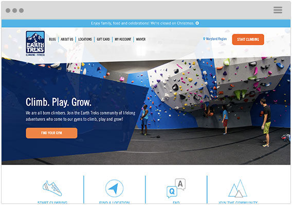
EarthTreks Climbing Center is an indoor climbing and fitness center with locations in Maryland, Virginia, and Colorado.
Their marketing team had recently refreshed their branding and the company was looking to have their website reflect the new style. In addition, they needed a website/CRM that would scale to keep up with their growing business.
EarthTreks wanted to stay with WordPress for their site build but moved their blog on to HubSpot which they also began using as their CRM. The redesign took their new branding to the next level with graphic elements to reflect the geometric shapes of the climbing walls and professional, journalistic photography to reflect the community atmosphere of the gyms.
The most challenging aspect of the redesign was creating a smooth, logical flow for the user when navigating to individual climb center information.
However, through the collaboration between EarthTreks and IMPACT, we were able to work through the user experience flow and not only make it more seamless but also more scalable.
The result was a website that fully-embodied the community that makes up EarthTreks.
EarthTreks' team is now equipped with the skills needed to create new pages as new locations are opened, stay connected to their subscribers through their HubSpot integration, and grow their blog readership by 100% through the implementation of IMPACT’s blog optimization package.
Working on this project really showed me the value of collaboration. The IMPACT and EarthTreks teams brought unique points of view and different strengths to the table during the brainstorming process which allowed for us to achieve an amazing final product.
![impact-design-jl.png impact-design-jl.png]() Jessie-Lee Nichols, Designer:
Jessie-Lee Nichols, Designer:
Owl Labs
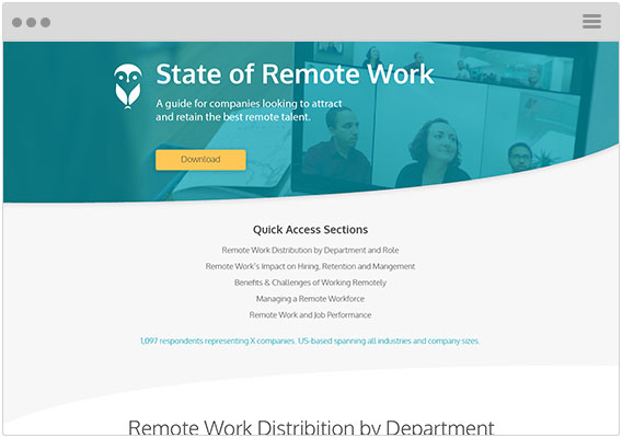
Truth be told, this was my very first project as an IMPACT employee ---And, it was a doozie!
This was a full-on interactive infographic that not only needed to impress but needed to deliver.
The good news is -- it did both!
Coming from a brief stint as an in-house marketer, the best part of this project was being fully immersed back into design, hardcore.
It was wonderful to dive right back into Illustrator creating all of these charts from scratch. Those skills took some dusting off, but it really paid off for Owl Labs. To top it off, Rebecca and crew at Owl Labs could not have been nicer, more collaborative clients. Such a great project.
We also had some really great results from the project. Ultimately, the page helped them get a ton of brand recognition, as well as fill their funnel with qualified leads to nurture to a sale.
Within the first 5 days, all traffic sources were converting above 2.5%. Organic Traffic converting at 7.5% and email marketing converting at 8.03%. As we stand today the majority of sources are still above 2.0%, or close to it.
The implementation of a mid-way offer also helped generate leads via the eBook. After the launch of the page, the CTA leading to the offer received 337 clicks, with the actual offer generating 242 Submissions, 199 of them being new contacts.
My biggest takeaway on this project was seeing how important it is to have a solid offer to help fill the top of your funnel.
Creating this offer gave Owl Labs the ability to engage, nurture, and segment their website traffic. They were able to gain valuable insights that they didn’t have before.
Yale Appliance:
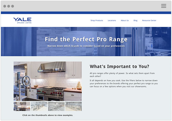
Yale Appliance was hands-down the coolest project I’ve worked on all year and thanks to the serious brainpower from our master developer, Tim Ostheimer, this configurator is equally as impressive on the back end.
In this project, Yale was looking for a “calculator” in which they could deliver products as results based on a series of options a user selects. Some options return up to 30 results. This thing is PACKED with valuable information for the user.
With its intricacy, I was really able to stretch my wings with the icons I created on this one.
We aren’t talking the simple, generic business case icons, but icons to describe features associated with oven ranges. Talk about specific! I couldn’t be happier with the tooltips, photos, and icons all coming together to make one beast of an interactive piece.
This project taught me to not be scared of taking the time to experiment with different ideas. Rather than using the typical icons someone might see on a website, I decided to work on building out custom icons that would deliver more value to the users.
![impact-design-christine.png impact-design-christine.png]() Christine Austin, Designer & Developer:
Christine Austin, Designer & Developer:
IMPACT
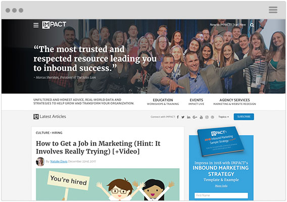
Back at the end of October, IMPACT took a big leap and redesigned its homepage as well as a few other key pages.
For us, it wasn’t just about updating what we already had and redoing the layout. Instead, we reimagined the IMPACT brand as a whole. We want to be an industry resource that helps as many people as it can learn and implement inbound marketing through articles, events, a sense of community, and agency services for those interested.
(You can read more about the reasonings & changes here).
If there were a couple things that this redesign and other recent pages taught me, it’s to always be on the lookout for inspiration.
It should not only come from similar companies It's critical you expand your horizon and look to those who represent something you want your company to become.
For example, you may be an insurance company that’s concerned with representing your team in a professional yet transparent way that shows you’re here to help.
Other insurance companies may not show that, but there could be a tech, consulting, or educational company that does this well.
Their exact strategy may not work for you, but it’s important to analyze what they are doing and how it could be transformed to fit your own organizational goals.
![impact-design-joe.png impact-design-joe.png]() Joe Rinaldi (aka Me), Designer:
Joe Rinaldi (aka Me), Designer:
RosterReach
(this project is still in progress so we don’t have a link to the site just yet)
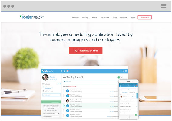
RosterReach was a really exciting project I got to work on this year.
They came to us in September with a goal of launching an entirely new SaaS tool and needed our help with building a brand and a new website around this tool.
As a designer, there’s nothing better than getting to build an entirely new brand for a client.
The first thing our team did was a messaging & branding workshop to decide on how we would position RosterReach as a company and communicate this on their new website (shout out to Stacy Willis for a killer job on the workshop).
Since the workshop, we’ve been designing and developing their new website.
While this project is still in progress, it’s already been such a valuable learning experience, my biggest takeaway being one straight out of a Simon Sinek book - You need to “Start with Why,”
Before you can build a website or a marketing strategy, you need to understand the mission of a company. Why do they exist? What problems are they solving? Using it as a foundation, then you build out new content and pages.
Taking this approach has made this one of the smoothest projects we’ve ever done as a team. Being aligned with RosterReach on “the why” has led to us having complete buy-in from the clients on the direction of the project as well as happier clients with consistent NPS scores of 9 or higher.
Lessons Learned
Our creative team had a busy year, and although there’s always more work to be done, these lessons and insights are things we wouldn’t have learned without taking the time to reflect on our previous work.
Here are some of the key takeaways that we learned:
- Be on the constant lookout for inspiration and don’t limit yourself to looking only within your industry.
- Always make sure you understand the “why” of a project.
- Communication is key. The best results come from collaboration, not from working in silos.
If you’re interested in seeing more of the work our team put out this year, check out the infographic we put together below.
Free: Assessment


 Ashleigh Respicio, Designer:
 Jessie-Lee Nichols, Designer:
 Christine Austin, Designer & Developer:
 Joe Rinaldi (aka Me), Designer: