Topics:
Lead GenerationSubscribe now and get the latest podcast releases delivered straight to your inbox.
 Imagine that you find yourself in a room with two doors.
One is standard in size, appears to have a fresh coat of green paint, and contains a sign that reads "Discover." The other door matches the tan paint on the walls, it's much smaller, and when you look closely, you can see the word "Buy" etched into the paint.
Which door would you choose?
Much like a door, your call-to-action serves as an entryway to move website visitors to an intended next step.
However, if the button appears uninviting, it's easy for a visitor to second-guess their decision, or worse, bounce off the page entirely.
To avoid chasing people away, it's important that you are employing the right call-to-action, for the right offer, on the right page. But what separate the right call-to-action from the wrong one?
Color? Placement? What about copy?
We came across a brilliant article from CopyHacker's Joanna Wiebe that got us thinking about the influence of strategic button text. Inspired by her approach, we've detailed the tips you need to put forth more action-oriented calls-to-action that will help you convert even more website visitors.
How to write button text that converts:
When it comes to button text, not just any word will do.
In her article, How to Find and Eliminate "Friction Words" in Your Web Copy, Wiebe explains that calls-to-action often contain friction words that have the ability to destroy your conversion rate.
"Friction words are words that describe things people have to do – not things people want to do,", she says.
To help better define this concept, check out these examples.
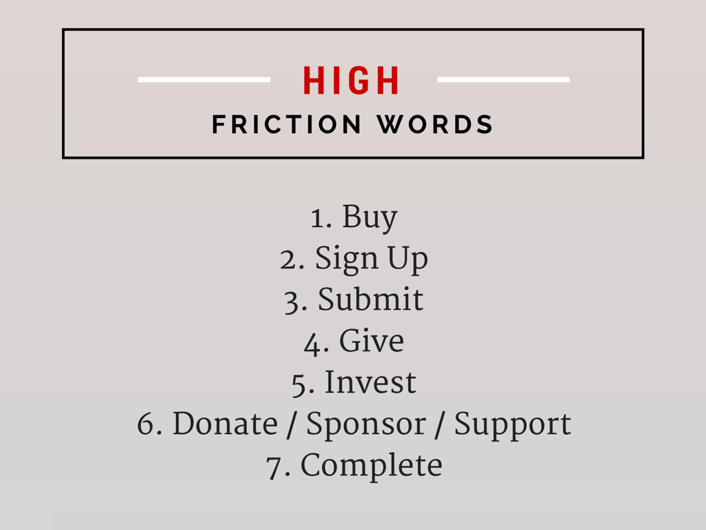
1. Words to avoid
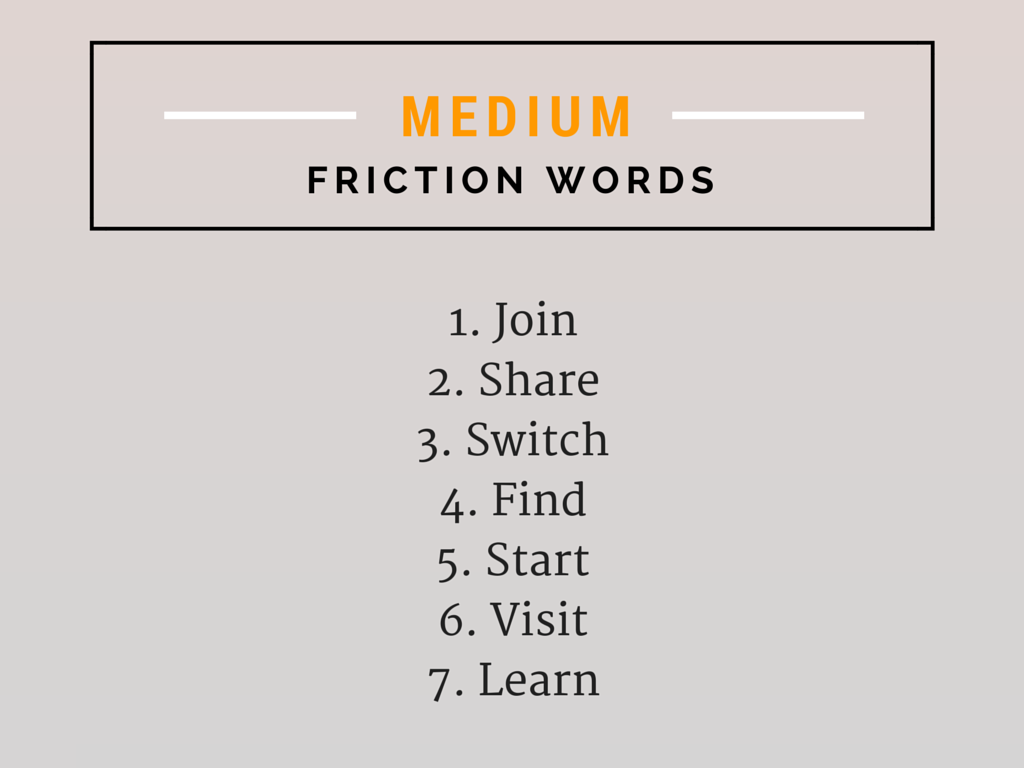
2. Words to be careful of

3. Words that prompt conversions

What's the difference?
When trying to persuade a visitor to take action, you want to be sure that you avoid words that imply that there's work to be done. In doing so, you'll find that it's much easier to lower the proverbial barrier between a visitor and your offering.
To better clarify, let's take a look at a couple examples.
Which button would you rather click on?

Submit is over-used. To entice your visitors to take action, consider using copy that speak directly to what they are looking to do (they're not trying to submit, they're trying to get an ebook.)
Here's another example:

Sure, these calls-to-action are seemingly identical, yet there is something about the word "discover" that is more inviting than "find." Point being, if you can improve the level of intrigue by simply swapping out one word for another, why not?
While Wiebe's suggestions serve as a great basis for guiding your button text strategy, it's important that you run tests to identify which words work best on your audience. For more on how to approach this type of testing, check out this article.


Order Your Copy of Marcus Sheridan's New Book — Endless Customers!


