Topics:
Web DesignSubscribe now and get the latest podcast releases delivered straight to your inbox.
 What's the purpose a website?
To share your message about your business, your cause, or yourself with the world and to make your brand look good. In that order.
So why is it that we so often approach design before content when planning a website redesign?
We've trained ourselves to assume that the process is easier when we handle the design first and simply go in and fill in the content around the design -- but this approach rarely works on the first try.
The problem is trying to get the real content to fit neatly where the placeholder text was without compromising the aesthetics of the design.
The result is a website that looks unprofessional and ends up compromising content and design.
However, this can easily be solved by taking a content-first approach to web design.
Why Take a Content-First Approach to Design?
Design is important and I'm not trying to take away from its value, but for the purposes of inbound marketing -- content is king.
That's not to say that you have to choose one or the other because you can certainly have both when you take the right approach.
A content-first approach is not only better for the delivery of your content to your buyer persona, but it also leads to better design in the end.
A Content-First Approach is More Efficient
Generally speaking, I've found that clients tend to request more rounds of revisions for the copy on their website than for the design. A big contributing factor for this is that it's easier to provide clear feedback for design than it is for copy.
With design, you can specify an exact color change and you can tell them exactly where to move a design element. When it comes to providing feedback for copy, you might find it challenging to express in words what you would like changed. (Or else you would just write it yourself.) Not only that, but there is so much more subjectivity in regards to copy. You don't really have to worry about design offending anyone or being misunderstood.
Rather than having the designer make changes based on each round of copy revisions, it makes more sense to have them get started after you've got a near-final draft ready. That way they can create their mockups based on the content that you know you want and you have a much clearer idea of what the final product will look like.
This prevents the entire mess of the web designer presenting you with a mockup that you love, only to end up changing it to suit the content or vice versa.
Content is User Experience (UX)
Content is information and without information your site visitors won't have the most pleasant experience. UX not only makes your brand likable, but it's also a vital factor for engagement, conversions, and SEO.
Content-first design allows you to guide your prospects through your website, providing them with everything they need to understand your business and make a purchasing decision as quickly as possible. The less intuitive the process is, the less likely they will be to purchase.
When you design around your content, you have much better control over the entire experience.
Especially for inbound marketers, content is UX. People aren't visiting your site to admire your design, they are there to consume your valuable content. Your design should only make that process easier and more enjoyable for them.
This is what led us to remove the distracting sidebar in our blog and it actually increased conversions.Design is a Form of Communication
Your copy isn't the only thing telling the story of your brand -- your design is also communicating information. Design should always complement copy, not work against it.
Everything from the colors that are used to the size and shape of design elements should be cohesive with the message of your content.
Remember when you were first learning how to read and you were given books with descriptive images and only one sentence on each page? Whenever you didn't know a word or two, it was easy to fill it in because you could look at the pictures to cheat. That's how easy you want to make it for your buyer persona to understand your message. (Obviously that's a little extreme, but you get the idea.)
It's much easier for your web designer to create a complementary design when they are provided with the content first and it also allows them to draw inspiration from the content itself.
How to Design Around Content
A content-first approach actually makes things easier for your web designer.
Rather than starting with a blank canvas, they can immediately identify specific elements that will be required -- which creates a template to work from.
Instead of trying to come up with what they are going to include in the design, they can focus their time on figuring out how to make the content look as great as possible.
Are you starting to see how this all comes together so well? The copywriter has complete freedom to focus on perfecting the message, instead of filling in blanks, and the web designer doesn't have to worry about leaving room for copy revisions, so they can craft a design that fits perfectly. In the end, the work from both parties looks better and you end up with an amazing website in less time.
Pick a Strategy
There are several ways you can take the content-first approach, depending on your specific situation. I'll discuss each one and give you a few considerations to keep in mind.
Design Around Your Current Content
The simplest approach is to use the content from your existing website for your new design.
If this is your plan, my first question to you is: do you really love your current content or are you just satisfied with it?
Just because your current content has been getting the job done, that doesn't mean you won't get better results with better copy. The best time to change and improve your copy is when you are doing a redesign.
Will your current content be a limitation to your new web design?
A content-first approach to design doesn't guarantee a beautiful website, especially if the content that you are designing around sucks.
People will forgive you for bad design if your content is on point, but the best design in the world won't justify bad content.
Design Around Your Competitor's Content
If you're a new business without a website, you might find yourself at a loss for where to start. A great source of inspiration for your content is from the website(s) that your buyer persona is already visiting and spending money at.
This is an easy way to get the content to your designer quickly, so they know how to approach the design.
I'm not suggesting you copy their website exactly, that would end up working against you. What I suggest is that you look at the websites of five of the most successful brands in your industry to gather ideas. Then you can create a content structure based on certain things that you liked from those brands, only you write the content specifically for your business.
One thing to keep in mind is that you don't want to end up looking like everyone else or looking exactly like one of your competitors. Your brand should still have its own identity.
You're only stealing concepts, not the exact content.
Design Around New Content
Designing around new content might take the longest amount of time, but this will generally lead to the best result.
You don't have to wait until you have the final draft of copy to start the web design. You just need to decide on the structure of your content and you need to have a general idea of what the fixed copy will say. The actual words can be tweaked until you get it just right, as long as you aren't adding or subtracting an entire paragraph from any given section.
To make this process as smooth as possible, you want to ensure that you have your content organized -- meaning you know where you would like for everything to go. This is the most important part of a content-first design. Don't even think about any design-related decisions until you know exactly how you want your content to be presented.
Organize Your Content
The best way to organize your content is with creating a visual aid. This helps you stay organized and it communicates your vision to the designer better than words can.
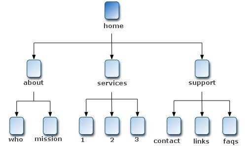
First, you'll want to create a sitemap diagram. This organizes the entire structure of your website. Take a look at the image below to see an example.

Then you'll want to create a wireframe for the most important pages, such as your home page, about page, pricing page, etc.
You can do this yourself or have your designer present you with a few options, the choice is yours. Some people prefer to have more control over the process than others.
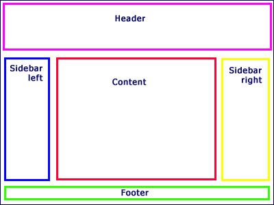
This first image is an example of a terrible wireframe. This is a basic version of a design-first approach.

Here is an example of a content-first approach. Notice how there isn't a huge block titled "content." That's because every section of your website has content.
While this is still a simple wireframe, you at least have a clear idea of the content structure.

Not sure how to create these visual aids? Check out these 20 wireframing tools if you'd like to learn how to do it yourself.
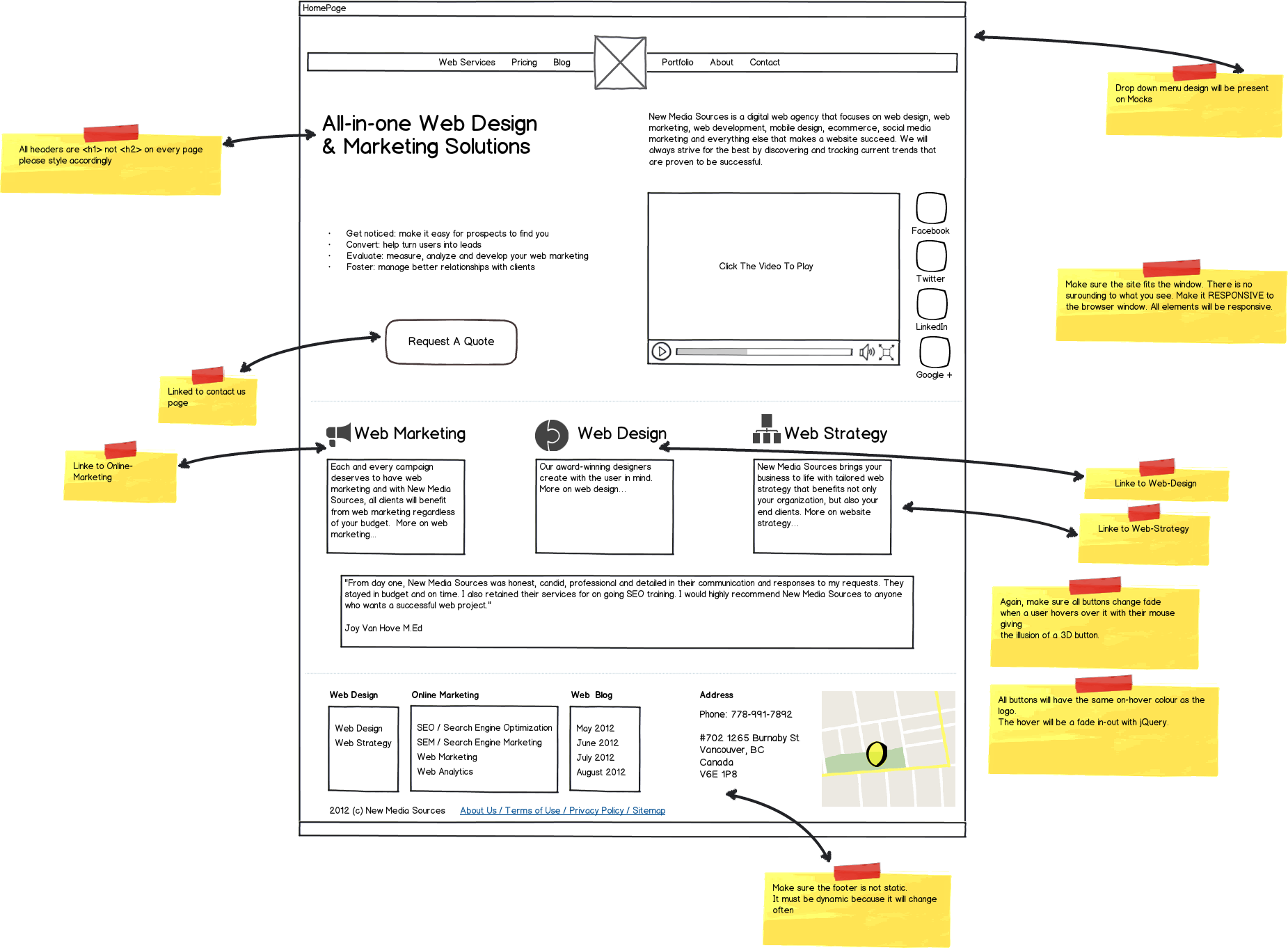
Once you've decided on a layout for your content, you can adjust the wireframe around the actual copy. Again, this doesn't have to be the final draft, but it should be a rough draft that only needs refining and not overhauling.
The result might look something like this:

(Source)
This is what content-first design looks like.
It's very clear what your website is going to say and how you are going to say it, the only thing missing is a great design to bring it all together.
Since you've specifically planned where all of your content is going to be, it's much easier for your web designer to direct the reader's attention to CTA's and other valuable content. The result is a much better user experience and a website that looks completely personalized to your marketing message -- because it is.
Free: Assessment


