Subscribe now and get the latest podcast releases delivered straight to your inbox.
How Redefining Inbound is Changing the Way I View Website Design

Aug 24, 2018

Think back to the last time your company redesigned its website. It gives you the warm and fuzzies, doesn’t it?
Lots of back-and-forths, hang-ups about strategy, content, and structure.
You had this idea in your head of what it should look like, but it never turned out quite like that, and to top it all off, it went over budget and past the deadline
You want a business website design that stands out from the crowd but is familiar enough that your audience can find what they want easily while also achieving your goals.
When I’m developing a website for a client, I want it to give them a sense of pride; happiness knowing that this is your website, a beacon to the world representing your company and brand.
It should attract visitors, convert leads, and delight everyone throughout the process.
Usually, this all depends on a group of people agreeing on the points I mentioned above. So, how do you reconcile all these conflicting requirements?
Let’s take a step back.
Designing with an Inbound Mindset
What is the goal of your website? Better yet, your organization?
If you just optimize for sales, you’ll probably bring in a lot of revenue -- for now -- but your audience is going to know that money is all you’re after.
Now, this isn’t to downplay revenue. You have to keep the lights on, keep your people happy, and drive growth opportunities for your organization -- but that’s not important to your customers.
What’s the end result of a purchase for the buyer? Why does your company really exist?
Most of us probably don’t think about that often enough, but it is that which brings customers in and keeps them coming back.
You have a vision, a mission, and you’re bringing value to the world. There’s a deeper connection that can be made with your audience if you can appropriately share this with them.
So, how can your website deliver on that?
Instead of just driving more visitors, it should connect with more people.
Instead of just making sales, it should develop relationships.
Instead of just garnering customer loyalty, it should build trust.
Instead of just growing your business, it should empower your audience to grow.
In other words, it needs to be built with an inbound marketing mindset.
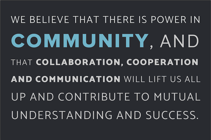
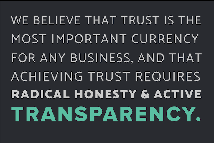
IMPACT recently unveiled the Inbound Manifesto which outlines a mindset to unite not only marketing and sales people but leaders, designers, developers, anyone who works in an inbound organization.
It has three core tenets: Education, Community, and Transparency and in this article, I’m going to dig into how we can use each of these to make decisions during your next website design (or even review of your current site) to achieve the goals mentioned above.
Designing with Education in Mind

There is always room to grow. You know it, your team knows it, and your customers know it.
As inbound professionals, your website is an unbridled opportunity to empower your audience to grow, to educate themselves on your industry.
Every page, every section, every module of your website should strive to help your audience learn and move further toward their goals.
Let’s look at some fundamental questions.
What forms of content do you provide on your site?
Everyone learns differently, and some people consume content differently depending on their current situation. If you aren’t sure which medium(s) work best for your audience, try some text, audio, and video content and see which performs or is received the best.
Lean into your strengths, but make sure to test different ones.
Try turning some blog articles into videos or infographics. Transcribe some videos to get some additional text content. If something doesn’t work for your audience, that’s still valuable information (and something to try again differently in the future).
Continue looking for the best way to get your audience engaged and they’ll make a better connection with the content you are sharing.
How comprehensive is your content?
If I want to learn about your industry, will your content answer my rabbit-hole of questions? If you’re in the early stages of building content, it might not, and that’s okay!
You don’t need to have it all right now, especially if you’ve built in some methods to learn what your audience is thinking next.
The more comprehensive your content is, the more you will be seen as the expert in your industry.
Remember in grade school when your teacher didn’t want you looking up the answer in the back of the book? That’s because just seeing the answer doesn’t teach you anything. This is the same concept.
Not only do you want to answer their question, but you want your content to help your audience understand their situation better, and greater details of the idea.
That’s a powerful concept. Now you aren’t just the company that gave them the answer, you actually helped propel them forward.
Tying this into some metrics, comprehensive and engaging content usually also keeps people on your website longer. That’s because comprehensive content tends to be longer, which means it will take longer to read (assuming it is valuable enough for them to keep reading!).
Comprehensive content can also be achieved by connecting related content, but more on that in a minute.
Is your website optimized for ideal content consumption?
It’s not enough to have the content, you need to make sure it’s delivered effectively and can be consumed easily.
For instance, take readability.
Font colors and background colors should work well together. (Don’t look at me in that tone of voice; I’m serious.)
There should be a visual hierarchy, taking advantage of font sizes and colors to clearly differentiate areas of text.
Be generous with spacing. Do not make me whip out a ruler to read a paragraph line by line. No matter how great and comprehensive your content is, it will perform better if it is more comfortable to read.
Also, does it look good both on mobile and desktop?
Make sure your website is responsive to different screen sizes, device types, and even browsers. Each is significantly different to consume and navigate and should have dedicated attention to ensure it provides an optimal experience.
All of these factors can affect the educational experience on your website.
Is your site structured to reflect an education-first mindset?
If I have a question, how many clicks will it take to get me to the answer? Can I easily find related content? Is that related content the next step in my thought process, or just under the same category?
People come to your website with specific intent. They are looking for an answer. If your website is well-optimized, they should be able to find that first answer by consuming that initial content. If your website is well-structured, they will be able to find answers to their follow-up questions.
On-site search is one way to approach this. If you have a search function, and it works well, I can find my way to the next answer in my learning process.
But more fundamental than that, there should be a solid information architecture supporting a seamless user experience.
For example, if I land on one of your blog articles, chances are you have some related content on that page. Maybe there’s a sidebar with recent articles or articles from the same category after I finish reading. That’s an example of information architecture supporting a good user experience.
To take that a step further, try giving recommendations for what to consume next. This way you’re leading them along a journey with a defined path… like a formal education.
As with any other tactic, measure this and figure out the path(s) that perform best.
If there’s a drop-off between pages, maybe that page doesn’t make sense as the logical next step (you can use something like Google Analytics 360). This may require some manual work to get started, but tools like artificial intelligence and machine learning will have a profound impact on this area.
You can probably correlate some of these ideas with common website metrics: bounce rate, length of session, pages per session. The metrics are great to have, but it’s the story they tell that we need to keep crafting.
And remember, you can always go back and optimize your site (as you should), but if you can keep the goal of educating in mind, you can trust your team and the creatives working on your site to fine-tune the details.
Designing with Community in Mind

Your community is so much more than your organization.
Although, it starts internally (why would anyone want to be involved with a company if the employees don’t even want to take part), your community is a support system, a motivational tool, a resource to stay aligned with the pulse of your industry.
It includes not only you, but your past and present team members, clients/customers, partners, fans, and technically even your critics.
Your website should encourage your growing audience to unite, grow together, and add to the conversation.
Again, let’s start with some fundamentals.
Can someone start a conversation via your website?
Is that something you promote, such as a live chat?
Yes, we all love forms and the lead generation benefits they provide, but that keeps us at arm’s length from our community, gathering information instead of having a personal conversation.
Many of us may never see our customers face-to-face. For instance, I’ve spent a lot of money with Amazon and never met a single employee (Okay, I have two Amazon connections on LinkedIn, but they weren’t working there when I knew them!).
If you remove as many steps and friction points as you can between your audience and your organization, your community will grow. Live chat is a great way to do this.
How easy is your content to share?
You are a thought leader in your space, and the information you provide is valuable. Make sure it’s easy for your community to spread that information and they’ll do it for you (well, in addition to you anyway).
Include social media share links on your content and suggested copy; and here’s a secret, if you simply ask people to share something, they’re more likely to do it.
Do you include community content on your site?
Remember, your community is more than just your organization; it’s a group of people united through interactions around a common interest. You may have the honor of “running the show,” but you should all be sitting at the same roundtable.
By putting community content in the same space as your internal content, you are acknowledging the value provided by your audience.
This will help them feel included, building their sense of unity and joint ownership. The more you can recognize your community, the more they will want to contribute, provide feedback, and advocate for you.
And of course, user-generated content is huge. Maybe it’s through guest blogs, embedded tweets from your fans, or even testimonials. Encourage your community to generate content, then use it.
Do you create new content based on the questions your community is asking? They are literally telling you what information they want from you, so give it to them!
How would you feel if you asked a company a question, and within a week or two they have a full-blown page dedicated to your answer? Yup, I’d feel pretty connected to them too.
Also, does the voice of your content welcome your audience?
Does it make them feel included, or are you putting yourself on a different level?
Every brand needs their own voice, but make sure yours is approachable enough that your community isn’t afraid to have a conversation with you.
No matter what your industry is, there is always a person on the other side of the screen interacting with you. So, be authentic and genuine.
You can tell when someone is faking or only doing something because it’s required of them. Don’t make your community feel that way. Every interaction is a reflection on you, your brand, and your mission. Take it seriously, because if you do it well then you will build trust and pull in your community tighter.
Designing with Transparency in Mind

Transparency is one of the big digital marketing buzzwords, but it’s more than that -- if you do it right.
Being transparent starts with how you run your organization, and extends to every interaction someone can have with you, or anyone and anything else that exists as part of your organization.
For a modern business, your website is the ideal opportunity to lay all of your cards on the table, and reflect on what it is like to interact with you.
Your website should be transparent about everything relating to you, and clearly outline expectations for every action that can be made.
That means it should be transparent about who you are, what you do, and why it matters to you.
It should set expectations about what it is like to interact with and work with you, for everything from personality to pricing, and every action that can be made on your website should have a clearly aligned expectation and outcome.
Do you discuss pricing on your website?
For the portion of your audience that will become paying customers, what is one aspect that they will learn about sooner or later?
Pricing.
So you have two options: talk about pricing earlier, or talk about pricing later.
If you talk about pricing later and it turns out they can’t afford you, then you have to deal with the time lost and the misaligned expectations. That may not just be a customer loss, but a community loss as well.
If you talk about pricing earlier, you set clear expectations for the customers you work with. Then your audience can self-assess and decide if they are a potential customer, community member, or just a casual observer.
Losing someone as a customer doesn’t mean losing them from your community. If anything, your community will be stronger because you are so open with them.
The strongest relationships are the ones that provide value even when it’s not an opportune time. So, don’t hide information from your community. Be as open and transparent as you can, and they’ll reward you with the same.
Your website should be no different from your word. If you would tell it to someone, put it on your website.
Do people know exactly what they’re getting?
We’re all guilty of being a little misleading from time-to-time. “Maybe if I make it seem a little different than it is, they’ll click through and then once they get the content they won’t care anyway.” The end justifies the means, right?
Wrong.
Every time your website doesn’t deliver on what someone expects, you lose trust and credibility.
When I click on a button, I expect it to do what it says (“download”, “submit”, “confirm”, “send”). If a link opens a completely different page or offer, it may be the last page someone ever views of your site.
Take advantage of hover effects and a clear visual hierarchy to specify exactly what is going to happen when someone takes an action.
When someone subscribes to your blog, what can they expect? Will you send emails daily, weekly, monthly? Are you including them in any other mailings as a blog subscriber? If they are submitting a contact form, when can they expect a response from you? Tell them on the landing page and in a follow-up email.
If you think something is unclear, spell it out so no one is surprised.
Apply an Inbound Mindset to Website Design

As with many tasks, we tend to get bogged down with what meets the eye when designing a website.
We get so worried about the way a picture crops or how the font-weight looks that we don’t take the time to step back and think about what the website is actually supposed to do. I am there with you. This is just as much a call-to-action for me when developing a website as it is for you during the design process.
Keep in mind the three tenets of the Inbound Manifesto: Education, Community, and Transparency.
If your site is primarily focused on educating people, go with the option that best supports comprehension and learning.
If your site is a part of your community, then evaluate and take advantage of the connection options available and be creative about user-generated content.
To be transparent, make sure every action someone takes on your site has expectations clearly outlined and that everything you share is truthful and accurate.
These are certainly not exhaustive, and there will not always be clear decisions to make, but if you can get yourself and your team looking from this viewpoint, your website will be so much more than some words on a screen.
Take advantage of your next website design and make your site a living extension of your inbound culture.


Order Your Copy of Marcus Sheridan's New Book — Endless Customers!