Subscribe now and get the latest podcast releases delivered straight to your inbox.
7 Tips for Unleashing a New UX Design (Without Confusing People)

Jan 26, 2018
You often hear people say that they hate change but sometimes, change can be good if it is done (or in the case of UX/UI, released) correctly.
How do you feel about change, especially changes to a website or software you use every day? Do you get disoriented? I wouldn’t be surprised if you do.
Let me tell you a story:
Here at IMPACT, we use Basecamp as the central communication/storage location for all our clients and even in-house communications.
In the last week, Basecamp rolled out some new updates to their software.
Usually, these updates don’t phase us, because we are used to things constantly changing, but, this one affected us differently -- especially because it happened during peak hours of the workday.
That release update sparked this article, but interrupting user behavior was a concern we dealt with internally as well when redesigning our homepage and relocating the blog there. (Would people know to look there?)
What is the proper way to release new UX, new features, or even remove old features?
Whether you’re a SaaS company or just a marketer thinking about your website like us, your main goal should be to maintain a positive user experience and not create any backlash.
Here are six tips to help make your new UX roll-out more user-friendly
1. Roll-out in Phases
If you’re making changes, don’t overload your customers with a large number all at once. If you can break them down into phased rollouts, do it.
This slower change will avoid jarring your customers and even help your internal development team keep up with improvements if issues are found.
Perhaps you can even consider a beta!
Start small by forming a group of long-time customers to test out what you’re working on. This way you can see how the actual user interacts with it and squash all the bugs before rolling it out to the public.
Once you and your private testers feel that the feature/UX changes are good-to-go, you can open it up to a public beta.
The more eyes on a project before launch the better. This kind of early evaluation will help lessen issues when it’s time to fully release it.
2. Make it Known Ahead of Time.
Every company should have a list of its current users. Use that list to communicate that changes are coming so people are prepared.
Consider sending an email announcement, explaining your new upcoming plans.
Showcase the updates with an animated gif, and/or a link to a video showing exactly how they will work. A lot of people are visual learners and this preview will make the changes feel less foreign the next time they visit.
Last month, the Databox team did a great job announcing new updates being rolled out for agency folks, like IMPACT.
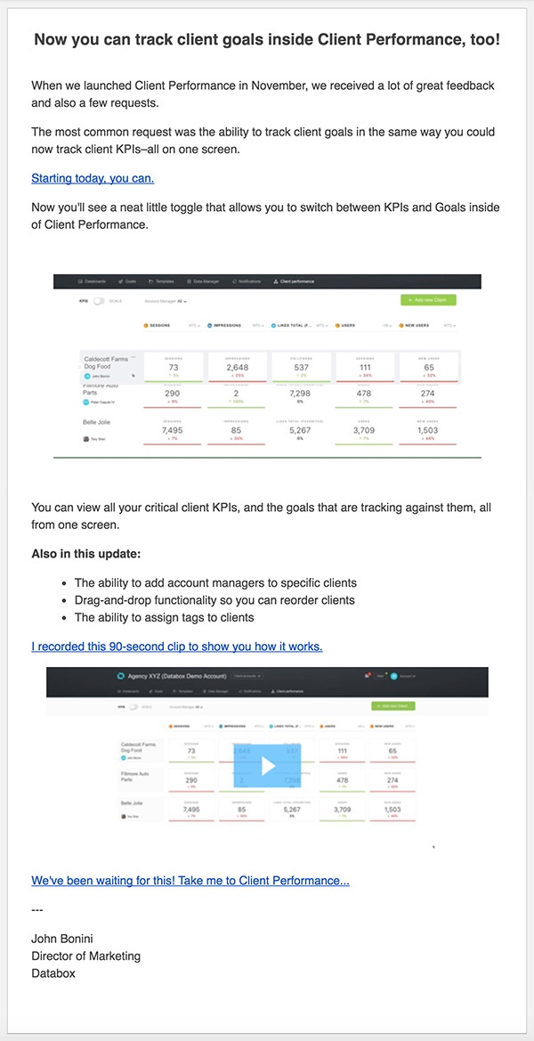
First off, their marketers used a catchy subject line to grab your attention and to right-of-the-bat position the updates as something good.
Then, in the email, they briefly explain what they did and why they did it, and provided an animated gif and a video (if you wanted to learn more) further showing the updates.
You can also consider announcing via a blog article...
Emails get lost in people’s inboxes all the time.
A good alternative to announcing your updates (to current customers or even prospective ones) is a blog article.
This approach will allow you to really detail your strategy and explain why you made the moves you did.
HubSpot has a dedicated blog to their product updates so that everyone has a place to go and look at what they are working on, and what they just finished up.
Here are just a few examples, of products announcements all in different stages of their roll-out.
- [Heads Up] We're Removing Weekly/Monthly Portal Summary Emails
- [In Beta] New Design Manager & New Modules Framework
- [Now Live] Catalogue Custom Meeting Types Directly Within the Meetings Tool
3. Add In-app Tours & Walkthroughs
When you work with certain apps or sites all day long, every day of the week, every week of the year, a new update can greatly affect your efficiency.
As a marketer or brand, you can help minimize this experience for your customers by adding guided tours.
Guided tours can help to re-teach user behavior and help users with missing or moved features.
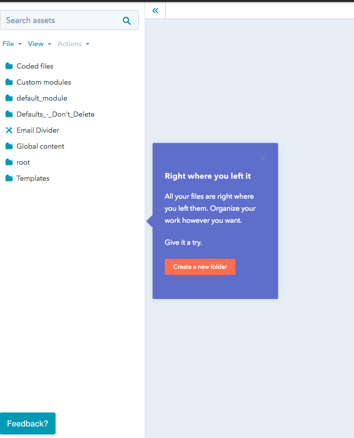
There are several different types of tours you can have, but I’m partial to those that actually point out and walk you through how to use a new feature and answer any common questions through automated prompts.
Like HubSpot’s for example:
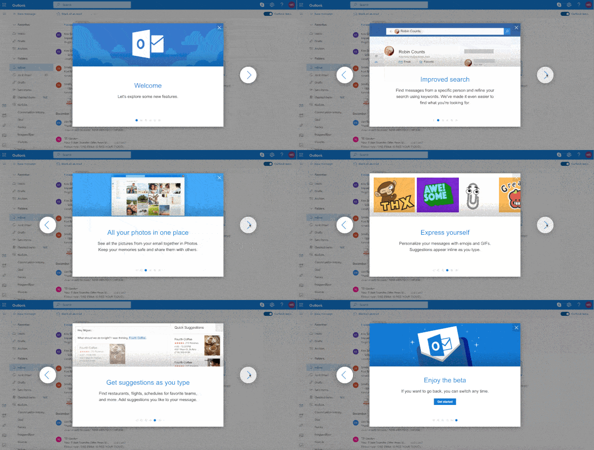
There are also tours that are a more like a quick slide deck presentation.
Outlook, for example, does a good job here outlining a few of their top new features when you first log in after an update:
Regardless of which approach you take, make sure you update all your documentation, as well. Nothing is more annoying than trying to find out how to do something with a new look/steps and the documentation not match.
4. Update Your Change Notification Log
Now this one is more for those of you selling software.
Whether you have an app-based tool or online, creating a change notification log will help keep people in the loop and avoid confusion.
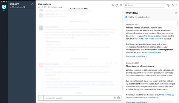
Adding a “What’s New,” or “New Stuff,” topic or pop-up on your site with notifications will grab your customer’s attention and encourage them to click to see what’s going.
Slack, for example, has a “What’s New” section of their app that automatically opens when a change is made and allows you to see the updates without having to go searching back through your email or searching on the site.
5. Add In-Screen Notification Bars
Once you have released any kind of update, you can also add a notification bar linking to the blog announcement or video, so customers don’t have to search your software to find out what has changed.
Once everything was rolled out by Basecamp, for example, they released an article showing over the next couple of days, telling about all the changes they have made.

6. Let Them Revert Back
No one likes being stuck in a beta or update with issues or a learning curve when they're in a time crunch. Nothing ruins a day more than when you can’t do your normal activities!
With that being said, give your users a chance to get out of a beta or update that is still in progress.
This will keep your customers happy and avoid hindering productivity if something’s not quite right yet.
I recently signed up for the Outlook Beta and was worried I was going to be stuck in the new look with a lot of bugs. Luckily, as you'll see below, in the upper right-hand corner, they gave me the option to leave if I wasn’t feeling these new changes quite yet.

7. Welcome Feedback!
Last, but not least, make giving feedback on your updates easy with a chat window, or survey, or form on-page.
You can never really know how something will function until it's out in the world so welcome the real data.
As people navigate through your changes, they’ll likely have questions, comments, or thoughts and making an outlet for them easily at-hand will be greatly appreciated. It’ll also give you tons of insights for improvement.
Roll Out!
We all know releasing a new UX and/or feature and is a long process, but it’s also a worthwhile one. In the end, it’s all about creating the best experience for your customers and future customers.
If you’re in the middle of a redesign, take these tips into your internal brainstorming meeting so you can start building out a thorough campaign to make the transition as smooth as possible.
Happy launching!
Free: Assessment