Subscribe now and get the latest podcast releases delivered straight to your inbox.
6 Shopify website examples every e-commerce brand needs to see

Aug 4, 2020

Shopify is a rock star e-commerce SaaS (Software as a Service) solution that helps users set up an online store with ease.
From grabbing a domain, naming your online store, customizing the website, and adding products, to tracking orders and accepting card payments, everything is built-in.
As one of the most powerful e-commerce builders on the market, Shopify is ideal for entrepreneurs looking to start an online business with minimal hassle.
Last I checked, it powers more than 1 million businesses in 175 countries and has generated over $135 billion in sales.
But what does it take to succeed with a website on the platform?
Since Shopify is fully focused on e-commerce and the content surrounding online sales, it’s essential to analyze the industry as a whole and determine what makes a successful e-commerce business before understanding what makes a great e-commerce website.
Aside from providing the obvious ability to purchase products online, what other features are essential? Where can your business really focus and set yourself apart from the competition? What UI/UX opportunities are there and how can you capitalize on them?
Today, we’ll go through the six most important features you need to have an effective online store and check out examples that exemplify them.
1. Beard Brand - Become the best teacher in your industry
Being the leader in your space can take on many forms.
You may not have the absolute cheapest price or the absolute best inventory, but if you own your space intellectually by providing useful content that answers all your customer’s questions, that’s a very powerful position to be in.
Running a search for information on a product or service is the first step in the buying process for just about anything.
Wouldn’t it be awesome to be considered the end-all-be-all source of truth for your industry?
Well, having that sort of information available to prospective customers as a precursor to their purchase is a super important step in the inbound methodology and really, it just makes sense.
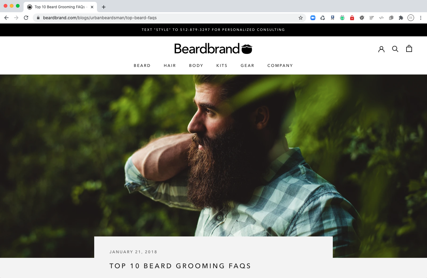
My favorite example in this category has got to be Beard Brand.
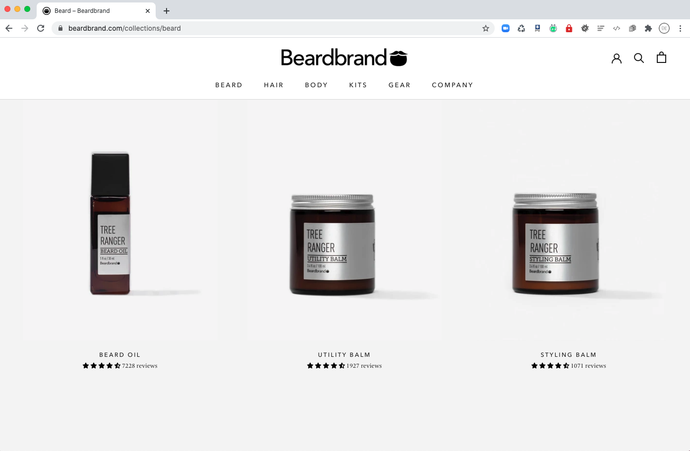
Their company is primarily geared towards the sale of beard-related products, but they’ve positioned their website as a resource that anyone can use to educate themselves about beards, beard maintenance, complimentary hairstyles, men’s fashion, men’s skincare, and fragrances. — Oh, and they also sell some beard products by the way.
Their blog is filled with articles explaining what to expect the first month when growing out your beard, how long it takes to grow one, The 20 Best Beard Styles for 2020, and even a guide for professional beard trimmers.
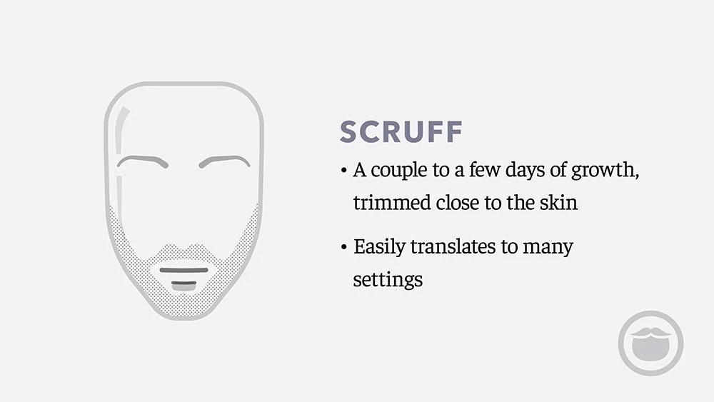
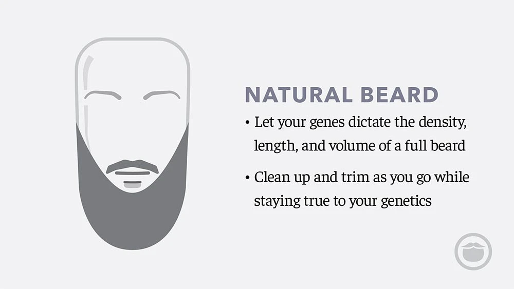
I’m still trying to get from the Scruff to the Natural myself.
By educating their audience on relevant concerns and not just going in for the hard sell with all of their content, Beard Brand keeps people coming back to their website for more than just purchases and, in turn, make themselves more likely to be the choice when that time does come.
2. Pipcorn - Make it super easy to make a purchase
A simple checkout/purchase process is one sure-fire way to boost your website sales. Any hiccups or unnecessary steps along the way could cause people to **pause for effect** abandon their cart!
**dun dun dun! You hear a scream off in the distance**
One thing I can say is pretty consistent across the board for Shopify is making a purchase is super easy.
This is due, in part, to the fact that depending on the tier you choose as a seller, your options to make changes to the checkout page are super limited.
Shopify has streamlined the checkout process and only with the more expensive Shopify tiers do you have access to make changes to this.
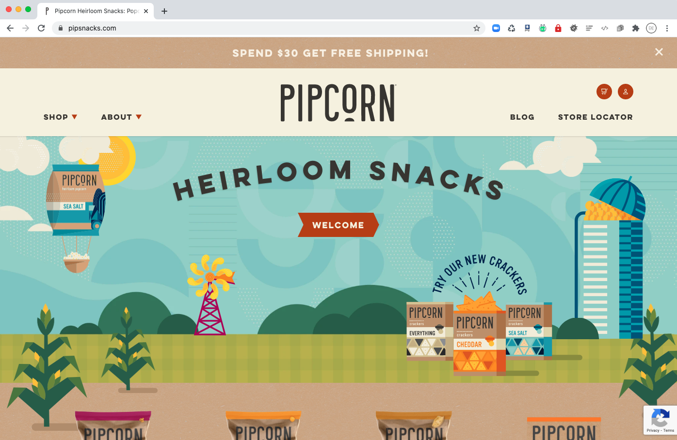
One great site that just keeps the checkout process fun and, really, just gets out of your way so it’s quick and easy is Pipcorn.
Pipcorn is a popcorn snack that I first heard of while watching Shark Tank a few years back.
It’s made with a type of corn that has a super fragile hull (the part that gets stuck in your teeth) which, essentially, disintegrates when it pops leaving nothing to get stuck.
(This, I had to try because, while I LOVE popcorn, I hate it when the hull gets stuck in my teeth. Plus, it tastes pretty good too with a bunch of flavors available.
Can you tell I love the product?)
But anyway, what I love about the site is that it’s really focused on showcasing the product, explaining why it’s better than traditional popcorn, and making the purchase process memorable with fun graphics and simple navigation.
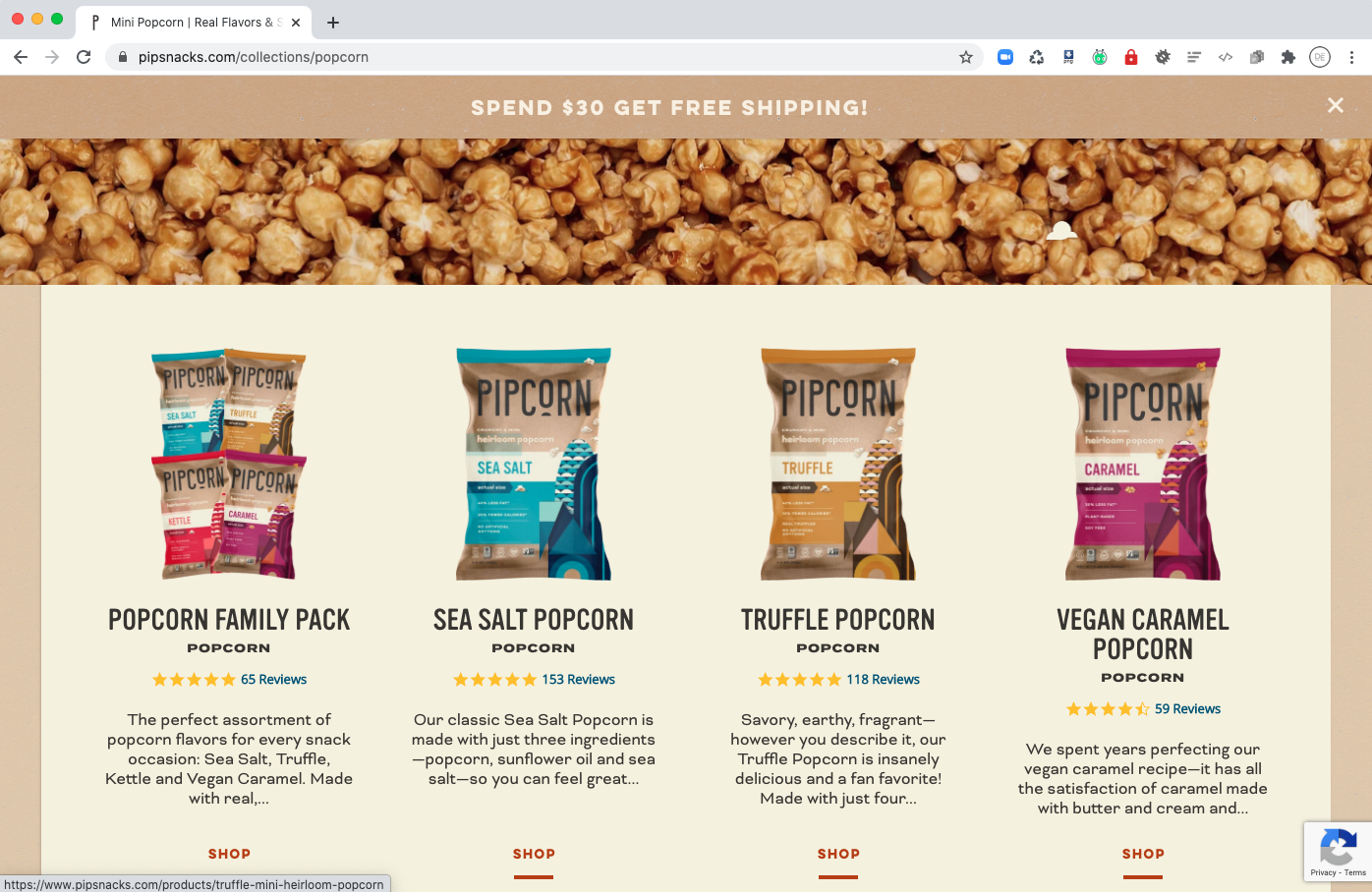
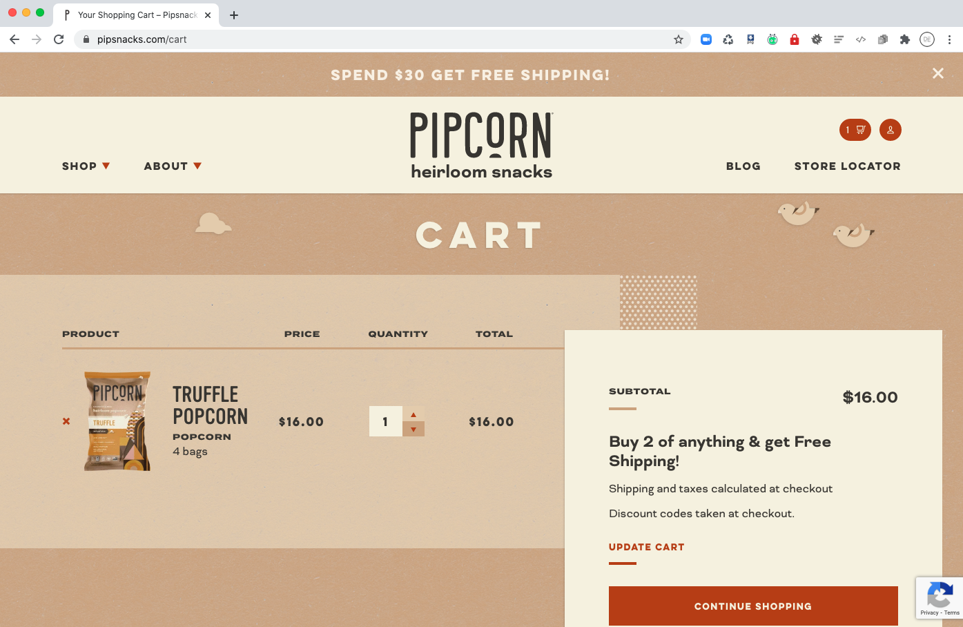
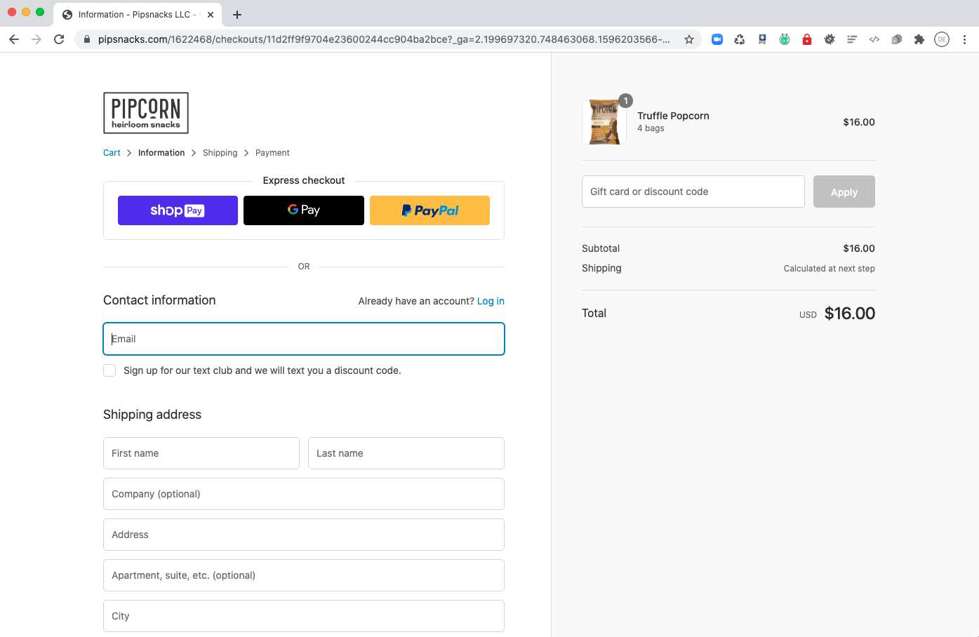
As you can see, I am able to get in, order painlessly in three steps, and get out.
This keeps me coming back to the site from time to time rather than leaving my purchase to the off chance that I come across it at the grocery store.
3. Allbirds - Keep your products as the main focus for your visitors
A clean, clutter-free interface just makes sense when it comes to showcasing your online products.
You want your customer’s focus on the products so they can find what they’re looking for and quickly convert to that all elusive purchase.
For online stores, strong photography is really the only way to experience the product before laying your hands on it.
Some can be moved to make a purchase with images of what he or she might look like while scaling the side of a mountain in brand new hiking sneakers — for example.
For others, it’s the visual proof of quality and value that makes the tipping point which culminates with the input of a credit card number.
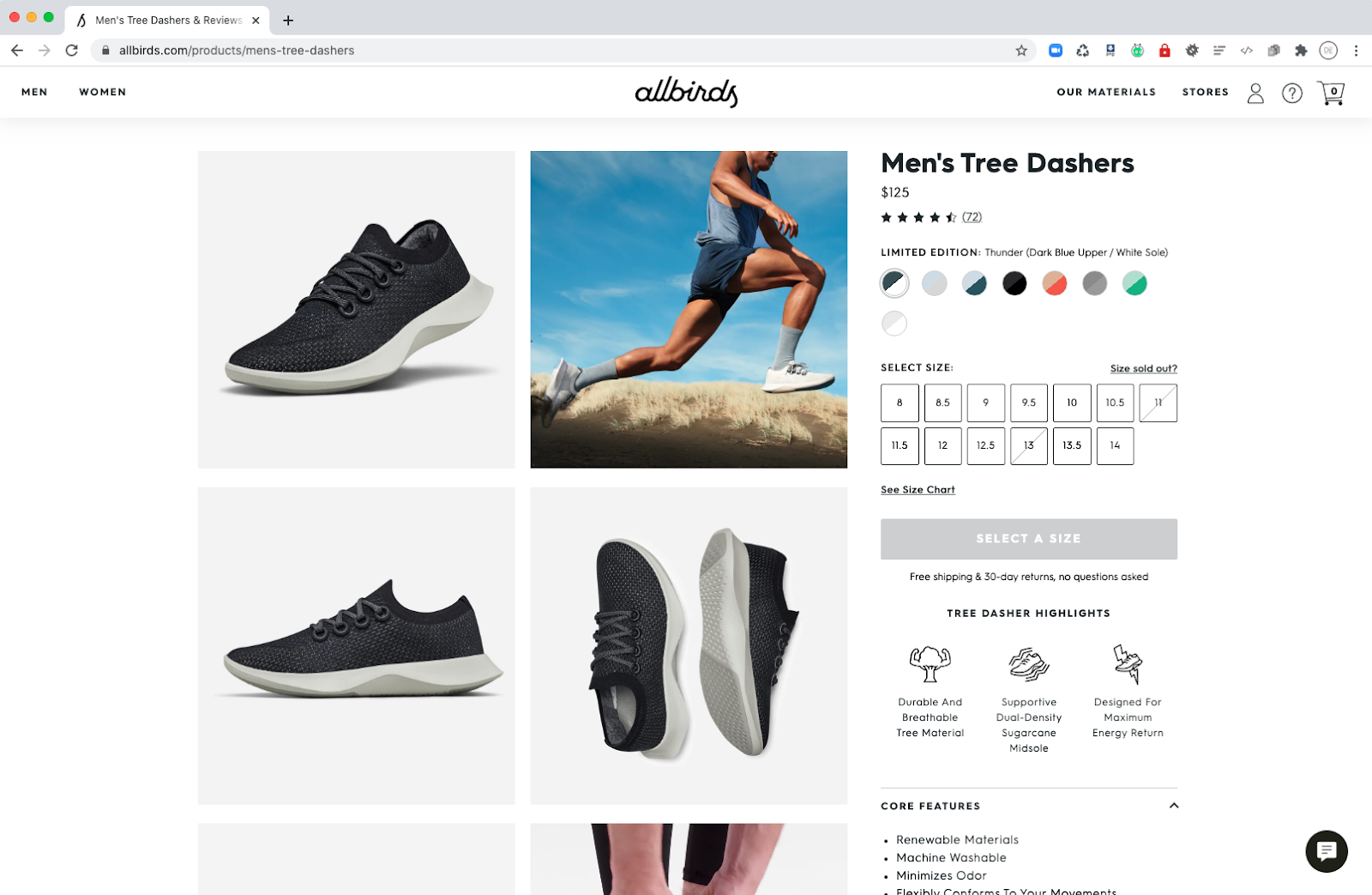
Allbirds.com is one awesome example site built on Shopify that embodies great product showcasing.
The minute you click into their products, everything is geared to keep your focus on them and what you could be doing with them.
Alongside shots of the product in every angle imaginable, you can see what they might look like in action.
There are also a ton of choices and sizes to choose from and once I’ve made a selection on the shoe I like, I never feel like I need to leave that page for any further information — meaning I’m not going to get distracted.
In e-commerce, where you can’t touch, feel, or try out the product, this kind of specificity is a must.
4. Bombas - Share your greater cause or mission
Buying a great product is one thing, but buying a great product that does something good with the proceeds is SO much better.
A website that makes me feel warm and fuzzy about making purchases is a website I’ll frequent over and over when I need to re-up or find something new to buy.
One great way to convey this sense is by sharing your brand’s story and if it has a greater mission.
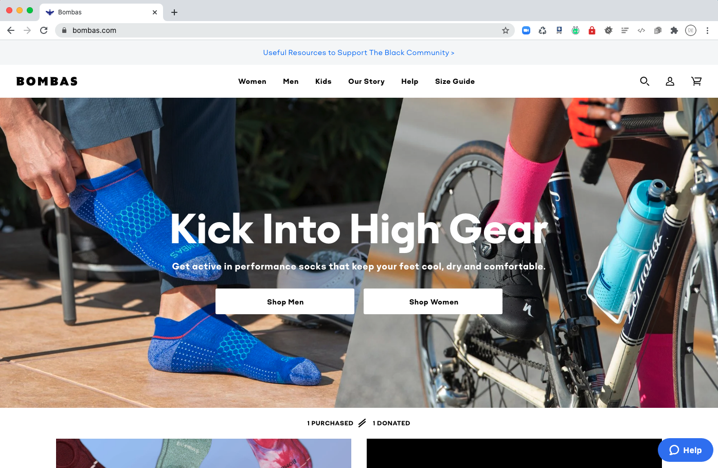
Bombas, a clothing company focused on selling socks and t-shirts, is a great example.
Another Shark Tank product — I’m realizing I may watch that program too much – Bombas gives a portion of its proceeds to provide clean clothing to the homeless. Pretty awesome, right?
While they do have a slew of information available about making a purchase (i.e. how long it takes to receive your product to their return policy — a 100% satisfaction guarantee) their underlying mission to help the homeless, makes me (and other buyers) feel like their doing more than just buying a pair of socks.
Identifying with a company’s values is one super fast way to cut through the indecision that comes with making a purchase.
5. Minaal - Show them other products they may like
A happy customer is begging you to give them more things to buy from you.
They will be back to your site over and over if they feel that there’ll be something new and exciting waiting to be sent off to their front door and, of course, that means more revenue for you.
Another way to add a bit more revenue to your bottom line is to give them items that go well with the product they already bought; like pairing a great wine with its best morsel of food. It’s difficult to resist something that was MADE for something you already have or want.
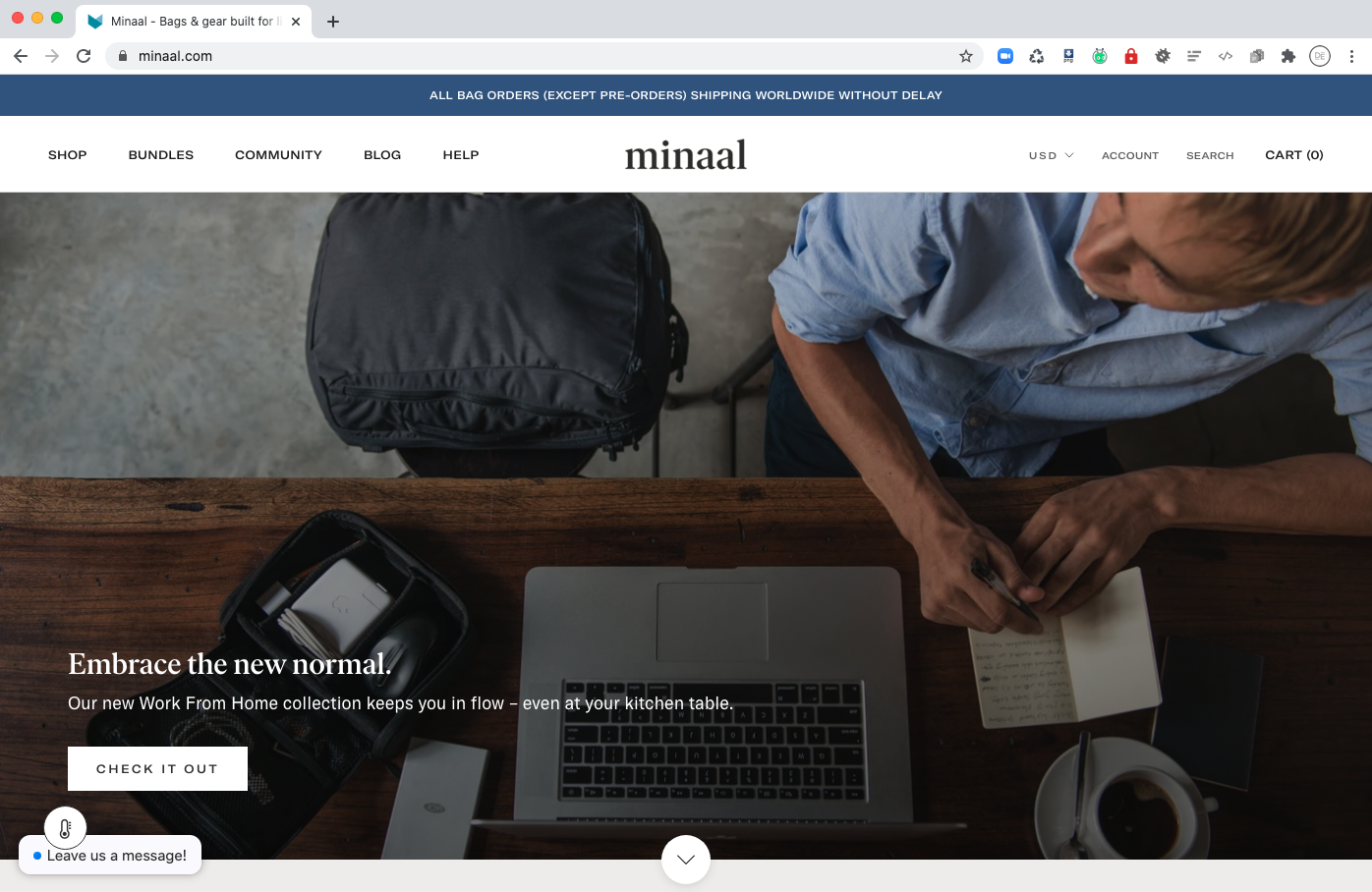
Minaal does a great job of showcasing related products in their “Works Well With…” section on every product page.
Started by two friends from New Zealand, they sell daily bags — for everyday use — and travel carry-on bags that “...you only need to buy once.”
Now, as an example, a daily bag isn’t something one would typically buy 10 of, and they know that, so they do a great job of pointing out every other product that could make it a better value for you and your routine.
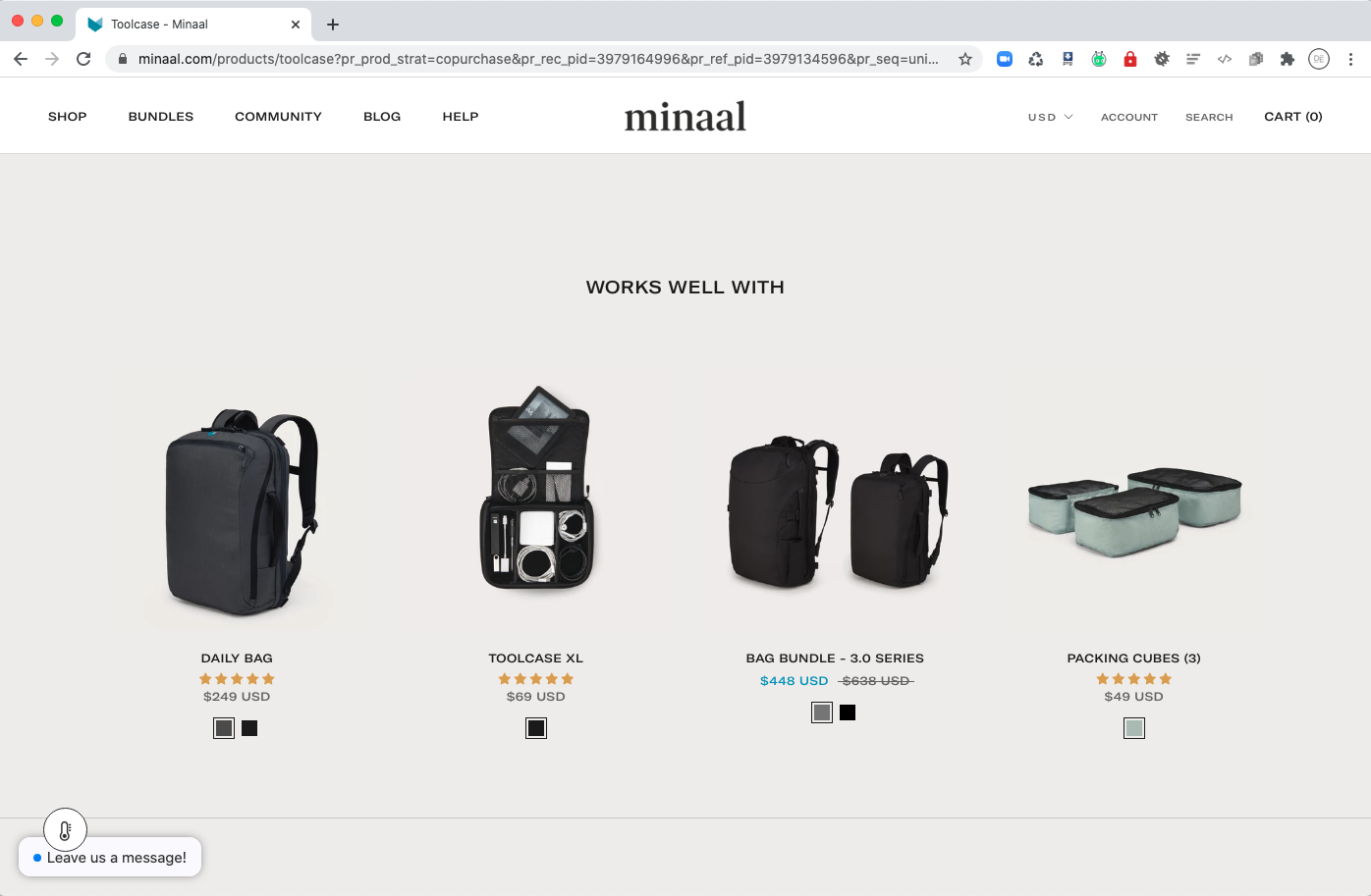
This makes transitioning into another purchase an easy decision since everything feels like it belongs.
It’s genius.
6. Cluse - Deals on products and shipping
Nothing gets a shopper’s heart racing like a good deal. Their pupils dilate and their blood pressure quickens at the sight of the word “OFF” following a % symbol.
Coming up with creative ways to run sales on your e-commerce site that don’t devalue your product is the job of any great retail organization.
A great online retailer’s website will rotate these deals frequently to keep your customers coming back for more of that rush they feel when they know they’ve kept some of their money safe and sound.
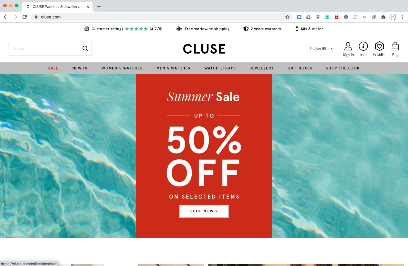
To me, cluse.com is one of the best Shopify examples.
Their use of typography and graphics to highlight their deals grab you as soon as you land on the site, immediately visible above-the-fold and they never let go.
No matter where I am on the site, I can see that there’s a sale going on right now and I can even see a little banner on every one of the products that are included in the sale.
I find it easy to use and navigate. All around a great site for purchasing watches and jewelry.
There are so many other brands doing a great job on Shopify
Since the spirit of this article is mainly about what online stores need in order to be successful, we’ve kept ourselves laser-focused on selling products online.
That said, during the course of my research, I came across so many amazing websites that embody some or all of these features which I could not stop myself from mentioning:
In no particular order here they are:
Check them out for more inspiration on how to optimize your e-commerce experience on Shopify.
Tailor your store to your customers’ needs
Taking care to include the features outlined above could very well make the difference in making your Shopify store successful or just another stepping stone on the consumer’s way to one of your competitors.
Online presence and attention are fickle so if you manage to get that elusive traffic to your site, make sure you give them the experience you’d expect.
Delight them and they will thank you for it by either purchasing your product or recommending it to someone else.
Free: Assessment
