Subscribe now and get the latest podcast releases delivered straight to your inbox.
4 Signs Your Current Website Strategy Is Broken (& How to Fix It)

Mar 14, 2019

Let’s say during your website redesign process you DID create a strategy and a really great one at that.
You researched, reviewed the performance data of your current site, and mapped out a plan for more traffic, more leads, and more customers through the door.
You even sprinkled in some subtle trends to make sure that savvy users could tell that you, indeed, have some design chops.
Now, let’s say your site has launched and the data you’re collecting is showing that your efforts and strategy worked. Traffic is up, leads are coming in and all is well.
This is usually the point when businesses tend to let their websites go on autopilot. The data shows the strategy works and so the bulk of the effort goes to nurturing the leads that are coming in. They may shift some homepage elements here and there, but they're not going to make an effort to drastically improve what's clearly doing okay.
Nurturing leads is important, however letting your website work on autopilot will, over time, result in an underperforming site and eventually, a broken strategy.
Think of your website like a house. You build a beautiful house with all of the bells and whistles that are completely on trend, you move in and it really is the best house you have ever lived in.
However, over time, if left untouched and ill-maintained, that house that once was the talk of the neighborhood will no longer look great or hold up so well.
Just like a house, your website (and the strategy that underpins it) will have the same fate if it is not continuously updated and maintained.
To prevent this downward spiral, you should know how to spot the signs of a broken strategy and make repairs to prevent a small issue from turning into a big problem.
But how do you know when it’s time for a change?
Here are some key indicators that your website strategy is broken, along with tips on how to fix it:
1. Your Website Is All About YOU and/or YOUR Company
This is a common trap. We are so proud of our organization and what we have to offer that we want to tell everyone how great WE are. Recognize any of these statements?
-
We are the leading [firm/agency/organization] in the ________ industry.
-
Our products are ________.
-
We help _______.
I get it.
Businesses want potential clients to know how great they are. They want to appear reputable and they want to make sure everyone knows what sets them apart.
The problem is, just as we don’t want to always be around people who like to talk about how great they are all of the time, we don’t want to hear it from businesses either.
Customers want to hear about what’s important to them.
If you want your customers to understand what sets you apart from the competition, you need to be the expert, answer their questions, and address their concerns before they even become concerns.
How do you address your customers’ concerns
Take a look at the value proposition (usually your headings) on your website and brainstorm how you can redirect the statement to address your client’s/customer’s concern by using “you” statements rather than “we.”
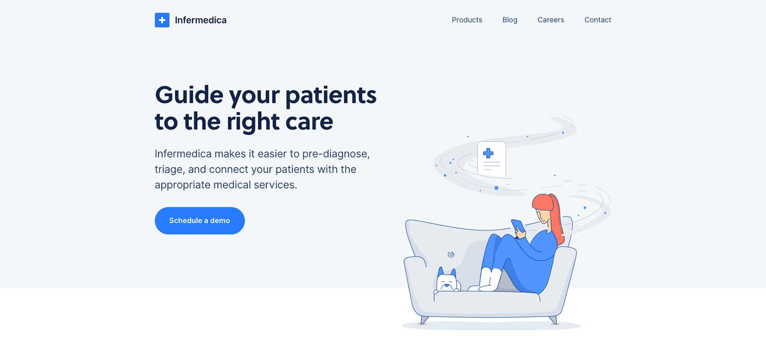
Here is an example of a strong “you” value statement from Infermedica:

In the example above, the potential customer’s concern of how to send patients to the right provider is directly addressed in a way that puts them first.
Instead of saying “We help to guide patients to the right care,” the headline statement is shifted to directly address the customer.
2. Your Website Is No Longer Attracting or Converting Qualified Leads
Before we address the issue of your website no longer attracting qualified leads, let’s establish exactly what a qualified lead is.
According to HubSpot, a qualified lead is “a lead who has been deemed more likely to become a customer compared to other leads.”
Based on that definition, if the leads your site is currently attracting are not converting into customers or require a huge effort by your sales team to convert, your website isn’t working.
Remember...
Your website is your 24/7 #1 Salesperson.
Read it. Understand it. Own it.
Your visitors should be so well-informed through the content on your website that they are more than 80% ready to make a purchase when submitting a request/contact form.
How to Adjust Your Strategy: First, Start Creating Meaningful Content.
Take inventory of the content currently on your website. Are you answering the questions that your customers and prospects consistently ask on a daily basis?
If you are creating this kind of content and still having issues, the most likely reason is that your visitors aren’t finding it. Reorganize and repurpose the content to get your customers’ attention in the form of a blog series, video, or pillar page.
If you aren’t creating this type of content, it’s time to start!
At IMPACT, we use the “They Ask, You Answer” inbound marketing methodology with our clients to shift their content approach and ensure their websites attract the right leads. I highly recommend reading Marcus Sheridan’s book with the same name to fully understand the power of this approach.
If you are ready to get going right now, start by making a list of all of the questions your prospects and customers are currently asking, even the tough questions.
Use the list as a launch pad for creating new website content (while reading the book!).
Second, create a way for your visitors to “choose their own adventure” through your website by implementing self-selection tools
What is a self-selection tool?
Commonly found on booking websites, self-selection tools allow the user to input options/preferences that will help to narrow the content to specifically what they are looking for.
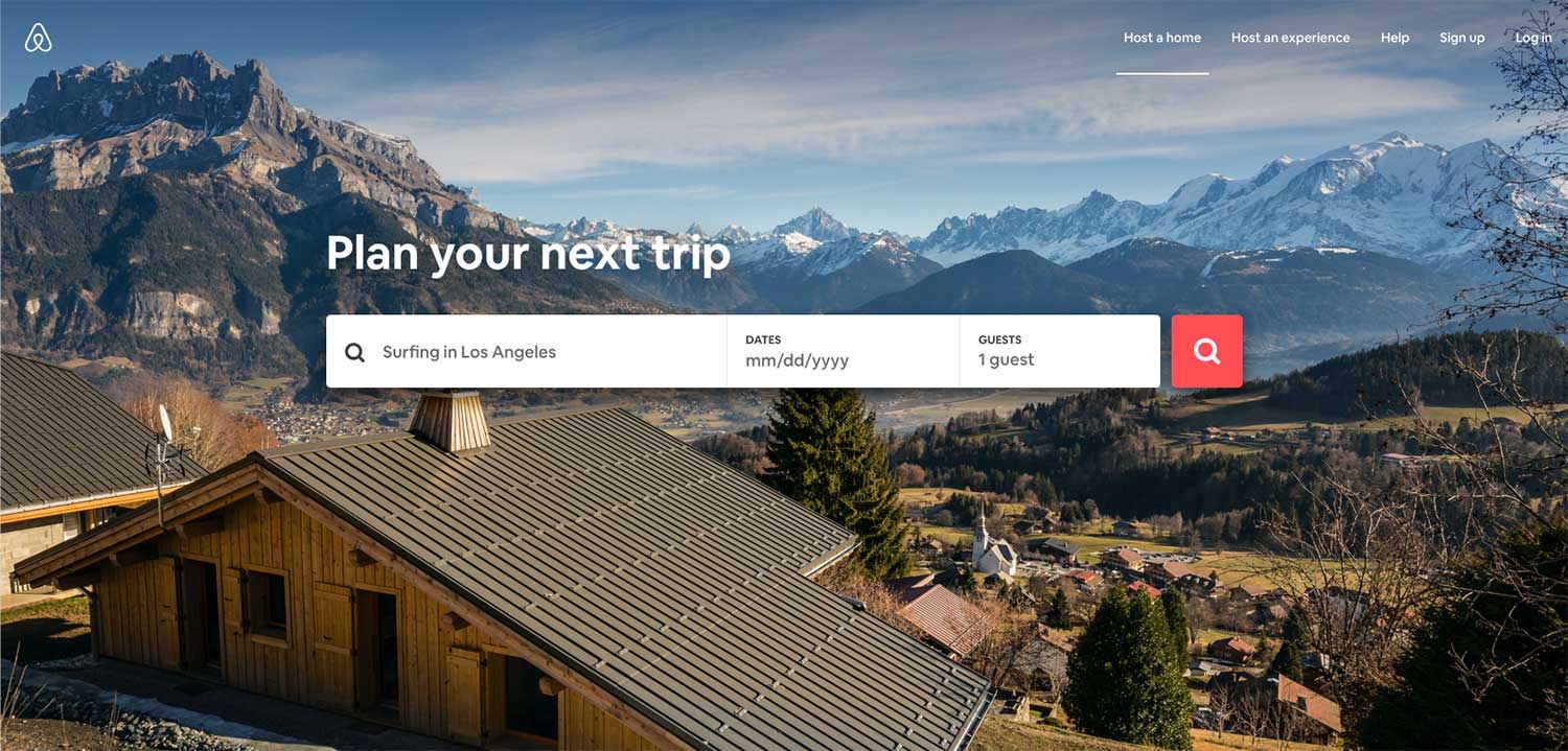
Here is an example of Airbnb’s self-selection tool:

Airbnb’s homepage clearly gets to the point of addressing why the user is there in the first place (to search for listings and book a stay) and providing the user with a way to zero in on content (in this case, places to stay) that will meet their needs (based on the number of guests) and be available during their desired time frame.
This same concept can be used with other industries as well.
Do you have multiple audiences?
Consider creating a selection tool that allows people to filter themselves into the appropriate category and view relevant content tailored to their need and interests.
Self-selection tools can be as simple as forms that enable the user to select their persona type (see Vanguard’s homepage below) or that tailor visitor experiences by having them answer a few questions such as the Airbnb example above.

Once your user has self-selected their content using your tool, the information you present to them on your website can more effectively drive them, if they are a qualified lead, to your conversion points.
In the end, your sales team with thank you.
Your lack of qualified leads may also be related to greater conversion path issues on your website, but more on that later.
3. Visitors Are Only Browsing 1 or 2 Pages on Your Website and Then Leaving
Maybe you have taken some time to review the performance of your website using Google Analytics or HubSpot and you notice the number of pages viewed per session is below the desired two pages per session minimum.
Pages per session is a useful metric that indicates how engaged your website visitors are.
With a minimum of two pages, your visitors should be landing on your homepage and moving onto a secondary page for additional information. This movement indicates your visitor is engaged in your content and more likely to convert.
If they’re not, it may be that your content is not engaging or you are not presenting the right content at the appropriate time.
For example, the content on your homepage may not be guiding the visitors to the information needed to make an informed decision to convert.
How to Adjust Your Strategy: Increase Your Website Pages per Session Rate
The most important step in increasing your pages per session rate is to determine which pages most visitors are landing on first. You can find this information by reviewing the behavior flow section of google analytics.
From there, you can begin to analyze the page by answering these questions:
-
Does the content on the page answer the questions we are most frequently asked?
-
Does the content on the page clearly guide the visitor to the next step or conversion goal of the page?
-
Is the design working with the copy to guide the visitor to the next step or is it distracting and pulling the user away from the goal of the page?
Once you have answered the questions above, you should have a good starting point to make adjustments and test the performance of your page.
We recommend making one adjustment at a time so that you are able to clearly understand what is working and what is not. Treat that change like a test, and if the metric has not improved, move on to the next adjustment, and so on.
By trying one adjustment at a time, you will begin to develop a greater understanding of your users’ behavior and can use that to build a stronger strategy.
4. Your Conversion Paths Are Broken
Perhaps your visitor-to-lead conversions increased after the launch of your redesigned website and you were pretty happy with the quality of leads coming in, but over time those results have changed.
User behavior changes all the time.
If your visitors are no longer clicking on your call-to-action (CTA) or submitting a form, it’s usually because there has either been a shift in user behavior or something may be broken. If something is broken, this means that the CTA link itself may not be working or the form is causing an error.
The best way to gain a greater understanding of what is causing your results to decline is to use tools such as heat mapping software and user testing solutions.
How to Adjust Your Strategy: Examine & Test User Behavior
User testing and heatmap tracking software provide a visual “peek” into how users are engaging with your website.
You have to ability to review how users move around your page, where they pause, where they click (more often than not it isn’t where you planned), and how far down the page they actually scroll.
After all, what good is a form at the bottom of your page if users aren’t getting there?!
Now that you have collected enough information and data to identify where your users are getting stuck, it’s time to tweak.
By changing one aspect of your website at a time, you can determine whether that change worked, did nothing, or caused a further decrease in your lead conversions.
Clearly, the last result is the least desirable.
You may find that users are not clicking the conversion points in the way that was intended. Perhaps the user is selecting the image itself instead of the link below. In this case, you would want to add the link to the images as well.
Small tests and tweaks on a continual base will help ensure your website strategy stays effective and get your conversion paths working again.
Keep Revisiting
Ultimately the key to a website that performs well over time is to consistently revisit the strategy and stay on track with the indicators above. If one area is starting to slip, identify the issue as soon as possible and take action.
When you stay active on your site, create quality content that informs your potential customers, find ways to allow your users to self-select/navigate to the content they need and use data to make small tweaks that create a big impact, you will begin to see consistency and/or improvement in the performance of your site over time.


Order Your Copy of Marcus Sheridan's New Book — Endless Customers!