Subscribe now and get the latest podcast releases delivered straight to your inbox.
There is no better way than to say it directly: Color is an essential element of branding and design.
When we think of cherished things: our favorite shirt, our bedroom, a piece of art, our favorite dessert — color makes each stand out in our mind.
Color has the ability to influence our emotions and change our mood, positively or negatively.
As marketers and designers, we must use color intentionally as we create messages and branding materials.
Scholarly research backs this up: According to studies done at The University of Winnipeg, “62-90% of a person’s initial assessment of a product is based on color alone.”
Companies have long known this, of course, and consistent design regimens have yielded iconic brand identities that are entrenched in our psyche.
Historian Mark Pendergrast reported that Coke (as in Coca-Cola) is “the second best-known word on Earth, after ‘OK.’”
Coke has been brilliantly marketed for decades (except for, you know, the whole New Coke thing) and part of the brand’s ascendency has been its consistent design (including color).
Look at this:
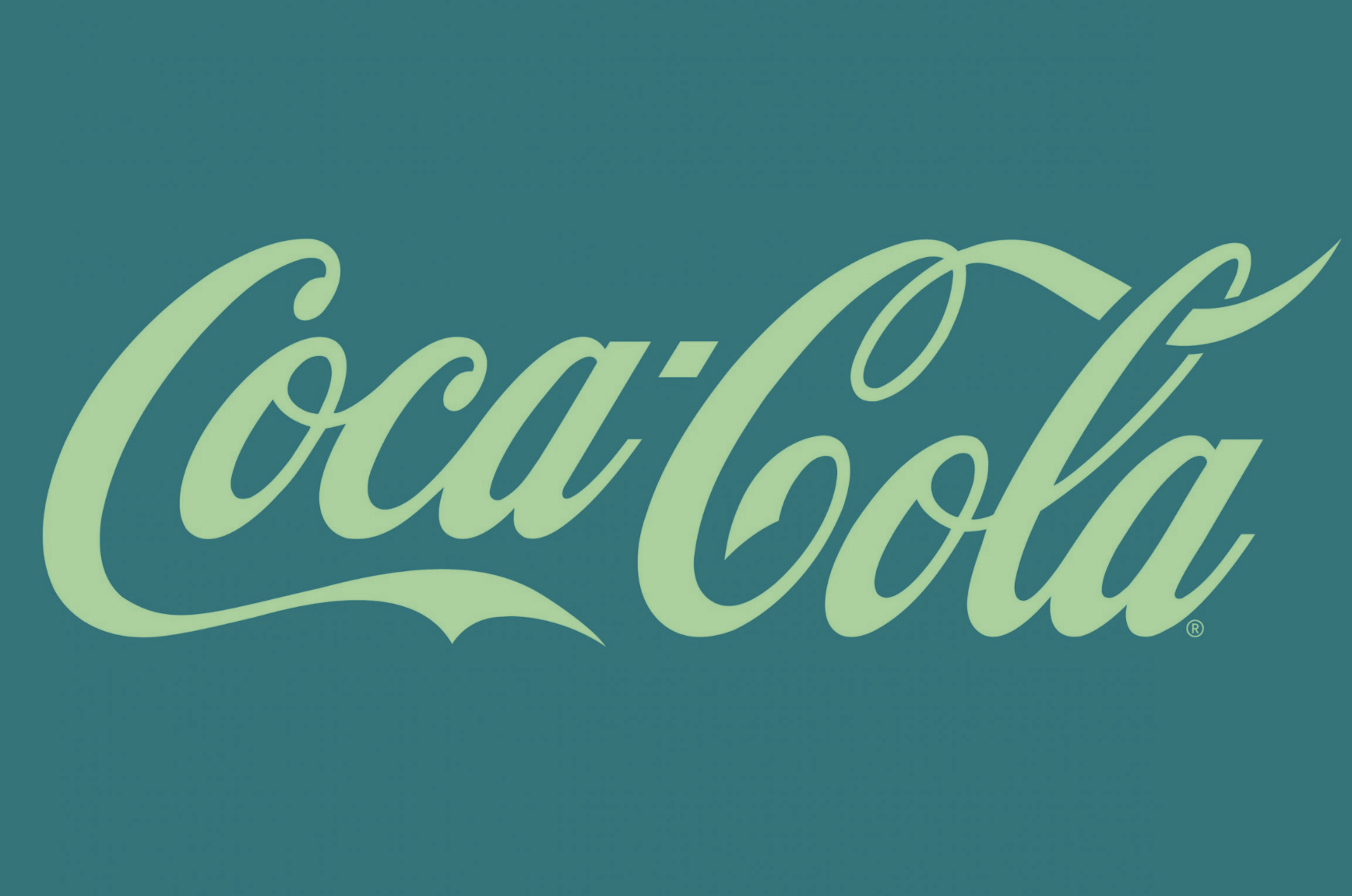
Exact same logo, exact same design, font, and typeface — but somehow off.
With a simple color change, something so familiar is rendered utterly, unsettlingly strange.
New colors completely change the impression left by the logo. Let’s take another iconic American brand, Ford.
.png)
The effect is alienating, uncomfortable, and just plain weird.
Don’t worry. I promise I’ll stop with just those two.
Honestly, it hurts my eyes to look at these — and you’re probably feeling the same.
But now, natural questions arise: What if Ford had always had a yellow and red logo? It wouldn’t look weird then, right?
The answer is no.
If Ford had a red and yellow logo, it would not be the same company.
Colors matter — and the powerful associations we have with blue and white (Authority? Austerity? Strength? Patriotism?) are closely linked with the logo and the brand.
The right color
In order to test product designs, companies create virtual display shelves that they then invite focus group participants to view. With retina-tracking technology, brand experts create heatmaps that track visitor eye movements as they scan the offerings.
What are they looking for? To see what colors (and designs) attract and hold viewers’ attention.
In any crowded marketplace — and, let’s be honest, every marketplace is crowded — standing out from the crowd is essential.
That doesn’t mean being different for the sake of being different; it means being intentional with the elements of any design, including color.
Colors are the key to unlocking an emotional response.
The right color can draw a consumer’s eyes and convey something about your service or product without a single word.
Just what that something is can vary depending on the viewer, but designers try to evoke a consistent, predictable response.
Choosing the right color relies on knowing what a color means.
Much has been written on the subject of color theory as it relates to branding — and I will not reiterate it here, except in brief.
The biggest distinction is between warm and cool colors, which exist on opposite sides of the color wheel.
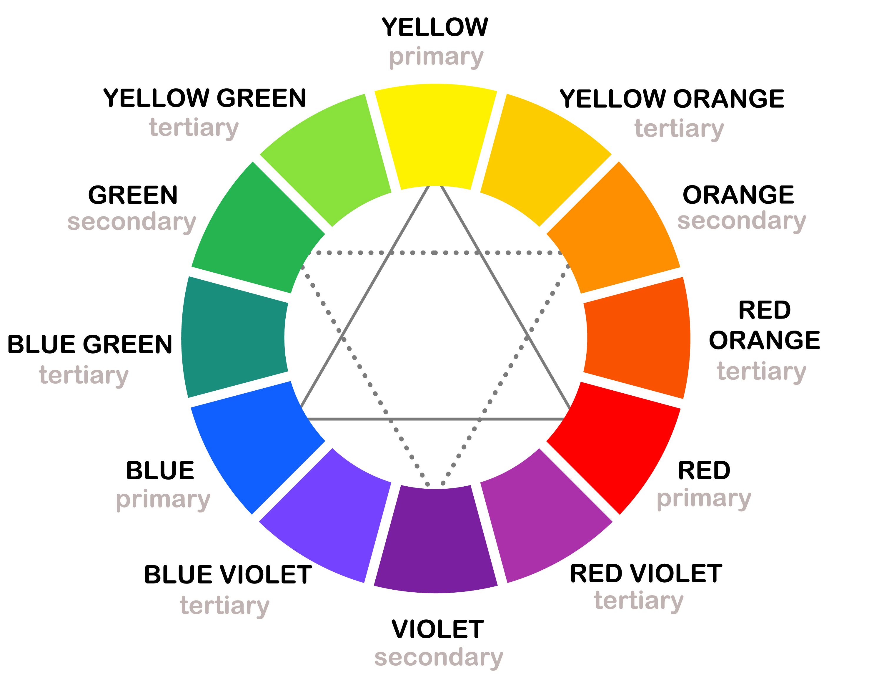
According to Dr. Sally Augustine, “Colors are called ‘warm’ (reds and oranges) and ‘cool’ (blues and greens) for a reason: When we’re in a space where the walls are painted in warm colors, we actually feel that the temperature there is warmer than we do in similar spaces painted [in] cool colors.”
Beyond aesthetical and psychological considerations, designers must keep cultural mores in mind as well.
For example, black is a long-established color of mourning and gloom in many countries, but white is the traditional color associated with grief in many Asian cultures, especially in India and China.
Suffice it to say, a quick study of cultural conventions would be time well spent as you’re initiating any design or rebranding process.
Once you use a color, you own its associations, both positive and negative.
What about orange?
Orange, the subject of this article, also presents a dichotomy.
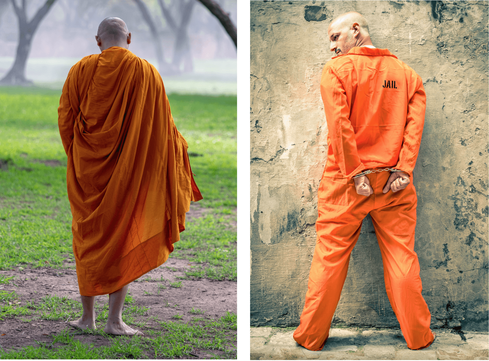
When we imagine orange clothing, we might think of Buddhist monks sitting in prayer or shackled prisoners.
We might think of the safety gear worn by hunters or a splash of color at a formal event.
In design, we may think of orange as a fun, youthful, and healthy color that connotes sunsets and autumn leaves — or as a color that demands attention to warn of danger.

Again, once you use a color, you own its associations, both positive and negative.
Orange in marketing and design
In the world of color, orange feels like a bit of an also-ran.
It lacks the center-stage presence of the primary colors: red, yellow, and blue. It’s not frequently used by prominent sports teams (I know, I know. Broncos, Flyers, Knicks, etc. But for the most part...).
Orange is also a rarity in national flags, taking a back seat to the likes of red, blue, green, and yellow.
Without looking it up, can you name a flag that features orange other than Ireland and India? If you can, you’re probably from Armenia.
However, none of this means orange can’t be a powerful player in marketing and design.
In the marketing world, orange is often used to portray youth, playfulness, and being bold. Orange is usually seen as healthy, energizing, and attention-grabbing.
HubSpot, an IMPACT partner and a card-carrying orange-loving brand, explains, “Orange, another warm color, is considered light and fun, so it suits less ‘corporate’-feeling brands. Darker shades of orange are associated with autumn, which lends itself to more ‘earthy’ brands.”
Consider these:
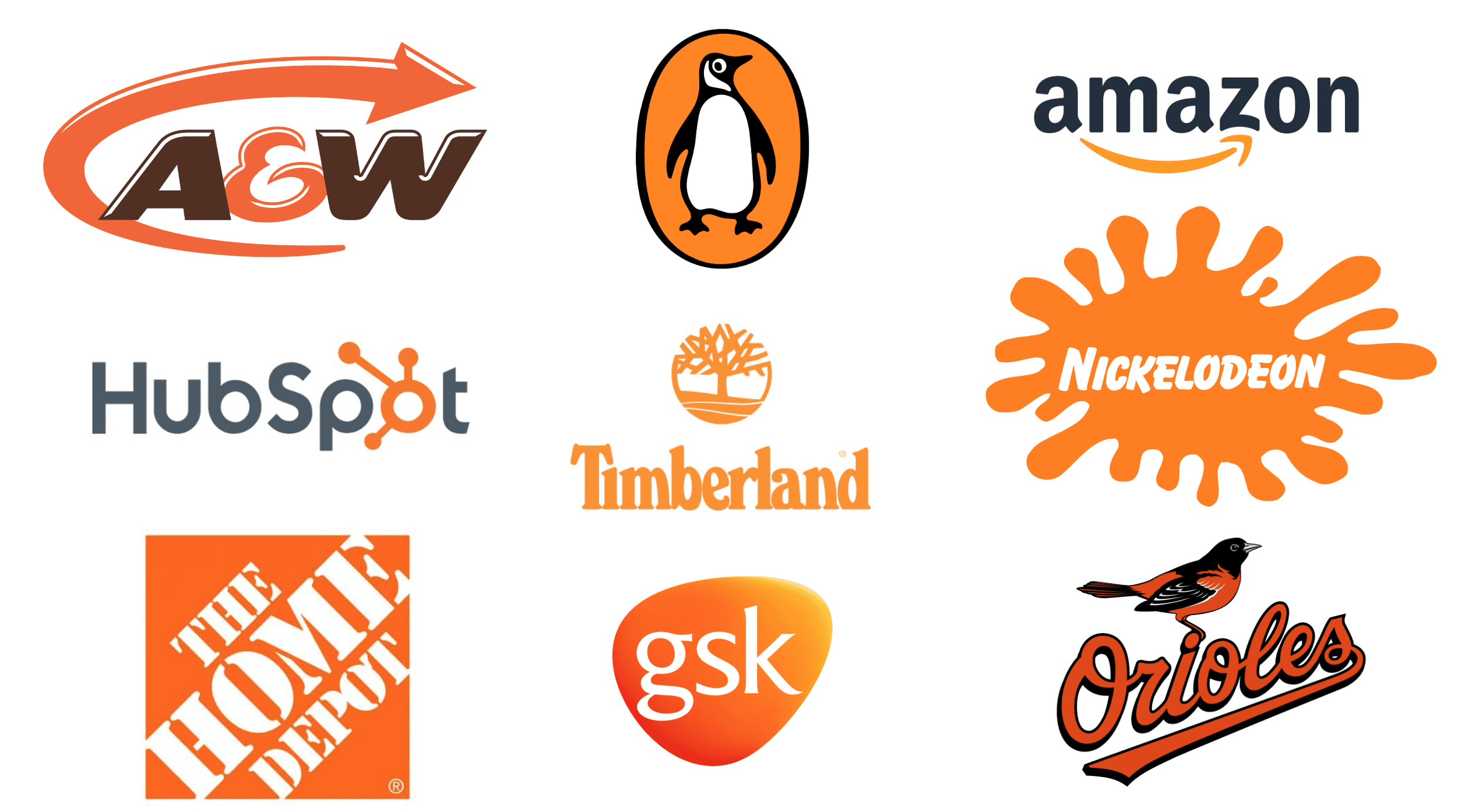
We certainly see the outdoorsy quality of Timberland and the fun of Nickelodeon. The Orioles, of course, are constrained by nature.
I suppose you could argue that pharma giant GlaxoSmithKline (GSK) is earthy and not too corporate — or you could take issue with HubSpot’s pithy generalization.
According to color expert Leatrice Eiseman, “orange has steadily progressed up the ladder of consumer preferences so there’s a greater appreciation of the color.”
Orange “gives you the excitement of red, but at the same time, the welcoming, friendly, warm aspect of yellow.”
And, in fact, it is orange’s unexpected nature that is also its biggest asset.
There are certain colors we expect from brands. The regal authority offered by blue, the attention commanded by red, the austerity and restraint displayed by gray.
Orange is warm and cozy, and it can be uplifting and inspiring. However, its status as a warning color can be softened by context and other colors.
At times, companies may be employing orange exactly because of its association with alarm and, by extension, safety.
Perhaps Harley-Davidson courts the risk that orange can signify, while Home Depot likely uses orange to associate with construction and maintenance workers.
So, is orange the new black?
When it comes to branding and design, orange makes for an accent that can really pop — in an entirely welcoming and gentle way.
Alternately, some companies go full-orange, choosing a color that, admittedly, has a range of meanings, the best of which are valuable to anyone.
It’s not uncommon to find orange present in product and web design, but this is frequently as an accent, standing out against contrasting or neutral colors.
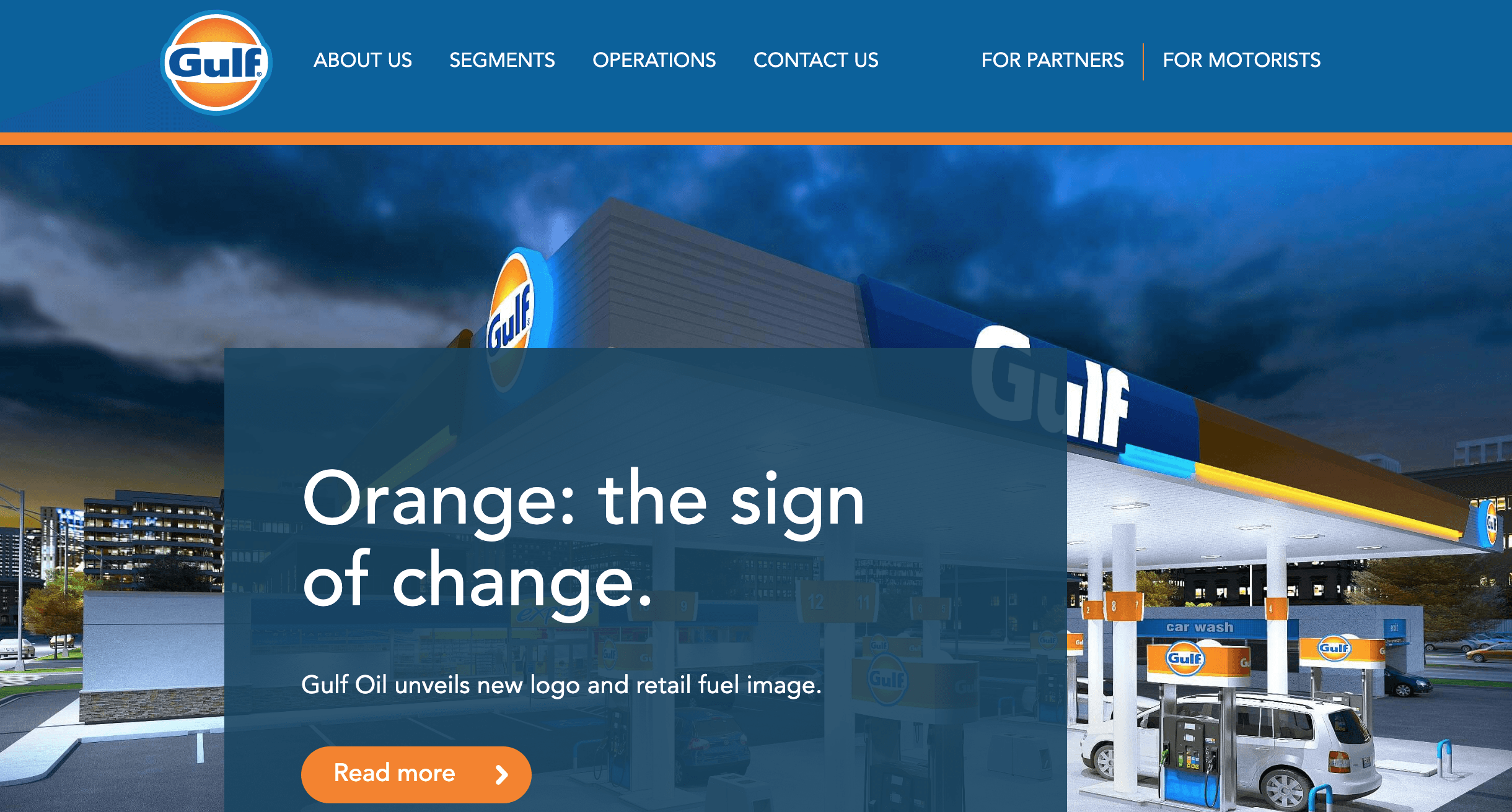

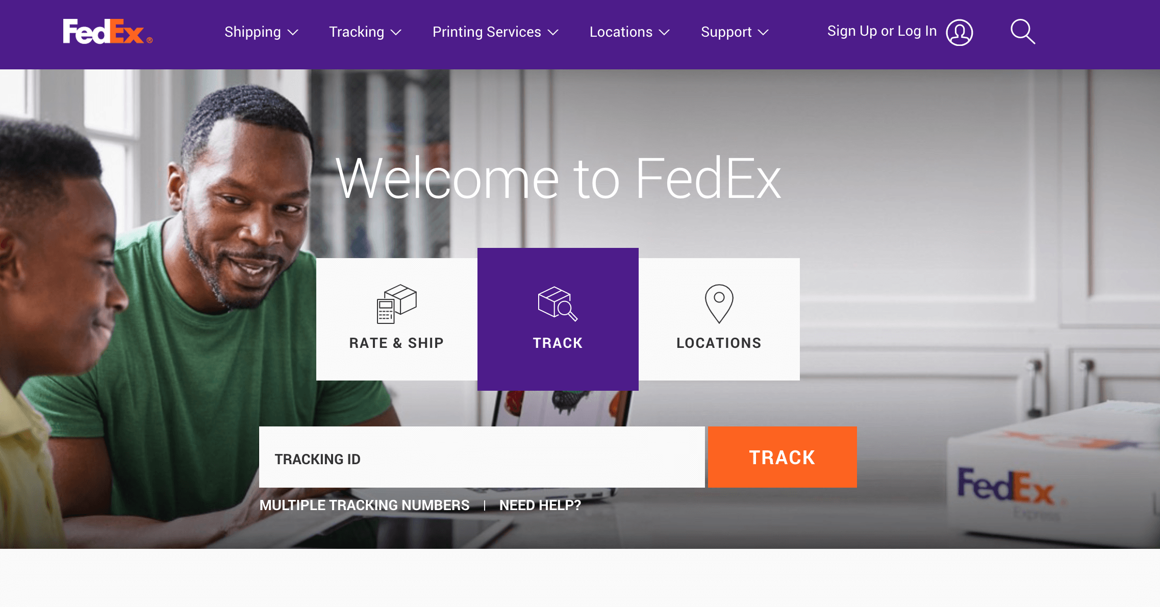 In each, orange is used to accent a call-to-action (CTA), which is quite common in digital marketing. Its contrast to the other elements (mostly in the blue end of the spectrum), makes it firmly stand forward.
The coolness of the other colors is alleviated by a small, clickable portal of cozy warmth. Orange is inviting, welcoming, and disarming.
Less often do we see orange as a major design component, but examples are out there.
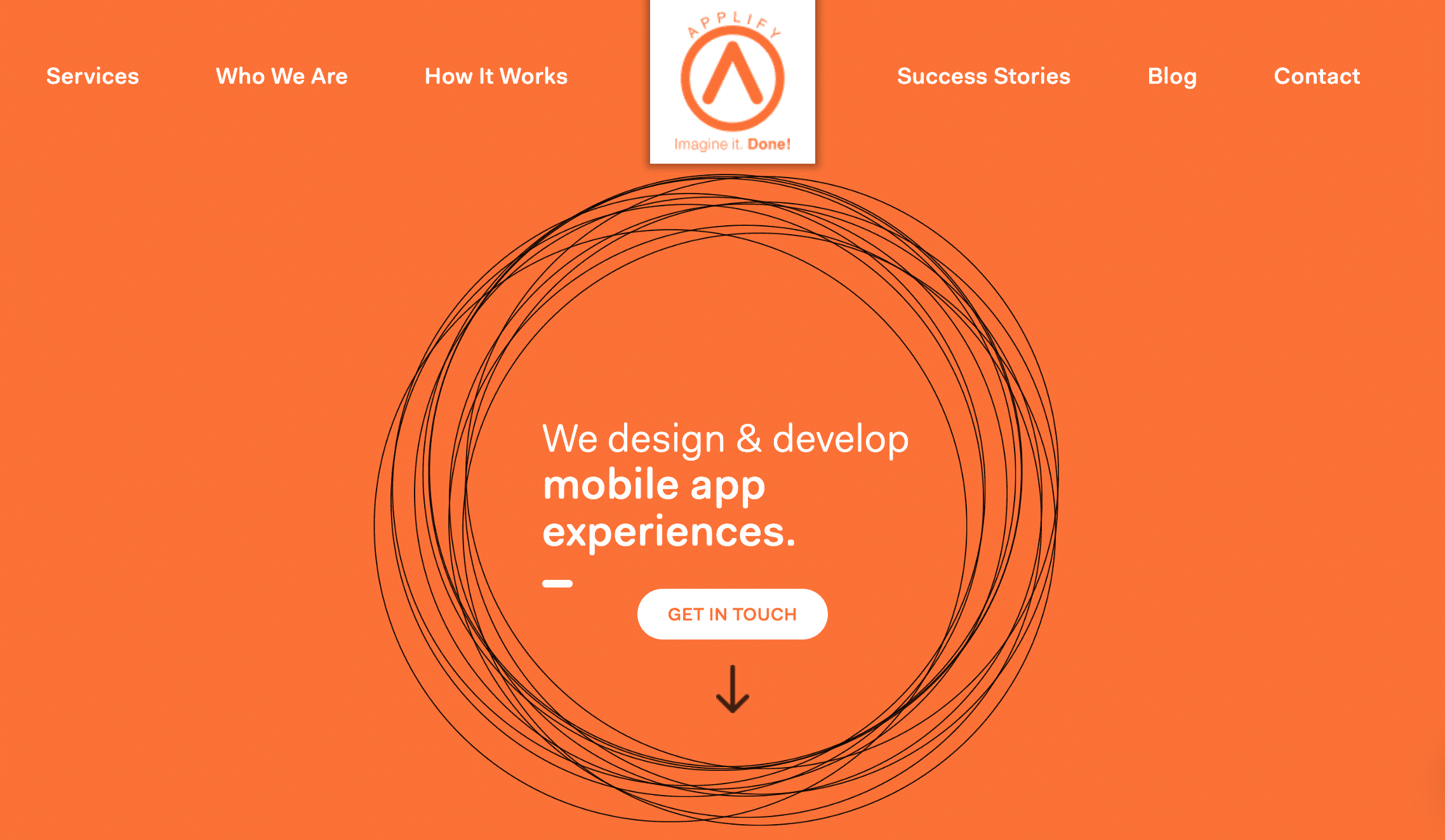
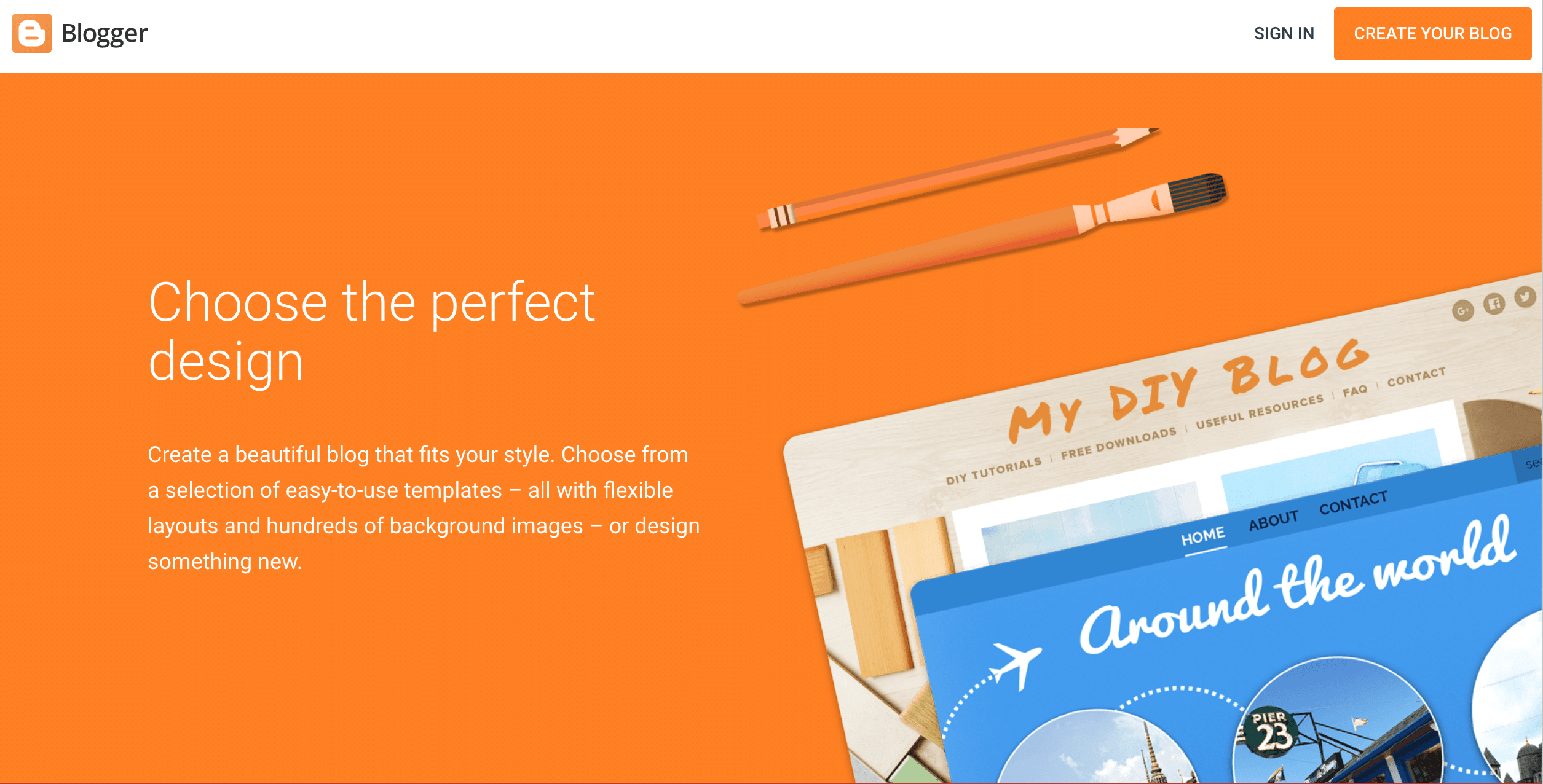
Above, we see an over-use of orange by Blogger. The CTA at the top blends in, hardly garnering attention.
It’s not visually unappealing, per se, and is certainly on-brand, but for a color that commands so much attention, orange everywhere makes it difficult to know which element on the page is most important.
After all, orange is a pleasant, warm color that’s softer than red, bolder than yellow, and miles away from anything cool.
With red and yellow, a slight shift along the spectrum gets you close to purple and green, respectively, but with orange, there’s no such proximity. It’s the epitome of warmth.
Orange in use
Orange is the color of sunsets and autumn, but it is also the high-vis hue of danger and alarm.
As you consider using it in web design, branding, or outreach, keep in mind what the color can evoke in your audience. Be aware of aesthetic, psychological, and cultural associations.
And, if you’re feeling like a splash of color could accent a certain message, consider orange. Or, in a bolder move (that should not be taken lightly), go all-in: employ the one color that’s far from cool, always cozy, frequently unexpected, and immediately welcoming.
Free: Assessment

