Topics:
Web DesignSubscribe now and get the latest podcast releases delivered straight to your inbox.
When it comes to color, the eye and the heart are linked.
Our reaction to what we visually prefer and the influence of powerful brands that have successfully used color to sway us into feeling a certain way both work together to give color (and color schemes) meaning.
Consider this infographic from the Logo Company, a logo design firm, which lays out famous logos and how they are meant to manipulate emotions:
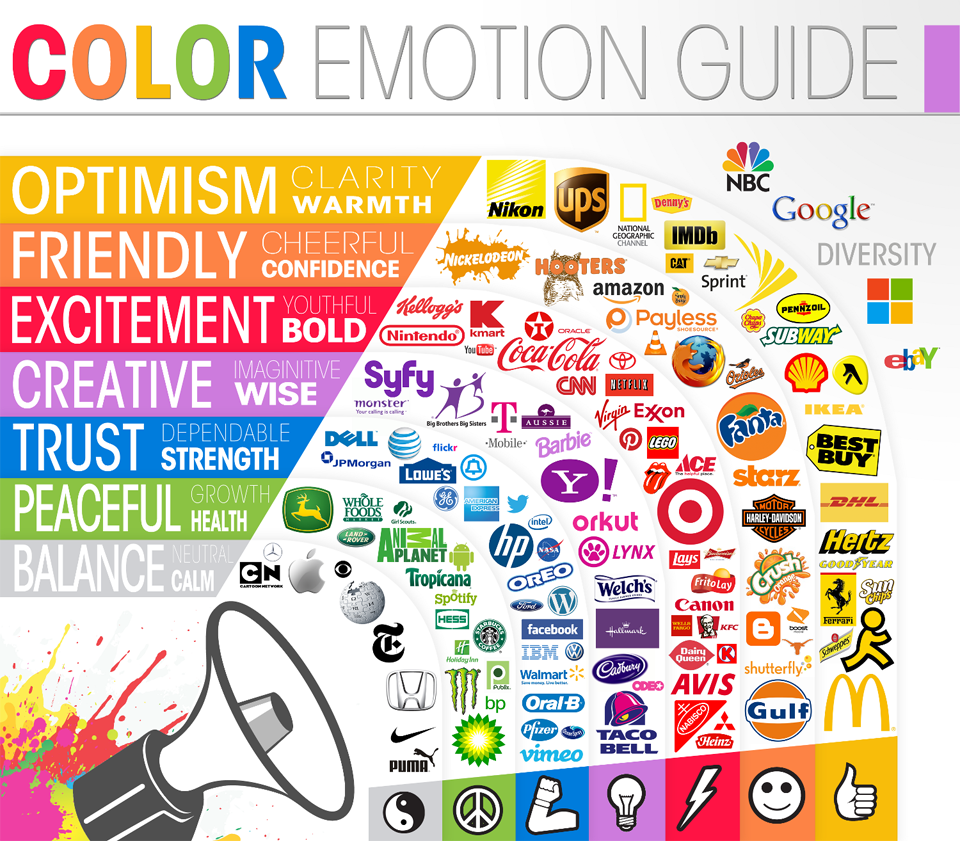
Does blue really make us think of trust and strength? Or have we seen so many “power-company” logos that we associate it that way?
When you see green, are you relaxed because you’re thinking of palm leaves or simply programmed by the design on your paper coffee mug?
Regardless of how these connotations and effects came about, the fact is that they exist and they are powerful, even for more unconventional colors, like purple.
Let’s Talk About Purple
Fun Fact: The color of Earth’s sky is actually violet. Human eyes merely see the sky as blue.
Color psychology isn’t new, and neither is the nature versus nurture argument surrounding it. Wherever the association might come from, the tie between color and emotion is strong.
That’s especially the case with purple, as people seem to either love it or hate it.
Purple’s associations run deep from Alice Walker’s heart-wrenching masterpiece The Color Purple (a novel that contains one heck of a great quote) to the haunting and catchy lyrics of a Prince song (and, really, Prince’s entire wardrobe), and from the absurdity of a children’s dinosaur to the freedom and imagination of a certain someone and a certain colored crayon.
Here are some common themes and logos running purple.
Women & Femininity
Purple is commonly associated with women and femininity, and more women prefer purple than men (minus Prince, of course).
That could be partially due to historic binary gender packaging, some evolutionary science, or it also might be because the color has been used with some powerful women’s causes. For example, the Women’s Liberation movement and the Women’s Social and Political Union, which fought for Britain’s women’s suffrage.
International Women’s Day
 International Women’s Day leaned into the association with women’s liberation and purple and chose the color for its logo. (They also picked the color at the same time PANTONE chose its 2018 color of the year, but we’ll get to that later.)
“Purple is historically associated with efforts to achieve gender equality,” the IWD organization said. “Now widely associated with contemporary feminism, the color purple symbolizes achievements gained and achievements yet to come.”
Urban Decay
 Cosmetics companies have been relying on purple for years to attract the eye of their key demographic — women. Urban Decay is no different, but their “Beauty with an Edge” tagline belies how this company is using purple to broaden what it means to be feminine.
“Our story opens nearly 20 years ago, when pink, red, and beige enslaved the prestige beauty market,” its website tells.
“Heaven forbid you wanted purple or green nails, because you'd either have to whip out a marker, or risk life and limb with that back alley drugstore junk.”
Through its logo, Urban Decay has made purple — and feminism — edgy.
Royalty & Luxury
Fun Fact: Only Roman emperors were allowed to wear purple togas. Those of lesser rank could, with permission, wear purple stripes. During Nero’s reign, it was punishable by death to wear or even sell purple dye.
Purple is a color that rarely appears in nature, and when it does, it appears in small amounts.
The earliest purple dyes date to 1900 BC, where it’s estimated it required up to 10,000 shellfish to extract the amount used to dye a Roman toga.
The dye, called Tyrian purple dye, became worth more than its weight in gold. With limited purple dye resources, the color was associated with the extremely wealthy and powerful, and emperors, kings, and queens quickly adopted purple as a color that represented nobility.
Even though purple is available to the masses today, the color still carries a deep association with royalty and luxury. In fact, Queen Elizabeth chose the color for some of the tickets to her coronation in 1953.
Famed author have used the color in place of royalty as well.
“He wrapped himself in quotations — as a beggar would enfold himself in the purple of Emperors.” —Rudyard Kipling
“There is no dignity in wickedness, whether in purple or rags.” — Herman Melville
Here are a few brands using this connotation to their advantage:
Purple Mattresses
Their name is Purple. Their products are purple. And their branding, well…take a guess.
The folks at Purple Mattresses make their connection to royalty pretty clear: “Why Purple? Well, why not? It is an awesome color, and it signifies treating everyone like royalty.”
Hallmark
 Hallmark’s ubiquitous design in full purple carries the crown, giving this the one-two punch of royal treatment.
The purple branding also carries with it connotations of the feminine and ties directly to Hallmark’s women’s lifestyle and movies channels.
Spirituality & the Supernatural
Given the rarity of purple in nature, it has also come to represent the spiritual and supernatural.
For many, it’s seen as something that’s not of this world. This is probably why the color often appears in religion, symbolizing oneness with peace and wisdom in Hinduism, the Christian Advent season, and redemption and purification in Judaism.
Syfy
 Spirituality’s association with purple extends beyond the world’s major religions into the mystical and supernatural. Cable network Syfy, which features science fiction, fantasy, and paranormal programming, chose purple for its logo while it built the network from 2002 to 2017.
Creativity & Imagination
Purple lies at the far end of the visual spectrum and it’s also believed to exist at the edge of the imagination as well.
As with the other concepts associated with the color, creativity and wild imagination are tied to purple because of its scarcity in nature. Purple represents thinking that’s outside average, free association, and the fantastical.
And, of course, who can forget 2018’s color of the year? It was PANTONE 18-3838 Ultra Violet, of course, chosen for creativity that purple inspires.
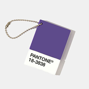 As Leatrice Eiseman of the PANTONE Color Institue said, “We are living in a time that requires inventiveness and imagination It is this kind of creative inspiration that is indigenous to PANTONE 18-3838 Ultra Violet.”
Yahoo!
 In its blog post discussing their 2013 logo iteration, Yahoo! called its logo “whimsical, yet sophisticated. Modern and fresh, with a nod to our history. Having a human touch, personal. Proud.”
Whether it's whimsical and creative on purpose, though, is a bit of a misnomer.
As it turns out, purple came to Yahoo! when its co-founders meant to paint the walls grey and ended up with lavender.
IMPACT Live
 I’d be remiss if I didn’t mention the choice of purple for IMPACT Live 2019, where IMPACT will be hosting 1,000 creative marketers and salespeople.
The color was chosen for this year’s theme based on its playful approach that harnesses the imagination needed to solve for the complexity of the digital marketing arena (and, yeah, it looks great with that IMPACT blue).
Is Purple Right for You?
You have the ability to choose colors that will affect your audience’s emotions and trigger their associations.
Can you include purple in a webpage to show the strength and determination of the women’s movement? Could you add purple to give your next Instagram post a hint of mystery? Or will branding your next product design with purple give it the luxury treatment for your would-be royal customers?
However you decide to use color, take the time to learn the history of its use so you know how you might be influencing your customers. It might make the difference if your audience skews blue, red…or purple.
Free: Assessment

