Subscribe now and get the latest podcast releases delivered straight to your inbox.
As the year comes to a close, we start to reminisce about the graphic design trends that helped carry us through the year and aided in our print and web choices, but one cannot simply analyze 2018 without wondering what’s to come in 2019.
At IMPACT, I’ve been using some of my time to research what’s been going on in the graphic design landscape for IMPACTs site. I’ve looked at
-
what other companies doing,
-
what are competitors testing,
-
what looks to be working,
-
what doesn’t,
...all to help formulate what to expect in the new year (as well as how it should guide IMPACTs design too!)
To set the premise, 2019 will likely explore motifs and styles of the past. This will create a sense of nostalgia for those from past generations, but feel new and fresh to those from the most recent two decades.
As technology continues to advance, there will also be a push towards breaking the design boundaries and introducing something no one has seen or explored before.
So, what will 2019 offer? Read below to find out the top seven trending patterns!
1. Complex Gradients
Gradients are back, brighter and bolder than ever.
Rather than utilizing them in the standard linear sense (simple horizontal appearance of one color to another), gradients are now being blended together to create a more dimensional appearance.

Gradients are trending on the brighter and vivid spectrum. For example, designers will use several warm-tone colors to create an airbrushed effect that will invite life and weight to a design.
With the trend towards more white-focused interfaces, labeling, and web design, it looks as if needs to be something else to fill the void of color, and gradients appear to be part of that solution. We can see companies such as Stripe, Lines Conference, and Mobipaid have been really doing a beautiful job of pushing this new trend forward.
When applied to very simple and stark white designs, gradients like these can tie the design together, by visually flowing elements together.
If you decide to experiment with this trend, make sure you use the gradients with purpose, otherwise, you may end up distracting from where the real focus needs to be.
2. Redesign to San Serif Logos
With the update to the Google logo to the sans serif look, brands everywhere have been slowly hopping on a similar logo redesign train.
Jonathan Hoefler, a type designer, believes the movement towards sans serif fonts is due to the “traditional notion that sans serifs connote progress and modernity while serifs evoke nostalgia.”
This is why brands in the biotech and aerospace sectors have gravitated towards this design trend from their beginnings.
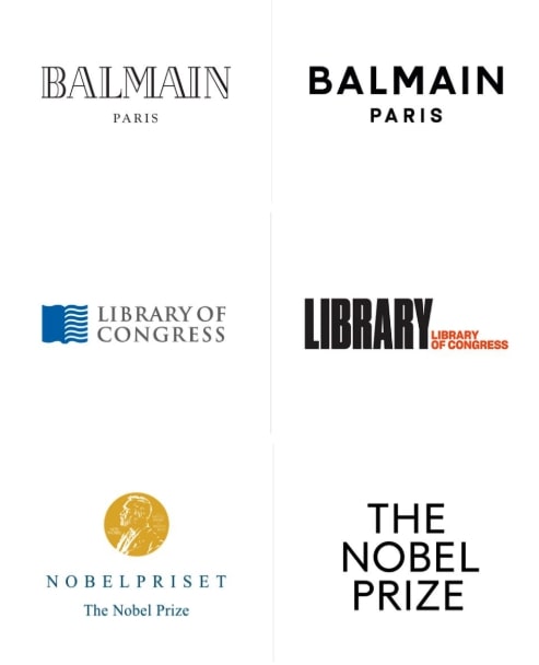
This movement was also part of a desire from modern designers to strip away what they considered to be ‘decoration.’ This challenged them to move towards a design that still had character, but left the viewer feeling the overall design is simply cleaner.
These logos also give brands the convenience of using their own logo fonts for their body fonts for print and web as well, rather than attempting to find a complementary typeface that works with the logo.
3. Retro-Modern Illustrations
They say old styles always make some sort of comeback, and that’s exactly what we are seeing with illustrative designs leading into 2019.
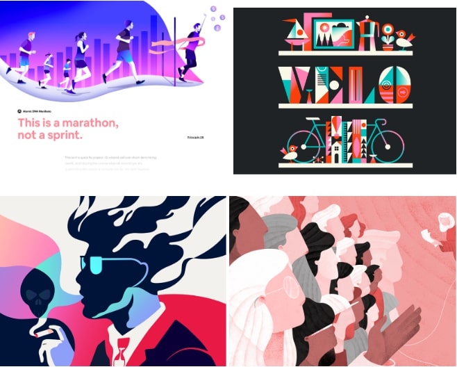
Modern designers are combining some of the art-deco and abstract elements of the 1920s with both type and human form and introducing them to bright color palettes to evoke energy and youth.
You’ll also notice most of these graphics introduce more organic lines and shapes, similar to a surrealist art style, yet still crisp enough to understand what the image is supposed to show.
This trend is also becoming heavily used in web design to illustrate scenarios for more descriptive sections on a page (as seen in the first image in the examples above).
4. Typography that Breaks its Bounds
Far too often, we think of type as something that needs to be placed separately from our graphics in whatever open spaces are available, but that’s not a guideline designers want to adhere to in 2019.

The end of 2018 is hinting at fonts and imagery becoming combined in compositions to explore both depth and space in more unexpected ways.
In the examples shown above, the type no longer feels like this additional, yet separate, element that's used to explain the image. Now, it almost feels like its a part of the photograph and was almost meant to be there.
Of course, this trend does have the potential to get messy if you aren’t careful with it.
If you decide to explore it, make sure to tastefully use it more-so for headers, as body copy may become too messy to read.
5. Use of Motion Graphics
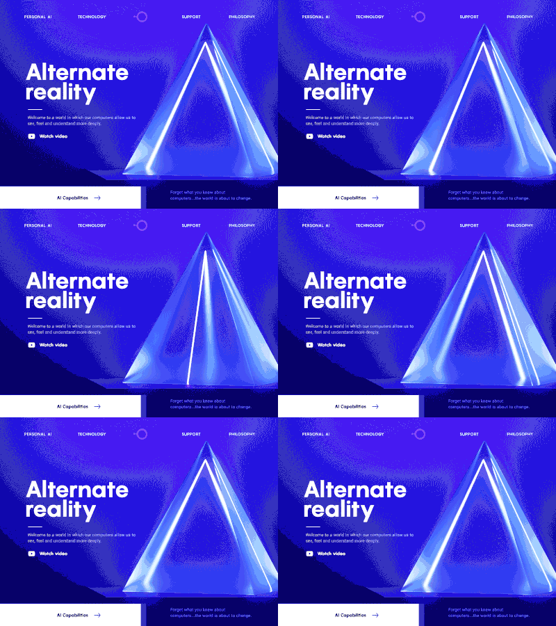
With the progression of computers ability to better process and display web pages on computers, we’ve reached a point where we can push the boundaries of graphics to move and even react to movement and actions.
.gif)
.gif)
In iconography, motion is being used on application icons when transitioning to different ‘states’ or ‘steps’ when completing a task.
This helps indicate the completion of one task or the preliminary introduction of the next one.
There’s also a strong trend to use movement in typography.
This most likely stems from the wide use of video and advancements in motion graphic tools and is helping brands attach feeling to their voice or logo.
For example, if a company presents a quote written out in text and animated in a particular way, that animation is going to make you think a certain way about that brand.
Did the text come in energetically? Was it subtle? Does the quote stand alone or is it being applied to another medium?
These will all play into how companies can assert their personality in more abstract formats in 2019.
6. Photos Evoking Emotion & Action
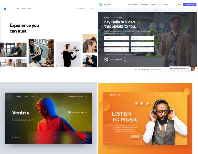
2018 saw a huge push towards showing people ‘the thing.’
In other words, if you have a product you are trying to sell, you shouldn’t use words alone to describe it. You should have been showing people how it looks, feels, and behaves, otherwise, it doesn't exist.
While this helped brands create a better representation of their products, it’s now time to pull people back in again.
There appears to be a shift towards graphics that are using people to help represent the product being sold. In some cases, this is shown simply by having a person using the product. In others, people are emotionally representing what the product hopes to make you feel.
In other instances, such as the Vidyard hero area example shown above, humans can play a part in adding humor to the desired action on a page.
In most cases, it all comes down to figuring out what will best visually represent the experience of a product to subconsciously convince your view of what it emotionally relates to.
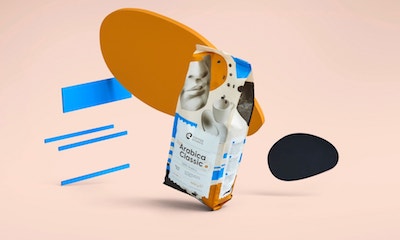
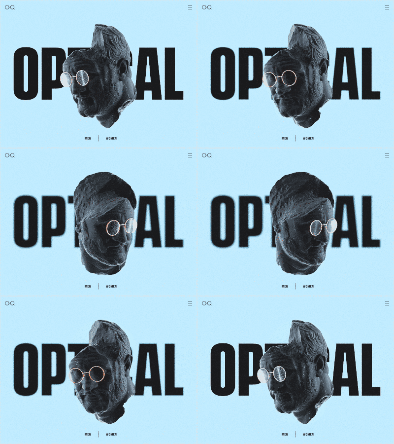
7. 3D
Don't worry, this comeback of 3D won’t involve us having to wear red and blue, headache-inducing glasses.
With the availability of improved 3D rendering software and tools, I anticipate there will continue to be an increase of graphics utilizing this format.
.gif)
One of the beauties of 3D is it helps better display the dimensionality of products or figures, it also helps to make the object that much more tangible.
In many cases, this will be heavily developed in the AR sector as developers continue to push the limits of the tools in what they can produce. With apps such as Snapchat and Pokemon Go continuing to explore how graphics interact with in real space, there is no telling what will be created in 2019.
Make Sure to Use These Predictions Wisely!
Although it looks like design styles are trending towards some of these areas, this doesn’t mean you should be implementing any of them without discussing what benefits it would provide to your brand. Look at these predictions as elemen


Order Your Copy of Marcus Sheridan's New Book — Endless Customers!

