Subscribe now and get the latest podcast releases delivered straight to your inbox.
It’s no secret that there’s power in design and what it can do for brands and businesses.
Every year, design trends alter the way we engage with our audience.
In 2019, heightened social media strategies, redesigns, and packaging innovations were rampant as brands stretched to be as colorful as the consumers that follow them.
To spark some inspiration for your 2020 engagement strategy, we’ve gathered a few of our favorite trends and compiled a list to guide you into a new year of innovative design.
Take a look at the examples below for tips on how to best use design to reach your audience.
1. Authentic imagery:
We all want the visuals we put in front of our audiences to appear professional and streamlined, but have you ever considered that “prim and proper” might be, well, a bit too prim and proper?
Instead of using posed stock photography and other “picture perfect” imagery, consider featuring original photography or candids in your graphic design.
Natural environments, body language, and the faces of your real team build trust and can make your brand feel more approachable and relatable, without sacrificing professionalism and purpose.
This is a practice that has become quite commonplace on social media, especially Instagram.
A great example of this can be found from the high fashion brand Balenciaga, which recently has been using less polished content to promote their clothes in a more natural way.
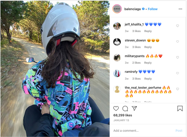
At first glance, it is hardly detectable that the photo, posted on Instagram, is a Balenciaga advertisement. Usually known for its unusual silhouettes and grand designs, this imagery is uncharacteristically down to earth.
Here, they lean on authenticity, engaging with their audience by sharing a snapshot of their clothing in an ordinary or relatable instance.
By embracing the in-the-moment culture of Instagram, Balenciaga disrupted the “polished” persona of their industry and grabbed attention as a result.
Are we saying that everything posted on your socials should be an abstract, meme-ready photo?
Not at all, but ditch the generic stock photography, and connect with your audience using original or user-generated images that visitors can see themselves in.
2. Asymmetry:
Design is meant to be eye-catching and in 2020, this may mean ditching uniformity.
While asymmetric layouts may feel disorienting to some at first, trends are showing that this design style may create a new sense of interest and surprise for your audience.
By not following a square grid or predictable pattern, asymmetry requires and draws more attention.
The deviation from what’s expected not only offers a refreshing look to your designs, but can ignite curiosity about the location of different elements, such as pictures or text, as viewers scan an image.
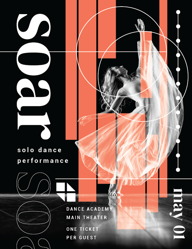
Take a look at this example I created above.
In this poster, I used the separation of date, location, and ticket details to guide the viewer’s attention through the whole design. This is something that may not have been accomplished if these elements were set in a traditional grid.
This makes consuming the information more compelling and in many ways more memorable and even “experiential.”
Overall, if you’re given the opportunity to break from what’s conventional, asymmetry is an effective device for taking your audience on a visual journey.
3. Innovative typography:
The last few years, we’ve seen designers get inventive with typography, using fonts and type styles to emphasize and enhance their messaging.
In 2020, the trend is expected to become an even more prominent feature in graphic design.
Satisfying more than just aesthetics, typography is a useful tool for establishing tone and brand voice because of the variety of elements available to reflect personality.
Geometric shapes, bold colors, and even floral designs are only a few of the creative elements that can become an extension of your communication strategy when included in the text of your graphic design.
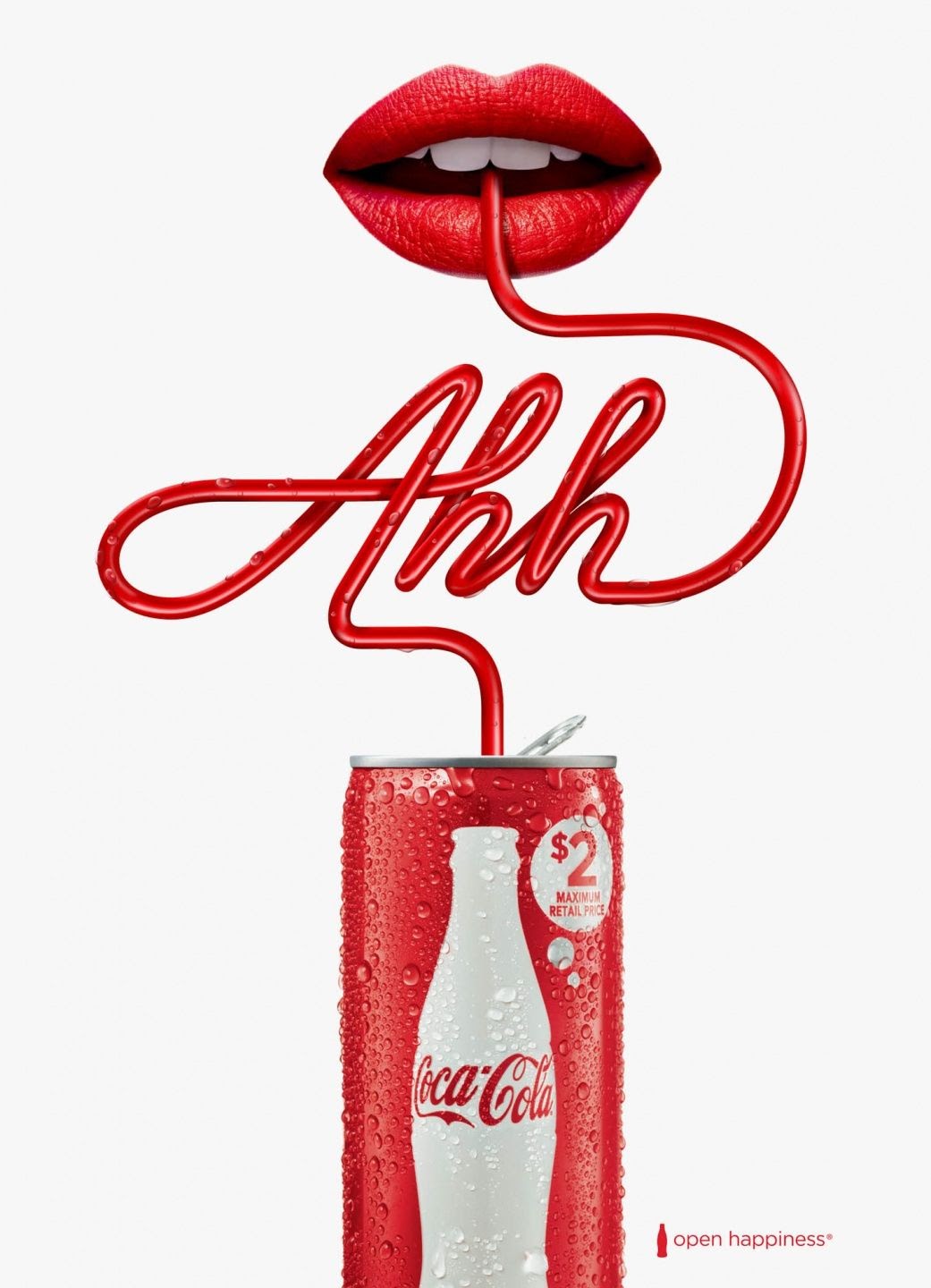
In the example above, beverage company Coca-Cola uses creative typography to emphasize the taste experience their soda gives consumers.
By illustrating the simple message, “Ahh,” the company was able to bring in elements like the color red and its can that consumers associate with the brand and also highlight the relatable experience of sipping it through a straw.
Thick, boxy fonts are another trend commanding attention in graphic design.
Dubbed “Maxi Typography,” this type style has been a popular choice for logos, on posters, on web layouts, and on package design.
The thickness of the letters, which can get so heavy that designers split words into multiple lines, provide a strong contrast against the background and are an effective way to make your message highly readable.
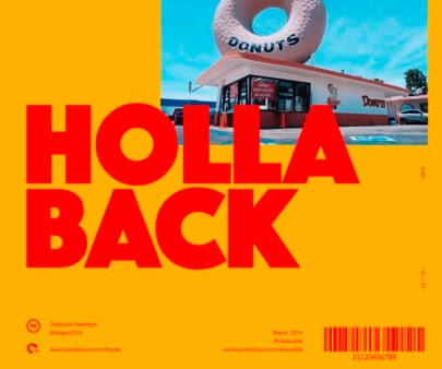
In the example above, the thick, bright red letters are the focal point of the flyer.
Even from a distance, viewers should be able to read the messaging and their eyes are drawn to the center of the print, where additional branding is located. This is a great tool for commanding attention.
4. Isometric design:
Isometric illustrations are another design style that have been populating trend lists for years.
Simply put, isometric illustrations add depth to design by taking a three-dimensional object and flattening it into a two-dimensional render.
This keeps the character and definition of the original 3D object, but allows you to show more details with less clutter.
They are often used as a way to make a design or information pop off a page.
The result is a realistic, but easily consumable design.
With the addition of shadows and different perspectives, viewers are provided visual hierarchy and may be better equipped to understand the ideas or concepts being shared.
This becomes an especially useful design tool in 2020, as our digital spaces expand and complex information is shared through phone apps, handheld devices, and other mediums requiring easy digestion.
In this example, Bitcoin, like others in the e-commerce industry, benefits from the use of isometric illustrations.

Currency exchange is a complicated topic, but this design style does a great job of breaking down the concept visually.
With the use of icons, Bitcoin was able to simplify their exchange process in one consumable image.
5. Line art:
On the other hand of illustration, some designers are opting for a more simplified way to illustrate their patterns and designs with line art.
Line art is not a new trend, but one highly regarded in contemporary and minimalist environments. They are a clean, elegant way to convey concepts and are commonplace in guidebooks, product packaging, and web design.
When done well and strategically, the use of lines can direct your viewer and draw their eye toward the main subject in your graphic design.
Line art icons often also act as an efficient guide through a design or can represent different facts, actions, or bits of information.
Lastly, line illustrations are a great way to incorporate patterns, branding, or pops of fun into your design.
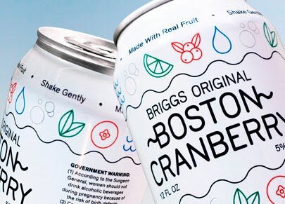
In the example above, Briggs Hard Seltzer used line art for a recent brand.
As a premium beverage company, it was necessary that Briggs differentiated themselves from their competitors and communicate their key benefits.
The use of line art allowed them to do this, highlighting nutrition facts, like being made of 100% real fruit ingredients and being low-carb.
Ready. Set. Go!
It’s no surprise that graphic design trends change and evolve every year, but
as a rule-of-thumb, remember you’re not obligated to adopt every new design style.
It is more important to use design elements that appropriately reflect your brand than to jump on each fleeting trend.
With that said, stretch your creativity to find ways to make current trends work for you.
Keep design relevant to engage your audience.
When aligned with your marketing strategy, refreshing design can garner new customer interest and keep the attention of your followers.
And above all, listen to the creative genius living inside you! You could be the creator of the next big design trend, so never be afraid to experiment.
If you need further inspiration, or just a partner to implement your company’s design refresh, Design Pickle is only a click away!
With a dedicated personal designer, unlimited requests, and quick turnaround times, revamping your design strategy is seamless.
Free: Assessment

