Subscribe now and get the latest podcast releases delivered straight to your inbox.
Twitter's Desktop Gets a Much Needed Redesign

Jul 16, 2019

A redesign of Twitter’s desktop shouldn’t be a surprise. As of July 15th, the platform started rolling out its new layout.
It’s been seven long years since Twitter's desktop had a facelift.
For the past year, the platform has been working to understand why people use it and how designers can make the platform better for its users.
Twitter even created its own beta app to better understand user needs. Since the beginning of the year, Twitter has been beta testing new versions of its website.
During the tests of the previous design prototypes, you had the ability to revert back to an older version. That’s not the case with the roll out of the official redesign.
The premise of redesigning its desktop was to make it easier for users to navigate.
Let’s take a closer look at the redesign.
Twitter’s redesigned desktop
Over the last few months, Twitter experimented with various changes to see how a small percentage of users would react. During those experiments, designers moved around the search bar and tested out bookmarks.
These weren't drastic changes. Twitter kept it simple, creating a new starting point.
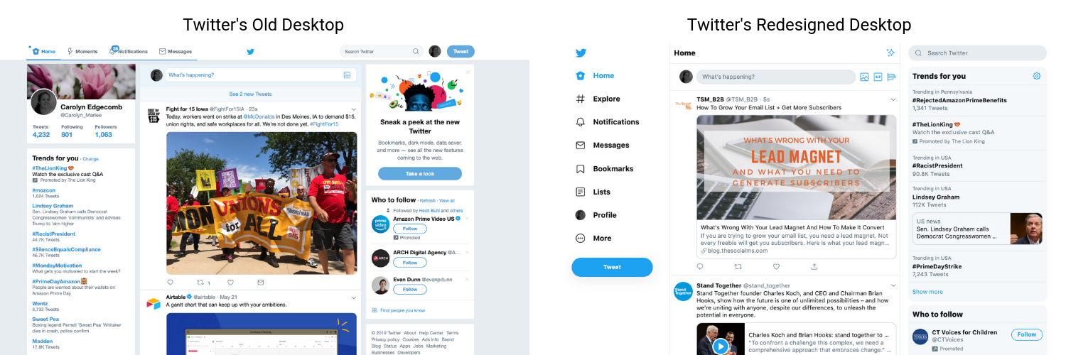
In the image below, you can see the varying differences between the old and redesigned desktops.

Twitter’s Senior Director of Design, Mike Kruzeniski, says, “Some of [the redesign] is subtle, but a lot of it is a simplification of design. We are trying to find the right places to be bold again, but it’s a resetting of that foundation. Starting with the best stuff and building from there.”
You’ll notice Twitter kept its three column layout, but redesigned and arranged those columns, making it easier for users to find what they’re looking for.
One of the biggest changes was moving the top navigation to the left sidebar. In the sidebar you will be able to access your messages and notifications, as well as tweets you’ve bookmarked and any lists created.
You’ll also notice the Tweet button is no longer at the top of the screen but also within the left sidebar.
The new design is simple and clean, with a similar feel to a mobile app.
Easily switch between accounts
You can FINALLY switch between Twitter accounts. This has been a top feature request for a long time.
While this was something you were able to do on mobile, that wasn’t the case for desktop. You had to regularly log out and log back in to another account.
In the left sidebar, there’s now a new profile button, making it easier for users to switch between the various accounts a user might manage. This is extremely helpful for marketers and individuals who manage multiple accounts, especially when you’re switching between personal and business.
Ability to customize your desktop
Unlike most other social platforms, you now have the ability to customize your Twitter desktop.
“Personalization and customization — that’s something we hope to start bringing out throughout the product,” says Ashlie Ford, the product designer who led Twitter's redesign.
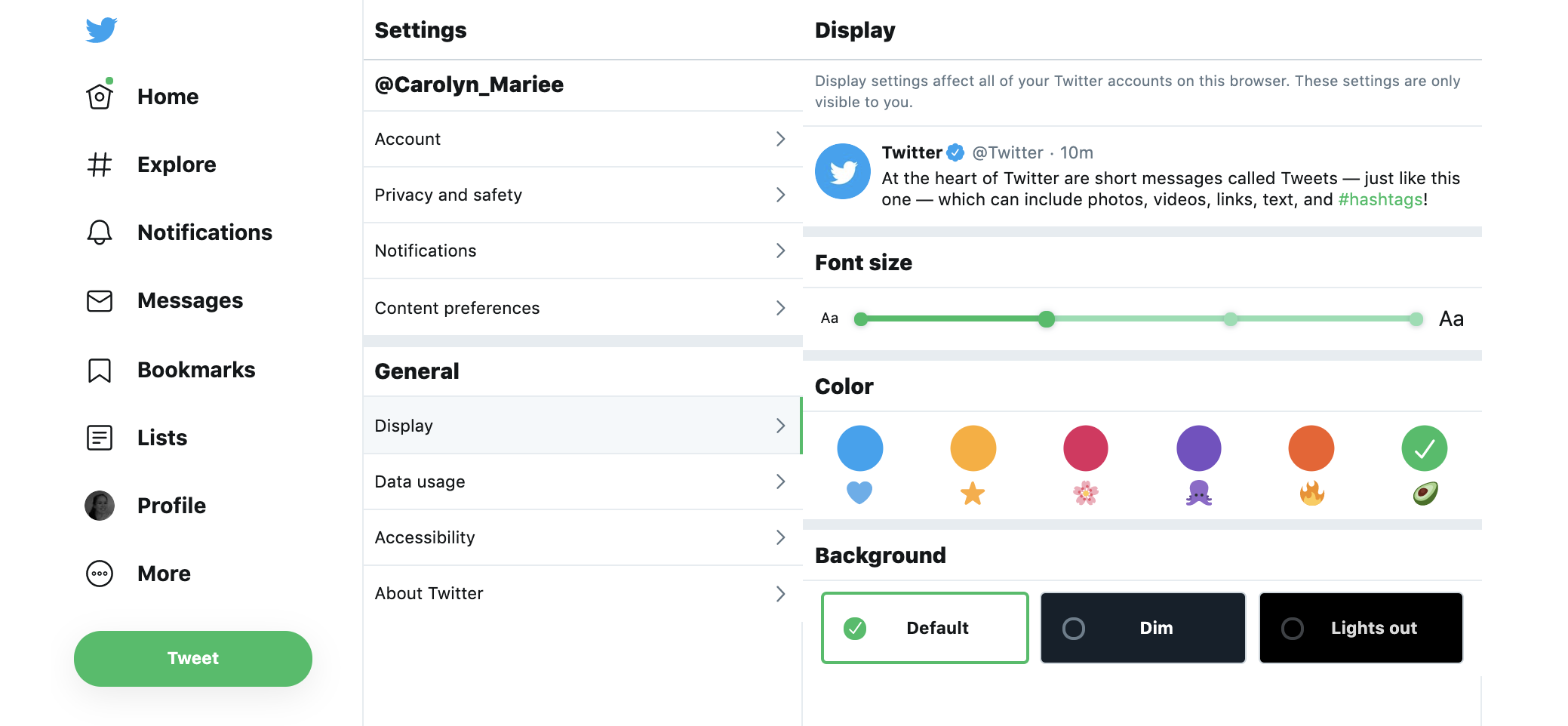
Customizing your desktop is simple. In the left sidebar, you’ll want to click More, and then under General go to Display. With the new design, you’re able to adjust font sizes, choose an accent color, and utilize one of Twitter’s new dark modes.

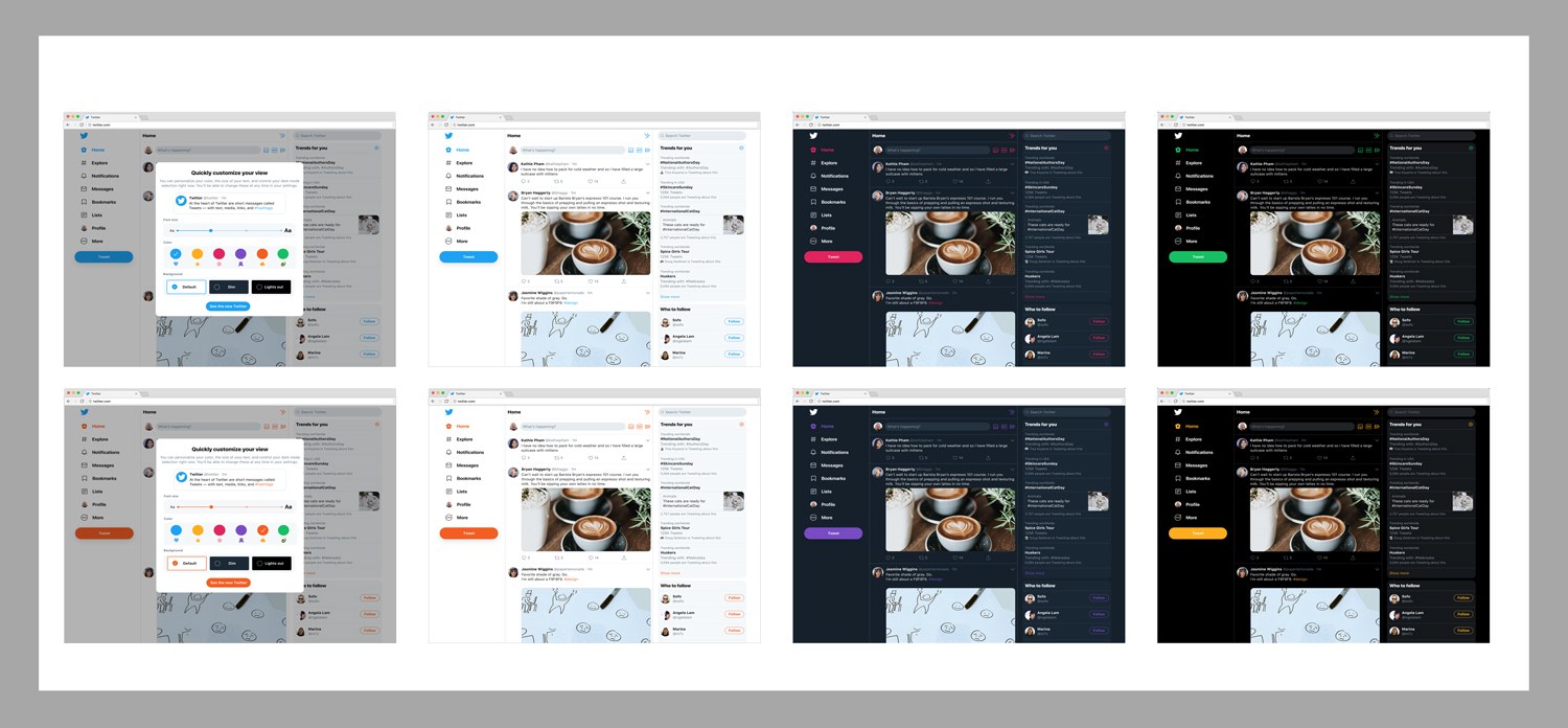
You can adjust the app’s background with one of Twitter’s two new dark mode options. One version is Dim, which gives you a blue-gray background, and the other version is Lights Out, which turns the background black.

Image courtesy of Twitter
What this means for marketers
I’m sure you’re excited about the ability to switch between your personal and business accounts, but Twitter’s redesign has a bigger underlying message.
It’s about making sure that a platform or product meets users’ expectations. Regularly updating and improving your website is extremely important, and you should be doing the same to your social platform, web interface, or client portal, whether you are a small company or a tech giant with hundreds of millions of users.
Twitter’s hoping users will find the desktop redesign exciting and that it will also bring users back to the platform.
What are your thoughts on Twitter’s redesigned desktop? Let us know in IMPACT Elite!


Order Your Copy of Marcus Sheridan's New Book — Endless Customers!