Topics:
Lead GenerationSubscribe now and get the latest podcast releases delivered straight to your inbox.
 If I asked you what the most important part of a landing page is, your go-to answer is likely content and I’d be hard pressed to argue with you, but the part that truly matters, and usually gets the least amount of love, is the form.
If you’re looking to overhaul your landing pages and create higher converting forms, you’ve come to the right place.
I compiled some examples of UX/UI elements from around the web that are sure to delight your users and increase conversions even if they don’t realize it.
1. Clean Up Your Field Labels
Every form has labels; how you choose to utilize them is up to you.
Studies have shown that the overall size of a form can determine its effectiveness. If the form looks enormous or complicated because you have 10px of space between the label and the actual field, people are people going to hit the back button as fast as they can, killing your conversion rates.
Putting placeholder text in each field is a great way to shrink up your forms.
That means there aren’t field labels to add unnecessary length, but unfortunately, it also means that once someone starts typing, the label goes away, making it more likely that people may forget what they were filling out (hey, it happens to the best of us).
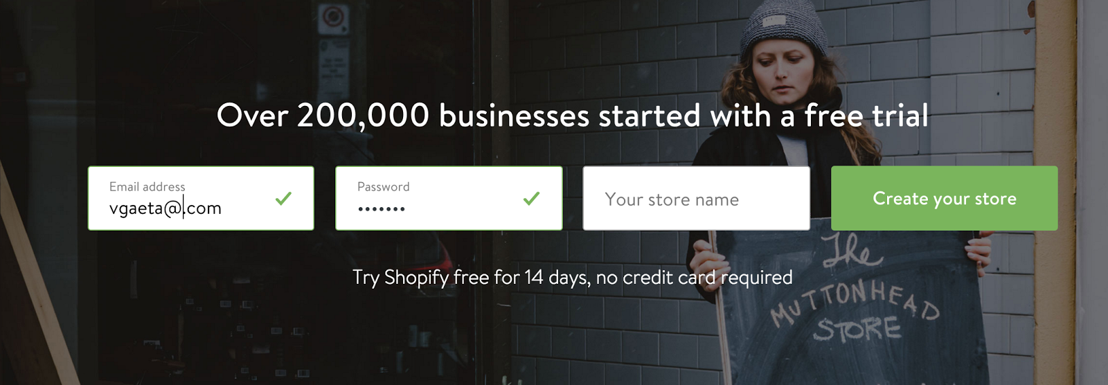
Shopify uses a great UI element on their subscribe form that transitions the placeholder to the top of their form fields. This is a clever way of keeping the form area small, but the label in front of the user at all times.
This is a small, but extremely helpful way to make the conversion process easier for users and in turn, making your conversion rate more likely to increase.
2. Tell Them What to Expect
Most landing pages do a great job of telling you what you’ll get for filling out their form, but FalconSocial is making 100% sure their users understand what comes after they submit by adding a “What happens next?” hover modal.
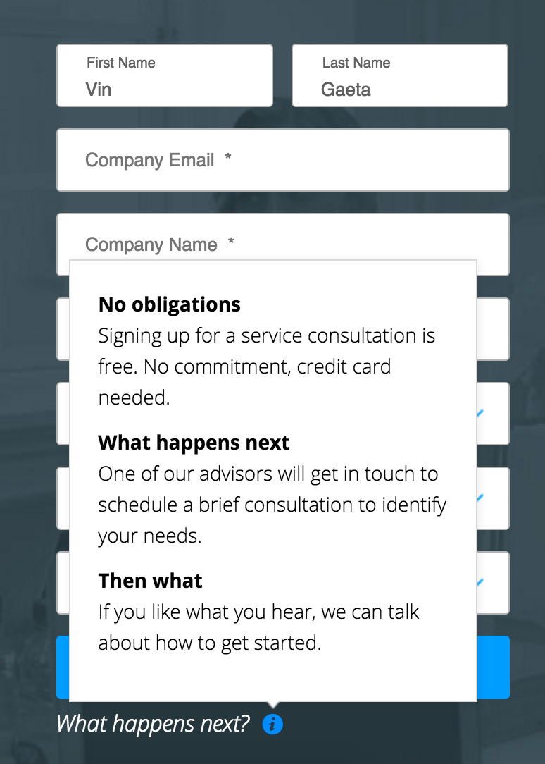
This simple addition quickly and easily tells you what will happen when you click that button, building trust.
If people know exactly what to expect when they submit the form it lowers their guard and makes them more willing to convert.
This is also great way to keep your landing pages streamlined, while also showing your user how simple the next steps are.
3. Show Value with Amazing Supporting Text
Regardless of whether your form is on a dedicated landing page or a subscribe field on your homepage, messaging and supporting text is vital.
If you’re not providing value to the user, they have no reason to give you their email address, let alone any other information. You need to explain why they need to fill out the form in as few words as possible.
Wistia does a great job with their newsletter subscribe form’s supporting text on the library page.

They tell you exactly what to expect, where to expect it, and how frequently you’ll get it. This makes it really easy for the user to say, “Why yes Wistia, please impart some fresh video marketing content upon me weekly.” That is what you said, right?
All joking aside, making your form or landing page text direct and easy-to-understand is the best way to ensure your audience gets the value you’re providing them, or hoping to provide them.
4. Create an Immersive Experience
This might not apply to every situation, but it’s definitely something to keep in mind for your next landing page.
What’s better than a higher converting form? A higher converting form that the user doesn’t realize they’re filling out.
The team over at Gasket.io has done an amazing job with this on their .
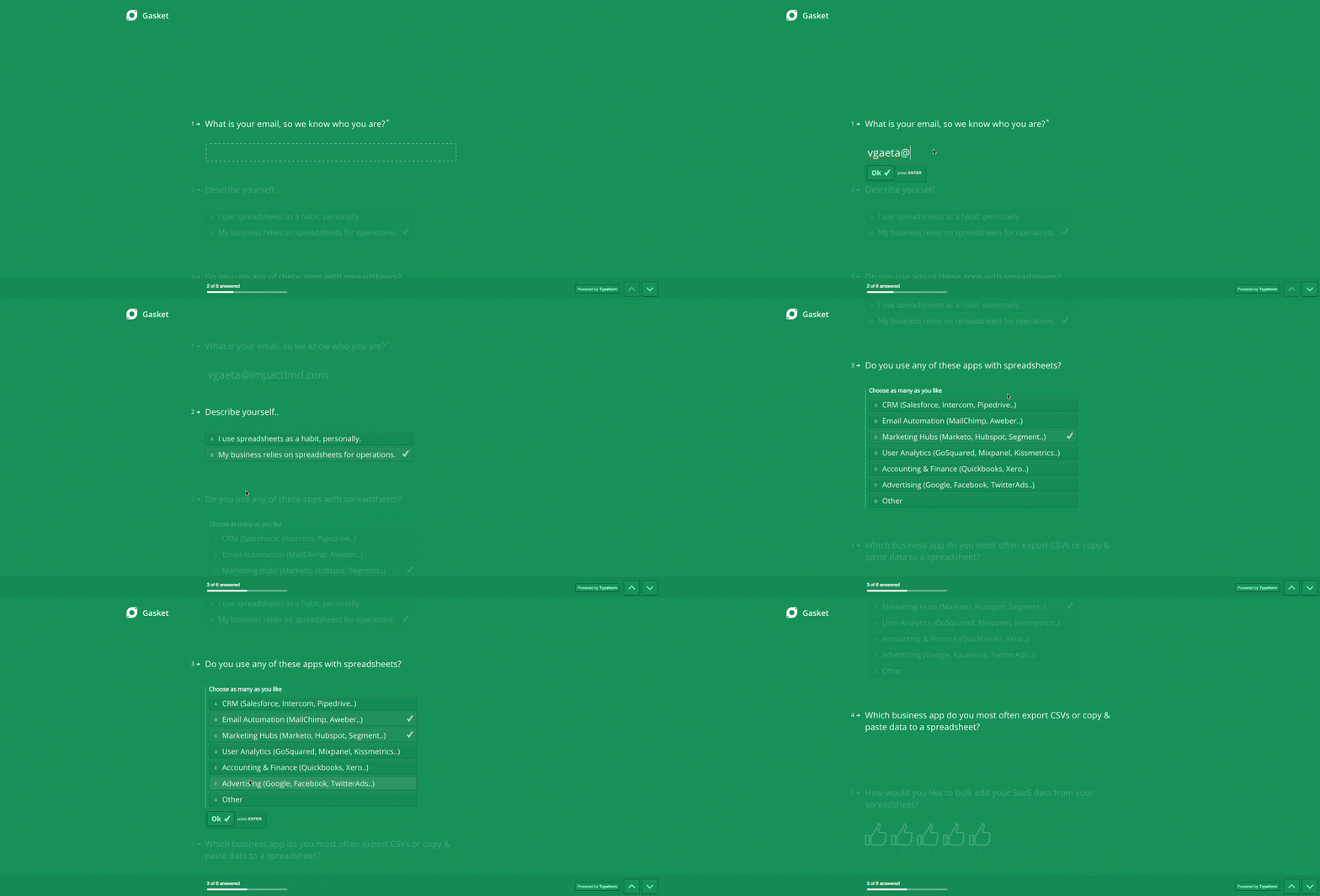
To sign up for the beta of their “Google Sheets as a front end” service, you’re taken through a beautifully designed, immersive form that feels seamless and is easy-to-use and understand. It doesn’t feel intrusive like most forms and actually makes you want to continue providing information.
The Takeaway
Improving your UI Design is a surefire way to get higher converting forms on your site. Cleaning up your form fields, creating an immersive experience, and telling the user exactly what to expect are great ways to improve your user experience, increase trust, and build the convert needed to follow through.

Order Your Copy of Marcus Sheridan's New Book — Endless Customers!


