Topics:
Marketing StrategySubscribe now and get the latest podcast releases delivered straight to your inbox.
In my pre-marketing life, I worked as an assistant for a wedding planner.
After about my first one hundred weddings, it became increasingly easier to predict how the night would pan out (heartfelt ceremony, alcohol-induced best man speech, the electric slide, etc.)
While most agendas were seemingly interchangeable, I found that it was the details that worked to differentiate each special day (the vintage lace veil inherited from grandma, the Star Wars themed cake toppers, the epic choreographed dance routine, etc.)
Often times it's the tiniest of things that stick with us, which is precisely why microcopy in marketing deserves a bit more attention.
What's microcopy?
Unlike traditional copywriting, microcopy refers to the small bits of text that work to color the rest of the content on the page. Whether it's in place to instruct, contextualize, or alleviate concerns, microcopy is one of those small considerations that has the ability to make a profound impact on the performance of your content.
To help you enhance your website experience, we've collected 5 examples of brilliant microcopy from companies like Shopify, HubSpot, and everybody's favorite snack that smiles back, Goldfish.
5 effective ways to use microcopy in your marketing:
1. Email

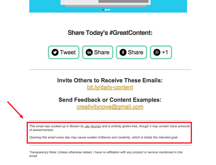
(Source: The Daily Content)
Content Marketer, Jay Acunzo, proves that email footers don't have to be a snooze.
By leveraging this tiny bit of real estate to infuse some charm into his already personable email newsletter, The Daily Content, Acunzo is effectively humanizing his content.
2. "Terms of Service" page

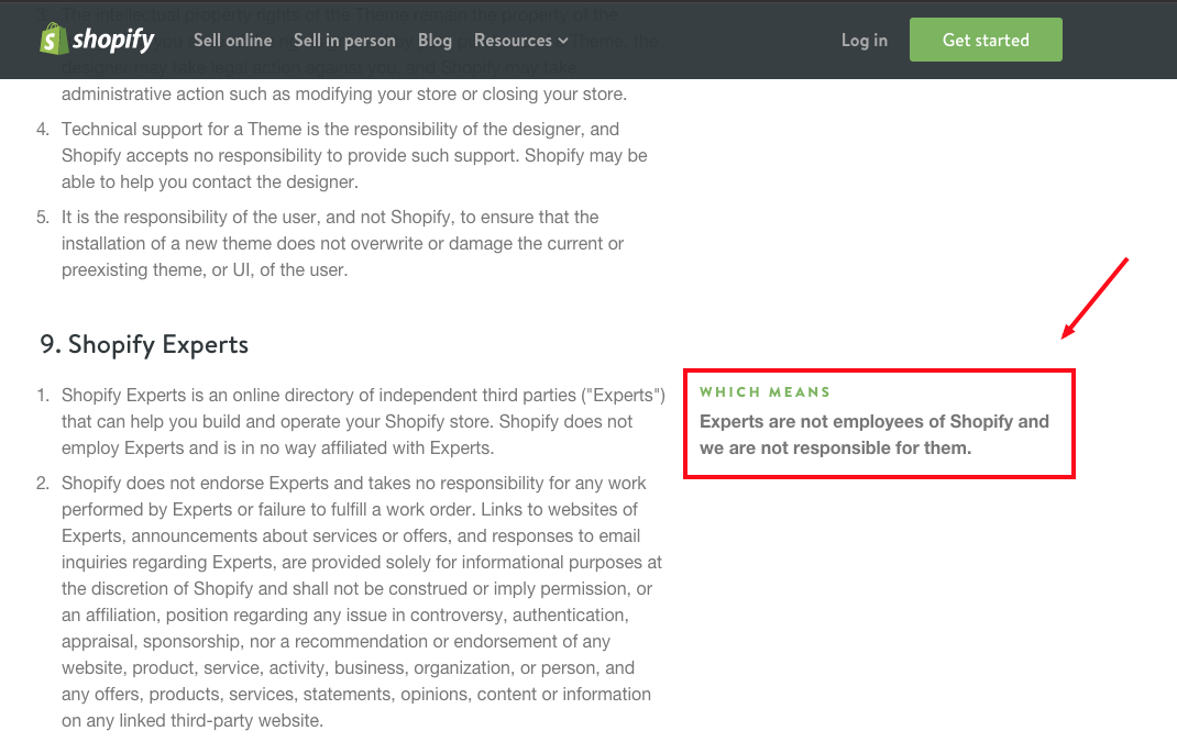
(Source: Shopify)
"It really doesn't take that much effort to just be a little bit different, and to just do something a little bit more remarkable," says Shopify's CMO, Craig Miller. (Source: The Growth Show)
Shopify's Terms of Service page is proof of just that.
By going to extra mile to offer up a stripped-down version of the jargon-heavy text that comprises their Terms of Service page, Shopify was able to create a buzz around a page that people typically never talk about.
3. 404 pages

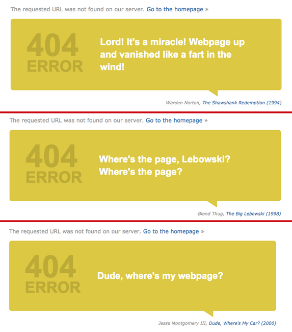
(Source: IMDb)
Ah, the 404 page.
While the goal is to limit the number of error pages your website visitors come in contact with, you can't win them all. With that said, we love the way that IMDb chose to include error-inspired variations of famous movie quotes to provide comedic relief when a visitor's request cannot be retrieved.
You've got to admit, it's tough to get mad when you're greeted with a quote from Dude, Where's My Car, am I right?
4. Instructions


(Source: HubSpot)
If microcopy were a sport, HubSpot would deserve all of the trophies.
Their software is riddled with witty microcopy that aims to enhance the user experience while simultaneously providing necessary instruction.
From the "beloved followers" quip in their social publishing tool to the "nailed it" inclusion within the SEO view of their blog editor, these small details work to ensure that the user gets it right the first time (and enjoys themselves in the process.)
5. Subscribe CTAs
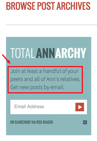
 (Source: AnnHandley.com)
The microcopy included in Ann Handley's subscribe CTA, like all of her writing, is peppered with warmth and personality.
The comical remark regarding her family member's subscription to her blog is relatable, in that anyone who has written something from the ground up knows what it's like to start with just the support of your friends and family.
Introducing a bit of charisma on a subscribe CTA serves as a great way to connect with your audience, and ultimately persuade them to fork over their contact info.
3 expert tips on how to write microcopy:
1. Reference sites that share a similar voice
Writer's block is merciless, even for the clever writer behind HubSpot's microcopy, Beth Dunn.
When the idea well runs dry for Dunn, she turns to a series of bookmarked websites that align with HubSpot's helpful (yet playful) voice to turn up some inspiration. Of these said websites, she often frequents Go Fug Yourself, a fashion blog that explores the good, the bad, and the ugly in terms of red carpet looks. (Source: HubSpot)
"They're always funny and helpful and warm," says Dunn.
2. Get to know the user
If and when possible, turn to usability testing to turn up insights that you may be overlooking as a result of your heavy involvement in a copywriting project. This type of observatory feedback has the ability to shape the direction of your microcopy in a way that you'd never be able to achieve through self-revision.
Creative director and content strategist, Bill Beard, insists that the key is to listen closely.
"You’d be surprised by what you can learn about a user and their language set from a comment they make about a cup of coffee. Everything someone says tells you something about them and can inform your copywriting process," says Beard. (Source: Smashing Magazine)
3. Write for common sense
"Something that may be common sense to the designer or developer of a website is not always common sense to the user," says creative writer and UI designer, Jake Rocheleau. (Source: Web Design Ledger)
When pairing copy and design, don't be afraid to explore different variations of microcopy to provide the user with the clarity they need to complete a desired action. While you may see things one way, you want to ensure that you're never leaving visitors hanging.
In other words, it's better to be safe than sorry.


Order Your Copy of Marcus Sheridan's New Book — Endless Customers!

