Subscribe now and get the latest podcast releases delivered straight to your inbox.
It’s almost that time of the year; The holiday season.
Soon we’ll be planning our holiday parties, preparing for battle on Black Friday, and, if you’re a marketer, reflecting on the past year and trying to predict what UX design trends to keep an eye on in the upcoming year.
In 2017, we saw companies start to move away from the standard hamburger menu, invest in live chat and messaging bots, designing for “the fold” finally became a thing of that past, and we entered the early stages of VR in marketing.
With so much changing in the marketing world, many are wondering if they should stick to the plan they laid out in 2017 or if it’s time to make some changes and adapt to new trends in 2018.
Here’s what I believe are the nine the most promising trends and predictions to keep an eye on for 2018:
1. Greater Use of Negative Space
Negative space, also known as “whitespace,” is the area of a design that isn’t occupied by anything. Think of it simply as the breathing room around page elements.
While it’s not a new concept, increased mobile browsing and changes in people's reading habits have pushed companies to put more focus on creating open page layouts that keep this in mind.
Most of today’s website visitors are content-scanners. Using negative space makes it easier for readers to stay focused on the content of a page without feeling overwhelmed.
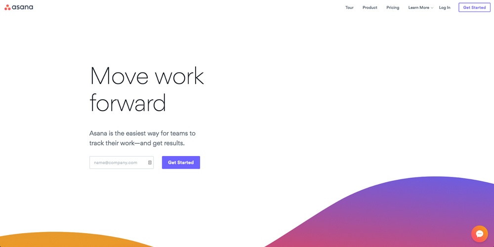
Asana is an example of a site that uses negative space to focus a user’s attention on one task. In the example below, you can see that their homepage focuses on one goal: Get visitors to sign up.
2. More Conversational Bots
Ever since Facebook invited developers to start making bots via its Messenger app, we’ve seen the number of bots grow from 30,000 active bots in 2016 to today's 100,000 active bots.
Companies like Sephora, Whole Foods, and National Geographic have implemented them into their marketing with impressive results.
In fact, according to Facebook, since Sephora released its “Sephora Assistant” they’ve increased their booking rate by 11%. It’s also reported that they see an average incremental spend of over $50 from clients who have booked an in-store service.

With tools like Drift and Facebook looking to release an on-site version of its Messenger in 2018, I think it’s safe to say that these are going to become even more mainstream.
3. Mobile Influence on Desktop
For the first time ever, mobile browsing has surpassed desktop and this shift has played a large role in influencing modern design trends.
Design trends that were initially only on mobile, for instance, are now becoming more common in desktop design (i.e. hamburger menus and large typography.)
Another trend I predict will make its way over to desktop design is sticky elements being placed on the bottom of a page instead of the top.
We’ve recently seen mobile sites placing sticky elements such as navigation menus and hello bars on the bottom of a page in order to help make them more accessible and easier to click.
As people become more familiar with this functionality, we’ll likely begin to see modern design follow suit and implement the same type of elements.
You can view an example of this functionality on our mobile site:

4.VR Video to Showcase Products
2018 won’t be the year of virtual reality (VR). We still have a lot of challenges to address (such as production costs and time) before VR videos become a standard, but, I do predict we will see more companies striving to define best practices for creating VR videos.
I expect many companies will even begin to implement these videos to showcase products.
VR gives marketers a whole new platform to connect with prospects. River Pools, an IMPACT client, is one company that’s ahead of the VR-product marketing curve. They’ve created a library of videos that lets prospects walk around and view their different size pools.
5. Micro-Interactions Will Become More Common
Microinteractions are subtle moments or effects centered around accomplishing a single task. According to UXPin, micro-interactions are used for:
- Communicating feedback or the result of an action
- Accomplishing an isolated, individual task (i.e., connecting one device to another, liking a friend’s post)
- Manipulating a setting
- Preventing user error
One of the most common examples of this is Facebook giving users the ability to add a reaction to a post.
In 2018, we’ll see more websites using micro-interactions to do things like encouraging engagement and giving users confirmation that a task was completed.
A recent example of a company using micro-interactions to increase user engagement is the “clap” system that Medium implemented on their blog.
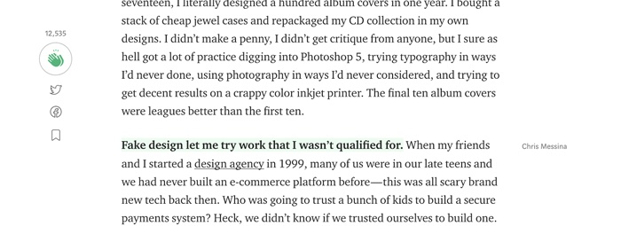
“Claps” allow you to show support for an article and recommend content to your followers by clicking an icon. As you click the icon it lights up and a counter with the number of likes increases giving users the positive feedback that their action was completed.
6. “Card Based” Design Still Rules
Most marketers are familiar with card style design. While this trend isn’t new, it’s likely one that’s here to stay. It’s become so widespread that Google has even implemented it into its material design.
Why do you ask?
Well, cards are an effective way to display a lot of information on smaller screens. They also provide users with a consistent viewing experience across all screens whether it be smartphone, tablet, or desktop. This is a style of design has become popular with sites such a Twitter, Facebook, and The Verge.
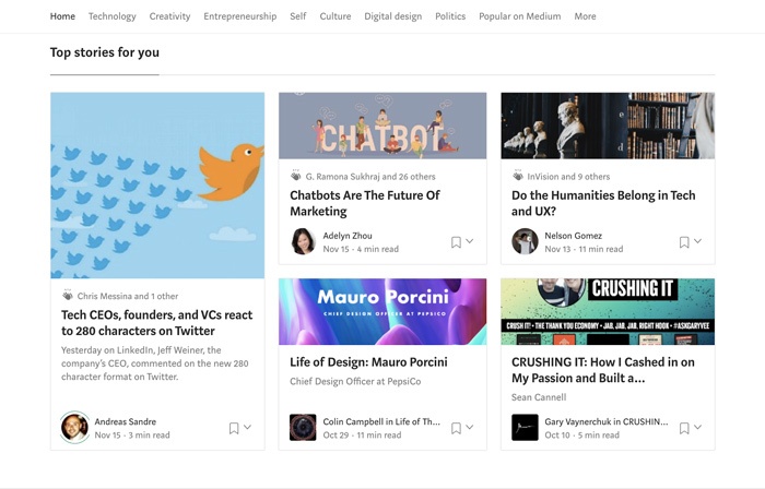
To pick on Medium again, it is a great example of cards being used in a design.
The layout lets users quickly scan a handful of different topics which makes it easier for them get to the content they’re looking for.
If you’re browsing on mobile, this is also much easier to click.
7. Alternatives to the Hamburger Menus
Believe it or not, many companies are beginning to move away from the use of hamburger menus due to their effects on UX -- mainly lowering discoverability and efficiency.
Although hamburger menus are currently a popular trend, it’s likely we will begin seeing people experimenting with alternatives in order to increase navigation menu clicks.
Spotify, for example, recently removed their hamburger menu and implemented a tab-based navigation menu that appears on the bottom of the app.
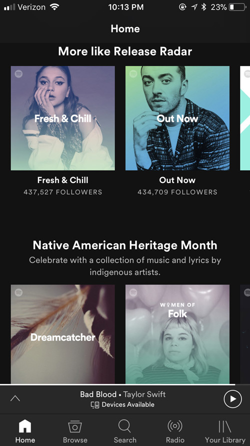
While the menu includes the same key sections that were in the hamburger menu, they found that the tabbed menu led to a 30% increase in navigation menu clicks.
Throughout 2018, I wouldn’t be surprised if we will see other companies follow suit and begin to find better ways to display their navigations.
8. Personalization Will Become Smarter
In 2015, Gartner posted this stat about personalization:
With 2018 rapidly approaching, it’s safe to say Gartner’s research was spot on.
Implementing personalization helps us create a more intimate experience for our customers. It lets us serve content personally tailored to them, which in turn builds trust and loyalty.t.
Companies of all sizes are finding ways to work personalized experiences into their marketing. One of most widely known case studies is the Coca-Cola “Share a Coke” campaign.
In 2014, in an attempt to reach the younger generation, Coke released bottles and cans that swapped their name for 250 of the most popular first names. The campaign was an instant hit. Conversion Sciences reports that Coke solid over 250 million bottles in the first summer and that wasn’t even a digital campaign.
Significant advancements in AI and machine learning are giving marketers new and exciting ways to offer more personalized experiences to people online. With data enrichment, smart content, and a host of other tools emerging, we’re likely to see personalization hit a new high in 2018.
9. “Above the Fold” as a Thing of the Past
We’ve been saying this for a while now, but with more companies opting for more whitespace, the “fold” is becoming a thing of the past.
The mindset behind “above the fold” is that we need to squeeze everything we possibly can in the real estate a visitor first sees because users won’t scroll.
But this isn’t true -- at least, not anymore.
This is an outdated idea that’s been carried over from the early days of web design when users weren’t accustomed to scrolling.
The average user has evolved and scrolling has now become second nature.
Users are actually so used to scrolling that in 2011 Apple removed the scrollbar from Mac OS X (as a default setting) because users no longer needed the visual cue for it.
If people aren’t scrolling, chances are it’s because there’s not enough motivation to continue down a page, not because they don’t know how to.
Instead of focusing on whether or not a CTA or logos of companies you’ve worked with is in the first 600 pixels, focus on whether or not what you put first on a page is engaging enough to get people to continue.
Start Planning!
While we can never predict trends with 100% certainty, we can always look to past trends to help us make an educated guess on what will come next.
Based on what we saw this year, overall in 2018 there is going to be a heavy focus on:
- producing video, possibly even using VR
- improving user experience with things like micro-interactions and personalization
- Clean layouts with content that’s easy to scan
2018 will be here before you know it, so now’s the time to begin planning for what trends you think can really benefit your marketing in the upcoming year.
Free: Assessment

