Subscribe now and get the latest podcast releases delivered straight to your inbox.
7 Valentine's Day Landing Pages You'll Fall in Love With

Feb 14, 2017

Breaking the bank on Valentine’s day can be quite a challenge to avoid.
Depending on your significant other's taste, you might think a bouquet of flowers will cut it, but then you think about purchasing a nice piece of jewelry, and what the heck, why not throw in a dinner date to that fancy restaurant you’ve always wanted to try?
Many of us find ourselves falling into this trap, so it's no surprise to hear that the average consumer spent around $146.84 in 2016, and this year, individuals are expected to spend an average $136.57.
Soon you find yourself out that extra $100 that was supposed to go to that next bill you had to pay, but it was all worth it for your significant other! (Right?!)
If you’re like me around Valentine’s day, you look for deals, promotions, and sales that you know will help put a little extra money back into your bank account. (Although, sometimes you just can’t help spending a little more.)
As I was searching around for gifts this year, I stumbled across some amazing Valentine’s Day landing pages that handled their holiday advertising with some fantastic UX and marketing strategies.
So, whether you’re looking for some great sales, or, some holiday campaign inspiration, here are eight Valentine’s Day landing pages that might find a place in your heart.
1. T-Mobile
This year, T-Mobile took their brand’s main color, the bright pink, and liberally applied it throughout its Valentine’s day deals page.
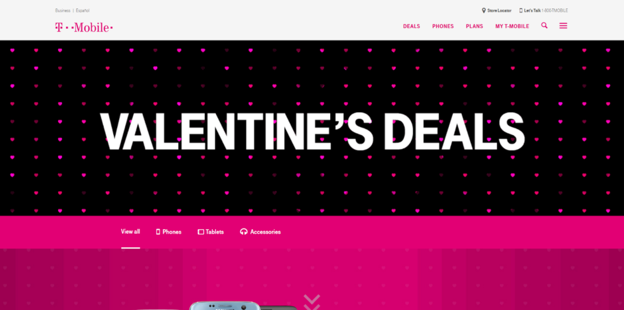
The company also applied a couple variations of a small heart pattern across various sections of the page. This, matched with the bright pink and the love-themed copy, align the T-Mobile brand with the holiday perfectly.
Each deal T-Mobile promotes is very visually separated by either the bright pink, black, or white. This enables users to easily segment each sale and prevents any information overload.
What’s also very interesting is the products still stand out fairly well, despite all the decorative additions. Depending on how your own product looks, you might have the ability to also get away with creating a bold design like this that incorporates product imagery as well.
2. Coach
Coach decided to skip the shades of bright pinks for their design and instead went with a classy bold and luxurious red to complement the brand's refined identity.

The website page also takes a much simpler approach than most of the other examples listed here. Coach decided to forgo any sort of text in the hero area and let a beautiful image of a red purse set the tone for the page and perfectly evoke thoughts of love and romance.
Below the hero image, a small header indicates the page's purpose as a list of ‘Valentine’s gifts for her.’ The rest of the page blocks out a variety of purses that gradient from red to purple to pink to white, and finally black. There's also some gold and silver jewelry mixed in as well.
To break up the long list, the page has a couple large images, one being a simple GIF of a gentleman drawing a heart. These help keep the user's eyes from becoming blind to the list of item and helps to continue engaging them down the page while also staying aligned with the Valentine’s motif.
3. CyberPowerPC
Just because you're trying to promote your Valentine’s day sale doesn’t mean you need to be stuck to the same old color palette the holiday is associated with. Sometimes, changing things up like CyberPowerPC did isn’t such a bad idea.
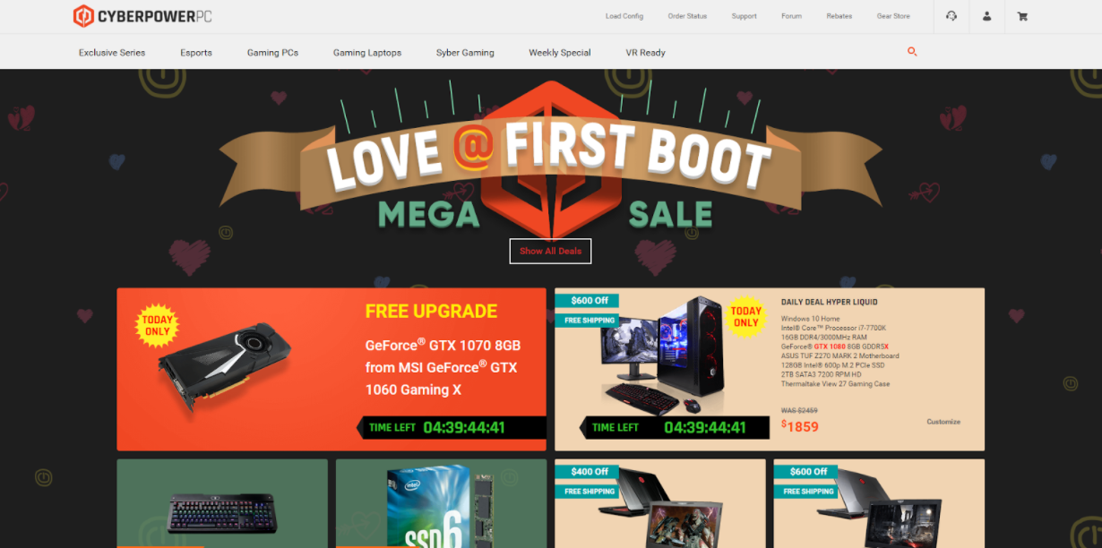
CyberPowerPC’s clever name for their sale and the hand-drawn iconography in the background makes for a delightful bit of Valentine’s Day marketing when you first arrive on the page.
Like Coach, they proceed to list a variety of items they're slashing the prices on. To create a little more urgency, the page starts off with two special sale item listed at a ‘today only’ price that’s accompanied with a countdown timer.
Tactics like this, alongside ‘Almost gone!’ or ‘Only X left!’ tags when applicable, can greatly aid in compelling the user to purchase the item before time or quantity runs out.
4. Chanel
Sometimes, telling an engaging story is all you need to peak your users interest in your products, just like Chanel did on its Valentine’s day landing page.
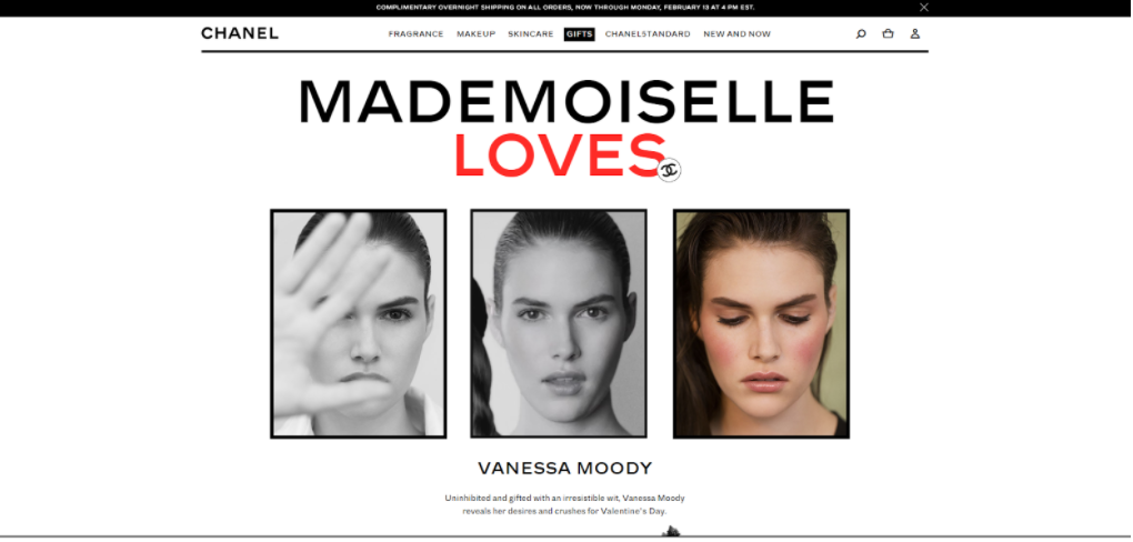
Chanel’s page showcases high-fashion model Vanessa Moody and lists of 11 bold and sultry quotes that ‘reveals her desires and crushes for Valentine’s Day,’ and connects these quotes back its products.
Doing this combines the seductive sentiments of Valentine’s day with Chanel’s products, evoking feelings such as desire, confidence, and of course, love with them.
Accompanied throughout each section are images, GIFs, videos, and sound bites to add to the holiday theme and seductive ambiance Vanessa portrays.
Pages like this do an excellent job at removing the overwhelming feeling of Valentine’s ads that may appear salesy, losing any emotion you're trying to capture on your landing page.
Instead, you're left wanting to emanate the same sort of emotion Vanessa has captured which draws you into further exploring Chanel's products.
5. Apple
Sometime’s we get so caught up with trying to find the right gift to impress our significant others or friends that we forget what the holiday is truly all about - celebrating how much you love one another. And what better a way to show that than through some cute little emoticons as Apple has so nicely done.
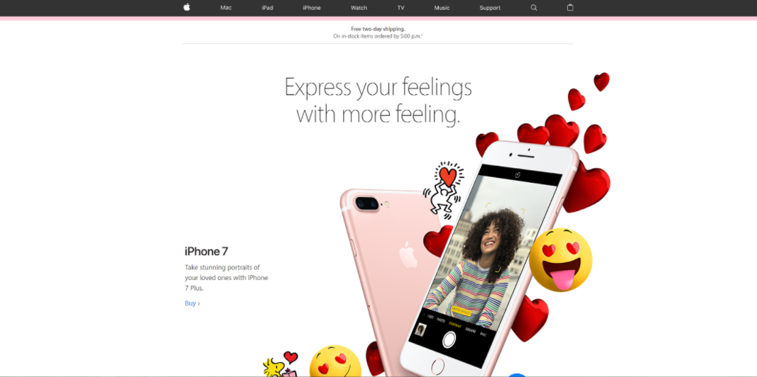
Apple redesigned their gifts page to display a waterfall of emojis and images surrounding their products. This emotional and creative design helps lead the user further down the page to see more of the page's content. As emojis are typically something people associate with mobile messaging, the design also aligns perfectly with the iPhone 7.
Sections below this showcase ‘perfect matches’, or accessories that go with some of the Apple products you may own, and love-related iMessage stickers you can download onto your devices.
Theming the page in this way helps break the page out of Apple’s traditional copy and product imagery to resonate with their audience on a more personal level. If done right, you can attract and delight your customers with unique imagery and creative holiday copy, leading them to further explore your site.
6. G2A
I never thought I’d stumble upon a gaming site taking advantage of Valentine’s day and making something pretty comical out of it, yet, I just so happened to find G2A doing just that.
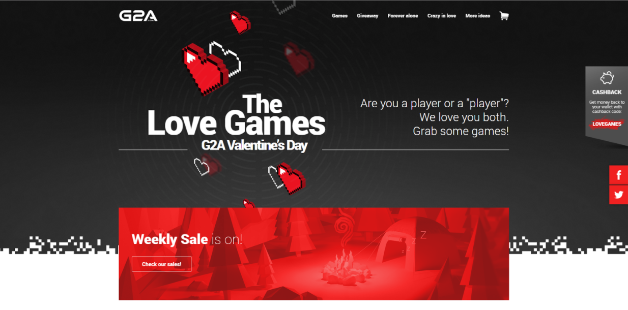
The part of this page that really caught my eye was the ‘1 Player Forever Alone’ & ‘2 Player Crazy in Love’ sections showcasing games and products the company has on sale.
This was a comical way to highlight the holiday but also stay true to “gamer culture,” and directing them to products they may enjoy.
Even the little ‘lag is in the air’ content in the section afterward gave me quite a chuckle.
Creative content snippets like this attract those those in the holiday spirit and entice users to read the content. Taking this approach gets your users not only reading your jokes, but your promotions as well.
7. Samsung Mobile (India)
Samsung Mobile of India went with the #BundleofLove hashtag for their holiday campaign to showcase the variety of bundle sales they’re offering.

The ‘one for..’ messages in each as a nice personal touch to the products and gives the bundles more meaning that they otherwise might not have.
Each section also repeats the hashtag which acts as a reminder to people to tweet the sale for others to see and act on.
Free: Assessment