Subscribe now and get the latest podcast releases delivered straight to your inbox.
Writing website copy is a content marketer’s rite of passage.
You might be someone who has been tasked with writing copy for the first time and are approaching this with newfound enthusiasm and a graceful calm, or maybe you’ve been through this before and are bracing for a nightmare, having seen your “perfect” sentences get cut time and again because they “don’t fit the design.”
Somewhere between zen and panic — and the inevitable pile of sticky notes with coworkers' ideas of the ideal hero tagline — lies the truth.
Writing website copy is just as rewarding as it is daunting, but it can be a relatively smooth experience if you remember this one rule above all others: Don’t write about yourself.
I’ll let this sink in for a bit.
Why shouldn't we write about ourselves in our website copy?
Don’t…write about your company.
Do not…talk about how great your product or service is.
Under no condition…should you explain why you’re “simply the best.”
Writing about yourself is a webpage no-no.
I’ve written my share of site copy and, honestly, back when I was writing value propositions and clever taglines, I would have pushed back hard against this rule. And after at least rejecting this straight away and most likely throwing a childlike tantrum, I would have asked a long list of questions:
- How can I explain why readers should buy from me if I can’t talk about myself?
- Does this mean I can’t talk about my products?
- Will site visitors understand what my company does if I don’t talk about what we do?
- What am I supposed to be talking about if I’m not writing about my company?
- Isn’t the website about us? And, if not, what’s the point?
If any of these questions have popped into your head in the last 30 seconds, you’re not alone. As a website content trainer, the content managers and copywriters I work with often have these questions and I don’t blame them one bit.
At first blush, it feels unnatural to not talk about yourself on your own website, but once you understand the reasons why self-promotion doesn’t work, the alternative comes much easier.
Think about it like this: Websites that are full of self-promotion are no different than an online sales brochure and a website that operates as a sales brochure lacks context for the user.
This might come in the form of a line list of product features, accolades the company has won over the years, or how a service has evolved over time.
None of these are necessarily bad to mention, but without detail around what’s in it for the reader, there’s really no value to having these elements on your site.
Remember, your readers don’t care about you. They care about what’s in it for them.
Websites may be selling a wide range of products and services, but the people who visit them all have their own interests and questions in mind and want similar things:
- They want to resolve the issues that are keeping them up at night.
- They want to impress their clients, customers, and friends.
- They want their bosses to see them as company heroes.
- They want to know they made a good decision.
- They want their family to be proud of them.
To get started on writing converting website copy without talking about yourself, we first have to identify the goal of a website.
What’s the goal of a website?
Ask any of your coworkers what the goal of your website is, and you’ll most likely be met with similar responses: to drive traffic from interested prospects, to generate leads, and to move visitors closer to a sale.
You might already be aware that 81% of buyers conduct online research before making a purchase. This statistic by itself shouldn’t surprise any of us marketers, especially since commercial websites have been tasked with a heavy marketing lift since the first one launched in 1979, but here’s the thing: While it may have quite a few marketing responsibilities, at its core, your website is a sales tool.
While you’re in the weekly team meeting, at the gym, or trying to turn your brain off to go to sleep, your website is still talking to your prospects. It’s helping them make purchasing decisions. It’s selling.
So when thinking about content, the question becomes: how do you want to sell to your customers?
Do you approach them the old-fashioned way, with the zeal of a stereotypical car salesman, shouting from the rooftops why your product is the very best? Doing whatever it takes to get their attention?
Forever my favorite car salesman of all time.
Or do you frame their experience in a way that helps prospects make an educated decision?
With 64% of online customers rating their experience more important than price, I’d say it’s high time to skip the pushy approach and make sure your site visitors have what they need when they’re scrolling your pages.
Your website needs to speak directly to your customers and give them what they need to feel confident about buying from you. Its goal is to help and, ultimately, sell.
🔎 Related: Why your website is a sales tool — not a marketing tool
Your website sells by building trust
When we consider a website’s user experience, we often limit ourselves to the design of the pages — how the visitor will behave on each page as they navigate through the site.
And, of course, website design is certainly important. Good UX will help visitors navigate through the site in an organic and logical way. It should provide value and help your readers find what they need with the least friction possible.
The same goes for your site’s language. Just as visual design needs to meet visitor expectations, so do the words we use.
Buyers want to be educated. They won’t buy from you — or fill out a form or even get past the homepage — if they feel like you’re pushing them in a direction they don’t want to go.
How do you build that trust?
You end the self-promotion and give your visitors honest information. Show them that you understand their problems by framing what you offer as a solution to their obstacles.
Help them. Speak to them as human beings about what they care about.
How to talk about yourself without, well, talking about yourself
A good sales tool is one that helps users make better-informed decisions and your copy is your chance to give your visitors the unbiased data they need.
Answering buyer questions
This is best done by answering the questions buyers have as they go through the research and purchasing process.
No matter what industry you’re in, who you’re selling to, or what you have to sell, the bulk of buyers’ questions fall into the following five categories:
- Cost
- Problems
- Comparisons
- Best of
- Review
You can — and you absolutely should — include these topics in your blog, but there is also a place for these on your site pages.
By answering these questions, you’re providing value and framing the page about their needs and their solutions. Instead of a hard sell, you’re educating them.
These topics also show the buyer that you understand what they need — that you know and care enough about them to make sure they feel comfortable working with you.
Your buyers will be more likely to connect with your company and with your product when you can show them you know where they’re coming from. Be clear about the problems and pains they’re experiencing, then, help them overcome any objections they may have by honestly calling out their fears.
Your website then becomes your company concierge, welcoming buyers, connecting with them on what they need, and then ushering them through their journey.
Embracing “you language” versus “we language”
We know when we’re being sold to. This is largely because salesy language tends to skirt the real value of whatever’s being sold.
You’ll find jargon, insider language, and facts and figures intended to make whoever was writing the website copy look smart. Unfortunately, it leaves the buyer out of the equation almost entirely.
When we’re writing for our audience and writing in the language of trust, we make everything — everything — about the customer.
In most cases, you can quickly identify which side a site is on by scanning for two words: you and we.
Try this:
Pull up any site and count the number of times you see “we language:” words that are about the company or what the company does. This will often come in the form of mentioning the company or product itself by name or with sentences that start with we or our.
Copy like this is all about the brand and leaves the rest of us wondering where — or if — we fit in.
You’ll see this with lines like:
- “We are the leading provider of…”
- “Our innovative technology offers…”
- “Hear what people are saying about us!”
Then, look for “you language.”
These are statements that talk to or about the reader directly. These often do contain you in them (“Where do you want to go?” or “Make your house a home”), but they don’t necessarily have to. In many cases, the you is implied (“Turn leads into customers” or “Work happens faster”).
“You language” positions the reader at the center of the story; to make them see the possibilities and results of working or buying from you from their perspective.
So, now what?
Your aim is to tip the scales to the reader. We recommend making sure that 80% of your copy is “you language” versus only 20% being “we.”
What text on your homepage can you change today from we to you?
Turning “we” language into “you” language
Transitioning from “we language” to “you language” is a subtle shift that makes a huge difference in how your site visitors perceive your value and trust what you have to say.
Let’s see how a few popular websites have evolved their copy over time.
Buzzfeed
Here’s the homepage of Buzzfeed from 2007:
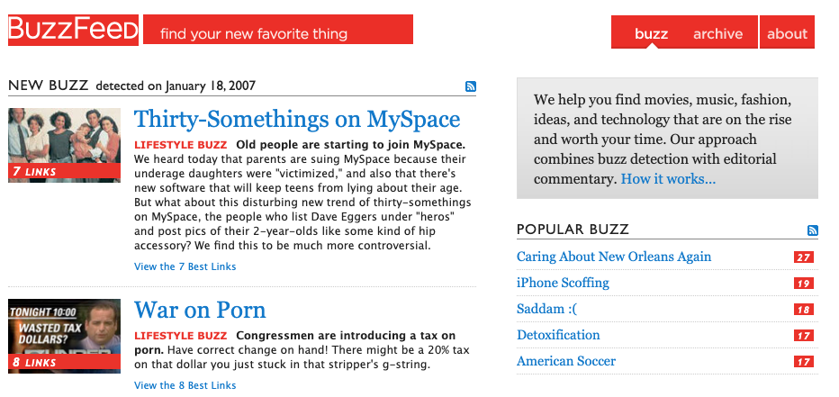
Notice that in addition to a wall of text and tiny photos, Buzzfeed inserts its value proposition in the gray box at the top right.
Back in 2007, Buzzfeed’s value prop was entirely we-based:
“We help you find movies, music, fashion, ideas, and technology that are on the rise and worth your time. Our approach combines buzz detection with editorial commentary.”
Even their article descriptions contained we copy. In the article about MySpace (haha MySpace!), the description starts with, “We heard today that…”. (We can talk about how they thought people in their 30s were “old” another time.)
Compare that to today’s homepage:
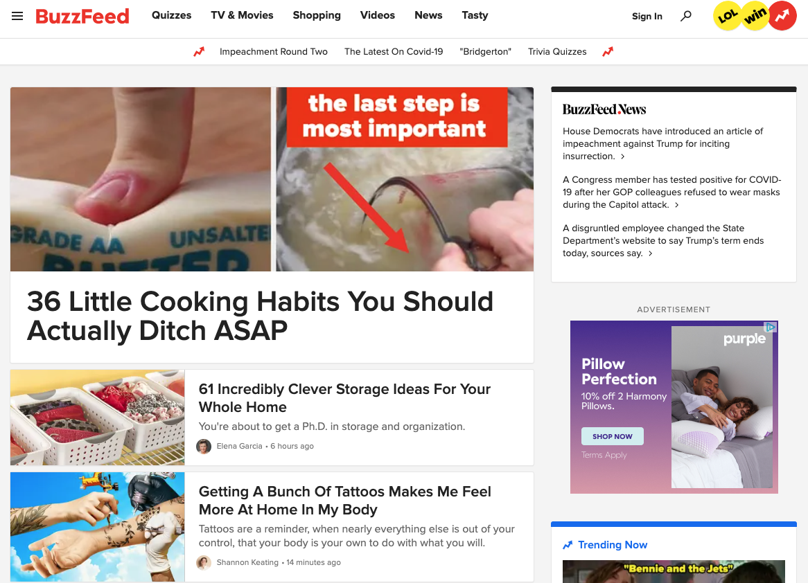
The page doesn’t have an overall tagline, but it’s easy to spot all the “you language” in the headlines themselves: “Cooking Habits You Should Actually Ditch,” “Clever Storage Ideas For Your Whole Home,” etc.
“You language” has become ubiquitous in Buzzfeed’s headlines. So much so that, as we’ve seen in headlines all over the web, it’s become an expected trend.
TripAdvisor
Then there’s TripAdvisor’s evolution. Their homepage from 2009, again, features tiny photos, text that hurts my eyes, and a very long value prop thrown in at the top.
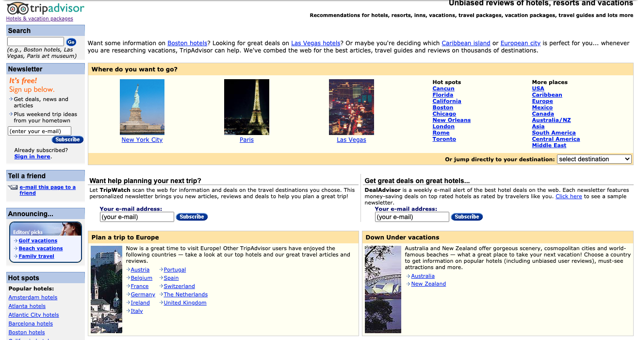
Today’s homepage is open and direct:
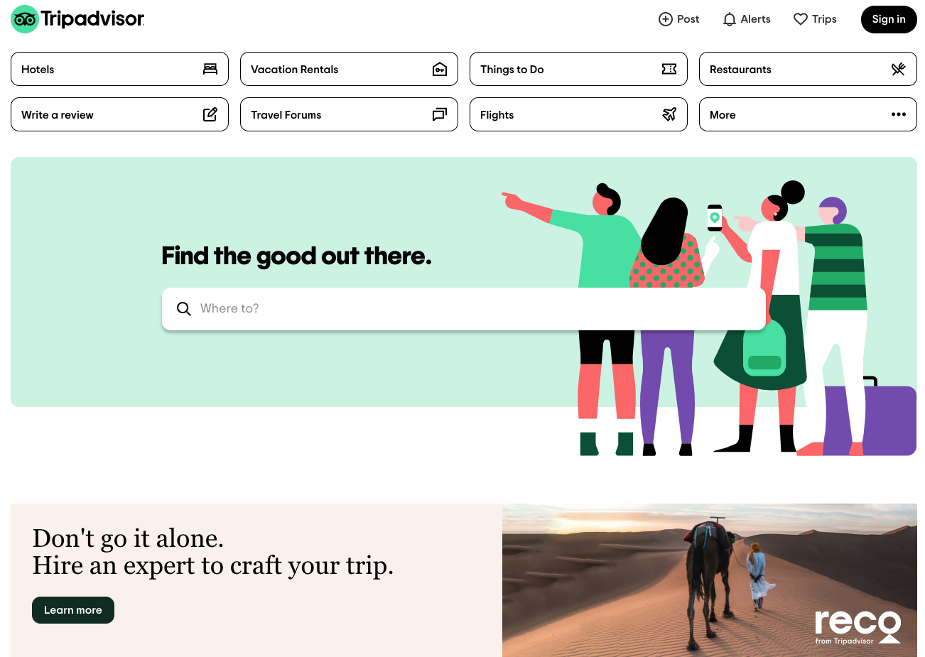
The change in TripAdvisor’s homepage tells the same story, evolving from “We’ve combed the web for the best articles, travel guides and reviews on thousands of destinations” (blah) to a simple, “Find the good out there” (hurrah!).
To-Increase
Another one of my favorite examples is from my client To-Increase, which just rolled out a solutions page that’s dominated by “you language” in nearly every corner.
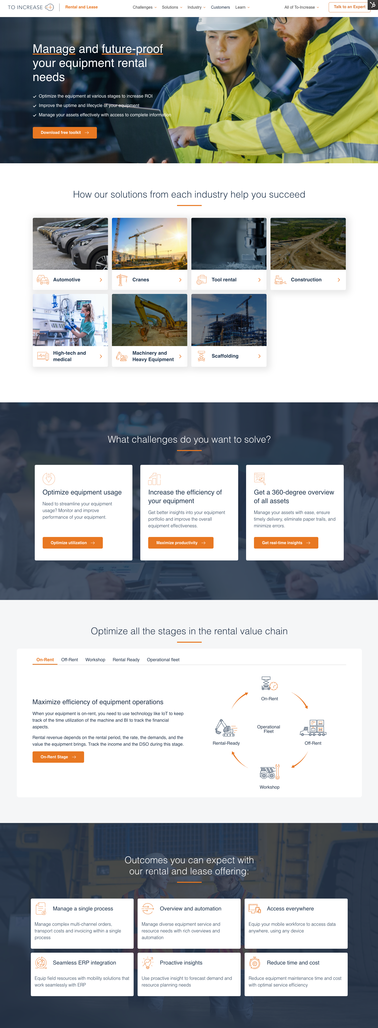
To-Increase leans strongly toward the reader, positioning “you language” with every header and nearly every descriptive statement.
Let’s zoom in and look at one of the modules:

Each of these headers starts with an active verb and compels the reader to see what’s in it for them.
What will you do with this product? You’ll optimize equipment usage, increase the efficiency of your equipment, and get a 360-degree overview of all assets.
Notice that the product and company names never appear here. In fact, visitors are left to picture themselves participating with this — seeing themselves in the vision of what’s possible — rather than even thinking about who’s selling them.
Discovery Lodge
New Zealand resort and client Discovery Lodge certainly has the graphics to inspire their visitors, but it’s their copy that’s really doing the work here.

Phrases like “Be treated more like friends or family” and “Only a short 10-minute shuttle ride to the start” easily tout their customer service and convenient location, but the wording, again, is focused on the visitor.
The notion of being treated like friends and family gives a clear sense of what that experience will be like, and readers are then free to click further into the site to learn what this truly means.
It encourages more exploration without merely listing features.
Applied Education Systems
Our friends and clients at Applied Education Systems (AES) do the same thing. Their value proposition in the homepage hero section clearly positions who the site is for and what they do without mentioning themselves at all.
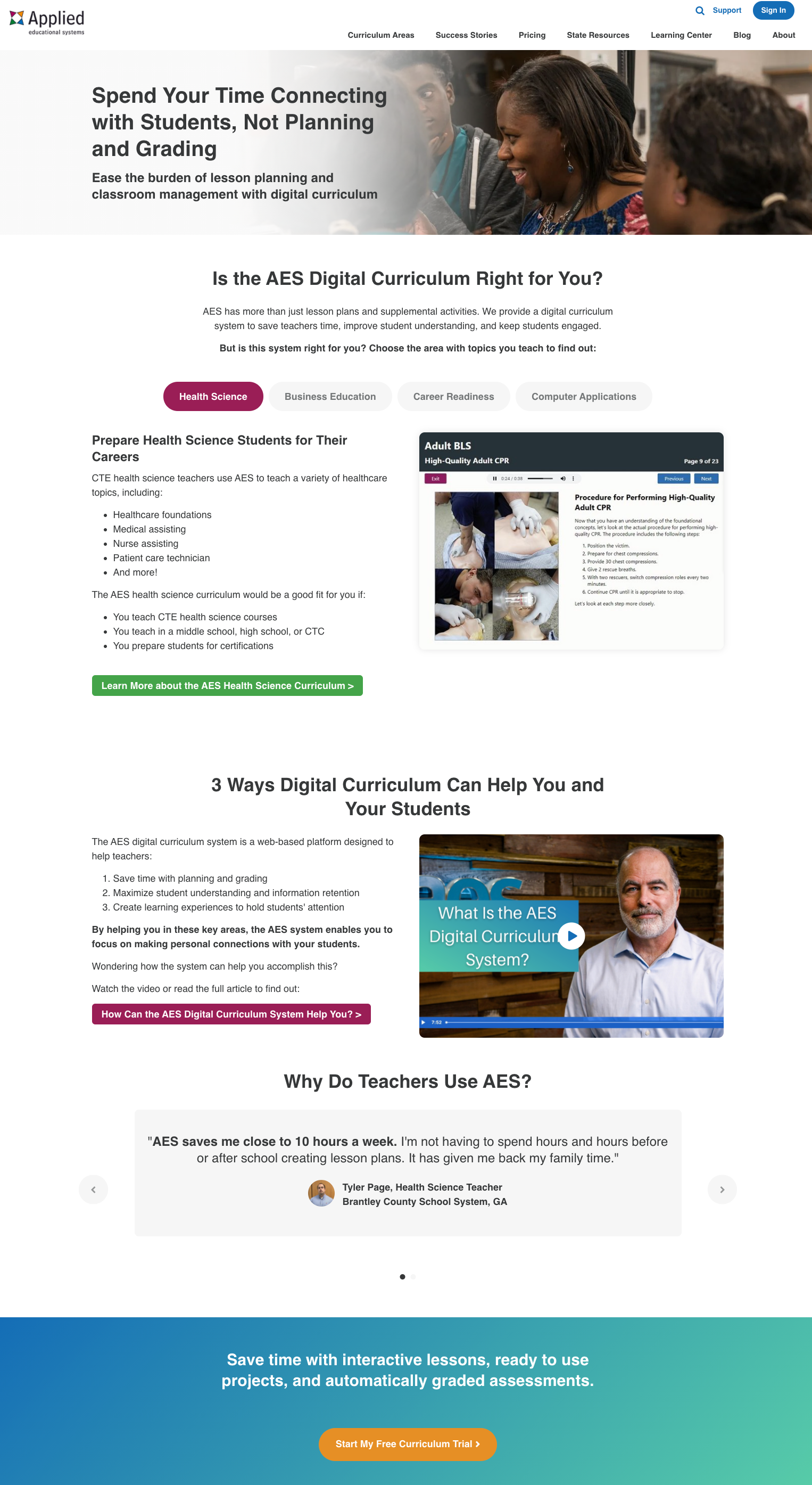
The phrases they use to draw the reader in are active: Spend your time connecting, Ease the burden of lesson planning. AES knows that its customers are short on time and so they lead with this, putting the reader at the center of the site.
Using language to build trust and convert customers
Language that focuses on the customer above everything else, including your company and your product, will more likely engage and keep visitors around. As your visitors explore your pages and learn from you, they’ll grow their trust in you.
When you write copy that allows the reader to see how they would experience the successful outcome of being your client or customer, you are providing them with a much stronger case than just listing who you are or what your product does.
Plus, the shift into “you language” is something that, once you see it, you can’t unsee. And that’s a good thing.
If you find that some of this language is still creeping on your own site, start planning how you’ll replace it with words that will better convert your visitors:
- Lead with the problem the visitor has.
- Show them the value and benefit (the why) instead of the features (the how).
- Create a conversation that’s helpful and not salesy by answering their questions.
- Bring action to the phrases you use.
- Make it all about them.
Keeping your customers top of mind in every line you write will help ease the mania that often stems from producing or refreshing website copy. While it might not keep your coworkers from offering you their “winning” tagline ideas, it will maintain your focus on getting your text across the finish line and giving customers the answers they crave.
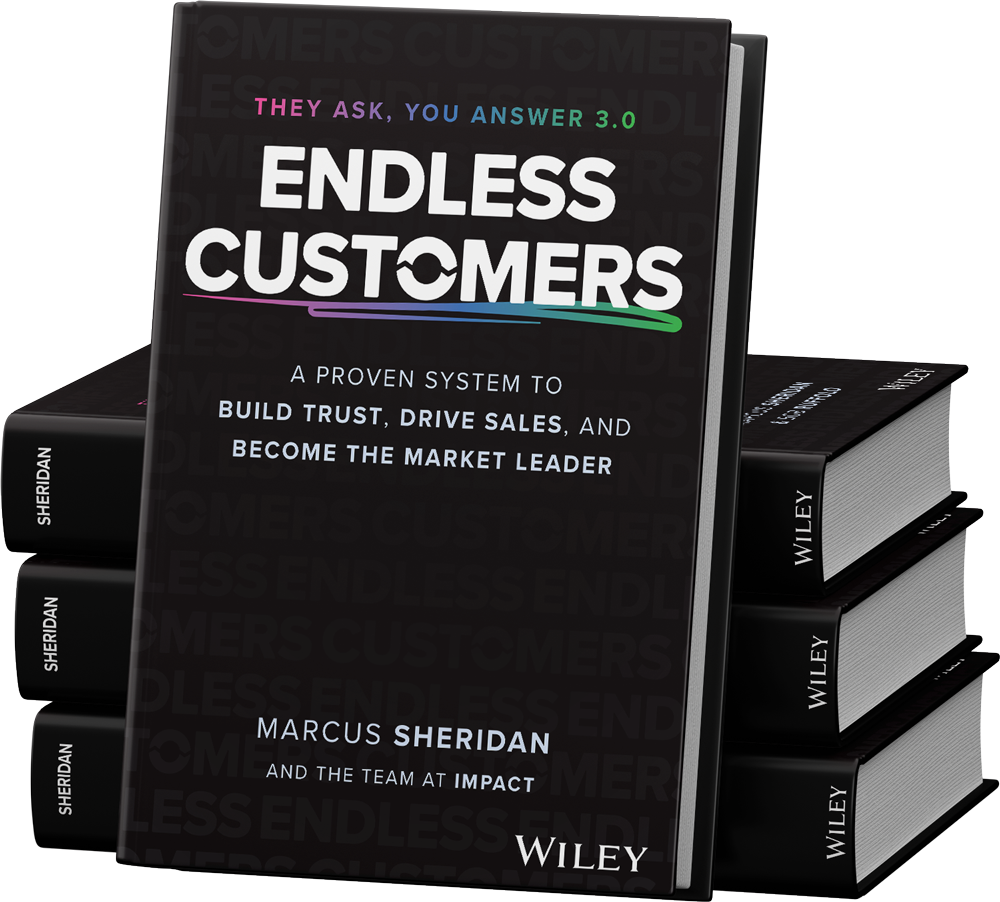

Order Your Copy of Marcus Sheridan's New Book — Endless Customers!

