Subscribe now and get the latest podcast releases delivered straight to your inbox.
Critiquing 15 PPC Landing Pages (And What You Can Learn From Them)

Jan 14, 2016

 Contrary to popular belief, PPC doesn't just guarantee success for a campaign.
Like any other tactic, marketers need to build a dedicated strategy around PPC. They need to create content specifically optimized for it as well as the goal they have in mind.
While some campaigns may aim to simply send new/more traffic to a site, if you're a small to medium-sized business looking for more tangible results from an investment, you'll want to focus on generating leads.
The biggest piece of this lead generation puzzle is usually creating a high-converting landing page.
On PPC ads, your ad copy is what grabs a prospect's attention and earns their click, but once they're on your site, you need to ensure that the landing page they see keeps them there (and gets them to convert).
Below we've critiqued 20 PPC landing pages, explained what they did right, and also how they could've been better.
Though from a variety of different companies and industries, each one offers a valuable lesson in how to create an effective PPC landing page that will actually convert. So, take notes!
1. FluidSurveys
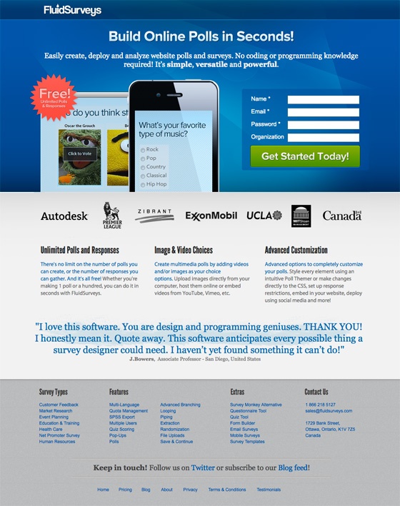
Why it works:
- They use contrast to draw attention to the call-to-action button
- Between the headline and the supporting text, their value proposition is very clear.
- They build credibility by including the logos of their notable customers and testimonials as social proof.
How it could be better: As good as this landing page is, the team included far too many links. According to best practices, the company should isolated users rather than distracting them with other places to visit on their site. Doing this would help keep the reader's attention on conversion -- and only conversion.
2. CHEEZburger
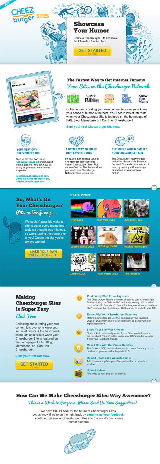
Why it works:
- The value proposition is straightforward and concise.
- They repeated the CTA several times, which is a good rule-of-thumb for longer landing pages.
- The CTA button stands out prominently from the rest of the page.
- The content is separated very neatly, making it easy to read or skim through.
- The page is highly visual.
How it could be better: As a landing page, there should have been an actual form on it. In fact, as I scrolled I found myself waiting for the form to arrive. While there are a number of CTAs so take the user to their next step; I would've advised CheezBurger to simplify the path to conversion by incorporating its form directly on this page.
3. Nerds On Call
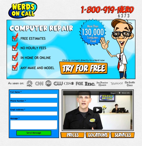
Why it works:
- They capitalize on video marketing.
- They built trust by incorporating the logos of the media outlets that have featured them.
- The design is consistent with their brand.
- They provide a phone number, which adds a rare personal and more "human" touch.
How it could be better: The form here gets a bit lost among all of the other pieces on this landing page. I could've made drawn more attention to it by expanding the amount of real estate is was allotted on the page and adding a headline above it.
It's also not 100% clear what filling out this form will get the reader. Are they reaching out to someone to try their services or are they simply leaving a message that may or may not be addressed? The messaging here could have been a bit more direct and consistent.
4. Crikey

Why it works:
- Between the arrow and the contrasted CTA button, Crikey made good use of direction cues to guide the reader's eye naturally to the form.
- CTA button contrasts well on the page.
- The CTA copy is personalized (highlighting the personal benefit of clicking through)
- They have incorporated testimonials as social proof.
How it could be better: The headline. While being free is a huge selling point for many people, it tells us nothing about what the actual value of the offer at hand.
5. Charlottesville Medical Research
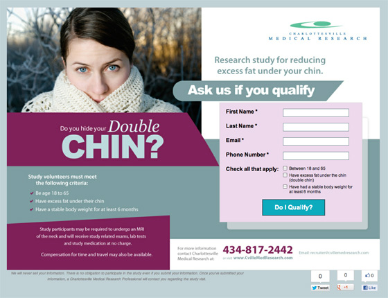
Why it works:
- Using a photo of a person helps visitors picture themselves in that situation.
- The personal question encourages introspection and elicits an emotional response.
- The headline also incorporates humor and addresses a small, but common pain point that its persona can relate to.
How it could be better: There is a lot going on on this page. With several different fonts, text sizes, and weights, the page could be difficult to navigate when you first land on it.
6. H.BLOOM

Why it works:
- The content is segmented well and organized in a way to address any questions or concerns their persona might have.
- Similar to #2, they repeat the CTA in each section; making it easy to convert at any point.
- Visually-based products need to be seen and they use a lot of great pictures throughout the page.
- They make great use of social proof sharing partner logos and logos of those who have featured their brand.
7. Keas
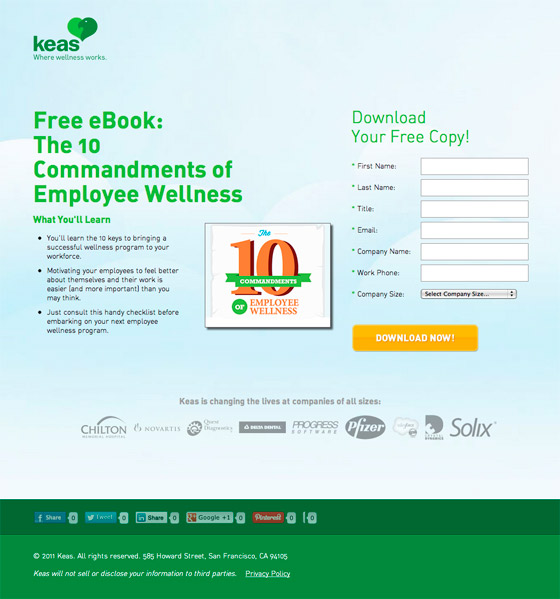
Why it works:
- They've listed exactly what you'll learn from download their eBook.
- They keep everything above the fold.
- They display the logos of their well-known clients as social proof.
- They included social sharing buttons.
How it could be better: I would've suggested they try different copy on their CTA; perhaps something that highlights the benefits of clicking more like "Start Learning" or "Get My Copy."
8. Wistia
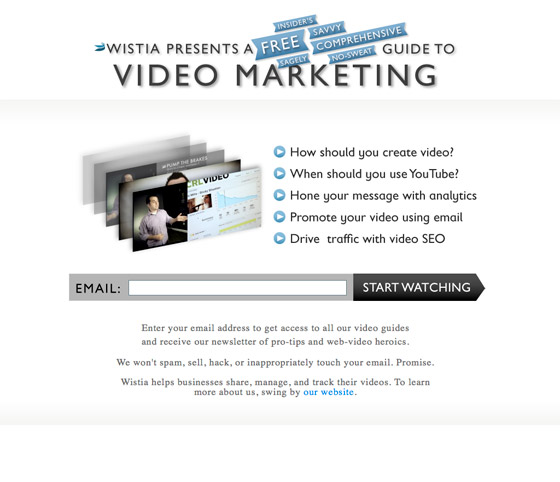
Why it works:
- There's a huge emphasis on the benefits/value you receive by signing up.
- The form fields are kept to the absolute minimum.
- The CTA copy does a great job of highlight benefits, and minimizing the sense of work by saying "start watching," rather that submit, enter, or other cold alternatives.
How it could be better: Wistia could have drawn more attention to the form by highlighting it in a contrasting color or adding directional cues. Though still an effective landing page, it is easy to overlook the form when you first arrive.
9. Optimize New York
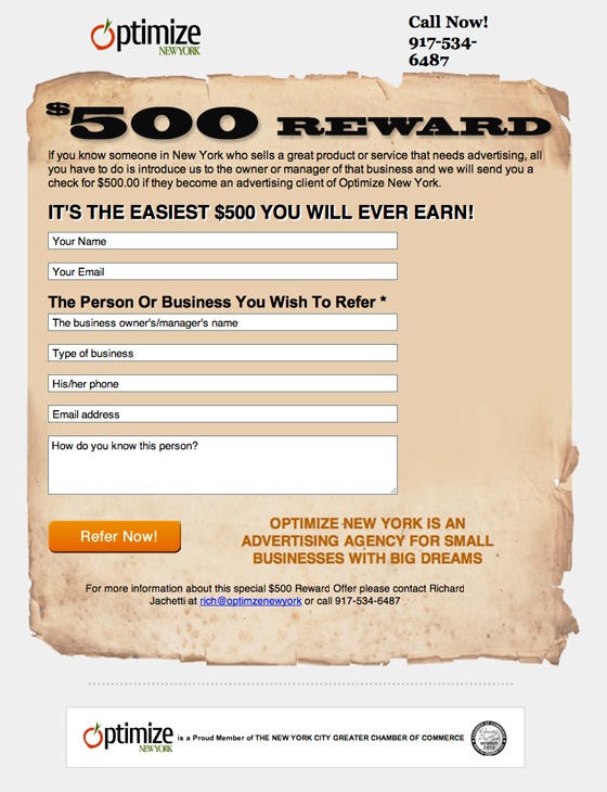
Why it works:
- They offer a handsome incentive.
- They instill trust by listing an actual employee for the visitor to contact by email or phone.
- The overall design is unique and playful.
How it could be better: Adding Contrast to the CTA. While the color orange is known for increasing conversions, in this particular design, it doesn't have quite the same effect. I would have suggested A/B testing other colors.
10. Zipongo
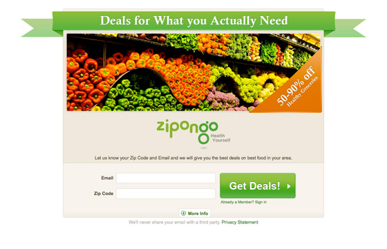
Why it works:
- The offering of a 50-90% is convincing enough that it doesn't require a lot of supporting copy.
- Between the image and the design, the colors are consistent with their brand and are visually appealing.
- The CTA is big and grabs your attention immediately.
How it could be better: Adding Social Proof. If you're unfamiliar with Zipongo, which many visitors from PPC will be, you may be reluctant to share your information with them. Adding social proof in the form of industry logos or testimonials would help further explain the benefits of converting and build credibility.
11. Spine Health Institute
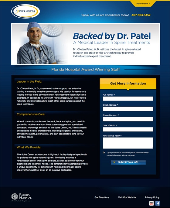
Why it works:
- It uses a real name and photo; not a stock model.
- This is a complicated and expensive offering that requires a lot of thought, but they've done a nice job condensing it to three sections that summarize all of the critical information.
- The yellow box above the form grabs your attention and uses a small arrow to guide you to the form fields.
- They include social buttons.
How it could be better: A subheader on this landing page, mentions that they award-winning. They should highlight this social proof rather than hiding it in the corner.
12. Voxeo
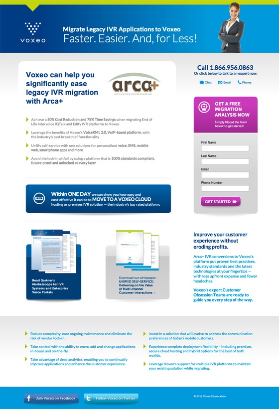
Why it works:
- The purple form contrasts with the rest of the page and immediately draws your eye to the form.
- They humanize their brand offering a phone number and live chat
How it could be better: There are two additional offers that aren't gated. While this offers great value to visitors, it distracts from the most important task at hand; converting on the form.
13. Knovio
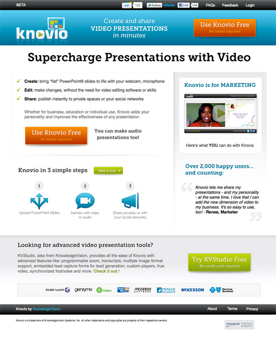
Why it works:
- They incorporated video marketing.
- The CTA buttons are big and bright, ensuring that you don't miss them.
- "Over 2,000 happy users" adds social proof, along with the testimonials and logos of their customers.
How it could be better: There are several different CTAs on this page, with different messaging and design. This inconsistency makes it unclear where someone should be clicking to actually take action. Your conversion path should be as clear and effortless as possible.
14. Mango Languages

Why it works:
- The images and overall design create an emotional connection to an enhanced traveling experiences -- one of the primary benefits of learning a new language.
- The CTA button truly stands out from the page.
- The CTA copy is clear and direct about the value of filling out the form.
- They capitalize on video marketing.
How it could be better: This landing page is very interesting to look at, but the form can easily get lost in it. In addition to the directional cue above it, I'd like to have seen more attention driven to the form itself; either by placing it at more of a focal point or highlighting it visually.
15. IMPRESS by Digital Telepathy

Why it works:
- The directional cues make for charming visual experience when scrolling through the information.
- It showcases the offer visually; offers a "preview" to reduce any hesitation one might have.
- They use a bright yellow CTA multiple times and it stands out in each section.
- It incorporates social proof.
How it could be better: I'd like to see a form incorporated into this page. While each CTA adds to the "story" of the page, it forces you to go to another page to follow through. Including the form at the bottom of the page would be a skillful way of concluding the argument built above and shortening the conversion process.
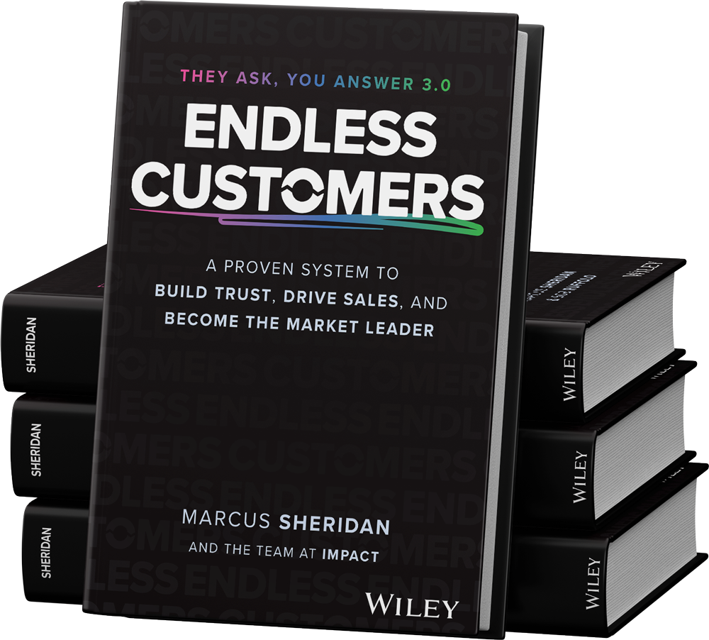

Order Your Copy of Marcus Sheridan's New Book — Endless Customers!