Topics:
Social Media MarketingSubscribe now and get the latest podcast releases delivered straight to your inbox.
Creating an Engaging User Experience on Twitter with Visual Content

Oct 31, 2013

 We all know how effective and beneficial user experience is.
Whether it's on your website, their mobile device, or you're engaging with them on social media it makes user experience an even stronger component. This is especially true when you're a social networking platform.
Engagement and user experience are two of your most commonly used and thought about words in your vocabulary. The two in a sense, tend to go hand in hand.
With Twitter's latest update, they're making pictures and videos even bigger and better. Helping to bring you and your followers closer together.
The whole idea behind creating social media is to bring people with similar interests closer together.
On Tuesday, you've probably started to see your timeline/ news feed transform. You're no longer just seeing 140 characters of text after text from each person tweeting. You're seeing previews of photos and videos. They're becoming front and center.
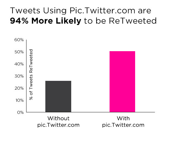
I don't know about you, but I love visual content, it's a great way to keep your audience actively engaged. I'm not the only one that thinks that way. According to Zabisco, 40% of people will respond better to visual information than plain text.
How Your Brand Can Utilize this Feature
Text isn't the only way to engage and interact with your audience. Let visual content do all of the talking.
Now you can reply, retweet, or favorite a tweet without leaving your timeline. Twitter won't show you the entire photo or video, but they're giving you a peek. Showing you just a glimpse of the photo. But, "what can a 1.5 inch by 2.5 inch photo really display?" That's a great question. Not much. But that's not all Twitters new feature has added.
If you want to see a bigger more up close image of that picture, you're in luck. It's extremely easy. All you have to do is tap. Tap the photo or video and you'll see the entire image or video.
I hate being sent to another window. Some times I'm left pondering how I'm going to get back to the page or app I was just in. It could just be the blond stereotypes kicking in; but I like staying in one place. I sometimes get lost driving just 15 minutes from my house.
Am I not making any sense? Am I speaking Gibberish? It might be, if you haven't updated the Twitter app on your mobile device recently.


— Sean Percival (@Percival) October 30, 2013
— Sean Percival (@Percival) October 30, 2013
— Sean Percival (@Percival) October 30, 2013
— Sean Percival (@Percival) October 30, 2013
We all know that visual content is a great way to tell a story and storytelling is becoming a big part of inbound marketing. How are you telling your audience and followers your story?
Turning Off the Feature
If visual content isn't your thing and you don't want pictures and video cluttering your newsfeed, don't worry. There is an alternative. It is as simple as turning off the feature.
Unfortunately, there isn't a specific way to turn off the feature on your desktop but it can be easily turned off on mobile.
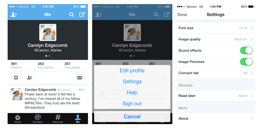
Here's a walk through of the steps.
1. Log on to Twitter and click on your account. One on the page, there's the circular widget on the left side just below your total number of tweets select that.
2. So, you might be wondering what's next. Upon hitting that button, a list will scroll up from the bottom. You are going to want to selection settings.
3. Once you're on the settings page, scroll down until you find font size, image quality, sound effects and image previews. Next to image preview is a green button. Just slide that button to the left and you'll be good to go. You will no longer see those photos in your news feed.

What’s your take and input on this new update? Will it make Twitter more user friendly?


Order Your Copy of Marcus Sheridan's New Book — Endless Customers!