By: Ellen Lupton
Reviewed By: Ramona Sukhraj
Before you jump to the seemingly obvious conclusion, this is NOT a book about fonts.
It’s exactly what it claims to be – a critical guide for designers, writers, editors, and students.
If you’ve ever had the slightest interest in typography, Thinking with Type: A Critical Guide for Designers, Writers, Editors & Students by Ellen Lupton is a great book that deserves a read.
Although Thinking with Type is interesting to read through the first time, it’s also useful to keep on hand for future reference.
It is packed with information and examples that allow you to visualize various styles, theories, and methods discussed.
Despite what might seem like a dense topic, Lupton does a great job of making the content easy to digest so you can breeze through it. The book is organized into three primary sections: Letter, Text, and Grid.
Each section begins with a well-researched essay that provides greater context for the material and is followed by a variety of illustrations with a how-to section and exercises.
The bulk of Thinking with Type is made up of visual examples with comments, instructions, and anecdotes from Lupton. She uses carefully chosen graphics of contemporary and historic works and every page is filled with some aspect of type.
Although advanced designers might find this book too brief, it is meant to be fairly comprehensive without getting too complicated.
One of the best features about Thinking with Type is the bibliography at the end that defines a wide variety of terms for you, so you don’t have to worry about being unfamiliar with the relevant terminology.
This really is a book you have to explore for yourself because most of the content relies heavily on the graphics displayed throughout each page – much of which you can find on her website.
However, to give you a further glimpse into the essays, which are not on her companion website, I’ll include several key excerpts from each section.
“Typefaces are an essential resource employed by graphic designers, just as glass, stone, steel, and countless other materials are employed by architects. Graphic designers sometimes create their own fonts and custom lettering. More commonly, however, they tap the vast library of existing typefaces, choosing and combining them in response to a particular audience or situation. To do this with wit and wisdom requires knowledge of how – and why – letterforms have evolved.
Words originated as gestures of the body. The first typefaces were directly modeled on the forms of calligraphy. Typefaces, however, are not bodily gestures – they are manufactured images designed for infinite repetition. The history of typography reflects a continual tension between the hand and the machine, the organic and the geometric, the human body and the abstract system. These tensions, which marked the birth of printed letters over five hundred years ago, continue to energize typography today. [...]
With the rise of industrialization and mass consumption in the nineteenth century came the explosion of advertising, a new form of communication demanding new kinds of typography. Big, bold faces were designed by distorting the anatomical elements of classical letters. Fonts of astonishing height, width, and depth appeared – expanded, contracted, shadowed, inlined, fattened, faceted, and floriated. Serifs abandoned their role as finishing details to become independent architectural structures, and the vertical stress of traditional letters migrated in new directions.”
When was the last time you took some time to select a font or typeface specifically for the project you were working on?
With so much to consider from a marketing perspective, it’s easy to overlook the small nuances of typeface. The truth is, most marketers have a handful of fonts that they like to stick – mainly because they like them or they fit their brand, but this can quickly lead to monotony.
Thinking With Type challenges readers to think analytically about the smallest details and how they apply to the message you are delivering -- its tone, the style of content, and the emotions that font evokes in the reader.
As the excerpt above states, every flourish on the typeface that you choose can change the way that it is received and the message that it ultimately conveys to your audience.
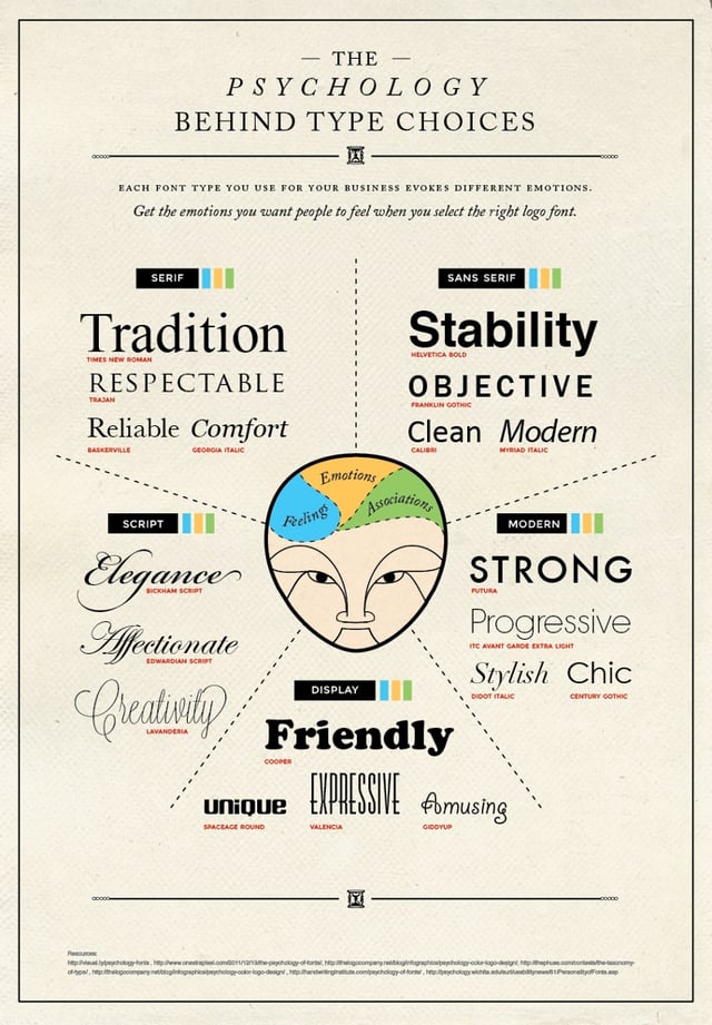
Different fonts trigger different emotional responses and associations in our minds (i.e. time periods, certain qualities, etc.) As a marketer or designer, take the time to fully understand what emotions you want to elicit in your audience so you can strategically choose a typeface that both evokes this emotion while being consistent with your brand.
This infographic from designer, Brandon Gaille helps explain some of the most common associations people have with different fonts:
“Letters gather into words, words build into sentences. In typography, ‘text’ is defined as an ongoing sequence of words, distinct from shorter headlines or captions. The main block is often called the ‘body,’ comprising the principal mass of content. Also known as ‘running text,’ it can flow from one page, column, or box to another. Text can be viewed as a thing – a sound and sturdy object – or a fluid poured into the containers of page or screen. Text can be solid or liquid, body or blood.
As body, text has more integrity and wholeness than the elements that surround it, from pictures, captions, and page numbers to banners, buttons, and menus. Designers generally treat a body of text consistently, letting it appear as a coherent substance that is distributed across the spaces of a document. In digital media, long texts are typically broken into chunks that can be accessed by search engines or hypertext links. [...]
Typography helped seal the literary notion of ‘the text’ as a complete, original work, a stable body of ideas expressed in an essential form. Before the invention of printing, handwritten documents were riddled with errors. Copies were copied from copies, each with its own glitches and gaps.”
Unless you have a background in copywriting, you probably don’t consider how your sentences and paragraphs look visually, but you don’t need to be a copywriter to see the difference between a well-formatted blog post and a science textbook.
Modern consumers, instinctively gravitate towards text that looks lighter and easier to read.
Beyond grammar and writing style, text should visually flow smoothly and guide the reader along the page naturally.
As you add images and other visual elements to the page, they should blend in and complement the structure of the text, bouncing the reader from one point to the next, never fighting for attention.
It should incorporate bolding, italics, bullet points, numbered lists, spacing, and elements of visual hierarchy to break up your text and make your message easier to digest.
“A grid breaks space or time into regular units. A grid can be simple or complex, specific or generic, tightly defined or loosely interpreted. Typographic grids are all about control. They establish a system for arranging content within the space of page, screen, or built environment. Designed in response to the internal pressures of content (text, image, data) and the outer edge or frame (page, screen, window), an effective grid is not a rigid formula but a flexible and resilient structure, a skeleton that moves in concert with the muscular mass of information.
Grids belong to the technological framework of typography, from the concrete modularity of letterpress to the ubiquitous rulers, guides, and coordinate systems of graphics applications. Although software generates illusions of smooth curves and continuous tones, every digital image or mark is constructed – ultimately – from a grid of neatly bounded blocks. The ubiquitous language of the GUI (graphical user interface) creates a gridded space in which window overlay windows in a haphazard way. [...]
The grid has evolved across centuries of typographic development. For graphic designers, grids are carefully honed intellectual devices, infused with ideology and ambition, and they are the inescapable mesh that filters, at some level of resolution, nearly every system of writing and reproduction.”
Grids, whether you can see them or not, form the structure in which text is organized. They can be used to guide the eye, enhance a story, or even highlight a message.
The current trend in grids right now is white space. By eliminating distractions from the page, it’s much easier for a reader to stay focused on the text at hand and easier for you to guide them along with your design.
However, even with white space, we still have to use grids.
Whenever design is structured well, even when we can’t see the boundaries (like with designs heavy on white space), our brains automatically fill in the dividing lines and boundaries.
Without this grid, disorganized white space is just as distracting as clutter.
When laying out your next eBook, website, infographic, or any other piece of content, consider the grid when outlining your content. What’s your main point? What message do you want your audience to walk away with?
Take those goals and work with a designer and determine the best way to use the grid to accomplish them.
Thinking With Type teaches you how to think deeper into the partnership of design and marketing -- from the big picture to every single brush stroke.
Understanding design from the ground up makes it easier to create attractive and more effective, marketing materials without any advanced technical design knowledge and it all starts with letters, text, and grid.