Topics:
Web DesignSubscribe now and get the latest podcast releases delivered straight to your inbox.
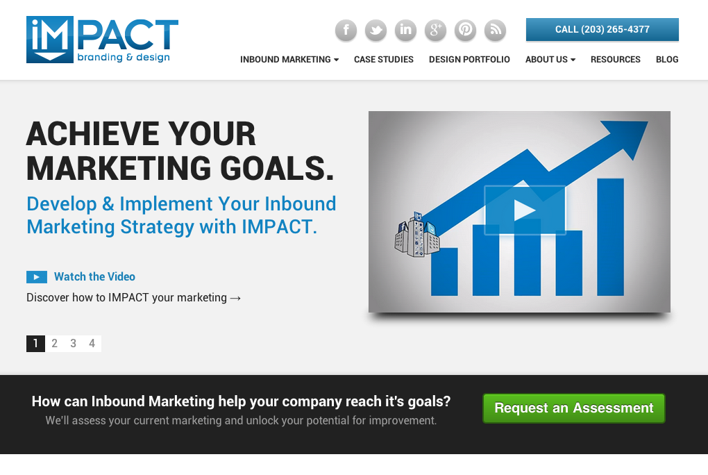 It was time for us to do a redesign. No, not because I thought our old site got stale or was tired of our current website. It also wasn't because I wanted IMPACT to have a new look and feel. And despite popular belief, it's not because I like to redesign our site every 12-months, even though that's sort of been the case. No, the truth is, IMPACT needed a website redesign badly.
The Quick Story of Our Website Redesign:
We decided to redesign our site when we got back from winter break and really got cracking on it the second week of January. I personally led the charge dusting off my website design skills that I haven't used in a couple of years (but I still got it!). Here's a little background regarding our redesign:
The CMS: Our previous site was using Wordpress as a CMS and in order to get a new site up quickly, we decided to stay with Wordpress. A move to HubSpot's CMS was very tempting for us and may still be an option down the road when they release their new CMS later this year.
The Theme: We don't build themes at IMPACT, we almost always start with one we purchase. For our site, I purchased a theme called Pax from Themeforest. We chose it since it has the layout I was looking for was clean, responsive, cross-browser compatible, and had a ton of great shortcodes that I knew would help shorten the development process. This saved a ton of development time. After a little bit of customization (maybe 10 hours), the theme for our site was the way I wanted it. To all the naysayers out there that view utilizing themes as a shortcut, I want to remind you that A THEME IS NOT A WEBSITE. One person was so critical of us using a theme that his comments to us got him banned on Twitter. The fact is, themes are great. They drastically shorten the process of creating a website (which client's love) and allows the agency to get right to creating content, building landing pages, implementing marketing automation, and the other tasks needed to make a website perform as opposed to trying to fix cross-browser issues and optimize the site for mobile. 'Nuff said, themes are awesome.
The Content: This is where we spent most of the time time on our site, and most of our time is an understatement. We wanted our content, both text and graphics, to really show our vast understanding of the inbound marketing methodology and our capabilities. I worked 20 days straight averaging 15 hours a day to get the content completed and pages built. As you can imagine, I was pretty red-eyed for a while. Thanks to John Bonini for helping with the content. If you like the graphics, credit also has to go to Bobby Kane and Amir Hamdi. We spent a combined 400 hours building and implementing our site's content and graphics.
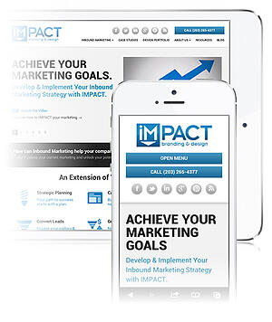 Mobile Optimization: We want our mobile website visitors to have just as good of an experience as our desktop visitors. As I mentioned, the theme we purchased is responsive, but when building the pages, often the content did not appear the way I wanted it to. Throughout the entire process, I was constantly checking the site on my iPhone and implementing mobile-only sections to ensure the best experience for our visitors.
Marketing Automation: We wanted to take advantage of as many HubSpot 3 / Enterprise tools as possible. This included implementing lead scoring and Hubspot's smart tools. Thanks go to Katie Pritchard and Keith Cairo for helping convert our hundreds of landing pages to Smart Landing Pages.
Proofing and Launch: The week before going live, the site was pretty much ready to go and it was time for all of the pre-launch tasks. Among these tasks included creating 301 redirects (hundreds of them) and proofing the site's content. You need to know your strengths, and grammar and spelling is not a strength of mine. Poor John Bonini, Amy Chudy, and Carolyn Edgecomb had to fix all my typos. If there are any left - blame them (achudy [at] impactplus.com).
What's Left: The site is not as fast as I want it to be - And that's our priority over the next few weeks is to optimize our scripts and CSS to drastically increase the site's loading performance. It was important for me to get this site live and we'll continue to improve it over time.
7 Things We Did With Our Website Redesign:
1. Define a Clear Value Proposition
Does your website pass the blink test? Ours didn't, so that was one of my top priorities. This didn't take too long since I knew the objective of the website, to tell visitors that we can help them achieve their marketing goals and help them develop and implement their inbound marketing strategy. Like most websites, our homepage is our most popular page - therefore this value proposition needed to pop off the page. How'd we do?

2. Create a More Modern Style & Prove Design Capabilities
You're probably saying - Bob, in the first line of this post, you clearly said that you didn't redesign your a new look and feel. Correct, but when our prospects are asking if we have certain design capabilities and want to see proof, then clearly our site was not proving our design capabilities. And what's worse, it was extending our sales cycle as we then had to collect and send relevant website examples.
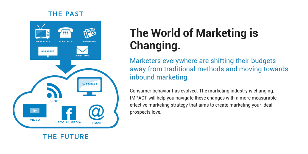
Showcasing our design capabilities was a huge priority. From our homepage, to our blog, to our inbound marketing page, to our landing pages, we wanted to ensure all aspects of our site reflected a complete and professional image. Below is a screenshot from our inbound marketing page in which we took advantage of design elements that include big, graphical images, headers, sub-headers, small paragraphs, and clear calls to action.
More importantly to our prospects is the design work we've done for our clients. That's why we created our new design portfolio. Now client's are able to better qualify our capabilities even before speaking with us, thus shortening the sales cycle.
3. Clearly Define Our On-Boarding Process
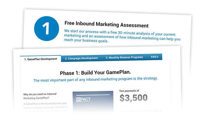
I sit next to Jeff Pelliccio, one of our inbound marketing consultants. If I had to hear him explain the on-boarding process that a new prospect goes through one more time, I was going to freak out. Clearly, our website was not explaining our process which was obviously a topic that our prospects cared about. So in order to make our inbound marketing consultants more effective, I knew we needed to get this information on our website and in the hands of our prospects before they speak to us allowing the consultant to spend less time discussing our process and spend more time helping the prospect understand how inbound marketing can help them. We created an on-boarding page, which we feel is now a very important page for us, and also tried to include this process everywhere else on our site where it makes sense, like on our pricing page.
4. Showcase Our Personality
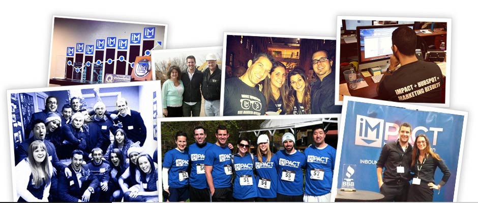
Another common question during our sales process was, "can you tell me more about you?" In which I would hear our consultants repeat time and time again our story, about me, who does what here, and our culture. So clearly, we needed to showcase more about the people of our company. In our business, it's all about relationships. People do business with people. Every account is assigned a dedicated account manager, and part of the value of our offering is the relationship between the account manager and the client.
To showcase more of our personality, we added the following picture to our homepage. It shows our team's personality, the culture of our office, our closeness as a team, our professionalism and our creativity, and the fact that we're real people. Beyond that, we also implemented page that shows our story, a new culture page with pictures from instagram, and an updated version of our team page.
5. Improve Calls to Action, Generate Qualified Leads.
The point of our website, like any other inbound marketing website, is to generate leads. We're going to do that with attractive offers and landing pages. To get people to our landing pages, we need relevant calls to action. Inbound marketing basics right? Well our old site did a poor job at that.
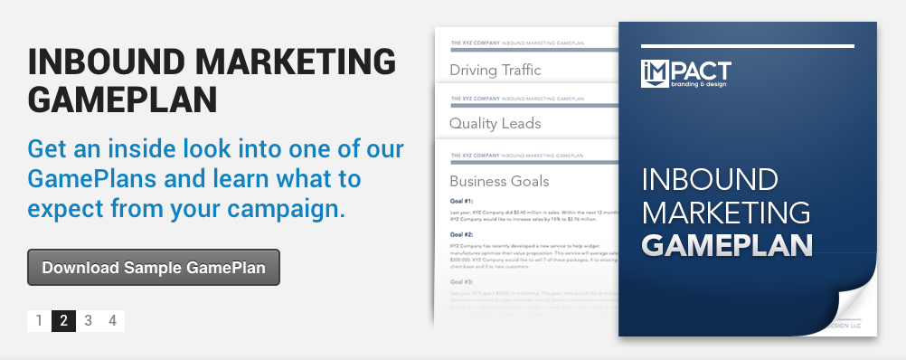
I truly believe we did a great job with our new CTA's. From the ebooks in our slider, the giant Inbound Marketing Gameplan CTA on our homepage, the HubSpot inspired banner on our blog, and the numerous request assessment buttons on our service pages, our site is now packed with relevant CTA's. Quickly, we noticed that our lead generation is up 50% from last month.
6. Shorten Our Sales Cycle with Content.
You've already read me mentioning this several times throughout the article, but I cannot express how important shortening the sales cycle was for this redesign. It was probably the main reason behind the website redesign. Here is a list of 12 ways our new website shortens our sales cycle:
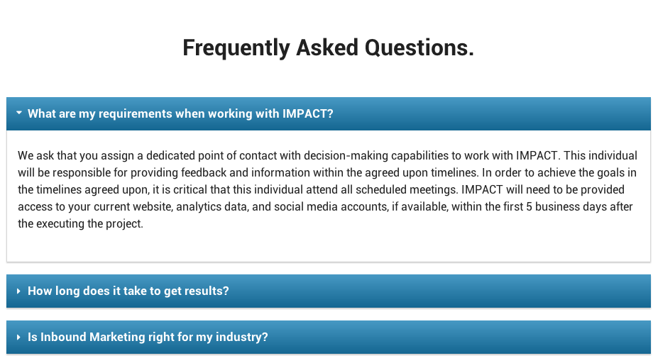
- Frequently Asked Questions Page addresses the most common questions in a sales process (See below).
- On-boarding page showcases our process from consultation to client.
- Inbound Marketing Services section clearly defines how IMPACT helps them with our services.
- Showcases the people of the organization thoughout the site.
- Provides customer proof with case studies and testimonials.
- Pricing page sets realistic expectations on our pricing.
- Design portfolio showcases our design capabilities.
- Retainer section explains the relationship client and account manager.
- Show's an example of one of our Inbound Marketing GamePlans.
- Educates prospects on how inbound marketing can help achieve their goals.
- Shows how IMPACT will help you generate a marketing ROI.
- Explain how and why they need HubSpot.
7. Implement a Page-Level Lead Scoring Strategy.
So now that we are educating our prospects and generating a ton of leads, our inbound marketing consultants need to be able to qualify which leads are sales ready (and ones that are not). We knew we needed to set up a powerful and accurate lead scoring system, which required page level segmentation as available in HubSpot Enterprise.
We kept this in mind when creating pages. Sections such as our services, case studies, pricing, on-boarding process, and offers such as 'What to Expect When Working With IMPACT' and '10 Reasons to Hire an Inbound Marketing Agency' represent sales-ready activity, or other agencies checking out our stuff. :)
We used a leads visit to these pages as part of our lead scoring system. We qualify leads in Salesforce and a level of 85 represents a lead that is an SQL.

Conclusion
It's been my pleasure to share this insight with you, and thank you for reading. If you would like to ask me any questions, please leave a comment below and I will respond within 24 hours. Also, feel free to share your redesign experience, we'd love to hear it!
Free: Assessment

