Topics:
Lead GenerationSubscribe now and get the latest podcast releases delivered straight to your inbox.

The following is an excerpt from IMPACT's new ebook, "26 Ways to Generate More Inbound Customers in 2013." For more expert tips on capturing more qualified leads from your website, to Generate More Inbound Customers in 2013">be sure to check out the full ebook.
In order to attract visitors and generate leads, it's no secret that you need great, resourceful offers.
A great offer is only as great as its landing page.
A landing page acts as the vehicle for gathering the contact information of your visitors in exchange for one of your offers. Once this occurs, you now have a contact list that you can effectively nurture further down the sales funnel.
However, you have to essentially sell your visitors on the benefits of the offer in order for them to willingly offer their valuable contact information. Are you conveying enough value through your landing page content?
What Makes a Great, Lead Capturing Landing Page?
Obviously the first step is having great copy.
Visually, it can be as gorgeous as San Francisco on a sunny day, but it your content is weak and not conveying the value of your offer, don't expect many clicks.
But what makes great landing page copy? The first step is knowing your audience, and what affects their purchasing behavior. Obviously, if you're already creating landing pages and offers, you have already defined your buyer personas right? Right?
So here's how you can ensure that your landing page copy is capable of capturing leads.
Consider these 6 tips for creating more effective landing page copy:
- Use action oriented language – Let visitors know how they’ll benefit. What are they getting out of it? Rank higher. Drive more traffic. Generate more leads. Action words produce results.
- Consistent content – Your users clicked on a call-to-action to get to this landing page for a reason, they liked what they saw. Be sure to include that same message on your landing page as well.
- Write in the second person – Visitors want to know how you’ll help them. Speak in those terms. Learn how “you” can rank higher. Learn how “you” can drive more relevant traffic.
- Clear and concise – Landing pages often aren’t the best places to get creative. You have a very short time – 3 seconds according to HubSpot – to convince your visitor. No time for fluff. Let them know why they need this offer…quickly.
- Convey value – Sounds obvious, but use language that conveys value. How will they benefit?
- Format – Great copy often goes overlooked if it’s formatted poorly. Website visitors prefer scanning than large chunks of text. Utilize bullet points, numbers, and line breaks to make it easier to read.
Proper Landing Page Format
- Get rid of any navigational bars or extra links
- Get rid of any flashing images or distractions
- The description of the offer needs to be simple and clear (point form is best)
- Keep your form above the fold of the page (meaning, keep it fully viewable without the visitor having to scroll).
- Fewer fields in your form will result in more conversions. Just keep the most important ones in there.
- List only the benefits of your product
- Provide a couple of testimonies at the top fold of the page (optional)
Smart Landing Pages
With the launch of ‘HubSpot 3’ in August of 2012 came the unveiling of “smart” content, including smart landing pages.
By utilizing the HubSpot software, you can offer your visitors a more unique, targeted experience by enabling them to skip the process of filling in all of their information each time they fill out a form for an offer, making it easier.
The result? More lead reconversions, more sales qualified leads, and ultimately, more sales.
Smart CTAs
Without a great call-to-action, it will be much harder to drive the amount of traffic to your landing pages that's necessary to succeed. HubSpot now allows users to feature smart CTAs, where your visitors will actually see different CTAs each time they convert on one.
This ensures that website visitors will never see a CTA graphic again if they’ve already clicked and filled out the form for the offer.
This enables you to more effectively work visitors down the sales funnel with different offers.


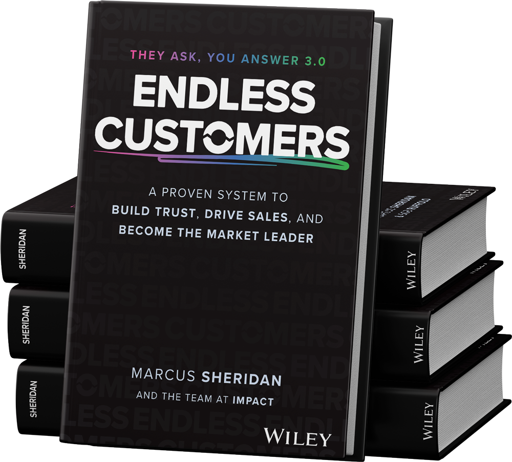
Order Your Copy of Marcus Sheridan's New Book — Endless Customers!

