Topics:
Lead GenerationSubscribe now and get the latest podcast releases delivered straight to your inbox.
What Is a Landing Page? Everything You Need to Create One That Converts!

Aug 22, 2017
As digital marketers, we’re almost always looking for ways to generate more leads.
Put a call-to-action here. Change the headline text to this color. We try so many different things, yet a lot of times, the solution lies in one of the foundation elements of inbound marketing -- the landing page.
A well-crafted landing page is the single-most important tool in turning a visitor into a lead, so read on to make sure you’re still doing it right.
But First, What is a Landing Page?
By definition, a landing page is a page where visitors to your website “land,” typically by clicking on a link or call-to-action which may either be on your website or on another external site.
More specifically, it is a page where someone exchanges their contact information (usually by filling out a form) for something of value.
In order for a web page to be considered a landing page, it must meet this criteria:
- The page has a form to collect leads
- The sole purpose of the page is to collect information from that form
But, I have an opt-in form on my homepage, doesn’t that make it a landing page?
No. Your homepage serves several purposes and discusses many different topics beyond lead generation. It welcomes new and returning visitors, it helps show visitors how to get to different areas of your website, and yes it may happen to collect leads.
Like homepages, many types of pages may closely resemble landing pages (such as a click-through page) but technically aren’t. They might look the same and have the same end goal, but they aren’t landing pages if there is no form that collects leads directly on the page.
That doesn’t mean you can’t use elements of a landing page in all kinds of web pages. It just important to understand the distinction between one and the other.
Different Types of Landing Pages
Landing pages are usually defined or strategized based on their offer. Obviously the goal from an inbound marketing perspective is to collect leads, but you have to consider what’s in it for your persona as well.
You also need to offer them something in return. Most people don’t like to give away their contact info (especially not their address or phone number) just because a page is pretty.
The page doesn’t have to offer anything extravagant or extreme, but it has to be something of real value to your persona -- something that fulfills a need or relieves a pain point.
Let’s take a look at how you can approach landing pages for different types of offers.
1. Long-form Content
In inbound marketing, long-form content is one of the most common types of an offer to appear on a landing page.
On this landing page, you usually present a free eBook or another type of document that holds valuable, relevant information that couldn’t be found elsewhere.
Let’s say your company sells WordPress themes and your ideal persona could benefit from an eBook that lists the “Top Twenty Must-Have WordPress Plugins.”
On your landing page, you must convince your audience that they need this offer and that is worth exchanging their contact information for.
With this in mind, consider including:
- A cover photo
- An excerpt or snippet
- Bullet points highlighting the content
- Customer reviews
- Share/Download numbers
2. Free Trial/Demo
People are indecisive and often need to eliminate all doubt before taking action. What better way to convince someone who is on the fence about your service than to let them test it out for free?
Even if they decide to cancel after their free trial period, you still have more opportunities to improve your bottom line.
When it comes to this landing page you should include:
- Product Benefits/Value
- Customer Reviews
- Trial Terms: Length of the Trial, Features Available, Any Guarantees (No credit card needed, risk-free, etc.)
Are you a SaaS? Learn all about how to generate more SaaS trial users than ever here!
3. News/Updates
For this landing page, your persona signs up to be the first to know about updates at your organization (i.e. a new product launch, a new blog article, etc.).
Does your business already have a thriving customer base or large following of loyal fans? This offer, while it may not seem like much, can be extremely valuable to those people.
The people who lineup and say “take my email, I want to know immediately when this is available” are the same people who say “shut-up and take my money!”
For this landing page, consider keeping the form short (perhaps just requiring an email address and first name, or just email) and include information about what, when, and how. If someone is signing up for a product launch notification, for instance, this may include:
- Launch Date (even if tentative)
- What to Expect (in terms of communication)
- Value of the New Product/Website (Features, services, etc.)
4. Coupon, Discount, or Free Gift Card
However you decide to position it, this offer is all about money; either saving a prospect it or giving it away.
One of the great things about using this offer is that it doesn’t cost you anything until the prospect becomes a customer.
A content offer takes time and/or money to produce; a free trial uses various resources from your business, but a good ol’ fashioned discount requires no resources upfront.
For this landing page, the benefit is rather clear. Instead of just trying to sell the reader on the value, focus your landing page on highlighting the offer terms and maybe even highlighting something they could use the coupon on.
5. A Physical Gift
Mailing your readers a free gift like a t-shirt, stickers, or other company “swag,” it is a great way to “delight” your customers and get free exposure. (i.e. If you give someone a free t-shirt, every time they wear that out and about, your brand is reaching a new audience.)
With this landing page, you can collect not only an email address but also collect a physical address so you can mail them the gift. While this isn’t a priority for inbound marketing, it does open another line of communication for the future if needed.
On this page you may also want to include:
- An Image of the Free Gift
- Terms (Reassure your audience that their address is safe, provide an estimated delivery time, etc.)
6. PPC Landing Page
When it comes to pay-per-click, don’t just consider your PPC ad, but the landing page they’re directed to your ad. Since the text on your PPC ad and landing page can affect your conversion rate, it’s important to make sure that they are consistent and easy to understand.
Also, you’ll want to stick to one ad per landing page to ensure the content is suited to that persona’s experience or position in the buyer’s journey.
🔍 Related: 5 Key Elements of a Winning Inbound Marketing Strategy
How to Craft a Lead Generating Landing Page
Every landing page you create needs to be tailored so that it speaks specifically to the campaign’s persona. You need to take distinct things into consideration, such as:
- How did the person arrive at your landing page?
- What are their demographics?
- What pain point are they feeling at this time? What pain point does your offer solve?
- What sort of tone and jargon does this particular target market relate to?
Making a landing page that people will actually spend more than half a second on is a challenge to most, but it can be done. Here are some of our top tips on how you can create a successful landing page:
1. Keep it Simple
No one wants to sort through paragraphs and paragraphs of content trying to figure out if an offer is right for them. Keep it short, and keep it simple.
Have things like bullet points and numbered points to draw visitors to your key selling points, and to make it easy for them to understand your product or service.
You don’t need to write every detail of your offer, just enough to pique curiosity and remove friction.
2. Write About the Benefits
When it comes to describing your offer, don’t just list cold, technical features. These things are usually universal and are easily replicable by competitors.
Instead, focus your copy on the benefits that your features lead to. People often arrive on landing pages because they have a problem that they want to solve. Phrase your benefits in terms of solutions to these pain points.
This will help people actually tangibly envision what they’ll get by converting.
3. Social Proof
Do people have great things to say about this offer? Have more than you ever could have imagined converted on it?
All of this acts as social proof and nothing is better at building trust, credibility, and lowering people’s objections to converting than social proof. Social proof is a powerful affirmation that everything you claim on your landing page is true.
In fact, a study by Nielsen found, 92% of people will trust a recommendation from a peer, but 70% of people will trust a recommendation from someone they don’t even know. So, don’t doubt it’s influence!
Here are a few social proof examples you can try on your landing pages:
- Customer Testimonials
- Social Sharing Stats
- Customer Logos
- Product Reviews and Star Ratings from Users
- Awards
- Industry Influencer Endorsements
- Customer Pictures / Videos (of real users using your product)
- Customer Success Stories / Case Studies
- Partnerships
- Trust Badges
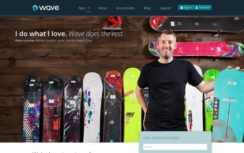
Wave is a perfect example of how to incorporate social proof on your landing page, displaying customer testimonials on theirs:
4. Don’t Link Out
As we mentioned earlier, a good landing page is focused on just one offer; one action they want the visitor to take. Anything that doesn’t point to this action should be eliminated, including navigation and outbound links.
By adding links on your landing page (whether they’re to outside resources or your own website), you’re providing your visitors with distractions and the opportunity to leave without converting. So, don’t risk it.
Only 16% of landing pages don’t have navigation. This is a small, but amazingly effective change you can make.
5. A/B Testing
A/B testing is great for improving the performance of your landing page, which is why you should always be monitoring and tracking the performance of your landing pages and then taking action on the data. You can conduct your A/B tests with tools such as Hotjar and Optimizely (or even HubSpot).
Not every audience is the same. The message or design you have on one landing page might only resonate with one particular segment of your audience so you need to experiment to find the best ones.
When implementing an A/B test on your landing page, some elements you’ll want to test include the headline, your CTA, the graphic used, form fields, and the copy.
While you can test pretty much anything you’d like, stick to items that will have a big impact and significantly impact conversions. Just remember to always test one element per test, otherwise, you won’t know which variation caused the increase.
If you’re A/B testing your landing page, to judge the performance of your test, some metrics you’ll want to measure are the conversion rate, exit rate, and the page's bounce rate.
6. Consider Including Video
Studies show Adding video to your landing page can increase conversions by over 80% and pages with video are 53 times more likely to rank on the first page of Google search results.
If you’re adding a video to your landing page, keep these best practices in mind:
- Video should be above the fold
- Choose a thumbnail that best represents the video and audience you’re trying to reach
- Turn off autoplay
- Include a CTA at the end of the video
- Add directional cues to pinpoint the conversion goal
- Keep it short
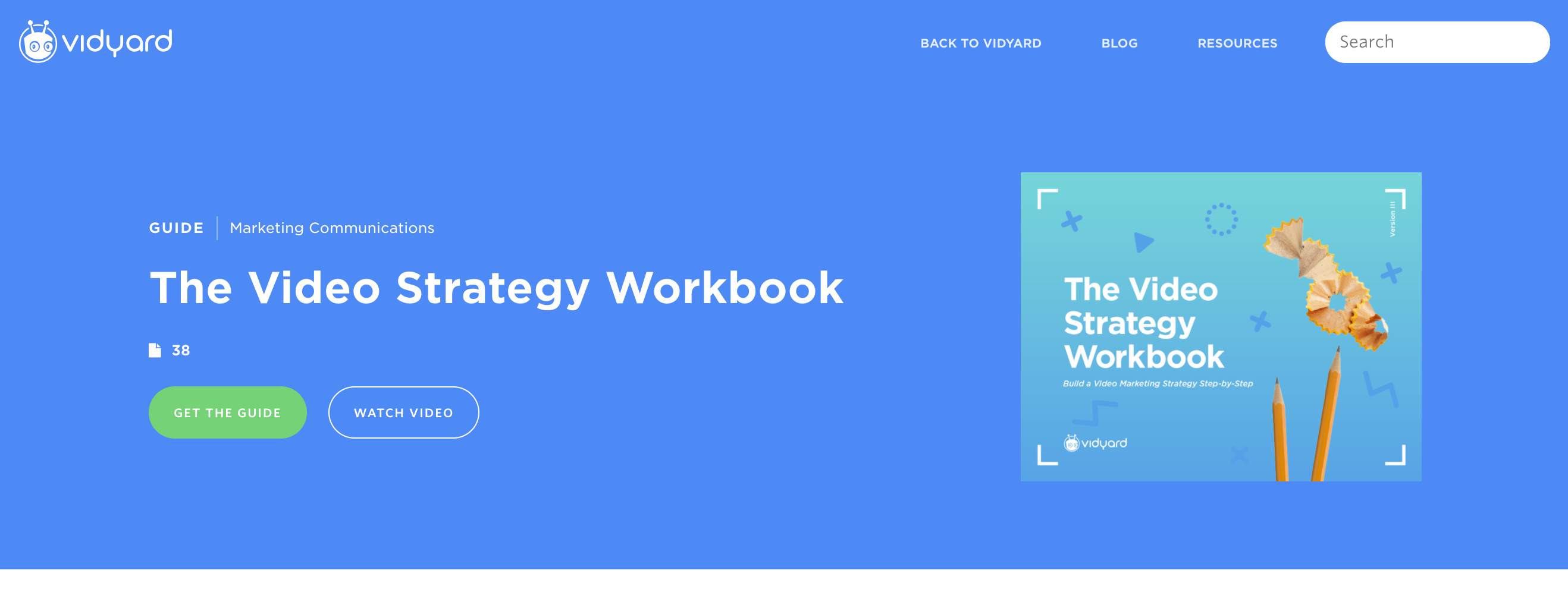
Here’s a great example from Vidyard. While the video doesn’t play in the background, you can click on the “watch video” button to start viewing the video in a lightbox.
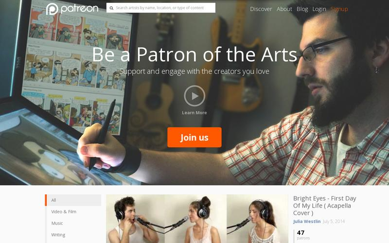
 Patreon, on the other hand, makes their video a primary focus of the landing page:
7. The Length of Your Form
Would you fill out the form on your landing page?
You would be amazed by how many people create really long forms that consist of irrelevant fields. Unfortunately, causing your visitors to hit the back button.
Put yourself in your visitor's shoes, and review your forms. If any field isn’t absolutely necessary for your company to ask at that stage of the funnel, remove it!
A study by Unbounce tells us that forms with 3-5 fields have a 20% conversion rate while forms with 6+ fields show results of only 15% conversion. So, stick with 3-5 form fields and make sure they’re items you need to ask them at this stage.
How Many Landing Pages Do You Need?
Having multiple landing pages for different products and services or for the same thing is important.
While one landing page may work for one type of visitor, it may not work so well for the next, so you’ll want to have a page that speaks to each persona or perhaps different pages optimized for different search terms.
Just make sure you’re not directly duplicating content as this will negatively affect your site authority in search engines. Every landing page should be unique and target the pain points of the audience you’re trying to reach.
The only way you can really find out how well your landing pages are doing is by creating A/B testing and, if possible, you can narrow down what’s working on all of the pages through multivariate testing.
Bringing it All Together
By now you should have a clear idea about what a landing page is and some ideas about how your business could use one (or several.)
Now you might be wondering how to design your landing page?
Believe it or not, designing a landing page isn’t complicated.
- Just: Have a clear call-to-action that readers see immediately when they land on the page
- Keep the design simple and free of distractions (No menus, sidebars, etc.)
- The copy should be clear and concise -- get to the point!
- Only request the minimum amount of information, making it as easy and quick as possible for your persona to sign-up
There are a lot more advanced things you can do to optimize your landing page, but those are the most important criteria.Now that you know what you’re doing, you can start generating more leads from your landing pages right away!

Order Your Copy of Marcus Sheridan's New Book — Endless Customers!