Subscribe now and get the latest podcast releases delivered straight to your inbox.
What Does a Great Inbound Marketing Website Look Like in 2024?

Aug 8, 2023

When I was 10, I built my first website.
It was a single page dedicated to the anime series Sailor Moon and, to use a phrase from that era, it was “the bomb.”
It had everything you’d expect from a late 1990s-early 2000s fansite.
It was built on the pioneering, but now defunct, Geocities. There were animated looping GIFs I saved from other websites, large slow-loading images, and background music that auto-played at every refresh.
Of course we can’t forget the unreliable “visitors” count — and, of course, the same static, generic information about the series you could find on hundreds of other fan sites.
Today, it’s laughable. But, if we’re being honest here, it was pretty on par with most websites online at the time.
 Just take a gander at the real website for Space Jam. It went live in 1996 and is still up to this day.
Fast forward 20-odd years and, thankfully, the web space has dramatically changed, and not just because websites now live in our pockets rather than just on chunky desktop computers in our living rooms.
Who we are as consumers has changed as well, and marketers need to take notice, especially when it comes to their inbound marketing web design. It’s only natural to be confused. There are so many content and design practices to consider and evaluate.
What do users actually want to see? What content do they want to read? What features will help you convert more leads? What design can help you close more sales?
Answering these questions and launching successful inbound websites is something we’ve helped hundreds of companies with.
So, in this article, I will share:
- How modern websites and user behavior have changed
- 10 features of a great inbound marketing website design
- Examples of these features in action
In websites we trust: how websites and user behavior have changed
Today, buyers have a relationship with the internet that wasn’t even a thought when I first logged onto Geocities.
Now, the internet is the first place we turn when making almost any purchase. In fact, 63% of shopping journeys start online, whether you’re searching for a specific product or just gathering information.
Regardless of what they're shopping for, every consumer is hunting for the same thing: a brand they can trust.
Everyone is looking for a company with a product or service they know will actually solve their problems. A brand that they know will deliver on its promises, that won’t sell them what they don’t need or doesn’t work. Someone reliable and worth giving their hard-earned money to.
Especially, facing a recession — when budgets are tight and so many people are feeling helpless — this trust is more important than ever.
When it comes to your website, there are a number of ways of establishing and reinforcing this trust for 2024 — and no it doesn’t involve animated GIFs.
Features of a great inbound marketing website design
Below I'll share 10 critical elements (along with examples) that every great inbound marketing website design should have to aid their strategy and make buyers’ journeys easier.
They'll also help you establish the trust needed to actually make your ideal customers comfortable doing business with you.
1. Customer-focused messaging
I can say it time and time again: Your website is not for you, it’s for your customer.
Your website exists solely to give your current customers and potential buyers all of the information they want and need to feel comfortable making a purchase. (More on this later.)
Everything on your business website should be catered to their needs, especially your messaging. From your value proposition in the hero section to your blog topics, put yourself in your customer's shoes.
What do they want to know when they arrive on the page? What are their concerns and questions? What value do you offer? What problem do you solve and how?
If you’re already a big and beloved brand like Coca-Cola or Microsoft, you can get away with not selling your worth. When you’re still introducing yourself, however, and building trust with website visitors, keep your messaging about them.
As my friend Ann Handley says in her book Everybody Writes, “The best way to keep readers reading is to talk about them, not you.” In other words, don’t tell them what you’ve done.
Tell your story in terms of what you can do for them.
In They Ask, You Answer, IMPACT partner Marcus Sheridan recommends following a 5-to-1 ratio of self-promotion when writing your inbound website content.
That means you should refer to the customer five times more than you refer to yourself or your company. This helps maintain an air of helping, not selling.
You can also take a more holistic approach with The StoryBrand Framework.
The StoryBrand Framework is a messaging template that essentially positions customers as the "hero" in a story. They are the main characters facing a challenge in the story of their lives and brands as the guide or solution that helps them live happily ever after.
Dot Drives, a software company for nonprofits, does a great job putting the framework to work on its website.
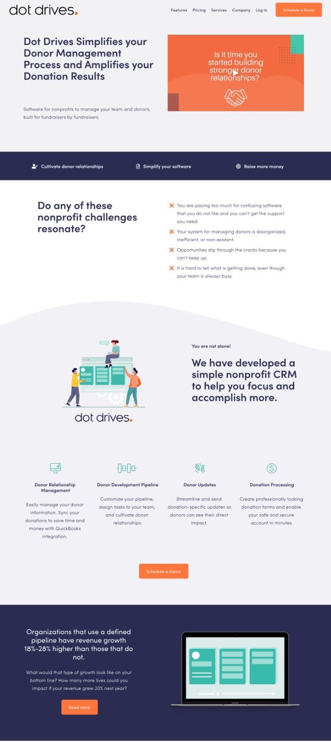
Notice how in their copy, they lead with the value and success of their customer: The customer's tasks will be amplified, their results will be amplified.
Using the StoryBrand approach, they immediately highlight their three key offerings and then draw attention to the challenges a potential customer is facing.
2. A user-friendly design
It’s not enough to have an inbound marketing website design that looks good in form (which it should), it also needs to function well.
That means your website needs to be easy for the user to navigate and complete the actions they want.
From a marketer’s perspective, Marcus says to ask the question, “How do we get them to page two?”
It’s your job to fully understand what page two or the next step in their journey on your website should be on each page for your target audience.
Then, you need to make it as easy as possible for them to take it, without having to think or figure things out on their own. Perhaps this is in the form of a call-to-action button or a form.
In terms of your homepage, put the most common and important next steps for your business (i.e. scheduling a time to talk, making a purchase, signing up for a trial, or even learning more about your product) front and center (or at least easily and intuitively found) in your navigation.
This next step will likely change depending on where your visitor is in their buyer's journey, but until you have that information, sticking with the most common is a good benchmark.
61% of shoppers report saying navigation and search are the most important attributes of online shopping in the United States. The harder it is to find the things they want to do, the more likely you are to lose the sale during the hunt.
Duolingo's website has a great user experience.
When you first arrive on the homepage, their major calls to action are front-and-center: get started or log into your existing account. In other words, convert.
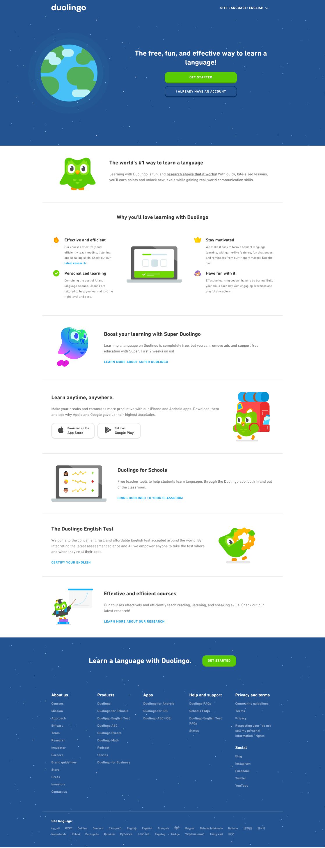
As you scroll, things get more granular about what Duolingo is and what it offers, but the path to learn more or convert based on those offerings is made extremely clear with in-line links in each section.
3. Optimized site speed
User-friendliness can also be heavily impacted by your site speed, or how long it takes your website to load.
Modern buyers and website visitors are impatient. They want trusted answers, but more so, they want them quickly. In fact, a study shows more than half of users expect a website to load in three seconds or less.
That means it doesn’t matter how great your content is. If your website doesn’t load quickly enough, they’ll bounce before they ever find out.
Of course, that’s assuming they ever get to your site in the first place.
Site speed, page load time, and your website’s performance overall are factors that heavily influence how well you rank in search engines like Google. So, the slower your site is, the lower you’ll rank.
Studies show you want your site speed to get to as close to or below five seconds as possible to keep users around. You can see what yours is for free on sites like webpagetest.org or Google’s PageSpeed Insights.
If it’s skewing on the longer end, do the following:
- Compress your images
- Implement lazy load
- Use a CDN
- Minimize HTTP requests
You’ll also want to pay close attention to mobile optimization and make sure you have a responsive website. Poor performance on a mobile device can also affect your search engine rankings and lose potential customers.
Speaking of which...
4. Search engine optimization
Every great inbound marketing website should be optimized to rank and get found in search engines — and by generative AI-powered search.
Of course, there are other sources of traffic like social media and referrals, but with most people starting their purchasing journey with a web search, optimizing your website and content for search engines can't be neglected.
This means tackling two main buckets: on-page and technical SEO.
On-page SEO pertains to things like your page title, meta description, and headers. Optimizing these with accurate keywords not only helps search engines crawl and understand what your page is about but also helps users skim the page and find what they need.
Technical SEO refers to a lot of what we mentioned in feature three — site speed, mobile responsiveness, and site structure. It can be a bit intimidating, but Backlinko has a comprehensive guide that does a great job of breaking it down.
Both of these areas should be carefully planned for when building your website and creating content for it.
5. Question-focused content
Creating content is a must for any digital strategy, but it’s not enough to just publish anything to your blog.
You have to create content current and potential customers actually care about — content that offers them value. That value can take many forms and change with time.
At the start of the COVID-19 pandemic, for example, Bain & Company found:
“Consumers globally are valuing services, products, people, and institutions that: reduce anxiety, reduce risks, and provide some sense of safety and belonging."
Pandemic aside, generally marketers say brand content should either educate or entertain, but for small-to-medium-sized businesses (SMBs), we recommend leaning most heavily into the former to most directly and quickly impact your bottom line.
As an SMB, the best content marketing is content that will help people make educated buying decisions by addressing questions, objections, or concerns they may have about your offering — or your industry in general.
Answer the questions they are asking and typing into Google, and answer them honestly.
Regardless of industry, size, or offering, we typically find these fall into five categories we call The Big 5:
When you answer these questions thoroughly and truthfully on your business website, your audience will naturally find you, and begin trusting you as the brand that told them what they needed to know.
You helped; you didn't just "pitch" to get them on the hook.
Before the internet, businesses would have brochures and catalogs with all of the information about their products and services to field questions.
You still need those assets today; they just need to be on your website ready to be found when users are looking for them or for your sales team to link to in conversations.
Tailwind CSS does a great job of this.
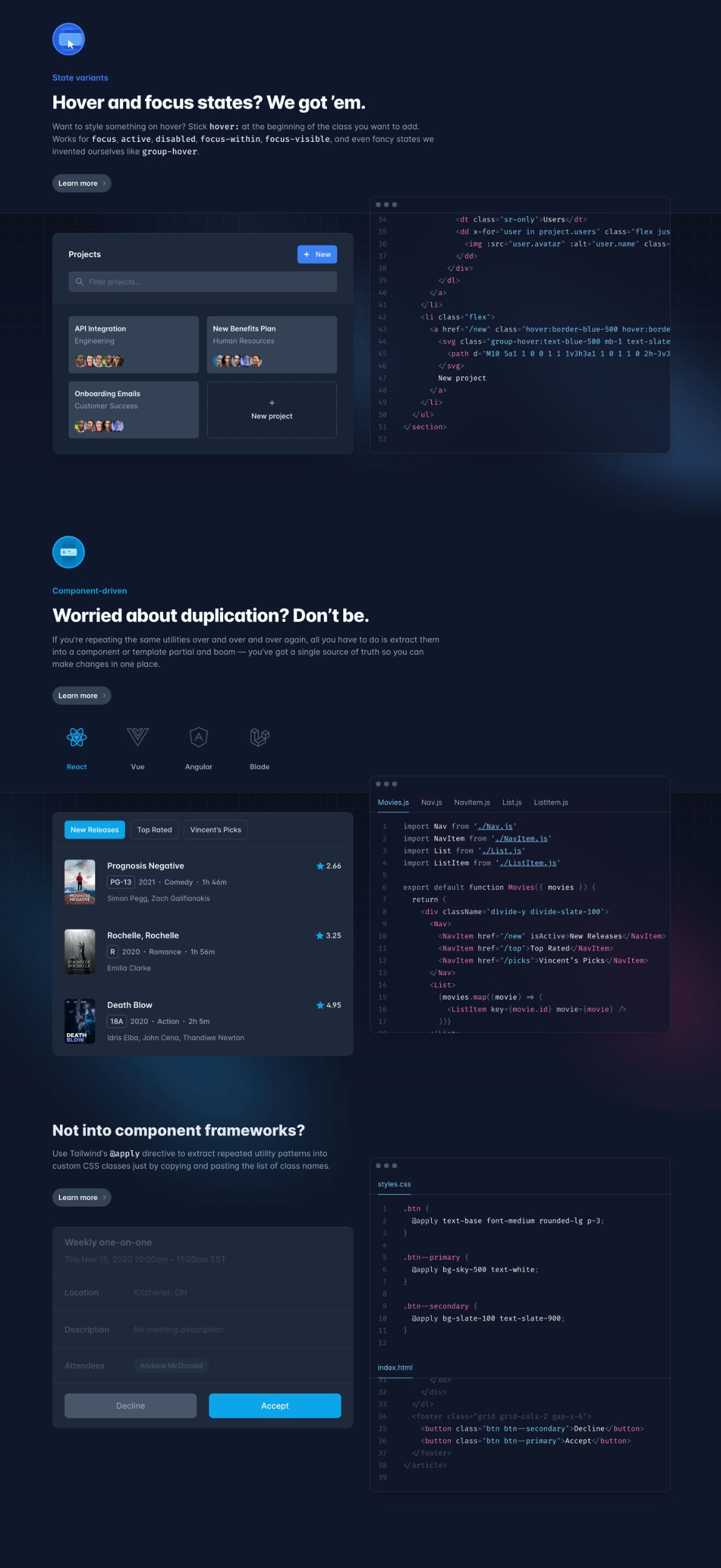
While we primarily focus on answering questions in blog articles, the tech company cleverly uses questions to highlight its unique features and solutions as you scroll down its homepage, then links to pages to go into more detail.
6. Mix of text and visual-based content
Now, before we move on, let me get one thing straight: Answering purchase-related questions is a box you must check, but it's not the entire list. This is simply one part of a healthy content mix.
In addition to purchase questions, monitor related news and topics your customers care and talk about. Answer questions related to these or speak about them within the context of your business.
This shows you are current and truly a knowledgeable resource; not just preaching the same old information.
Another part of a healthy, trustworthy content mix is having a mix of mediums.
Some people are voracious readers who will gobble up every 2,000-word article you publish. Others, however, may be visual or auditory learners, or simply not have the time to sit down and read article after article.
This is proving to be increasingly common as the demand for video content continues to increase. 73% of respondents said, when researching a product, they’d prefer to watch a short video than read a blog post, view an infographic, or watch a webinar, among other things.
Plus, studies show that information shared in a video is much more likely to be remembered, not to mention the humanization that comes with seeing and hearing members of your team on film.
All that being said, a great inbound marketing website includes both text-based and visual content.
Every critical page on your website should include both ways to consume your content. This extends the reach and effectiveness of your content by not only aligning with customer preferences but also offering another level of accessibility.
What kind of video should you create? Well, you can certainly tackle The Big 5 in video, but throughout your business pages, you can also include what we call The Selling 7:
- 80% Videos
- Employee Bio Videos
- Product or Service Videos
- Landing Page Videos
- Cost Videos
- Social Proof/Testimonials Videos
- “Claims We Make” Videos
IMPACT client Berry Insurance does a great job with their inbound marketing overall, but we're especially fans of their extensive library of videos, blogs, and podcasts.
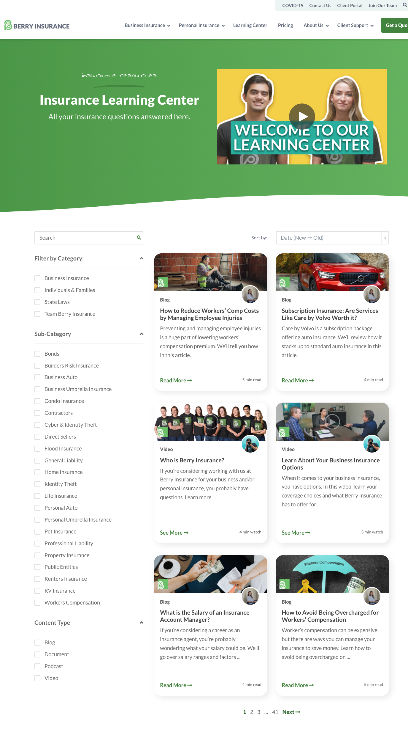
They also make it easy for you to filter through their different mediums using the "content type" labels in the left-hand menu. Here's a great example of one of their videos:

7. A hub of premium content
Speaking of a healthy content mix, great inbound marketing websites go beyond just blog articles to include “premium” pieces like:
- Webinars or long-form videos
- Online courses
- Original research and reports
- Evaluations and quizzes
- Content pillars
- Templates
We call this “premium” content because these offers go beyond basics and provide some advanced knowledge or engagement with your organization. They also, typically, take more time and dedication to consume.
These pieces also offer higher value to your audience than blog articles and showcase greater expertise in your industry.
Including these on your inbound website instills the fact that you are a trusted authority in your area and (from a selling perspective) tends to show greater engagement and intent from a prospect.
Once you have this content, it’s important to display it prominently on your website.
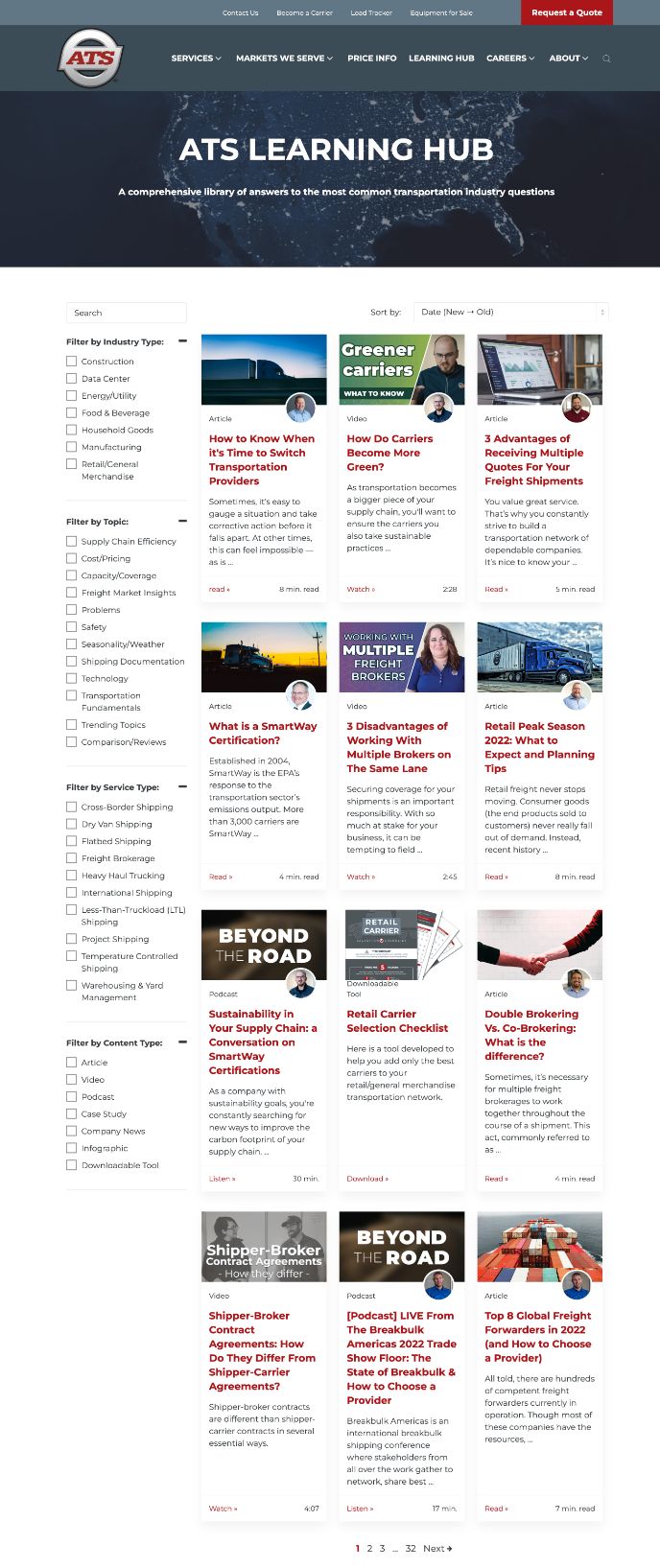
We’ve found housing content in what we call a Learning Center to be the most user-friendly and effective way to do this. IMPACT client ATS does an great job with its learning center, including a host of mediums and filtering options.
8. A self-service tool
Modern buyers don’t want to be sold. They can spot sales pitches from miles away and have learned to drown them out.
That’s why, with Forrester and SiriusDecisions estimating that 70% of the buyer’s journey is completed before someone ever talks to a salesperson, great inbound marketing website design enables people to evaluate their options and buy or disqualify themselves.
Effective web design gives them pretty much everything they need to feel ready to buy or to go ahead and make the purchase without ever speaking to someone at that company.
Aside from content, one powerful way of doing this is through a self-service or self-configuration tool.
The quick-and-dirty explanation of a self-selection tool is that it is any type of interactive feature (i.e. a quiz, form, etc.) that customizes the experience of a website to your user — for example, guiding them to the information or product that best matches their specific needs.
These usually fall into one of three common buckets:
- A pricing/cost calculator: This is exactly what it sounds like; a tool that helps you evaluate how much an action, product, or service will cost you.
- A build/design tool (or what I like to call a “finder”): This helps you create or identify the right solution or product for your needs. For example, take WIX’s site builder.
- Customer onboarding tool: An experience that gets things set up correctly for a new user. Think of how when you first sign up for Twitter or other social media platforms, they ask you for a few interests so they can suggest people for you to follow.
Overall, what these tools do is create a “seller-less” experience. It puts the power into the hands of the consumer and frees your sales team up to work on the leads that really need that one-on-one attention.
One of my favorite self-selection tools right now is makeup brand Il Makiage’s Power Match quiz.

This quiz (the subject of many viral makeup videos on YouTube) promises to guide you to the perfect shade of their foundation based on your answers to a few multiple-choice questions.
From there, they even let you try the product before you buy it for 14 days.
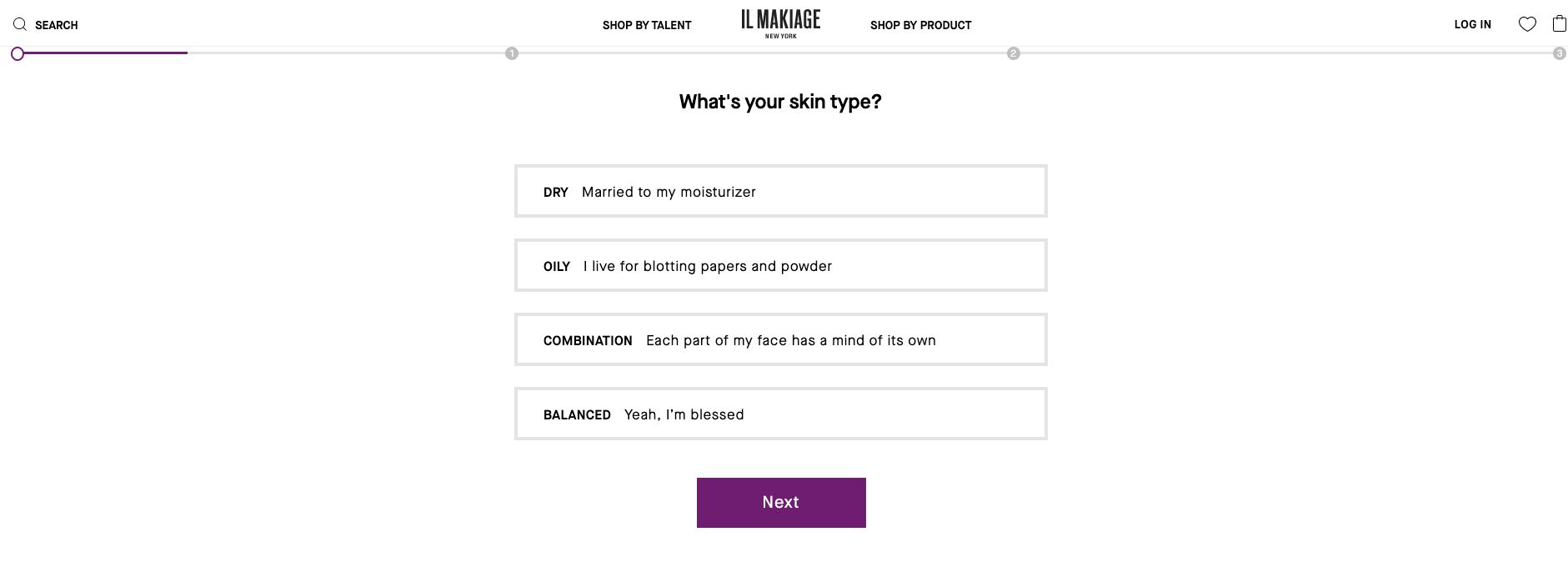
For something that can be as difficult as choosing the perfect shade of foundation for your skin (especially online and from a new brand), this quiz offers a fun, easy, and risk-free solution.
It’s also a brilliant way to generate leads to support your inbound marketing efforts.
9. Real-time conversations
Similar to how users won’t wait around for your site to load to get their answers, they often won’t wait around to talk to you either.
In an age of push notifications, informality, and constant connection, people have come to expect the same from interacting with brands: quick, simple answers.
With this in mind, your website should be able to support real-time conversations, but where do you start?
Test the waters by first including a messenger on your website pages that show the highest intent (i.e. shopping cart, a landing page to request a demo, a pricing page). Try tools like:
AI capabilities give you the opportunity to start a conversation (or to let prospects start one with you), offer good customer service, and hopefully ease any objections to converting in the moment.
From there, you can consider branching out to other more early-stage pages (like FAQs or general service pages) where people may commonly have questions.
Considering the omnipresence of live chats and messengers in our day-to-day lives, you can even try delivering calls-to-action via a live chat window rather than a traditional pop-up button or delivering helpful related resources.
No matter how you use it, embracing this new form of communication will help you connect with your potential buyers in a way they find comfortable and useful.
10. Social proof
You can praise yourself as much as you like in content, it will never hold as much clout as praise from an unbiased, third party — especially former customers.
In order to establish trust and credibility on your website, buyers need to see that you actually deliver on what you promise. They need to see that real people have seen results and gotten their money’s worth.
That’s why social proof is so important (and I don’t mean the bogus visitor count I had on my website). Share case studies with real data, customer testimonials, and reviews. Share ratings from reputable authorities and relevant awards.
You can also post what we call “Claims We Make” videos (one of The Selling 7) showcasing your work like former IMPACT client Industrial Packaging:

All of this tells prospective buyers that you’re not just making empty claims; you live up to the hype.
HubSpot's customer reviews page is one of my favorites.
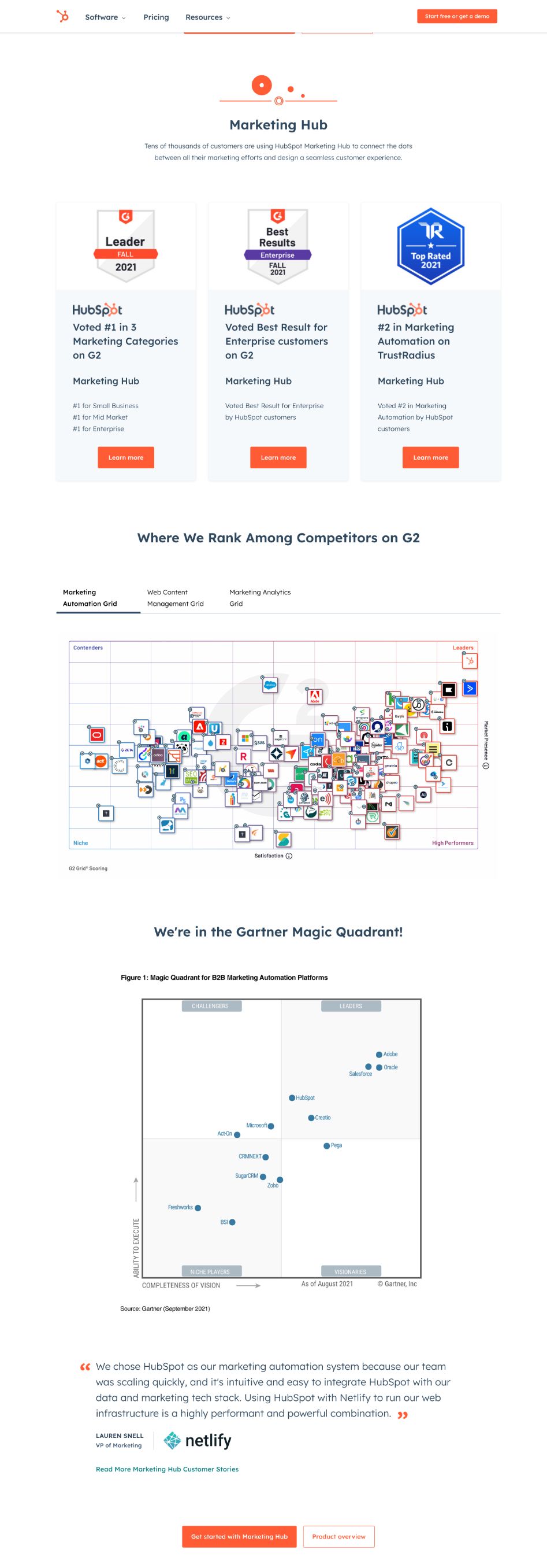
Not only does it share testimonials for each of its hubs, it also shows a long list of its awards and rankings/ratings against competitors.
Make websites great again
If the elements mentioned in this article didn’t surprise you, honestly, I had a feeling they wouldn't. They can each be connected to elements that make an inbound marketing strategy work.
These features are things you as a consumer look for when you’re researching a purchase online and things that make you trust the brand that you ultimately buy from. Your buyer is no different.
If you can implement these pieces onto your inbound marketing website design in 2024, you will be well-equipped to not only establish credibility with your audience, but also have your product or service sell itself and increase your bottom line.
Free: Assessment