Subscribe now and get the latest podcast releases delivered straight to your inbox.
Throughout my life, I’ve gone through my fair share of phases.
Some were positive, such as going vegetarian. Some were funny, like my long hair and sweatband phase. Then there are the ones that I REALLY wish I could forget, like my short-lived JNCO jeans phase.
For anyone who isn't familiar with JNCO, they were jeans with extra wide legs that essentially turned yours into amorphous tubes of denim.
Aside from the obnoxious appearance, they constantly dragged on the ground and got caught on EVERYTHING.
But, at the time, 13-year-old me wholeheartedly thought I was killing it.
Many years later, looking back in shame and embarrassment and ask myself, “How did I ever think those were a good idea?”
One thing that gives me some solace is that I know that I’m not alone.
Even the web design world has had its fair share of embarrassing phases.
Just look at the marquee tag or bevel and embossed buttons. Even more recently (and still far too prevalent) are homepage carousels.
It’s tough to pinpoint exactly when carousels (also called sliders or slideshows) officially made their debut into the web design world but, despite leading to poor conversion rates, we still see them used all over the web today.
You may be wondering “if they’re not effective, why do people use them?”
There are really two main reasons:
-
To some people, they look flashy and cool.
-
It’s an easy solution for telling competing departments within an organization that their messaging is on the website.
But there are several downfalls to this logic.
If you’re currently using a slider on your homepage — or considering it for a future website redesign — check out the following reasons to ditch the slider and try one of the alternatives we’ve suggested below.
Reason 1: Sliders are likely to cause 'banner blindness'
"Banner blindness" refers to when people, over time, subconsciously learn to tune out any content that resembles an ad.
When users arrive on a website, they direct their attention to accomplishing a specific goal so anything extra, especially ads, gets ignored.
A number of studies have confirmed that the majority of users view sliders as spammy ads so they tend to skip right over these types of elements.
This is mainly because the animations and layouts that most sliders use, tend to mimic the design aesthetics we’re used to seeing in banner ads.
Reason 2: Sliders are not built for accessibility
Website accessibility plays an extremely important role in modern web design.
The Department of Justice is working on making amendments to the ADA (Americans with Disabilities Act) that would change the law to include information found on the web and create an equal user experience for everyone.
Unfortunately, most carousels are not optimized for users with disabilities.
Take a look at the site below, for example

Having a website that is accessible ensures that all your visitors have the equal opportunity to view your site’s content and interact with your company, regardless of any disabilities anyone may have.
If you do not comply, you may not only alienate some
Reason 3: Sliders are notorious for low click-through rates
To put this plain and simple, sliders are conversion killers. People simply do not interact with them.
The University of Notre Dame ran a study on its website to determine the effectiveness of a homepage slider and found that out of the 3,755,297 people who visited its homepage, only 1% actually clicked on an item in the slider.
To add insult to injury, 89% of those clicks were on the slide in the first position.
The main reason sliders lead to low click-through rates is due to the “banner blindness” effect that I mentioned earlier.
People simply don't pay attention to sliders. Additionally, the quickly-changing slides and multiple offers can make people feel overwhelmed so they just skip that part of the page.
Reason 4: Sliders are slow loading and lack mobile optimization
Site speed is a key piece of delivering an enjoyable user experience to your visitors.
Site speed has become so important that Google factors it into its search algorithm.
With this in mind, sliders have been described by Kevin Hunt as the “the king-size candy bar of site weight.”
This is mainly because they feature multiple large images that load all at once and require the use of additional JavaScript to run.
All those assets quickly eat up your bandwidth.
On top of slow load times, many sliders are not optimized for mobile.
Slider images that may look OK on desktop become impossible to read once shrunk down on mobile. Combine this with the frustration of trying to swipe left and right between slides on your phone and visitors are sure to leave your site with a bad taste in their mouths.
Reason 5: Competing messages overwhelm visitors
There’s a popular saying that “If you’re focused on too many things, you’re not focused on anything.” This could not be truer when it comes to carousels.
Let’s break down the typical experience a user has with a slider:
Visitor arrives at your homepage excited and ready to learn more.
Visitor sees a message on the first slide and begins reading it - “At Company X We Strive to…”
BOOM! Gone. Next slide. “We have 20 Years of Experience Specializing in...”
BAM! Gone. Next slide.
Pretty overwhelming, right?
Often sliders move so fast that people aren’t able to fully read, let alone digest and then take action on the information.
This usually leaves users feeling confused about what you're trying to communicate — and what their next steps should be.
If the initial feeling a user has on your site is confusion, that’s going to make it almost impossible to build trust. A lot of times, this is enough to cause users to leave your site and find another solution.
Reason 6: Sliders take control away from the user
Sliders are also a bad idea because they break one of the most important rules of UX — Keep the user in control.
People are always the most comfortable when they are in charge. The modern buyer wants to be in control of their own browsing and purchase experience.
Your website should let users decide what links they click and how fast or slow they read and digest your content. Sliders work against this by either moving too quickly or having small navigation icons.
What are the Alternatives to Using a Carousel?
All of these reasons come back to one main overarching theme: Sliders simply provide people with a poor user experience.
They create a scenario where users are beaten over the head with multiple messages, images, and actions to take. All this adds up to a poor user experience that will leave visitors with a poor image of your brand.
What can you use instead of a slider?
1. Smart content
If you’re looking for a way to craft specific messaging for multiple personas on your homepage try implementing smart content.
Smart content (which is readily available in HubSpot) creates an experience that’s personalized specifically for a website visitor based on interests or previous actions on the site.
Not only does it delight users with an experience that’s customized for them but it also presents them with one clear message.
2. Focus on your most important messaging
Rather than beating users over the head with all of your offers at once, let them come across the offers naturally throughout your site.
If you’re struggling to get eyes on your most important offers, try implementing static call-outs for that content in relevant areas and include clear actionable links.
Take a look at the example below.

Instead of putting a bunch of content offers into a slider, ThoroughCare chose one of its most important offers and created a call-out section right below the hero to draw attention to it.
You’ll also notice they have a bright button that tells users exactly what it’s for.
This, like a slider, highlights a key message but doesn’t come with any of the accessibility and experience issues.
3. Video or animations
If you’re looking to add some interactivity and motion to your site, try pairing your content with animated GIFs.
The movement and smooth animations used in GIFs grab user attention and add another level of context to your content. Their smooth animations and motion help guide users to where their eyes need to go.

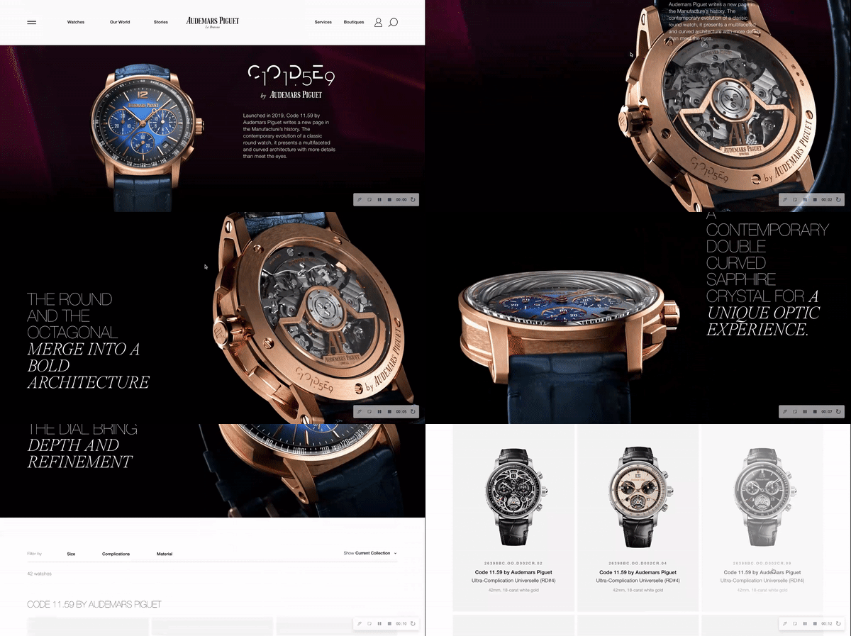
This stunning site for watchmaker Audemars Piguet uses beautiful animation in the hero of their homepage to give users an idea of the quality of their watches.
For those in the market for a luxury watch, the details matter, and this design offers a peek inside the craftsmanship that makes the watch tick. You'll see animations, videos, text, and more.
In addition to animated GIFs, video is also an incredibly useful technique for explaining complex ideas to users through motion.
Video delivers ideas in a format that’s fast and much easier to digest. In fact, viewers retain 95% of a message when they watch it in a video compared to 10% when reading it in text.
As mentioned before, sliders struggle with low click-through rates and user engagement. Videos and GIFs, however, are known to have the opposite effect.
The website your buyers want
I can’t take back my embarrassing JNCO jeans phase, but it’s not too late for you to help your website skip an embarrassing phase by ditching its carousel.
Carousels may seem flashy and cool but they’re simply not effective when it comes to converting visitors to qualified leads.
Not only do they lead to slow load times, but they also create a poor user experience that reflects badly on your brand.
Give your users a positive, intuitive experience by delivering content that’s tailored to them using smart content, making your top content naturally and easily accessible, or adding dynamic elements to your site with animated GIFs and video.
I’m sure you’ll find no one misses the slider once it’s gone!
Free: Assessment

