Topics:
Web DesignSubscribe now and get the latest podcast releases delivered straight to your inbox.
10 Web Design Mistakes You're Making That You Love (& Your Visitors Hate)

Jun 20, 2019

In only 50 milliseconds (0.05 seconds), someone will decide whether or not they like your website. If that person is someone you want to turn into a buyer, that at infinitesimal amount of time is absolutely critical -- it's the difference between having them stay or leave.
Even if you get them to stay, you still have another problem.
Get this -- 38% of people will stop engaging with a website if the content or layout are unattractive.
Yikes!
That puts a ton of pressure on the design of your site -- you need to have the right elements in the right places, and presented to people at the right time, if you want them to move further into your site instead of bouncing away.
So, how do you know which elements are the right ones, and which elements are turning off your audience?
Of course, there isn't a definitive way to know exactly what design elements you need, down to every last single detail, without taking your unique analytics and user data into account. However, there are best practices out there that are relatively universal, when it comes to helping you make better design choices.
For instance, testimonials on the homepage or keeping social icons in the footer.
Elements outside of these best practices are considered experimental. And, most of the time, we find that these elements can show up on websites due to personal preference and/or outdated best practices.
Each site is different, and the audience for those sites are equally as different. But, just like best practices are things we absolutely know will work, there are a few elements that just won’t.
Here are 10 examples of design choices that are accidentally turning off your audience.
1. Your Navigation Is Confusing
Have you ever been on a website, and you didn't know how to get around or where you were supposed to go? It's jarring, because you know (or you think) you're in the right place, but you couldn't find what you needed.
This is a case of bad site navigation. The menu might have been hidden, or been on the right hand side, or even the bottom of the page.
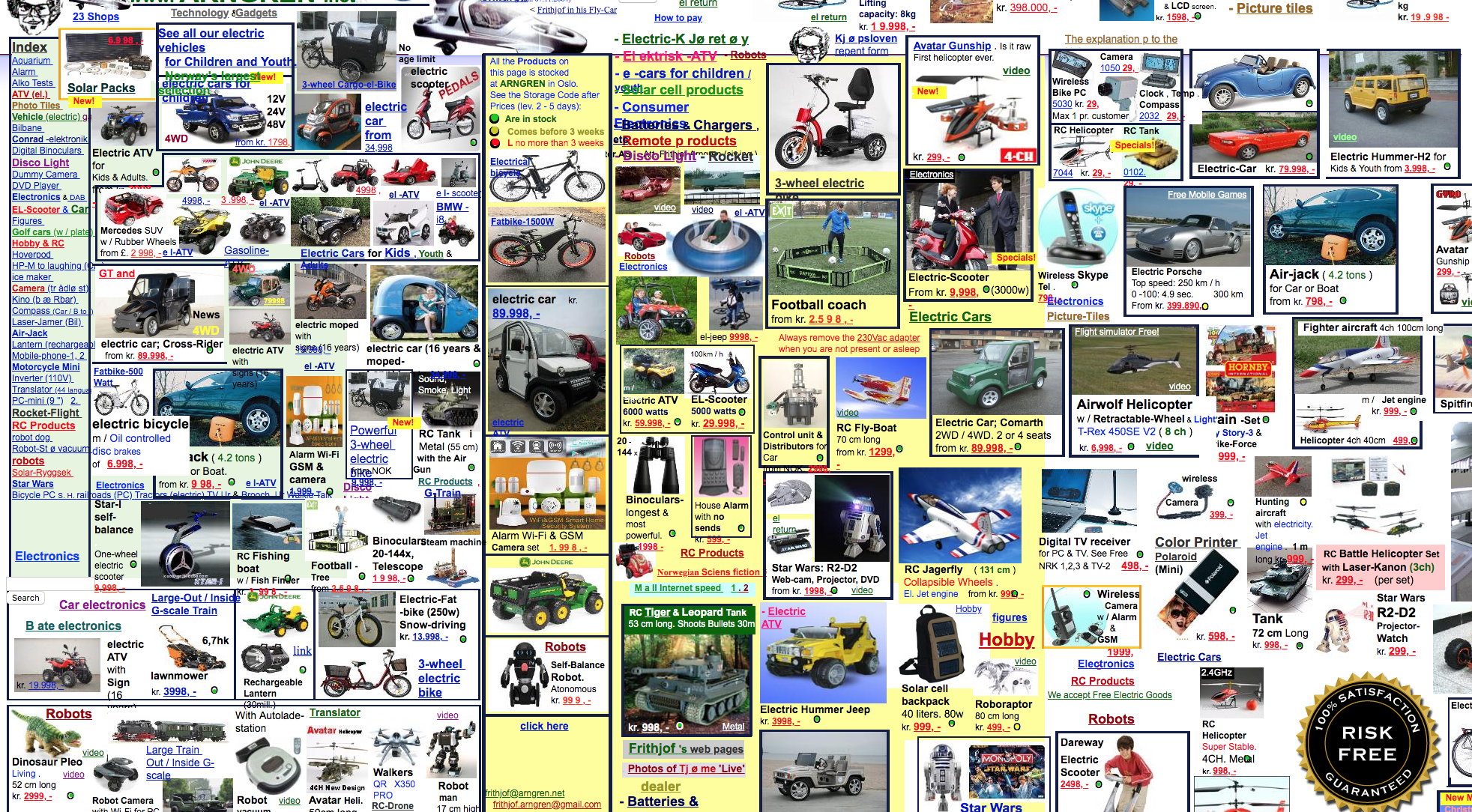
In case you're wondering... the navigation in this example is on the left. 🙃
We see these results a lot when a site is trying very hard to be different, creative, and/or unique. Or, in some cases, no one can decide what is the most important thing you should see first.
Certainly, we want every site to be different, creative, and unique in its look and feel. But you shouldn't go too far. You may end up compromising the user experience, to the point where someone will throw up their hands, because it's too hard for them to figure out what they're supposed to do.
You never want your users to have to think about how to use your website. It should always feel intuitive.
Your menu should be clear and prominent on the page. It needs to be easy to spot, understand, and actionable:
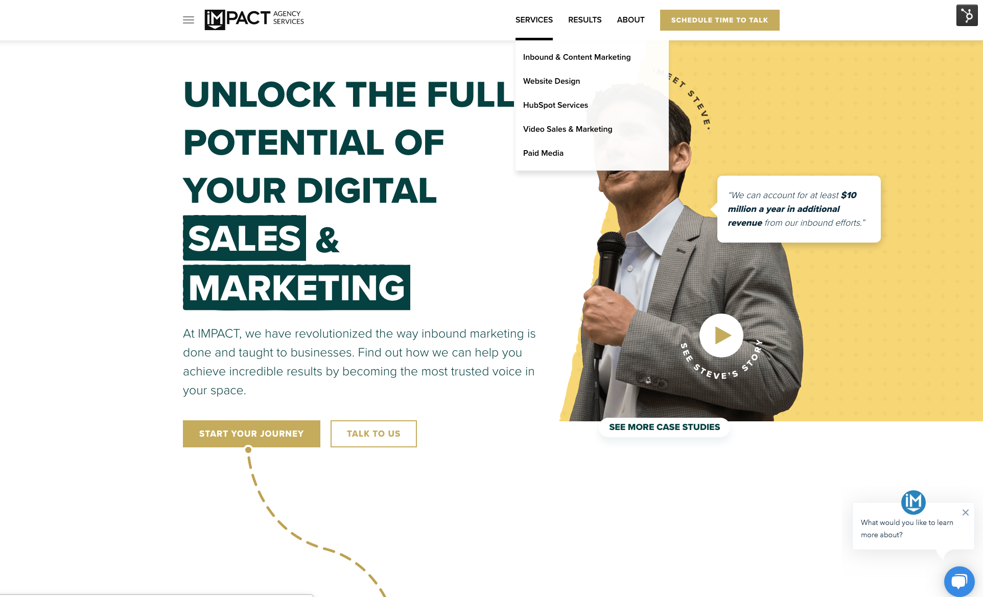
We try to keep it simple on the agency side.
Not only will you confuse folks with overstuffed site navigation menus, it’s bad for your SEO. So, limit the number of main menu options between five and seven.
Dropdown menus should be organized in a manner that your user will understand, not in a way that makes the most sense to you, from an internal organization standpoint.
Your website analytics can provide you with pretty great insight on what paths your users are taking to get where they need to go, as well as where users may be dropping off on your site, when they should be staying and taking action.
Take this into account when determining the structure of your menu, you want your menu to be easy to understand and find the info they’ll need quickly.
2. You're Relying on Homepage Sliders to Convey Multiple, Competing Messages
Ah, homepage sliders (or carousels, as they're sometimes called). The website element all designers love to hate:
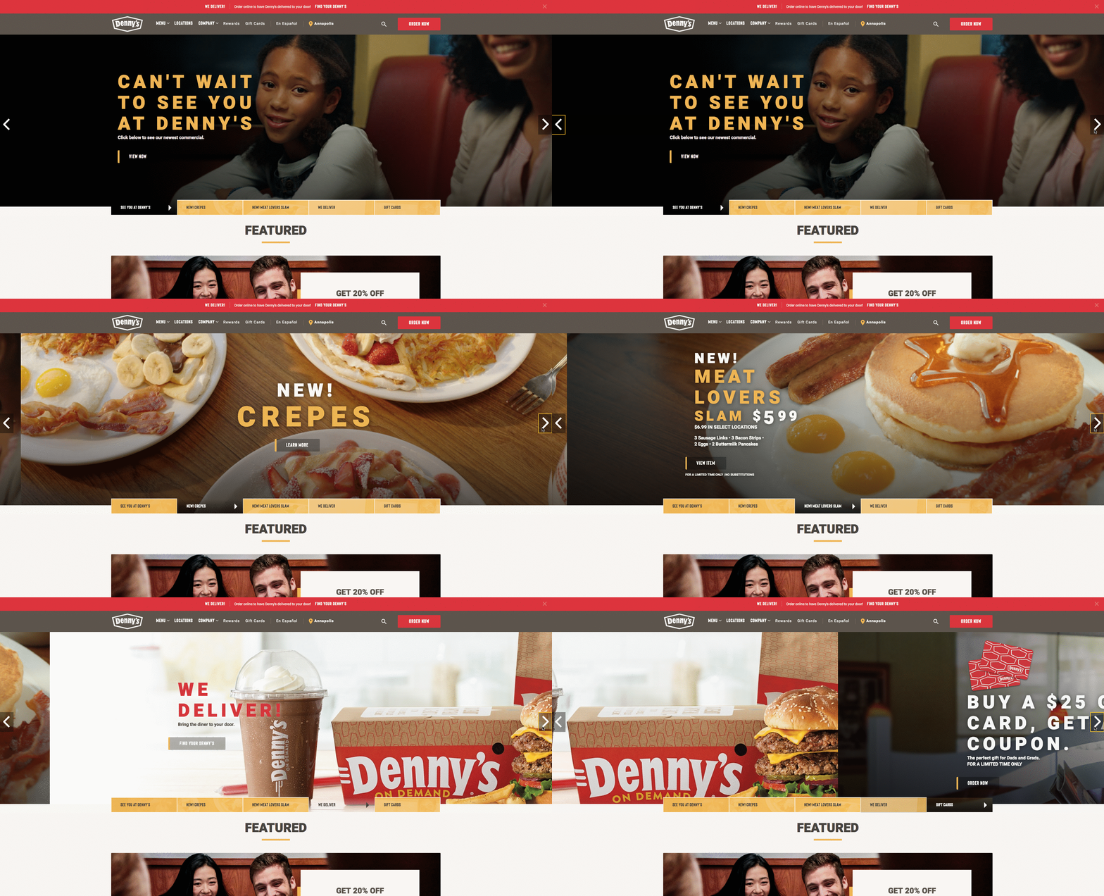
I know, you’re probably thinking, “Hey, what’s wrong with sliders?”
And my knee-jerk response to you would be, “Well, what do you think is wrong with dial-up internet?”
Sassy? Maybe. But the reality is they just doesn't work.
Fellow IMPACT designer Joe Rinaldi wrote a very concise and persuasive article about why homepage carousels or sliders may seem easy on the eyes, but they are not a good idea.
Here's one of my favorite quotes:
"I can’t take back my embarrassing JNCO jeans phase, but it’s not too late for you to help your website skip an embarrassing phase by ditching its carousel. Carousels may seem flashy and cool but they’re simply not effective when it comes to converting visitors to qualified leads."
In short, homepage sliders (or carousels) aren’t effective because they don’t convert.
While you may think your users will take the time to sit around and wait to view all options in a homepage slider before clicking through and starting their journey. (Or, if you're Denny's, you may think someone is actually going to actively click through everything like I did.)
You would be wrong.
Sliders solve internal problems -- they allow multiple internal stakeholders to feel that their priority is important.
They don’t, however, solve for the user’s needs.
So, what do you do if you can’t slider? You simplify!
If you're hosting a website on HubSpot, take advantage of Smart Content features, which allows you to craft and display unique messaging that will change depending on whatever variables you set as the trigger points. (For example, you may have a different message for someone in the United States, versus someone in Canada.)
Or, just stick to a single, really important message, and make it very prominent in a “hero section.” But, if you really need the “flashiness” of a slider, maybe check out some options with video or animations.
Again, Joe has some great suggestions on alternatives to homepage sliders.
3. You’re Still Forcing Everything Above the Fold
I don’t know if you’ve noticed, but the internet doesn’t actually fold like a newspaper! Still, the concept of "above the fold" has persisted for decades in the world of web design.
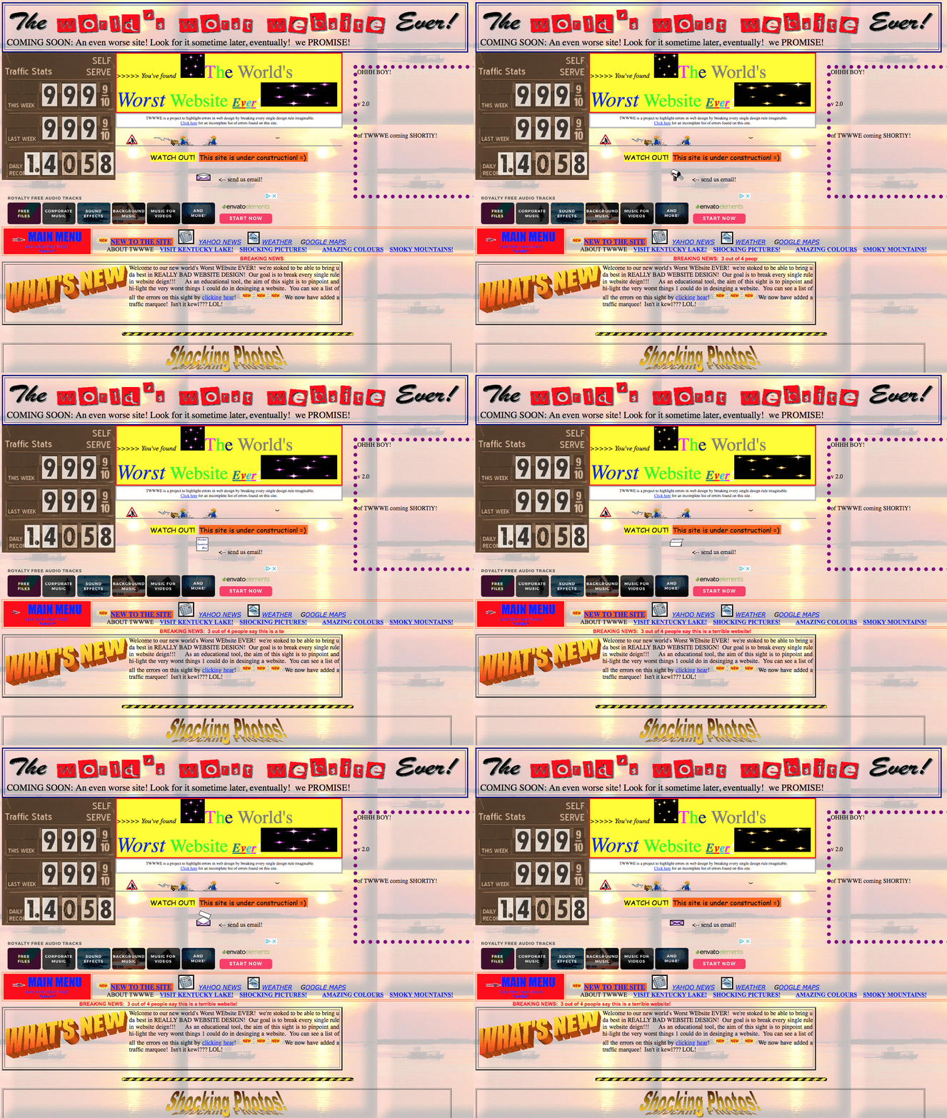
If you don't put it above the fold, it doesn't exist, according to this website.
But this "above the fold" idea is nonsense -- especially with the endless amount of devices and screen sizes out there.
When users land on a website they scroll. Our mobile culture has made this second nature. When designers perceive the (invisible) fold, it provides an unrealistic boundary for the problems they are solving.
Your messaging should come through loud and clear in your hero space, but keep it singular and free of distraction. You want this area to address the one thing you want your users to accomplish during their time here.
Don’t include too much verbiage. Be concise and direct. Don’t include too many buttons, you want the user to follow a very defined path.
Embracing whitespace in these sections is crucial. The extra room whitespace provides is going to force your user to hone in on your key message.
It’s also a good idea to anticipate the scroll. You can keep your users engaged by adding in slight animation encouraging scrolling. Or you can put a larger design emphasis on key section transitions.
4. You Stick to Your Branding, Accessibility Be Darned!
Website accessibility has been receiving a ton of buzz lately, and rightfully so. This isn’t a trend, or something that is going to phase out. Website accessibility is essential for all people to use the internet. It’s the right to information.
Yes, it’s heavy, it’s complicated, and it can’t be ignored.
Even with the recent focus on accessibility, we’ve actually seen a number of company teams be resistant to embracing accessibility on their own website. It’s not because they don’t want to be inclusive; it’s because it’s requiring them to change or abandon established brand standards.
Contrast is the worst offender in this category.
See, website accessibility isn’t just about designing for a screen reader. It’s about optimizing for readability.
For example, someone who is colorblind may have a difficult time distinguishing copy on a button if the colors used do not have enough contrast -- think white text on a light yellow button.
This might be a difficult change to put into practice. Brand standards are just that, standards, and changing them will likely have to be discussed and rewritten to comply with accessibility expectations.
The best place to start is simply to check your existing color contrasts with a tool like Color.review. Simply add in two hex codes and the website will deliver a pass/fail grade and put you well on your way to change.
5. You’re Pressuring Your Visitors With Too Many Calls-to-Action

Who hasn’t been to a website and seen this on every single button all the way down the page? While I have to commend those websites by sticking hard and fast to the “one-thing” principal of web design, it’s simply too much.
Calls-to-action should be helpful. They should be strategically placed where it’s logical for the user to dive further into the site.
An overabundance of buttons will only deter the user from clicking on them. It feels gimmicky and pushy. No one likes a pushy salesperson -- but is your website the pushiest salesperson of them all? (Be honest.)
It’s not just about placement, either -- consider the hierarchy you are creating with the style of your buttons. An effective CTA doesn’t have to be red with bold lettering. And every CTA shouldn’t look the same.
The most commanding styles should be for bottom-of-the-funnel offers and the least commanding (like a ghost button 👻) should be for links that simply lead the user to internal pages.
Also, don’t be afraid to add in-text links. Sometimes a link doesn’t need to be a button, but something in-line with the text with a simple arrow to show the user can dive deeper.
6. You’re Using Too Much Animation
Animation and video are so hot in web design right now.

In all seriousness, everyone seems to be experimenting with moving elements. And, especially in the case of video, it’s seeing massive results.
When it comes to animation, use the Jurassic Park rule -- just because you can, doesn't mean you should. When every element on a page moves, it just distracts the user. It calls attention to everything and therefore nothing.
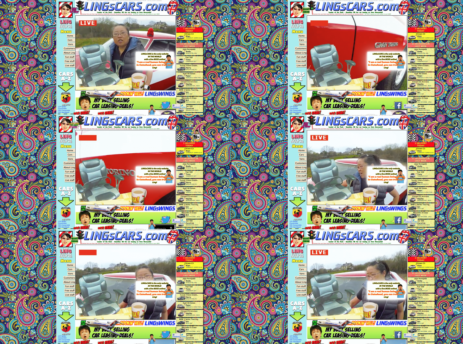
Dear Ling. Where am I supposed to look?
Having intentionally placed animation that draws your visitor's attention to critical elements like bottom-of-the-funnel offers, live chat, or even contact forms are really effective.
Also, don’t be intimidated by animation. Sometimes the smallest movements can be the most effective. This isn’t a "Go big or go home!" strategy.
7. You’re Hiding Content Behind “Bells & Whistles”
We see the use of unnecessary hover effects time and time again. It’s a great solution to the old favorite “Can you make it pop?” request.
The problem is, they are incredibly frustrating for the user, almost never work on mobile, and are entirely hidden to screen readers -- in fact, the same accessibility concerns mentioned above apply here, too.
We’ve talked a lot about being user-focused and the impact that has not only on your design, but more importantly your content.
If you are taking the time to create great content that is focused on solving your audience's biggest pain points, why in the world would you want to hide that in a hover effect, tab, or accordion?
Again, this comes back to what I said before -- don't make your visitor think.
In this context, don’t ask the user to dig for your content and then assume they will understand how to access it once they find it. That’s a frustrating user experience. Experiment with best practices to find ways to display your content so the user can easily read it.
Lastly, hidden content totally alienates an entire audience of users.
Screen readers can’t read text that is hidden. So, if a visually-impaired user navigates to your site, there will be entire sections of the website that they simply can’t consume.
8. You’re Still Using Cheesy Stock Photography
I can't believe it's 2019 and I still need to say this, but here we go again -- stock photography is noticeable and it looks as fake as it feels.

"I am a professional woman, and I am very upset about these charts."
"She has spinach in her teeth -- do I tell her?"
Now, to be fair, I know why sometimes companies fall into the trap of using them.
Not everyone has the budget to stage a photoshoot with a professional photographer, and there are plenty of businesses out there that just aren’t comfortable doing it on their smartphone, so stock photography can feel like the only option.
I’m not saying stock photography is unacceptable, but I am saying you can be much more purposeful about the stock photos you choose.
Don’t just think about having to pick out some stock photos -- think about curating a set of images that represent your brand.
Keeping small things consistent, like lighting, the way subjects are dressed, the technology they are utilizing, all help contribute to a polished brand image instead of randomly inserted images throughout your site.
These random images don’t personify trust, how can the user know what is really real about your company and what isn’t? If you are perceived as untrustworthy, your buyer’s journey is going to be incredibly longer than most.
9. You're Overwhelming Visitors with Slide-in/Pop-up CTAs & Chatbots
I am a huge advocate for helping your users on your site, our entire website methodology is built on it -- but there is a fine line between helpful and annoying. And this is something that can devolve into annoying very, very quickly.
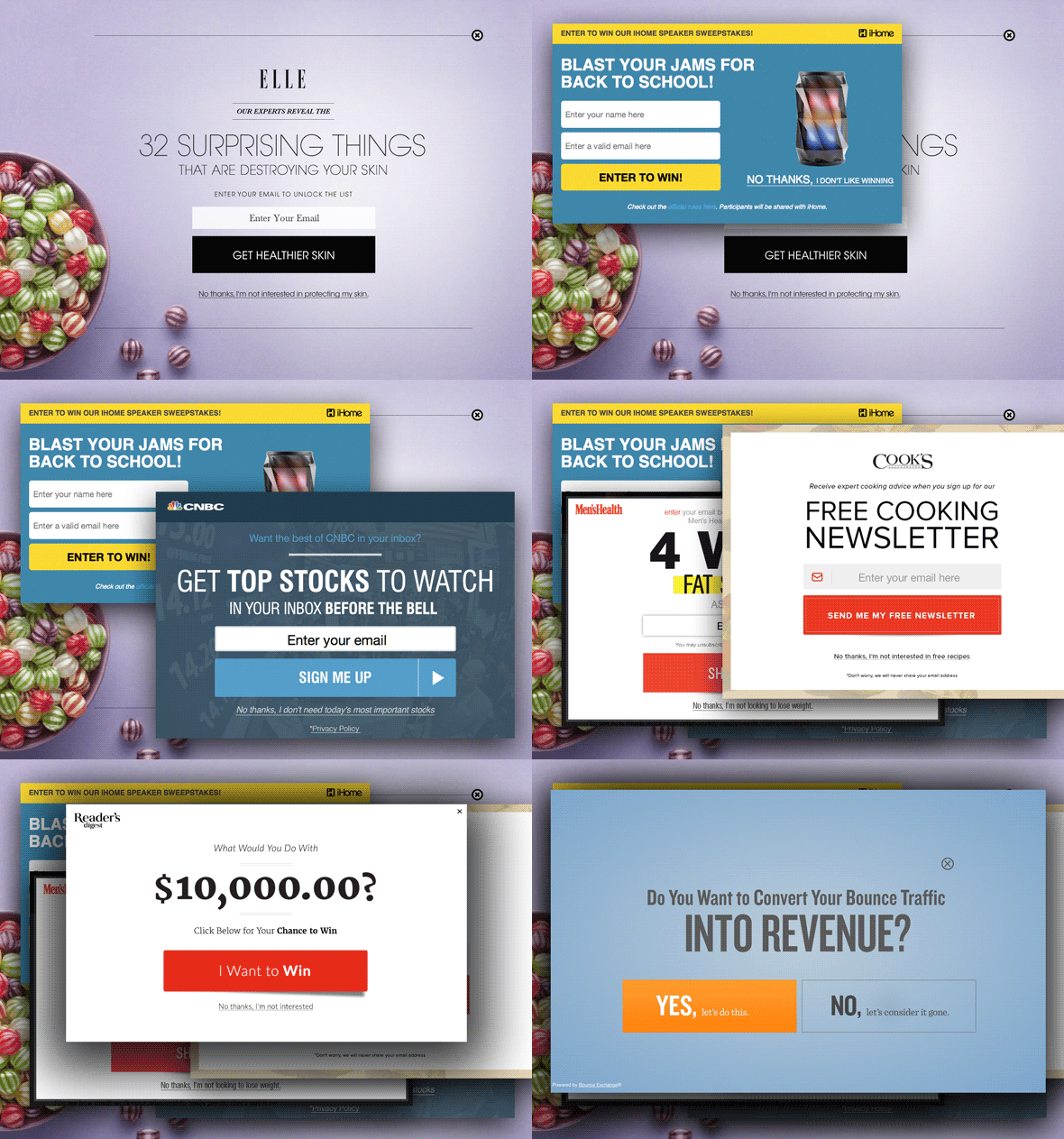
Pop-up calls to action and live chatbots that are always asking you if you need help are like the annoying 20-something electronics sales guys that are two steps behind you in an electronics store asking if you need help.
Look, I’ll ask for help when I need it thanks, but for now I’d like to do some self-discovery.
It’s good to let the user know you are there, ready to support them if they need it. But, once you let them know, let them do their thing. You don’t need to hit them with exit-intents and a new pop-up for every 20% they scroll down a page.
If your website strategy is worth its salt, it will get your users where they need to go without hounding them. If you feel like it can’t do this, revisit your navigation and page structure.
10. Icons with No Context
Icons are cool. We actually use them all the time. But, we have one simple rule, icons are not allowed to stand alone.
Icons were super trendy a few years ago. Every single site in existence didn’t have any merit unless they had their own custom icon set that was expected to translate every last detail of a concept.
That’s crazy.
Icons, much like images, help provide necessary, skimmable context to the copy on a website. That said, icons shouldn’t be used for every single headline, info box, and menu item on your website.
All this does is create visual clutter and it isn’t actually enhancing the user experience.
Be purposeful, be intentional, and be on brand.
BONUS: You’re Talking About Yourself Too Much In Your Website Copy
OK, I can't end this list without talking about one of my biggest pet peeves -- one that may surprise you, given that I am a designer. But still, one of the most common mistakes we see during our monthly Website Throwdown are websites that talk about nothing but themselves.
It’s boring, it’s vain, and it’s flat out unhelpful.
Take a look at your current site and count the number of times you are using “we” and “us” phrases as opposed to “you” statements.
Your website is about your user, it isn’t about you.
When creating website copy, you should be hyper focused on solving for the user’s problems. Think about what they are trying to solve by coming to your website and researching your products or services?
Your copy, your website navigation, and your resources should be centered around helping your users solve their problems. Not how great you are.
Here is a hint -- if you have a section labeled “Solutions” in your main menu, your navigation is not helping your users solve their problems. A simple switch to “How We Can Help?” puts the attention back on the user.
"I Will Neither Confirm Nor Deny That I Do Some of These Things. But If I Did, What Do I Do Now?"
Uh oh, did I hit a couple of sore spots? Don't worry. It’s going to be ok. Everything on this list is completely fixable, and most of it can be resolved without a lot of heavy lifting.
If you’re still skeptical, I understand. These things can be hard to let go of. But, do me a favor and make sure these decisions are holding up with your users.
If you have one (or more) of these examples on your site right now, the best thing you can do to prove or disprove their efficacy is to do some user testing.
Create some experiments around these elements. Maybe you want to see if users engage with a certain section or maybe you want to see if it is actually driving conversions, whatever the case write down what it is and determine how long you want to test it.
Then, define a parameter for success. What does “Hey, this actually works!” look like? Is it X amount of conversions? Is it a particular bounce rate? A heat map score? Whatever it is, write it down.
Now, utilize your tools! You can easily use the data already being gathered by tools like Google Analytics and Lucky Orange for these tests. Real data is the only way you are going to have a complete understanding of what your users are actually reacting to.
Run the experiment, read the data, and make changes accordingly.
The more you can experiment with your website, the more data you have to make informed changes that are based on user needs and behavior.
Free: Assessment